5. DATA ANALYSIS AND PRESENTATION
(Prepared in collaboration with William Dalzell)
Experiments never produce perfect data. Errors of various types always occur. For that reason, experiments should always
be repeated, and replicate measurements should always be made to assess
reproducibility (precision). This
section covers three areas that are very important in 10.27: (1) the nature of errors which arise in
obtaining quantitative data from experiments and the statistical treatment of
the data; (2) fitting data to a straight line, which is a very common form of
data analysis; and (3) the way in which information, quantitative data, and
predictions of theory should be presented as diagrams, figures, and tables in
technical reports and presentations.
5.1 Errors in Experimental Data and Their Statistical Treatment
In 10.27, we make use of two chapters from a textbook
on analytical chemistry:
Skoog, D.A.; D.M. West; F.
James Holler. Fundamentals of Analytical
Chemistry, 6th ed.; Saunders College Publishing: New York, 1996.
The chapters are
Chapter 2.
Errors in Chemical Analysis
Chapter 3.
Statistical Evaluation of Data
These two chapters are
contained in Appendix III. Data Analysis. Although the chapters are oriented towards applications in analytical
chemistry, all of the material covered is very useful and directly applicable
to the kinds of data that students collect in 10.27. The chapters are written at an elementary level for students with
no previous experience in statistics and do a good job of providing a basis for
understanding the sources of error in experimental data and how to report and
analyze them.
All
students in 10.27 are expected to read Appendix III completely and to make use
of the material presented therein in their reports.
The main topics covered in Appendix III are as
follows:
Sources of Error in Data
Definition of mean, precision, (standard deviation,
variance), accuracy
Determinate (systematic) errors
Sources
Effect on results
Detection
Indeterminate (random) errors
Sources
Distribution
Standard deviation of computed results
Propagation of error analysis
Reporting data
Significant figures
Rounding data
Statistical treatment of indeterminate (random) errors
Difference between population and sample parameters
Properties of the standard deviation
Uses of statistics
Confidence limits
Rejection of outlying data
Hypothesis testing
Comparison of means, true value,
measurement precision
Detection limits
Fitting data to a straight line
5.2 Fitting Data to a Straight Line
Fitting
data to a straight line is so common that all 10.27 students must be familiar
with the procedure. A linear
relationship between a dependent and an independent variable may be predicted
by theory or may be suggested simply by the behavior of the data itself. The problem to be solved is a follows: Suppose that ![]() measurements have
been made, giving values of the dependent variable,
measurements have
been made, giving values of the dependent variable, ![]() as a function of the
independent variable
as a function of the
independent variable ![]() Suppose further that
the uncertainty in x is insignificant in comparison with the uncertainty in
y. It is desired to fit a straight line
to these results.
Suppose further that
the uncertainty in x is insignificant in comparison with the uncertainty in
y. It is desired to fit a straight line
to these results.
Appendix IV. Linear Regression contains equations for fitting a straight
line using the method of least squares (also called linear regression). The material is taken from
Mickley, H.S.; T.K. Sherwood;
C.E. Reed. Applied Mathematics in
Chemical Engineering, 2nd ed.; McGraw-Hill Book Company,
Inc.: New York, 1957.
In Appendix IV, the straight
line is represented by
![]() (5-1)
(5-1)
where Y denotes the value
predicted by equation (5-1), b is the slope, and a is the value of Y when ![]() The x-dependence is
represented by the deviation from the mean value of x:
The x-dependence is
represented by the deviation from the mean value of x:
 (5-2)
(5-2)
The mean value of y is
 (5-3)
(5-3)
and the fitted straight line must pass through (![]() ). It is desired to
estimate the values of a and b, and the uncertainty in these parameters, that
gives the “best fit” straight line through the data. The best line is defined as that which minimizes the sum of the
squares of the residuals; each residual is the difference between the
experimental data
). It is desired to
estimate the values of a and b, and the uncertainty in these parameters, that
gives the “best fit” straight line through the data. The best line is defined as that which minimizes the sum of the
squares of the residuals; each residual is the difference between the
experimental data ![]() and the value
predicted by equation (5-1),
and the value
predicted by equation (5-1), ![]()
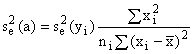
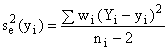
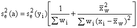
5.2.1 Unweighted Least Squares
In
Appendix III, equations are given for calculating a (2-89) and b (2-90) and
several estimates of precision, including the variance of the estimate ![]() (2-91) and the
estimated error variance of a,
(2-91) and the
estimated error variance of a, ![]() (2-94), and of b,
(2-94), and of b, ![]() (2-95). The square root of these quantities,
(2-95). The square root of these quantities, ![]() are the standard
errors of the estimate of a and b, respectively. Also of use is the estimate of the error variance of
are the standard
errors of the estimate of a and b, respectively. Also of use is the estimate of the error variance of ![]() (2-96) which is used
to estimate the confidence limits of
(2-96) which is used
to estimate the confidence limits of ![]() (2-97).
(2-97).
An alternative to equation (5-1), and the most common
form used to fit data to a straight line, is given by
![]() (5-4)
(5-4)
For this case,
![]()
 (5-5)
(5-5)
 (5-6)
(5-6)
where, as before, the
summation is taken from ![]() The expressions for
b,
The expressions for
b, ![]() remain the same as in
Appendix IV.
remain the same as in
Appendix IV.
5.2.2 Weighted Least Squares
A
modification of the analysis is required if the precision of ![]() is a function of
is a function of ![]() itself. This situation is common and can arise, for
example, if the error in a measurement is a constant fraction or percentage of
the magnitude of the measurement or if some sets of replicate measurements turn
out to be more precise than other sets.
It can also arise if the data is being fitted to the linearized form of
a nonlinear equation. A weighted least
squares analysis is used for this situation, and it is most common to set the
weighting
itself. This situation is common and can arise, for
example, if the error in a measurement is a constant fraction or percentage of
the magnitude of the measurement or if some sets of replicate measurements turn
out to be more precise than other sets.
It can also arise if the data is being fitted to the linearized form of
a nonlinear equation. A weighted least
squares analysis is used for this situation, and it is most common to set the
weighting ![]() of each datum point
equal to the reciprocal of its variance.
of each datum point
equal to the reciprocal of its variance.
Appendix
IV gives equations for all of the parameters when equation (5-1) applies. However, there is an error in equations
(2-108) to 2-110) in Appendix IV. The
right side of each equation should be multiplied by ![]() given by
given by
 (5-7)
(5-7)
When equation (5-4) applies,
![]() (5-8)
(5-8)
 (5-9)
(5-9)
The expressions for b, ![]() remain the same as
for the weighted least squares case in Appendix IV when corrected as described
above. If
remain the same as
for the weighted least squares case in Appendix IV when corrected as described
above. If ![]() for all i, the
equations for weighted least squares reduce to the equations for the unweighted
case.
for all i, the
equations for weighted least squares reduce to the equations for the unweighted
case.
5.2.3 Correlation Coefficient
The correlation coefficient r is a quantitative
measure of association between variables.
Its value ranges between –1 and +1, corresponding to perfect negative or
positive association (and a perfect fit to a straight line), respectively,
whereas r = 0 indicates no association between the variables. There are several definitions of r; one
common one is
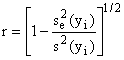 (5-10)
where ![]() is the sample
standard deviation of
is the sample
standard deviation of ![]() In most engineering
applications, r (or
In most engineering
applications, r (or ![]() called the
coefficient of determination) should be very close to 1.0. Even with scattered data, systematic errors,
and nonlinear behavior, r can be relatively high. Thus, the exact value of r is usually of limited value. Unfortunately, some software packages, such
as Excel, prominently feature the value of
called the
coefficient of determination) should be very close to 1.0. Even with scattered data, systematic errors,
and nonlinear behavior, r can be relatively high. Thus, the exact value of r is usually of limited value. Unfortunately, some software packages, such
as Excel, prominently feature the value of ![]() on plots of fitted
straight lines. What is of importance
in most cases are the parameters described earlier in this section, not the
value of
on plots of fitted
straight lines. What is of importance
in most cases are the parameters described earlier in this section, not the
value of ![]()
5.2.4 Obtaining Good Regression Lines
For
data that follows a linear relationship, the quality of the fit to a straight
line is improved when three criteria are met:
(1) The more precise values are plotted on the abscissa (x-axis). In the analyses referred to above, errors in
the x-values are assumed to be zero or negligible compared to those of the
ordinate.
(2) A reasonable number of data points are available (8-10). Remember that the confidence limits are
based on (n-2) degrees of freedom so calculations with 3 or 4 data points will
give very large values of the confidence limits. The reliability of each datum point ![]()
is improved if it
represents the mean of three or more measurements.
(3) The data,
whenever possible, should be uniformly distributed along the axes.
5.2.5 Linear
Regression with a Spreadsheet
Written instructions and a tutorial will be provided
for using Excel to carry out linear regression and to evaluate the parameters
described above. For unweighted least
squares, the capabilities already existing in Excel will be employed. For weighted least squares, the spreadsheet
will be used to calculate the parameters using the equations in this section
and in Appendix IV.
5.3 Presentation of Data and Information
This portion of these notes considers three major
topics: (1) schematic diagrams of
equipment, (2) tabulation of data, and (3) graphical presentation. Although most students use computers to
prepare graphic materials, hand drawn figures are acceptable in 10.27 and in
some situations are even preferred.
5.3.1 Diagrams of Equipment
Schematic diagrams of equipment should be uncluttered,
well labeled, and appropriate for the visual message you wish to convey. Always ask the question, “What is the
purpose of this diagram?” before presenting it. Include those parts of your apparatus which are important for its
operation. Equipment diagrams should be
placed on pages within the body of the text, not in an appendix. Allow large margins around your diagram, so
that information is not lost when you copy it.
As with all
figures, the diagram should carry figure number and an appropriate title at the
bottom. Use standard engineering drawing symbols. A good source for these is
Austin, D.G. Chemical Engineering Drawing Symbols;
John Wiley and Sons: New York, 1979.
If you cannot find a standard
drawing symbol, make up one. Simple
line drawings showing the key functional elements and general outline of the
device are best. Some common symbols
for process equipment flow diagrams are summarized in Figure 5-1. Label each element in the diagram or use
standard abbreviations.
In general, flow should be left to right and top to
bottom or bottom to top. Flow should be
shown as it occurs in reality, i.e., flow
through rotometers is upward, flow to a centrifugal pump enters at the center
and leaves at the outer circumference.
Use different width lines to indicate major and minor streams. Avoid using excess lines (e.g., do not use two lines for a pipe
unless there is some key message that only two lines will convey). Use arrows to indicate flow direction. When process fluid lines cross, make a small
loop in one to indicate that they do not interconnect.
If you prepare a diagram illustrating the detailed
construction of a particular piece of equipment, draw your sketches to scale if
possible. Label dimensions
clearly. For instance, if the diagram
shows two concentric pipes and these pipes are actually 8 inches and 4 inches
in diameter in the equipment, the diagram should not be drawn with the outer
pipe 3 inches and the inner one 1/2 inch in diameter. Use front, side and top views of equipment if necessary to convey
your message. Shading and dotted lines
can be used to highlight differences and to distinguish different layers,
inside from outside, fluid from walls, etc.
As with all pages, number the page on which the
diagram appears.
5.3.2 Tables
Tables are a systematic arrangement of data or results
in columns and rows for easy reference.
They contain a great deal of information and are inherently hard to
ready quickly. Usually trends and
overviews are not obvious unless pointed out in the text accompanying the table
or unless highlighted in the table.
A table should be placed on the page nearest to the
text in which it is discussed or on the next page (not at the end of the report
or in an appendix), and the page must be numbered.
The table
should have a table number and title at the top. All rows and columns
should be clearly labeled so that they are easily understandable. If the elements in a column or row have
dimensions, label the top of the column or the front end of the row with the
appropriate units. Use SI units if
possible, as is the case throughout reports for 10.27. Allow standard margins around the
table. Otherwise, parts of your table
may be lost when you copy it. Make the
table so it is easy to read. Include
only what is necessary, not every parameter used by the computer to get a
result. Do not use computer printouts
from your Excel or Lotus 1-2-3 spreadsheet as tables as is unless they are very
carefully prepared and the correct number of significant figures are used. It may be necessary to prepare the table
with a word processor or mathematics program.
Numerical
elements in a table should follow the same rules for significant figures (see
Appendix III) as used elsewhere in your report. Rows of figures with three or four extra digits detract from your
report. Error estimates can be given in
the table as appropriate. The recent
trend in preparing tables is towards simplicity. Generally, only horizontal lines (e.g., under column titles)
should be used. Explanatory material
should be placed in footnotes beneath the table.
Relations between row and columns can be included at
the top of the column or beginning of the row.
For instance, if column 5 is a product of elements in columns 2 and 3,
you might put (2) x (3) at the top of column 5, as well as words or symbols
indicating what the quantity is.
In the body of the text, data should be given in
tabular or graphical form but not both.
Extensive tables of raw or processed data should be placed in
appendixes.
5.3.3 Graphs
A graph is an extremely useful diagram that shows the
variation of one variable with that of one or more other variables at a
glance. Graphs are used for many
purposes, some of which are:
·
Display quantitative
data or a theoretical or empirical equation
·
Help visualize a method
of computation or a process
·
Compare one set of
results or data to another
·
Compare data or results
to theory, prediction or another method
·
Display visually the
scatter and expected error ranges of data
·
Determine the constants
in an empirical equation
·
Read the values of a
parameter on a continuous scale
·
Avoid trial and error
calculation
For your reports, graphs are the most important way to
display data, results, expected error, and appropriateness of a theory. In the literature, and in many software
packages, these are called line charts, time series, or scatter plots. In these software packages, there are often
a wide variety of other types of charts to choose from, including pie charts
and two- and three-dimensional bar charts.
In general, these are not useful for technical data presentation except
in very specific situations.
General
Rules for Graphs. Place a graph on a separate page immediately following
the page on which it is first mentioned.
The page should be numbered sequentially.
The graph
should have a figure number and a caption beneath it. Along with a title, the caption can be used
to explain the difference between curves or between different sets of data
points. Some examples are given below, which range from quite simple to more
complex:
Figure 7. Dimensionless correlation of area-averaged
mass transfer coefficients
Figure
4. Concentration dependence of the
infinite shear viscosity (m¥). Solid
curves are evaluated from the global fit to all of the viscosity data. The curves are plotted with µf = 0.69 and 1.00 mPa s for saline and
plasma, respectively.
Figure
9.
Effect of repeated 1-h exposures of immobilized monoclonal anti-BSA
to 0.1 M glycine hydrochloride at pH 2.5 on the affinity constants. Between
exposures to low pH, the pH was raised to 7 by washing with PBSA. The
antibodies are (A) 2.1, (B) 3.1, (C) 5.1, (D) 6.1, (E) 9.1, and (F) 11.1.
Some general rules follow:
1. Allow large margins around your graphs so that the
labels on the axes and the caption are not lost when you copy it or when you
place it on an overhead projector.
2. Label the axes with enough detail and in large enough
font to be easily understood. Include appropriate units for the variables on
each axis.
3. Identify each curve and set of data points. Do this either in the title region beneath
the graph or in an appropriate legend or key on the graph. Again, include appropriate units on all
parameters.
4. Pick appropriate scales and number subdivisions. Use one or at most two significant figures,
and use enough numbers on the axes to make the graph easily read. The appropriate scales and types of axes
(linear, semilog, nonlinear, etc.) are discussed below.
5. When you have many sets of data, for the data points
use open or closed circles, triangles, upside down triangles, in that order,
followed by crosses and diamonds. Do
not use letters or numbers as data points.
6. Occasionally one needs to plot a large family of
curves or data sets on a single plot, but this should only be done if the
presentation is clear and easily understandable.
7. Under no circumstances is a “computer dump”
appropriate. The graph that was useful
for you in juggling data in your computer is not usually readable by your
audience.
Choice of Axes and Scale of Axes. The coordinates you choose should allow the
graph to be read accurately over the full range of the variables involved and,
if possible, have a slope near ± 1 as a square diagram.
Empirical
Equations. Often a line or curve is drawn through the data simply
to show the trend of the data. In the
past, this was unusually done with a straight edge or French curve by eye. Today, computers can be used to fit an
algebraic equation to experimental data.
It provides a convenient and useful way to express a large amount of
information. Further, it allows further
mathematical manipulation of the information.
The mathematical equation must be closely representative of the data,
follow some theoretical model if possible, and be of simple form, ideally a
straight line. There are packages on
computers that allow a wide variety of functions, such as polynomials of the
form
![]() (5-11)
(5-11)
to be fit to your data. Considerable thought should go into
selecting an appropriate functional form.
Blind fitting of data to a mathematical function should be used only as a
last resort. A function that has no theoretical basis
generally limits understanding and cannot be extrapolated even minimally beyond
the last data points.
There are two steps in fitting an empirical equation
to your data: (1) Find a suitable form
of equation, and (2) evaluate the constants.
When fitting data, always plot the data initially on ordinary
rectangular coordinates. There are two
reasons to do this: (1) The possibility of a linear form is checked
before you try more complex expressions, and (2) the shape of the curve on
rectangular coordinates gives you strong clues as to the form of equation to
try.
Always
test your data against empirical equations with one or two constants unless the
initial plot suggests a very complicated equation. Further, always consider the theoretical basis for your
data. Even if you cannot write an
explicit theoretical equation, the form of the equation can often be selected. Use dimensional analysis to suggest
groupings of variables. If you resort
to higher-order expressions (more than two terms), the constants become
difficult to evaluate, and they are
difficult and often misleading to use.
Some useful expressions and suggestions for plotting
are given in Table 5-1 taken from the aforementioned book by Mickley, Sherwood,
and Reed.
Many of these expressions or variations on them are
suggested by theory. For instance,
kinetic data or rate r versus temperature follows the
Arrhenius equation, ![]() where T is absolute temperature. Therefore, a plot of
where T is absolute temperature. Therefore, a plot of ![]() (or r on a log
coordinate) versus 1/T is suggested. As
another example, heat and mass transfer correlations of the form
(or r on a log
coordinate) versus 1/T is suggested. As
another example, heat and mass transfer correlations of the form ![]() often give straight
lines when plotted on log-log coordinates.
often give straight
lines when plotted on log-log coordinates.
It is very useful to include error bars on the data
points when comparing data to theory, comparing two or more sets of data, or
presenting your data for the first time in a report. If the precision of the data points is much greater along one
axis than the other, only one error bar is needed on each point. If significant deviations can occur in both
directions, then crossed error bars are used.
Generally, the error bars will not be the same length
on the two axes, and they will not be the same along the curve even for one
axis. Precision of measurement often
varies with the magnitude of the variable, and you should allow for this in
your error bars. Some indication of the
way in which the error bars were calculated should be given in the caption or
in the text, for instance, “standard deviation” or “estimated standard error
from propagation of error analysis.”
Table 5-1. Simple
Algebraic Expressions to Give Straight Lines
Expression How to Construct the Plot
|
(1) |
plot
y vs. x |
|
(2) |
plot
log y vs. log x; or y vs. x on logarithmic coordinates |
|
(3) |
first
obtain c as intercept on plot of y vs. log x; then plot log (y - c) vs. log
x; or; y vs. |
|
(4) |
plot
log y vs. x; or y vs. x on semilogarithmic coordinates |
|
(5) |
plot
log y vs. x; or y vs. x on semilogarithmic coordinates |
|
(6)
|
plot
y vs. |
|
(7) |
plot
|
|
(8) |
plot
|
|
(9) |
plot
|
5.3.4 Some Examples of Graphs
On
the pages that follow are examples of the way graphs should look. All of them are characterized by a square or
rectangle in which the data and/or curves occupy the majority of the
space. All have tick marks on all
borders, or grid lines where it is necessary to accurately read values from a
curve. With one exception, scale values on the abscissa and ordinate are multiples
of 1, 2, 5, or 10. Although a few plots
use only dimensionless symbols, the preferred labeling of the axes is
descriptive words or phrase, symbol(s) of the quantity, and units in
parenthesis. In all cases there is a
figure number and descriptive caption on the bottom, and in most cases a legend
or labeling within the figure. Figures
5-2 and 5-3 illustrate the use of rectilinear coordinates, error bars, and
curves drawn “by eye” or from theoretical prediction. Note in “Fig. 9” that the ordinate has units of ![]() This means that the
data as plotted on the ordinate was multiplied by
This means that the
data as plotted on the ordinate was multiplied by ![]() Therefore, a datum
point that reads 1.1 on the ordinate represents an effective diffusion
coefficient of 1.1 ´
Therefore, a datum
point that reads 1.1 on the ordinate represents an effective diffusion
coefficient of 1.1 ´ ![]() Figures 5-4 and 5-5
illustrate plots on normal and inverted semi-logarithmic coordinates. Figure 5-6 contains plots on log-log
coordinates. Figure 5-7 is an example
of stacked plots with a common abscissa and a commonly labeled ordinate.
Figures 5-4 and 5-5
illustrate plots on normal and inverted semi-logarithmic coordinates. Figure 5-6 contains plots on log-log
coordinates. Figure 5-7 is an example
of stacked plots with a common abscissa and a commonly labeled ordinate.
5.3.5 Preparing Graphs with Plotting Software
We
have installed a commercial software package named Sigma Plot on the PC cluster
in the basement of building 66. Sigma
Plot has the capability for preparing plots which meet the standards described
in this section. It can import data
from a spreadsheet such as Excel.
Furthermore, it has capability for carrying out linear regression.
An announcement will be made
concerning notes and a tutorial about using Origin in 10.27.