|
11.188: Urban Planning
and Social Science Laboratory
|
|
11.205:
Intro to Spatial Analysis (1st half-semester)
|
|
11.520:
Workshop on GIS (2nd half-semester)
|
===>First Lab Meeting: 2//22/21, Monday, 2:30-5:00 PM; Lab Due Monday, March 1 <===
In this exercise, we will use coverages of Cambridge roads and U.S. Census block group data to explore the basic mapping capabilities of QGIS. We will produce a thematic map of median household income across census tracts in Cambridge and we will overlay houses that sold in 1989 using symbols that are sized in proportion to sales price. We will also explore alternative choices for how to symbolize spatial features and how to group continuous variables such as household income into categories.
Click here for today's in-class notes.
In Lab #0, we learned how to download and start using the open source software called QGIS. In this exercise, we will pick up where we left off in Lab #0. When you restart QGIS, a 'recent projects' window will appear within the part of the screen that usually shows maps. The window will show thumbnails of the map that was visible when you last saved your project - as long as QGIS can find saved project files in whichever 'working' folders it chooses to inspect. You can double-click on your saved Lab#0 project and return to where you left off. We don't need any of the map layers from lab #0, but it will be helpful to retain the 'Stamen Toner Lite' layer so we can use it as a backdrop. If your project also includes various OSM layer (such as 'som lines' and 'osm points', you may right-click those items in the 'Layers' window and choose 'remove layer' to remove them from the project (but this choice will still leave them untouched on disk). If you didn't save a QGS project from lab #0, no problem. All the data needed for Lab #1 are contained in a zipped package of files that we will open shortly.
Step 1. Find the lab exercise instruction on the class website.
Launch any web browser, open the class website, http://mit.edu/11.188, and navigate to the page you are reading now: http://web.mit.edu/11.188/www/labs/lab1. Keep this exercise open in a web browser while you work. You may print a copy of this exercise if you wish, but we recommend working directly from a browser window. If you have a second computer tablet or equivalent, you may find it useful to keep the lab exercise in a browser on the second machine so it is viewable while you work with QGIS on the larger monitor. In addition to the Lab #1 exercise, we have saved small text file with an outline of today's topcis. These notes are available here: lab1_inclass_notes.txt
Step 2. Copy the data needed for Lab #1.
Much of our class data reside in the course locker, 11.188. This locker is accessible online via the Andrew File System (AFS) at /afs/athena.mit.edu/course/11/11.188 (using the forward slash '/' unix notation). On campus computer labs can access these files, but this Spring's class will be entirely remote. If you have secure file transfer software (such as SecureFX, Fetch, or CyberDuck), you could connect to MIT servers and access the data locker. You could also install OpenAFS software and access the data locker directly. However, the security controls can make these options cumbersome and the class data locker is relatively small - less than 1 GB compressed. Accordingly, we have copied the class data files into a files and folders that are available via Stellar. For convenience, we have also included on Stellar, a smaller zipfile that contains only the files needed for Lab #1. Connect to the 'Materials' section of our class site on Stellar (https://stellar.mit.edu/S/course/11/sp21/11.188/materials.html) and get the data for Lab #1 by downloading this zipfile linked to 'Cambridge Shapelies'. At this time, you may also want to download all the data for the class by going to 'Accessing Class Data' and downloading the 'class_data' folder that contains ~750 MB of class data.
Step 3. Organizing your class workspace.
When doing GIS, one tends to generate lots of files in addition to the original class data. Put the class files in a folder that you treat as 'read only' and have another folder for your working files that include new files you generate and copies of the class data that you may have augmented or modified. You may want to organize these 'working files' into separate sub-folders for each lab exercise, homework, or project, and you may want a separate set of folders for the final version of each assignment that you turn in. For example, I copied cambridge_shapefiles.zip to c:\temp\11.188s21\classdata and created a working folder c:\\temp\11.188s21\lab1-prep for lab1. Then, I extracted my copy of cambridge_shapefiles.zip into c:\\temp\11.188s21\lab1-prep for lab1 and ended up with a few dozen files created into a folder called c:\\temp\11.188s21\lab1-prep\cambridge_shapefiles.
If you did save a QGIS project file at the end of Lab #0, then open it now and you should see a window that looks something like this:
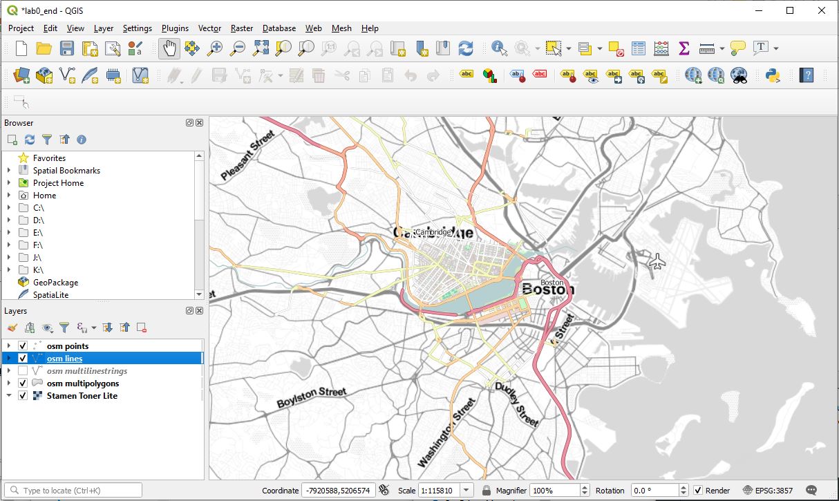
In my case, I ended lab#0 with the 'Stamen Toner Lite' basemap and some OSM layers showing point, line, and polygon data in the vicinity of MIT. We won't need the OSM layers for Lab-1, so we can right-click those layers and choose 'Renove Layer' for one. Next, let's add one of the shapefiles from cambridge_shapefiles. Choose 'Layer / Add Layer / Add Vector Layer' from the main QGIS menu in order to open a window called 'Data Source Manager / Vector'. Click the '...' tab to the right of the ''Vector Dataset' box within the 'Source' area and navigate to the 'cambridge_shapefiles' folder where you extracted all of the files in cambridge_shapefiles.zip. Choose the files called 'cambbgrp.shp' and click 'open' to get back to the 'data source manager | Vector' window. There are several files in the folder that begin with the same 'cambbgrp' so be sure the filename in the 'vector dataset' box ends with 'cambbgrp.shp'. Click 'Add' to add this vector layer. A new window pops up called, 'Select transformation for cambbgrp'. The window is full of text with lots of jargon. It popped up because the coordinate reference system (CRS) for the layer we are adding is different from the CRS being used to display the 'Stamen Toner Lite' layer that is already loaded into QGIS. We can tell this is the case from the two lines saying: 'Source CRS: EPSG:26986-NAD83 / Massachusetts Mainland,' and 'Destination CRS: EPSG:3857-WGS 84 / Pseudo-Mercator'. The rest of the text explains what QGIS proposes to do to transform the data in the new layer so it can be viewed appropriately in the map window. Coordinate systems and various transformation can get complicated and we will put off discussing them until next week. For now, just click 'OK' to accept the default transformation and then 'Close' the 'Data Source Manager | Vector' window to get back to the main QGIS window. Notice that the 'cambbgrp' shapefile layer has been added and is shaded in a solid color with black lines dividing the city of Cambridge into US census block groups. You may not see the 'cambbgrp' layer if you map window is viewing some geography that does not include Cambridge. If so, right-click the 'cambbgrp' layer and choose the first option 'Zoom to Layer'.
If you did not save your work at the end of Lab #0, no problem. After opening QGIS, ignore any 'recent files' or 'news' and just choose 'Project / New' and your QGIS window should look something like this:
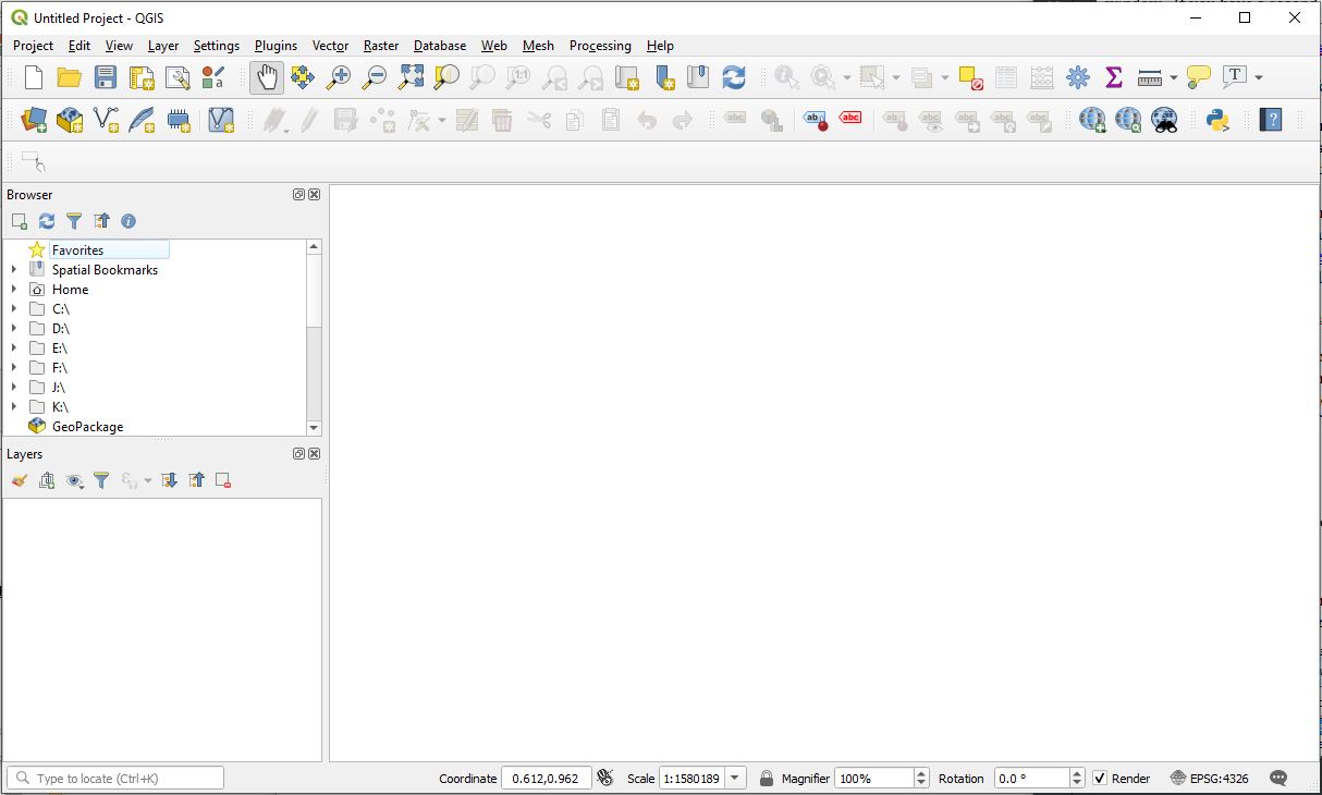
Choose 'Project / New' to open the 'Data Source Manager | Vector' window and navigate to your working copy of cambbgrp_shapefiles and add the 'cambbgrp.shp' file. Even though no layers have yet been added to your QGIS project, the 'Select Transformation for cambbgrp' window will still pop up. This is because the default coordinate reference system (CRS) for QGIS is 'EPSG:4326 - WGS 84' and that choice differs from the CRS associated with our cambbgrp shapefile. Click 'OK' to accept the default coordinate transformation and then 'Close' the 'Data Source Manager | Vector' window. The QGIS map window will show Cambridge shaded in a solid color with the US census block groups outlined in black.
Take a moment to get a sense of how QGIS tools are organized. If you hover over the icons in the toolbars, a brief description appears. The first row of icons contains the 'Project Toolbar' and the second is the 'Data Source Manager Toolbar.' Try out the 'pan', 'zoom in', 'zoom out', and various other icons in the 'project toolbar'. You can always return to the map to show all layers by clicking the 'zoom full' icon.
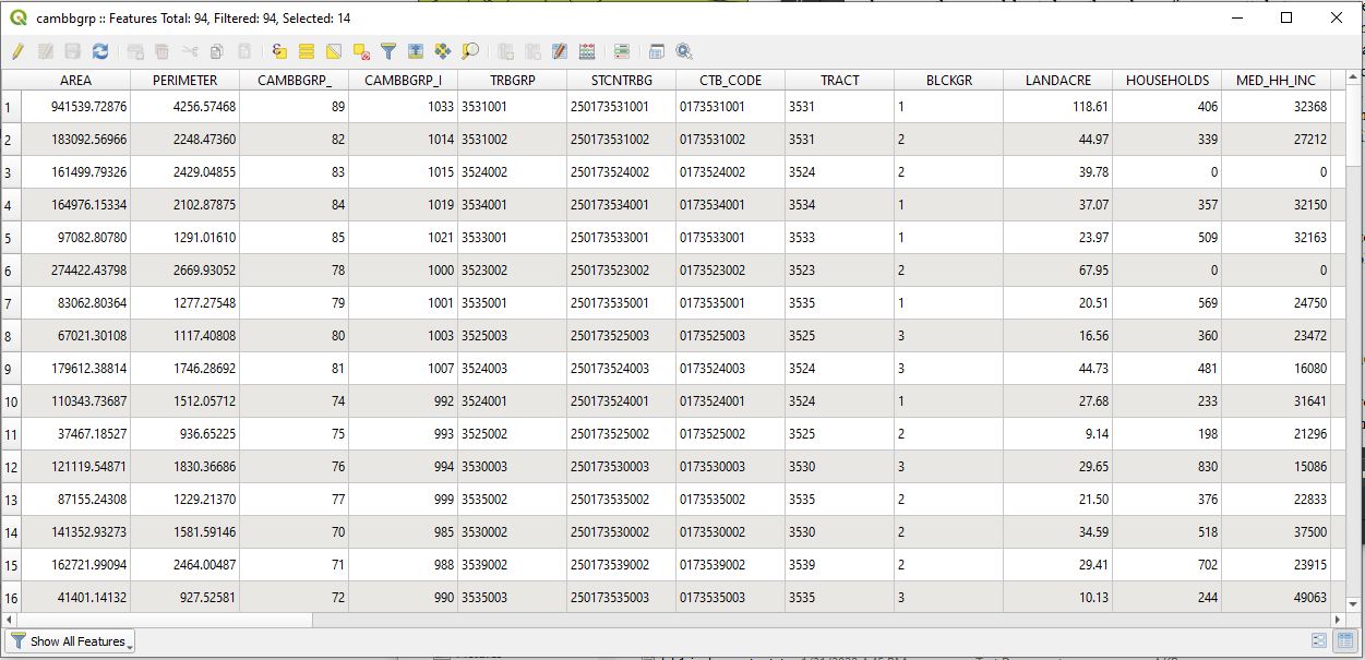
Click the 'Open Attribute Table' icon on the right side of the 'project toolbar', or choose 'Open Attribute Table' from the 'Layer' tab at the top. A spreadsheet opens up with 94 rows, one for each of the 94 polygons that trace the boundaries of the census block groups in Cambridge. The table will look like this:

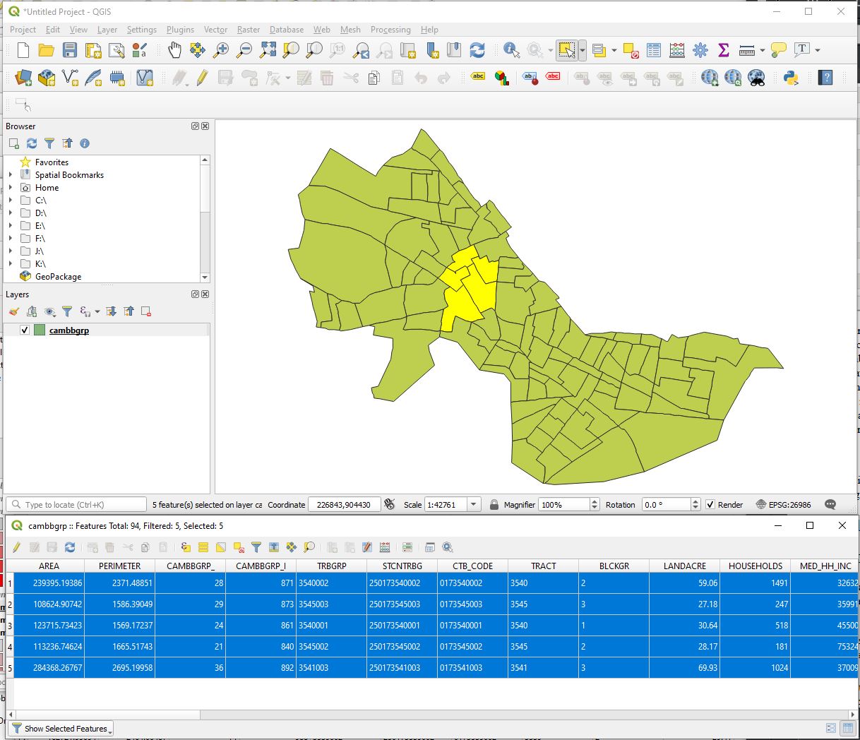
The columns in the spreadsheet show the values of various attributes associated with each spatial feature: e.g., the area and perimeter of each block group, Some columns (such as CAMBBGRP_) are just identifier columns with a unique number for each block group generated by a prior GIS. The column labeled 'STCNTRBG' contains the concatenated code standardized by the US Census Bureau to uniquely identify a block group within a particular state, county, and tract. Point your mouse to the row numbers along the left side of the attribute table. Click on a row number, or click and drag the mouse down that column. One or more rows in the table will be highlighted and so will the corresponding block groups in the map. Now click the icon in the 'project toolbar' labeled, 'select features by area or single click,' and then click and drag the mouse across the Cambridge map to define a rectangular box. Any block group with a portion of it inside your box will become highlighted - and so will the corresponding rows in the attribute table. For example, your selection might look something like this:
Before going any further, save the current state of your QGIS project by choosing 'Project / Save as' and navigating to a folder in your local workspace. In my case, I saved my work in C;\temp\11.188s21\lab1-prep\lab1-prep.qgz. Save your work early and often in case QGIS freezes - and save your current working version with a new name so you do not overwrite the end result of Lab #0. Notice that the file name of your project now replaces 'Untitled Project' in the upper-left corner of your QGIS window.
You will spend most of your time visualizing your data in the map window to examine spatial relationships, visualize various density and proximity measures, and overlay various data layers. Let's add a few more of the shapefiles included in the cambridge_shapefiles folder. Choose 'Layer / Add Layer / Add Vector Layer' once again to open the 'Data Source manager | Vector' window. (Alternatively, click on the furthest left of the icons in the 'Data Source Manager Toolbar'. The icon is labeled 'Open Data Source Manager'.) Open each of these files: sales89.shp, and cambtigr.shp.
Shapefiles are a popular, widely used format for storing basic 'vector' data about the location, shape, and attributes of location-tagged data. It was developed by ESRI, the vendor of ArcGIS, a popular 'industrial strength' GIS used by many government agencies, and the shapefile format is now widely used, without royalties, to store and exchange GIS data. Notice that each of the shapefiles saved in your data folder is really a set of about 7 individual files. Files with *.shp as the suffix contain geometry in a binary (non-readable) format. The *.dbf files contain attribute tables (in a circa 1980 dBase format), the *.prj files contain 'projection' information about the coordinate reference system (CRS), and the *.xml files contain metadata. The other files contain indexing information to speed queries and visualization. Any one shapefile can include only one type of geometric feature: e.g., points, lines, or polygons. A point shapefile contains one X,Y pair of numbers for each point. (X,Y,Z if one includes elevation as the third dimension.) A line shapefile stores sequences of X,Y pairs each of which define one line segment. A polygon shapefile stores sequences of points each of which traces the boundary of a two-dimensional spatial object as a closed sequence of line segments. In each case, on feature object ID lines the geometry of the object to the row of the attribute table that contains field of information describing the object.
The sales18 shapefile contains points that represent the approximate location of each residential home in Cambridge, MA that sold during the year 1989. Each 'point of sale' is associated with a row in the attribute table (sale89.dbf) that contains the address, sale price, and other relevant information about each real estate sale. The cambtigr shapefile contains lines that represent the street centerlines of all Cambridge roads. Each row of the associated attribute table contains information about one street segment extending from one road intersection (or endpoint) to the next. The cambbgrp shapefile contains polygons that represent the 94 US Census block groups within Cambridge. Each block group within Cambridge contains up to 10 city blocks and the block group boundaries are generally the road centerlines of the streets that comprise the block group boundary. (We say 'generally' because rivers, railroad tracks, and the like could also form the boundary of a block group.)
Turn on/off each of the three shapefiles that you have loaded into QGIS and browse through their attribute tables. (Toggle the check-box next to each layer in the 'layer' window to turn that layer on/off.) You may also click and drag any of the layers in the 'Layer window' to move them up or down the list. The layers are listed in the reverse order from how they are drawn on screen. For example, if you turn on both the cambbgrp and cambtigr layers, but put cambtigr below cambbgrp, then the solid shading of the block groups will obscure the road centerlines shown in the cambtigr layer.
Use the 'selection' features to highlight rows of the attribute table and see the corresponding geometric features. Similarly, select spatial features on the map (by first clicking on the 'Select Features by area or Single Click' icon) and see the corresponding rows of the attribute table. Notice that the 'Select Features by Area or Single click' tool icon will select features from the last layer(s) that you highlighted in the 'Layer' window. Also, there is an icon in the 'Project Toolbar' labeled 'Deselect Features from all Layers'. Clicking this icon will de-select all features. If there is a large number of features in a layer, it may be hard to find the features you have selected. In the attribute table window, click on the tab at the lower left of the window to choose 'Show selected Features' so that they are visible at the top of the table. Likewise, right-clicking on a layer name and choosing 'zoom to selection' will zoom to the smallest map window that contains all selected features in that layer.
If you wish to examine the attributes for a particular spatial feature, you may click the 'Identify Features' icon in the 'Project Toolbar' and then click over a feature in the Map window. An 'Identify Results' window opens up (and squeezes the Map window to the side) and display the values of attribute field for the selected feature(s). The selection is made from the feature layer that is highlighted in the 'Layer' window.Let's shade the Cambridge block groups based on the value in one of the fields of its attribute table - in our case, we will shade the block groups based on the field called 'MED_HH_INC'. Since the US census data are for 1980, the MED_HH_INC field measures the median annual earned income during the year 1979 of all households residing in a particular block group when the census was taken during 1980. Turn off the 'sales89' and 'cambtigr' layers so only the cambbgrp layers are mapped, and double-click on the cambgrp layer (or right-click on this layer and choose 'properties') to open the 'Layer Properties' window. We will use the various tabs along the left column of this window to control the way in which spatial features in this layer are visualized and linked to other data. When you highlight the 'Symbology' tab, the window should look something like this:
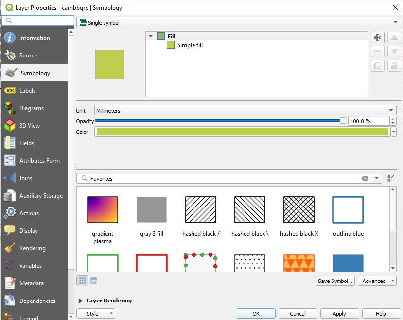
All block groups are currently shaded in the same color and, accordingly, the top row of the window is labeled 'Single symbol'. Click that tab to see other choices. The 'categorized' choice is useful for non-numeric data (like neighborhod names) or data grouped into categories (such as 'high', 'medium', and 'low'). Median income is measured on a numeric scale, so lets choose the 'graduated' option. In the 'value' row, choose the 'MED_HH_INC' field. Now click the 'Classify' tab lower down in the window and five rows will appear in the space under the 'Classes' tab with shades of red varying from white to dark red across the five categories. Why five? How are the category breakpoints set? To see what is going on, click on the 'Histogram' tab and then the click the 'load values' tab. The window should now look something like this:
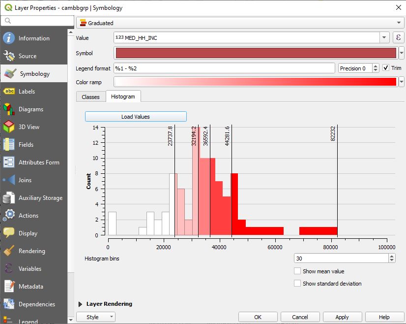
The four breakpoints that group the block groups into five categories are superimposed on the histogram and the counts are shaded using the white-to-red color ramp. The default number of categories is 5 and is set using an option on the 'Classes' tab. The breakpoints are set to place an (approximately) equal number of block group in each of the five groups. That is because the default for the classification 'Mode' - also set on the 'Classes' tab - is 'Equal Count (Quantile)' so that an equal number of spatial feature are grouped into each category. Click the 'Apply' tab at the bottom of the 'Layer Properties' window to use this categorization to shade the Cambridge block groups in your map. Then choose other 'Mode' options and number of 'Classes' on the 'Classes' (instead of Histogram) page in order to see the differences in the histogram and the appearance of the map.
A look at our histogram and thematic map based on the five categories with quantile classification reveals two potential problems:
(1) The default color ramp uses white for the lowest income category. Block groups shaded in white would not be distinguished from block groups with no data or places beyond Cambridge that are also shaded 'white' in our map.
(2) The histogram has an outlier 'bar' at the left end of the scale indicating that several block groups had a median household income at or near zero. How could this be? Were all the residents in that block group retired? A more likely explanation is that those block groups were industrial or commercial areas in which few if any households resided.
To address the first issue, lets adjust the color ramp so the color for the lowest income is no longer white. Click anywhere in the colored portion of the 'Color ramp' bar and a 'Select Color Ramp' window will open up. Scroll down the wind to the 'Plot' area and then click and drag down the dot at the left-end of the sloped line. As you move it down, you will see the shading at the left end of the color ramp go from pure white to a light red. Move the left end down one grid cell so the plot looks something like this: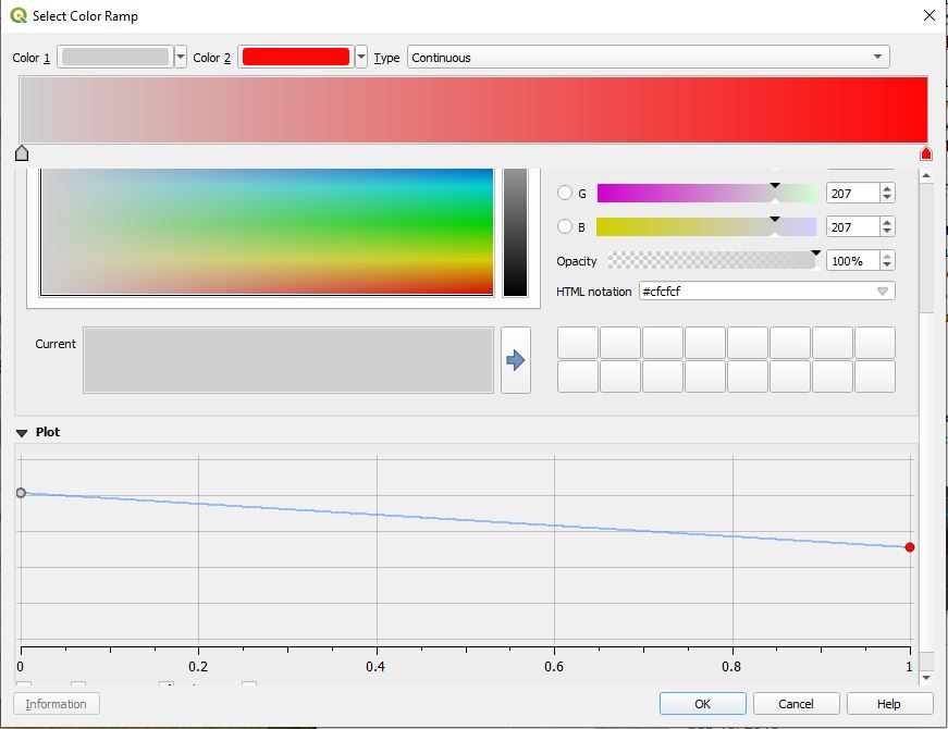
Click 'OK' at the bottom of the 'Select color ramp' window and then 'apply' the changes to see them on your map. You could also have darkened the high end of the color ramp, or chosen another pattern. You will want to utilize some of these choices later in the semester.
To address the second issue, we would like to exclude any block groups that had too few households for the numbers to be meaningful. Exit the 'Layer Properties' window and open the attribute table for the 'cambgrp' layer. Click on the toolbar icon labeled 'Select features using an expression'. A 'Select by expression' window pops up. Find and double-click on 'MED_HH_INC' under the 'Fields and Values' choice in the right-side list so that this variable name is written into the expression window. and then add '< 10000' to the expression. The window should look something like this:
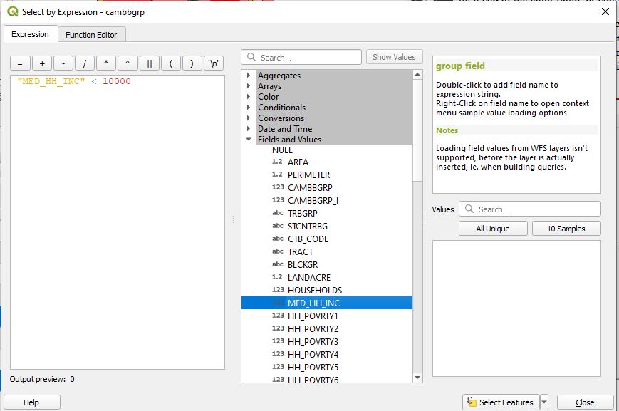
Click the 'Select Features' tab at the bottom of the window and look at the attribute table and map. The block groups with low median income are highlighted in yellow on the map and the corresponding rows are shaded in blue in the attribute table. Choose 'Show selected features' in the tab at the bottom of the attribute table so that only the three block groups meeting the low income criteria are displayed. Look at the column counting the number of HOUSEHOLDS in each block group. All three have zero households and they are the only block groups that report 0 households. The central block group in yellow is Harvard Yard. Only Harvard freshmen live there and they count as individuals living in dorms (not as households). The other two block groups are in the Lechmere Square area, long before the condominium apartment boom added many households to the neighborhood. Your map and attribute table should look something like this:
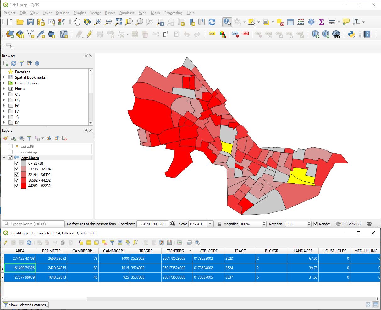
In order to avoid distorting our thematic map of Cambridge income, we should exclude these three block groups. To do this, right-click on the cambbgrp layer and choose the 'Filter' option to open a window called, 'Query Builder'. Once again, build an expression, but this time wirite "MED_HH_INC" >= 10000. Do you see why? Click the 'Test' tab to check that it is a valid expression returning all except the three low income rows. Now click 'OK' to close 'Query Builder' window. Only those block groups with MED_HH_INC >= 10000 have been retained so the three low income block groups are removed from the map and the attribute table. Switch to 'Show all features' in the attribute table and you will see that 91 block groups remain. The three zero-household block groups have not been erased. The shapefile on disk has not been edited, but only the 91 block groups that pass the filter are included in any further QGIS calculations, lists, and maps. Open the 'Layer properties' window for cambbgrp once again and check the histogram. You will see that the three block groups with 'zero' income are no longer displayed.
Now let's do a thematic map of Cambridge using a different field in the attribute table. Right-click on 'cambbrgrp' in the Layers window and choose 'Duplicate Layer'. A second cambbgrp layer will be added with the name 'cambbgrp copy'. Right-click on this new layer and choose rename to name it something else, e.g., 'cambbgrp-2nd'. Duble-click on the layer to open the 'Layer properties' window and make your choice of field, number of classes, categorization, and color ramp to thematically map the counts in the 'Households' field. This is easy to do, but not especially meaningful. The block groups vary considerably in size so a large household count could indicate a concentration of households, or just a number of households spread over a large area. The 'landacre' column in the attribute table indicates the acreage of land (not water) within each block group. It would be more meaningful to plot household density for each block group by dividing the household count by the relevant land acreage.To do that, we would have to add a new field to our attribute table and compute the densities. We will do that in next week's lab.
So far we've only looked only at polygon data. Mapping point data offers new challenges and opportunities. Make the layer sales89 visible. We see that property sales were pretty evenly spread across the city in 1989 (except in a few block groups, most notably around MIT). Simply looking at where sales occur isn't very interesting in this case.
Double-click on the 'sales89' layer to open the 'Layer properties' window, choose the 'symbology' tab and the 'Graduated' choice and construct a thematic map using the field labeled "Realprice". This field measures the sale price in inflation-adjusted dollars for each Cambridge residence that sold during 1989. Once again choose "Quantile" classification with, say, 5 categories. Apply your changes. Do you see a spatial pattern? Another way to visualize sale price is to vary the size of the housing 'dot' based on the sale price. Instead of the 'color' option in the 'Method' row of the 'Symbology' window, choose 'Size'.You may want to increase the number of classes display in the legend, and set the size range so the most expensive sales have a 4-mm wide symbol instead of 8. Apply your changes. You may also want to choose a different color ramp - e.g. blue instead of red to differ from the red ramp used for median income map. Experiment with manually changing the colors and sizes of the dots. Which method do you think is better? We will discuss symbology and color choices in more detail in subsequent lectures and labs. For today, we just want to get a basic feel for how QGIS is organized and what basic choices are available.
Finally, we would like to add our maps and tables, together with appropriate annotation, legend, scale bar, north arrow, and the like, onto a 'virtual' page that can be saved as a PDF file, inserted into a report, or printed on a poster. QGIS has several tools that help us 'layout' our 'page'. Choosing 'Project / Layout Manager' lets you open and manage various layouts. Alternatively, you can click the 'New Pint Layout' icon in the 'Project Toolbar', give your layout a name - e.g., Cambridge Income and Housing Prices'. Experiment on your own with the Layout tools. For example, be sure to use the 'Add Item' tab to add at your map plus a legend, scale bar, north arrow, title, and annotation. For this first lab, we won't be fussy about a well designed and annotated map but will accept one such as this one that could use a lot of improvement in its presentation:
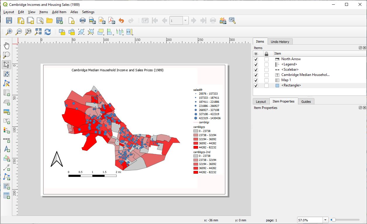
Just be sure to exclude the zero-household block groups from your thematic map of median income and display the sales prices using symbols that vary in size. For subsequent labs, we will pay more attention to the readability of our map layouts Think about aspects of the layout that you would like to improve. For now, explore the QGIS helpfiles and do Google searches to find out how to add and configure various items on your layout and get a few tips on color choices, legend readibility and the like. A few things to add are your name and the sources of data displayed on the map. For the source, you may say:
Sources:
U.S. Bureau of the Census, 1990
Banker and Tradesman Real Estate Transfer Database, 1987-1989
When you have finished your layout, choose 'Layout / Export as Image' or 'Layout / Export as PDF' to write you layout as a file in a format that can readily be printed as a page or poster or included in a report.
Remember to save your work again by clicking the "File / Save as..." menu option (and, after that, the disk icon). QGIS can save the status of your session in the project document file, which typically has a .qgz extension. The project document file does not contain the data itself, but rather stores pointers to their locations. Your thematic map properties and layouts are also stored in the document file.
After you have done additional work on a project document that you previously saved, you should probably save your changes under a different name by using Save As instead. Try this now, saving a copy of your map document as lab_1copy.qgz. Saving variations of your project documents under different filenames is a good practice. The document files themselves are typically not too large, so making lots of project document files should not waste too much disk space and provides some recovery help if your working document gets corrupted.
Next time, when you reopen the project document file with QGIS, it should look just the same as when you saved it this time - as long as the datasets that it references are still in the same locations. You can try it now if you have additional time. Note, also, that the dataset file locations that you save in a project document can be saved with absolute or relative paths. The default is 'relative' so QGIS will be able to find the data if its location - relative to where the project document file is saved - has not changed. This setting works fine for our purposes but it can be changed in 'Project / Proterties / General / General Settings' by altering the 'Save paths' selection.
We are done with the parts of this exercise that involve your preparing and visualizing maps. But we would like you to spend a little time examining and commenting on some map that you have encountered online. You are free to select an online map as long as you include a publicly-accessible URL with your exercise (so we can see the map!). You may also choose to use any one of the map-related links that are provided in the lecture notes during the first day of class.
In a few paragraphs, please do the following:
(a) Provide the URL for the article of your choice and for one of the
thematic maps included in the online article,
(b) What assertion (about some spatial pattern) is the map intended to
portray?
(c) Briefly describe the choice of classification method and color choices
used to construct the thematic map. (If the classification method is not
stated, make and explain your educated guess.),
(d) Comment on whether the data source and thematic map are reasonably
convincing regarding the assertion. Would you have preferred an
alternative classification method? .. more caveats in the text? ...a
different spatial scale? ...a more realistic baseline comparison? etc.
If you finish the lab assignment with time to spare, you may want to return to your QGIS layout window and experiment with the other templates and various styles of the map components.
Checking out more of the QGIS online help is also a good idea. Throughout the class we will expect you to try to answer your own questions about QGIS by consulting the online help and the class notes before asking the class staff. Of course, if you get stuck, we are here to help and we do not want you to be stuck for long!.
Turn in your lab assignment on the 'homework' portion of the class Stellar site: The lab assignment consists of the ArcMap layout that you produced in Part IV, and your comments on an online thematic map in part VI. The lab assignment is due by the START of class on Monday, Feb. 22, 2021.
Created by Raj Singh.
Modified for 2001-2019 by Thomas H. Grayson,
Joseph Ferreira, Jeeseong, Jinhua Zhao, Xiongjiu Liao, Mi Diao, Yang
Chen, Yi Zhu, Lulu Xue, Eric Schultheis, Melissa Chinchilla, Hongmou
Zhang, Juan Camilo Osorio,
and Rida Qadri.
Last Modified on 22 February. 2021 by Joe Ferreira.
Back to the 11.188
Home Page.
Back to the CRON Home Page.