Massachusetts Institute of Technology
Department of Urban Studies and Planning
| 11.188: Urban Planning and Social Science
Laboratory |
Lab Exercise 2:
Thematic Mapping in ArcMap
[Click here for today's in-class
notes. ]
In this exercise, you will build on the basic ArcMap techniques you
explored in Lab 1 to make more
sophisticated thematic maps. You will make two different kinds of maps:
exploratory and explanatory.
In the exploratory section, you will compare two thematic maps of the Cambridge population. One map shows population counts by block group and the other normalizes the population counts by dividing by land area to show population density. In the explanatory section, you examine the spatial pattern of home sales prices to see if they appear to be related to housing density. Once again, you will output some of your maps in PDF format for submission onto Stellar.
I. Setting Up a Work Environment (same as in Lab #1)
Step 1 . Start ArcMap by follow the following steps.
1. Click the Start button in the left bottom corner.
2. Move the mouse over the item Programs, then ArcGIS, and then finally click ArcMap.
Please wait patiently for ArcMap to launch. The program takes a while
to come up.
Step 2 . Access the class data locker.
Most of our class data reside in the 'data' sub-directory of our course locker, http://mit.edu/11.188/data. This locker is
accessible via the Andrew File System (AFS) as Z:\afs\athena.mit.edu\course\11\11.188.
However, ArcMAP sometimes is slow if one navigates through the upper-level directories on AFS
drives. (ArcMAP insists on trying to find mapable data in each sub-directory
that it examines. The upper-level directories on AFS are spread among machines
around the world and ArcMAP can spend forever looking.)
Attaching network lockers:
Since we will use the
class locker repeatedly, we might as well map the network locker to a 'virtual' local
drive and avoid this problem. You can use the Tool/Map-network-drive option from a Windows Explorer window to map the class locker. We suggest that you map the class locker using this name "\\afs\athena.mit.edu\course\11\11.188\" to your M:\ drive. Another way to map the class locker to a local drive is to run this command in a DOS command window: "net use M: \\afs\athena.mit.edu\course\11\11.188". This command has been saved as a batch command file named "attach_m.bat" at the top level of the class locker. You can navigate in a Windows Explorer window to Z:\athena.mit.edu\course\11\11.188 and then double-click on attach_m.bat to mount the drive. You may also copy this batch file into a convenient location in your personal locker (on Drive I:) and double-click on it when you want to mount the class locker.
The lesson from all this is not to remember the details of each method. Rather, it is to understand the basic idea behind hierarchical file directory trees and the notation that Windows and AFS use to navigate through them and to associate network lockers with local (virtual) disk drives.
II. Obtaining the Needed Data
Now that we have a general idea of what we are trying to accomplish and have taken a first look at some of the tools we will use, let's find the data that we will need and move a copy into a location and form that can be accessed from within ArcMap.
A. Finding the Massachusetts Town Boundaries
We will use the public version of the MIT GeoWeb services to find, examine, and download the Massachusetts town boundaries.
- There is a link to GeoWeb from the MIT GIS Services homepage (http://libraries.mit.edu/gis/) or you can navigate directly to GeoWeb at: http://mit.edu/geoweb
- Scroll down and click "Enter GeoWeb". If you do not have MIT personal certificates installed in your web browser then you will see a message that states
- "You are currently using the public version of GeoWeb. Some data will be unavailable. If you are part of the MIT community, get MIT certificates from http://ist.mit.edu/services/certificates for full access." For this exercise you will be using a dataset that is publicly accessible, so you do not have to install your MIT certificates to access it. You may end up with fewer tabs and datasets to choose, but you will find all that you need for this exercise.
- GeoWeb provides an information and help tab and a help video so you can learn more about it, how it works, and what you can expect to find in it.
- The front page of GeoWeb looks like this:
 |
Fig. 3. MIT GeoWeb Homepage |
- GeoWeb uses Google Maps as a background layer and OpenLayers for controlling the map interface. You can use the navigation tools, similar to what you find in Google maps, for zooming and panning in the map.
- Let's do a little exploring before we grab the Massachusetts Towns dataset that we will use. The 4 tabs near the top left of the page are for searching:
- Search Place Names (GeoNames.org) - is for locating and zooming to a particular location on the map. This is a free database with millions of place names that users can manually contribute to and edit. This is not searching the MIT Geodata Repository.
- Search, Spatial Search, and Browse all tabs enable searching the MIT Geodata Repository.
- Click the Search Place Names tab, enter 'boston, ma', click Search Place Names, click the locate button, and watch the Google map background zoom to Boston, MA.
- Alternatively you can press Alt + Shift and use the mouse to draw a box around the area of interest and search what falls within it. The searches tell you the bounding box in latitude & longitude coordinates.
- Using the Spatial Search tab, click the Find data layers that overlap the area currently being displayed on the map button, and note there are over 1000 search results
- Go back to the main Search tab, enter 'boston' in the keyword box and click the Search Metadata button - note there are over 100 search results but many fewer than before - that is, there are many data layers in the boston area that don't necessarily have 'boston' as a keyword in their metadata
- This time, enter boston subway as a keyword, click Search Metadata, and note there are many fewer search results this time (the searches are not case sensitive, you can use more than 1 word, and you can also use wildcards like *)
- Your search results appear in the "Search Results" tab. The initial Geometry column shows
whether the layer is point, line, or polygon. To see the metadata click the "I" button. The
arrow button in the draw column will draw the layer on the map. You can select as many layers as you like to draw on the map.
- When you click the draw button the interface switches you to the "Layers" tab. There are a variety of controls here that let you reorder the layers you have selected to draw, make them display or not, look at the attribute table information, change the transparency, and more. For example, you can click the 'none' tab above the map to turn off all the background layers.
- GeoWeb is not a GIS. It is a tool for easily discovering, viewing and accessing GIS data held in the MIT Geodata Repository. To download the data click "Download whole layer" to have the option to download the data in a variety of formats, including shapefile for use in ArcGIS and KML/KMZ for use in Google Earth. Do not save the data at this point.
 |
Fig. 4. MIT GeoWeb with Boston MBTA Subway Lines Selected and Ready for Download |
- For this exercise, we will not need the MBTA subway lines, or any of the Boston-specific datasets. Go back to the 'Search' tab on the GeoWeb page and enter 'Massachusetts Towns' as a keyword. When you click the 'search metadata' button, a number of data layers will be listed. Click the right arrow button at the right end of the 'Massachusetts (Towns, 2002) entry. The map is redrawn, as shown below in Figure 5, with a new semi-transparent layer covering all cities and towns in an around Boston, and the Massachusetts (Towns, 2002) layer is added to the table of contents along the left side of the map. This Massachusetts Town boundary layer was developed by MassGIS, the State's GIS Agency (http://www.mass.gov/mgis/), and can also be viewed and downloaded from their websites.
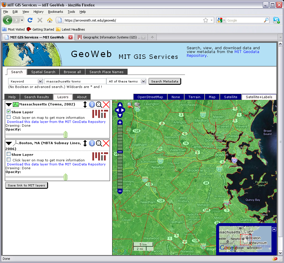 |
Fig. 5. MIT GeoWeb with 'Mass Towns' Layer Added to the Map |
- Shortly, we will download the Mass Towns layer directly from the MIT Libraries GeoWeb server. However, first, we should note the "Save link to this map". This link lets one easily save a link to the data layers in the Layers tab, for later use or for sharing with a partner. This link also lets any member of the MIT community with ArcGIS installed easily take data discovered in GeoWeb directly into ArcMap, where there are many tools for working with the data and creating maps. However, the link will only be useful if you have installed the MIT GeoData Repository extension to ArcMap. The extension is not yet installed on all the machines in the various MIT labs that run ArcGIS. So, we will not make use of this capability for the exercise. Later on you may find it useful - e.g., if you install ArcGIS on your personal laptop or desktop computer and then utilize the MIT GeoWeb.
- Instead of saving the link to the Mass Towns layer, let's download the dataset as a 'shapefile' (a very common but proprietary format copyrighted by ESRI, the vendor of ArcGIS software). Click the 'Download this data layer from the MIT GeoData Repository' phrase and a new window pops up (as shown in Figure 6) to help you determine your preferred download format.
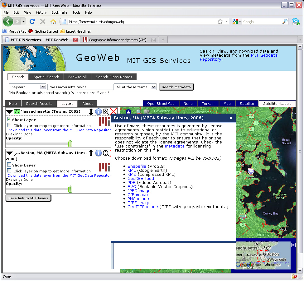 |
Fig. 6. MIT GeoWeb Ready to Download the Mass Towns Layer |
- Click the option: Shapefile (ArcGIS) and the GeoWeb will open a new browser tab and prepare a compressed and zipped file. When it is finished, you will see a link labeled, "Zipped shapefile of layer SDE_DATA.US_MA_BOSTON_P33MBTA_2006" that, when clicked, will begin downloading the zipped file. Depending upon the security settings in your browser, you may be prompted about whether and how to handle the file. Choose 'save' the file and it will be saved in your default download directory with a name such as, 1327416194_us_ma_f7towns_2002.zip. Any 'Shapefile' is actually a bundle of files (at least four) with the same primary name and different suffixes (such as .shp, .dat, .prj, etc.). The individual files will have to be extracted (i.e., separated and uncompressed) from the zipped file before ArcMap can read them. There are many utilities that can uncompress zipped files. The MIT computers use a free software package called 7-zip (www.7-zip.org). Find where your browser is downloading files and open the folder containing you zipped file. (In Firefox, you can right-click the file in the 'downloads' window and choose 'open containing folder.' Right-click on the zipped file and choose, 7-zip/Extract-all. Next, be careful where you put the extracted files. We suggest that you find a writeable sub-directory (i.e., folder) that is really on your local machine's hard drive. In 37-312, for example, C:\TEMP is a local drive - but your Desktop and Documents folders (and most sub-directories under C:\Documents and Settings\) are actually redirected to network drives. Since GIS data files multiply quickly, create a sub-directory within C:\TEMP using your logon (Athena) userid and extract the shapefile into that location. (You will end up with 5 files.)
III. Effective Mapmaking
For the rest of this week's lab exercise, we will use the Mass Town boundary shapefile that we just downloaded from the MIT GeoWeb repository plus several of the data layers that we used in Lab #1 . Although these shapefiles are fairly small, their use in ArcMap will be much faster if we download them to a local drive before adding them to ArcMap. You can use the Catalog tab in the ArcMap window to find and copy the data layers to a local drive before adding them to your ArcMap table of contents. (Remember, shapefiles consist of several separate files that begin with the same filename. When you copy a shapefile using ArcCatalog, it lists the shapefile only once but copies all the files. If you use Windows Explorer to copy the shapefile, you must be sure to copy every one of the files that begin with the shapefile name.) For this lab, however, that will not be necessary. To insure that you copy all of the needed files from Lab #1, we have bundled them into one 'zipped' file called cambridge_shapefiles.zip. This zip file is located in the data locker and contains shapefile versions of three data layers that we used earlier in Lab #1 plus a new land use layer (and a few symbology files that we will use later on):
cambbgrp - a shapefile of Cambridge 1990 us census blockgroups
cambtigr - a shapefile version of the street centerlines for Cambridge roads
landuse85 - a shapefile of Cambridge land use (from MassGIS)
sales89 - a shapefile version of the point locations of residential home sales in 1989
Besides these four shapefiles (and the Mass town boundaries obtained from the MIT GeoWeb), we will use another shapefile in the class data locker: majmhda1 - a shapefile of major Mass roads (from MassDOT and MassGIS) which have not used before. Use either ArcCatalog or Windows Explorer to copy this shapefile from the class data locker to your local drive, C:\TEMP.
Before starting our work, let's do one other thing to speed up the ArcMap processing. By default, ArcMap starts off assuming that your GIS 'workspace' and 'scratchspace' are both in your personal locker. But, for the WinAthena machines in the Lab and the CRON machines in the department, this location is in your network locker. Right after opening ArcMap, choose the Geoprocessing / Environment menu option to reset the 'workspace' and 'scratchspace' locations. Expand the first entry in the environment list and then reset both locations to a local drive folder such as C:\TEMP.
After copying the Mass town boundary and the three Cambridge shapefiles to C:\TEMP, add them to ArcMap. You can do this via the 'add data' button, or by dragging and dropping each of the *.shp files into the ArcMap table of contents (or by dragging and dropping the shapefile name from the Catalog window).
Before we start using the file, let us also inform ArcMap of the appropriate geographic units to use. Open the Data Frame Properties (View > Data Frame Properties from the menu bar) window
and set the "Map Units" to meters and the "Display Units" to feet. We must set the 'map units' to match the unit of measurement for the XY points that are saved on disk in the cambbgrp shapefile. If this information is saved in the 'metadata' portion of the shapefile, we could determine the correct units by using ArcCatalog to read the 'metadata' that is saved in the cambbgrp.shp.xml portion of the 7 files that comprise the cambbgrp shapefile. Beware that many shapefiles that you may find online do not have associated metadata. In our case, the 'map units' are meters. We can set the 'display units' to whatever units we would like to be shown on-screen. Do you understand the difference?
A. Exploratory Mapping
Exploratory mapping is the kind of mapping we do to get a feel for what
the data "look like." Before coming to any conclusions, let's use ArcMap to make several thematic maps to examine various data attributes and raise
questions that you would like to answer. We will go through a number of
exploratory
mapping techniques here.
The Effect of Normalization on Thematic Maps
Using the methods described in Lab 1,
use
the 'symbology' tab of the layer properties to modify the characteristics of
the cambbgrp
theme to match these criteria:
- Legend Type: Graduated Color
- Classification Field: Population
- Normalize by: <None>
- Color Ramps: Orange monochromatic
- Classification settings: Exclude block groups with 0 population and choose 'quantile' classification with 5 classes
Use the Layer Properties window to change the name of
this theme to Population. To change the number of
decimal places, put the cursor on a label and click the right mouse button. It
will open a Number Format window. Since
numbers represent population, choose numeric and set
the number of decimal places you want. In this case, be sure that the number
of decimal places is set to 0. [Note, you can right click on the title 'Label' and select 'Format Labels' to set the values for use with all the labels.].
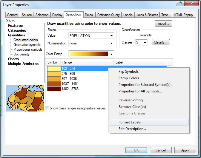 |
Fig. 5. Open a
Number Format window
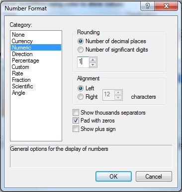 |
Fig. 6. Set the
number of decimal places
You have created an unnormalized map of the Cambridge population
by block group. Your map isn't as meaningful as you might like
since your thematic shading depends only on the raw number of people in
each block group - regardless of whether a block group is itself large
or small. In such cases where your raw data are not 'normalized'
(i.e., adjusted to represent a compared-to-something-meaningful
comparison), it is easy to generate a pretty looking map that is quite
misleading. (The Monmonier book, 'How to Lie with Maps,' in the class readings discuss such issues at greater length.) Shortly, we'll compare this thematic map with one
that does normalize the population count. But, first, lets spruce
up the map a bit.
Click on the Add layer button  , and add majmhda1.shp from M:\data
. This is a MassGIS (Massachusetts Geographic Information Systems) Major
Roads Datalayer created in December 2000.
, and add majmhda1.shp from M:\data
. This is a MassGIS (Massachusetts Geographic Information Systems) Major
Roads Datalayer created in December 2000.
Now let's adjust the characteristics of the major roads theme. First, change
the name of the layer to Major Roads. Next, open the Layer
Properties window and click the symbology tab and set
the properties as follows:
- Categories: Unique Value
- Values Field: Class
- Color Schemes: (don't change)
- Then click Add All Values button in the bottom of the
symbology tab
This is the first time we have encountered a "Unique Value" legend
type. This type of legend is often useful when a field takes on only a
limited number of discrete values. In this case, the field Class
assumes only four values: 1, 2, 3, and 4. Each value represents a
different type of road. These numbers are not very descriptive, so we
will want to include text labels for each value. But what do the
numbers mean? For that, we can consult the MassGIS
metadata for State roads. [The current MassGIS web pages describe more recent version of the State Road layers. However, the definition of the Class attribute is still applicable. Use the descriptions for the values of Class to label your legend.
By default, ArcMap does not choose a very attractive symbolization
scheme for the roads. You will need to adjust the symbols manually. Set
the symbols as described in Table 1.
| Value |
Color |
Size |
Style |
|
1
|
Red |
3
|
Solid |
|
2
|
Blue |
2
|
Solid |
| 3 |
Dark Gray |
0.1
|
Solid |
|
4
|
Dark Gray |
0.1
|
Dotted |
Table 1. Road
Symbolization
When you're done, your layer properties-symbology window should resemble Fig.
7. Note that the full text of the labels is cut off in Fig. 7; you should enter
the full text of the description as documented in the dataset's metadata. Don't forget to apply your changes!
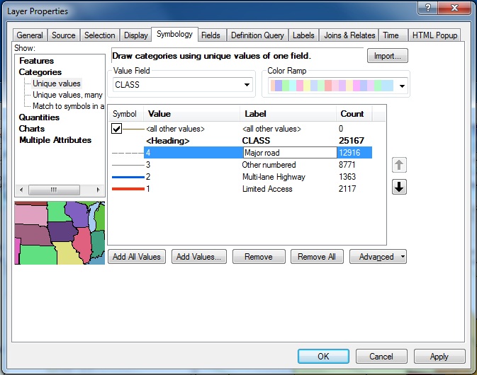 |
Fig. 7. Unique
Value Legend Window
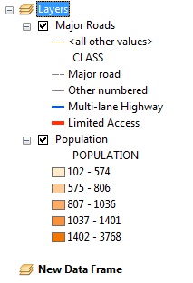
Next, you will create a normalized map of the population
data. Normalizing means dividing the variable of interest by a value (such as area) that enables the interpretation of the variable in the numerator to more meaningful and not misinterpreted due to variations in polygon size that distort the way the
data appears. Here, you can compensate for the effect of land area on
population by dividing population by block group land area in order to measure population density. Larger areas typically have larger populations than smaller
ones, but the actual densities of the areas may be quite different.
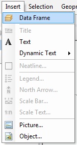
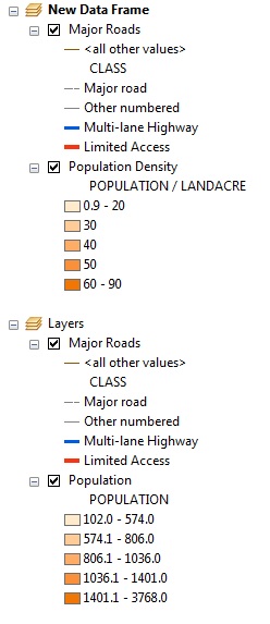
Create a new data frame by select insert "Data Frame" menu from the
menu bar. You should now see the "New Data Frame" icon
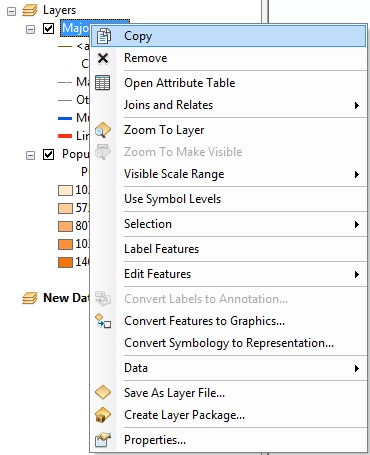
in the data frame window. Select the Major Roads layer under "Layers",
click the right mouse button and select "copy". Then select the "New
Data Frame", click the right mouse button and select "Paste Layer". Similarly,
paste the Population layer into the "New Data Frame".
Remember to set the Map and Display units for this new data frame.
 |
 |
 |
 |
| Insert a New Frame |
New data frame appears |
Copy layers from existing frame |
Paste layers to the new frame |
Fig. 8. Create a
New Data Frame
Open the layer properties to modify the Population
layer. Adjust the number of decimal places to "1" and set the
"Normalize by:" field to "Landacre." In ArcMap, the
'normalize by' option is used to pick an attribute that will be divided
into the mapped attribute before doing the classification and
shading. Hence, normalizing by landacre will create a population
per acre measure. You should still be using the
"Quantile" classification with 5 classes and "Orange Monochrome" color
ramps. When you apply your changes, you will have a population density
map. Change the layer's name to Population Density.
Mathematically speaking, what did the setting the normalization field
do to the population values? Is the population density map more
consistent with your impression of the parts of Cambridge that are more
crowded? Also, compare the result when you normalize by the
'Area' attribute rather than the 'Landacre' attribute. The 'Area'
attribute is the area (in square meters) of each block group polygon
whereas the 'landacre' measure excludes bodies of water (like the
Charles River Basin or Fresh Pond).
Since you have two data frames but the data view window displays only one frame
at a time, you need to activate a frame to see it. For example,
if you want to see a data frame named, "New Data Frame," click
the right mouse button with the mouse over "New Data Frame", and then select "Activate". (Note, you *can* show two maps within one "layout" view. We will
cover that soon.)
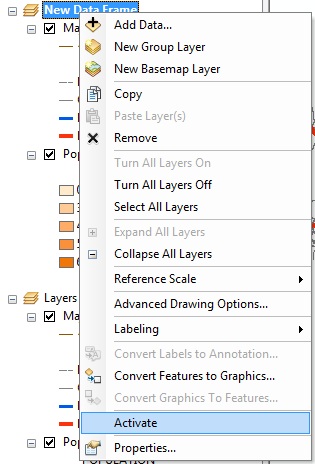 |
Fig. 9. Activate
a Frame
Annotating Your Map
While a map often can tell a convincing story on its own, you can often
strengthen your case with well-chosen labels and annotation.
Highlighting an Area of Interest
You should be able to spot one or more areas in your two maps of
Cambridge where the discrepancy between the two maps is especially apparent. In
the original "Layers" frame (the unnormalized map), highlight one of these areas by
drawing a circle around the area with the New Circle tool  . To select the New Circle tool, you will first need to
open the draw tool pop up menu as shown in table 2 and select the New
Circle from the pop up list of icons that appears. The complete list of
drawing tools is shown in Table 2.
. To select the New Circle tool, you will first need to
open the draw tool pop up menu as shown in table 2 and select the New
Circle from the pop up list of icons that appears. The complete list of
drawing tools is shown in Table 2.
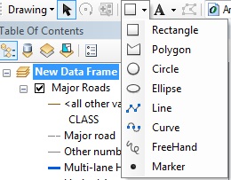 |
Table 2. Drawing
Tools
Once you've drawn the circle, you can use the Arrow Pointer tool  to move and resize it. You can change attributes such as the line
thickness, outline color, fill pattern, and so on using the Properties
Window. To open the properties window, double click the circle you just created. You
can also open the properties window by
clicking the right mouse button while placing the cursor over the circle, and then selecting properties from the botton of the drop
down list that appears. Make your circle have an outline width of 3 and
change the color to something that stands out, yet doesn't clash with
the color scheme of the map.
to move and resize it. You can change attributes such as the line
thickness, outline color, fill pattern, and so on using the Properties
Window. To open the properties window, double click the circle you just created. You
can also open the properties window by
clicking the right mouse button while placing the cursor over the circle, and then selecting properties from the botton of the drop
down list that appears. Make your circle have an outline width of 3 and
change the color to something that stands out, yet doesn't clash with
the color scheme of the map.
Adding Text Annotation
Now use the "A" Text tool  to add
some text annotation near the circle explaining why you put it there (e.g., "Zone
of High Discrepancy"). Use only a few words and choose font characteristics that
will make the text visible but not overwhelming. Note that, as with the drawing tools,
you can choose an annotation style from a pop up list. You can experiment with these
if you wish.
to add
some text annotation near the circle explaining why you put it there (e.g., "Zone
of High Discrepancy"). Use only a few words and choose font characteristics that
will make the text visible but not overwhelming. Note that, as with the drawing tools,
you can choose an annotation style from a pop up list. You can experiment with these
if you wish.
Adding Labels
Labelling features on the map can help viewers orient themselves. Labelling
too many features, however, clutters up the map and impedes readability. Let's
put identifying markers on stretches of limited access highways, symbolized
by thick red lines on your map. Use the "i" Info tool  to look at the attributes of the highways. Make sure that the Major
Roads layer is selected first. You will probably find that at least
two records show up for each click; that's because the two directions of the
multilane highways have been encoded separately, as if they were two different
routes very close to one another. If you watch closely as ArcMap flashes the
matching links, you can actually see this.
to look at the attributes of the highways. Make sure that the Major
Roads layer is selected first. You will probably find that at least
two records show up for each click; that's because the two directions of the
multilane highways have been encoded separately, as if they were two different
routes very close to one another. If you watch closely as ArcMap flashes the
matching links, you can actually see this.
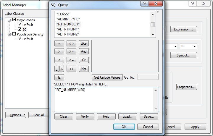
Interstate 90 (a.k.a. the Mass. Pike) extends east-west near the bottom of
the image. As you identify links along this stretch, you should see that the
"Rt-number" field is "90" and that the "Admin_type" is "1." From the metadata, you can see that an Admin_type of 1 indicates an
Interstate highway. We want to label a few roads using their "Rt-number" field.
Open the Layer Properties window for this theme. Click on the
"Labels" icon and confirm that the "Label Field" is set to "Rt-number."
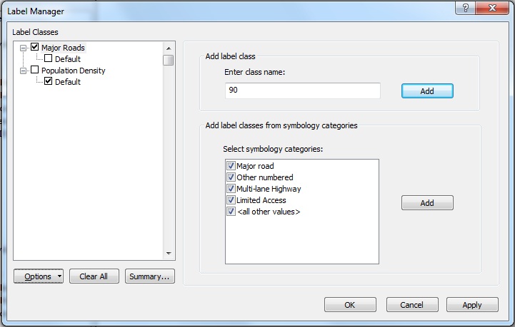
ArcMap has some nice cartographic goodies that will let us put highway shields
on the maps not unlike those you've seen in commercial road maps. Go to Menu
View/Toolbars, select labeling tool box. The labling tools like fig 10. will
appear in ArcGIS software. Click the second button  to bring up label manager dialog and input 90 as a new class name and click
add (seee table 3-1). A new class with name "90" will appear on the
left side. Right click "90" to select it, and select SQL Query to
select I-90 from the roads (see table 3-2). In the sql query input window, input
as shown in table 3-3, and click ok. Next, click the "Symbol" button
to bring up label manager dialog and input 90 as a new class name and click
add (seee table 3-1). A new class with name "90" will appear on the
left side. Right click "90" to select it, and select SQL Query to
select I-90 from the roads (see table 3-2). In the sql query input window, input
as shown in table 3-3, and click ok. Next, click the "Symbol" button
 , then select the "U.S. Interstate
HWY" sheild among many label styles (see table 3-4). Now click Apply
to see the the shield to appear on I-90, and click OK to exit
the labling tool box.
, then select the "U.S. Interstate
HWY" sheild among many label styles (see table 3-4). Now click Apply
to see the the shield to appear on I-90, and click OK to exit
the labling tool box.
|
Fig 10.
Labeling Tool Bar |
 |
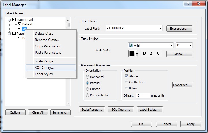 |
Table 3-1. add a new class |
Table 3-2. make a query to select I-90. |
 |
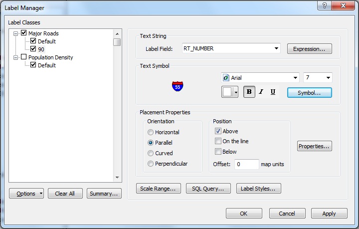 |
Table 3-3. the sql query |
Table 3-4. select the symbol for I-90 |
The ArcMap interface for labeling is not the most intuitive interface design. You may want to review the ArcGIS Help files for more information about labeling. At some point during the exercise, be sure to spend some time exploring these help files. They contain many useful illustrations and discussion. Beware that, on some WinAthena machines, opening the help files from the '?' buttons on various tool property windows will result in some error messages concerning javascripts that cannot be found. Ignore these messages (by clicking either 'yes' when asked several times about continuing) and the help files should eventually appear. If they do not, you can always start the same ArcGIS help files from the Start/Programs/ArcGIS menus.
Other limited access highways visible in this view are Interstate 93, Mass.
State Route 2, and a tiny stub of US 1. Place labels on I-93 and Mass. 2 and
ignore US 1. Note that Mass. 2 should not get an Interstate shield since it
is a state highway (Admin_type = 3); instead use a round, square, or oval shield.
The full set of label tools is shown in Table 3. ArcMap gives you some control
over the fonts and colors that appear in the shield symbols. To alter the settings, you may open the Layer
Properties window, select the Labels tab
and click the Symbol button to open the Symbol Selector
window, which gives you the chance to alter the settings. You can experiment
with this if you wish, but it is not necessary for this exercise.
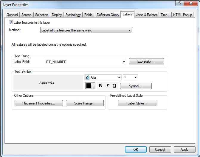 |
Fig. 11. Layer
Properties - Lables Tap
Enhanced Layouts
In Lab 1, you created a basic layout
and made some simple customizations to it. Now, let's create a more
elaborate layout that shows the comparison
between the normalized and unnormalized population data. Since you have two data frames, if you
create a layout view, both data frames will be shown in the
layout. Use View > Layout view to create a
default layout using the "Portrait" template. Now you can see two
frames in the layout. Adjust the size and location of each frames so
they are redible. Click the right mouse button while putting the cursor
on a data frame to check the properties of the frame.
In this layout we want the two view frames to be the same size and
lined up vertically, with "Layer" frame higher on the page than "New
Data Frame." Fortunately, ArcMap has tools to resize and align layout
elements. Select the Arrow Pointer tool .
Move "View1" near the top of the page and "View2" near the bottom,
resizing them, if necessary, so that they both fit. You may also need
to move the other layout elements. Now, hold down the Shift
key, and click on both frames to select them. Click the right mouse
button and choose Align Center from the Align
menu.
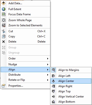 |
Fig. 12. Align
Window
Now let's spiff up the frames by adding a border line around
their edges. Select one of the view frames and click the right mouse
button. Choose properties from the bottom of
the drop down menu list. Properties window
will come up. Select Frame tab then set the
characteristics of border lines as you wish (we recommend keep default
settings for this lab.) and click OK. You should see a
black line forming a tight box around the view frame. Repeat this
procedure for the other view frame.
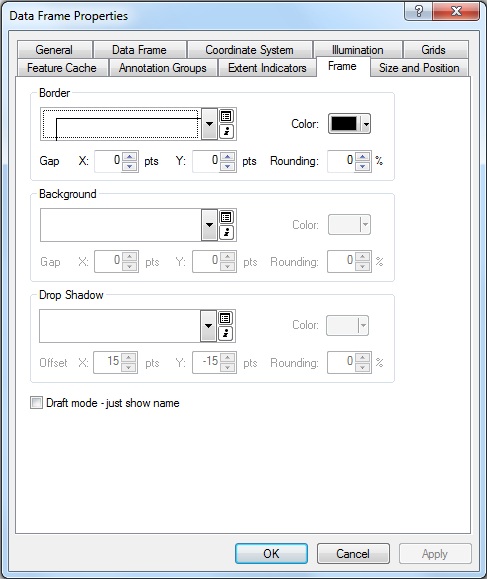 |
Fig. 13. Data
Frame Properties - Border Line Setting
Next, you need a legend, a scale bar, and a north arrow to improve the
layout view of the map. First, let's insert a legend for the "Layers" frame,
Activate the view frame either by clicking it or click the name of data
frame(Layers) and then click the right mouse button, and select "activate" from
the drop down list. Now select the Insert
menu from the menu bar, and select legend.
The Legend Wizard window will come up. Using the legend wizard, you can
choose which layers will be shown in the legend. For this exercise,
select all the names of layers shown in Map Layers
space and click ">" button. Selected layers will
be shown in the Legend Items space. Click Next.
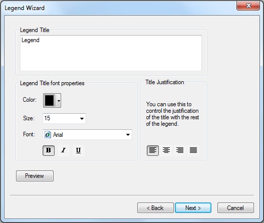
Change the legend title, set font, color and click Next.
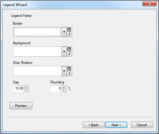
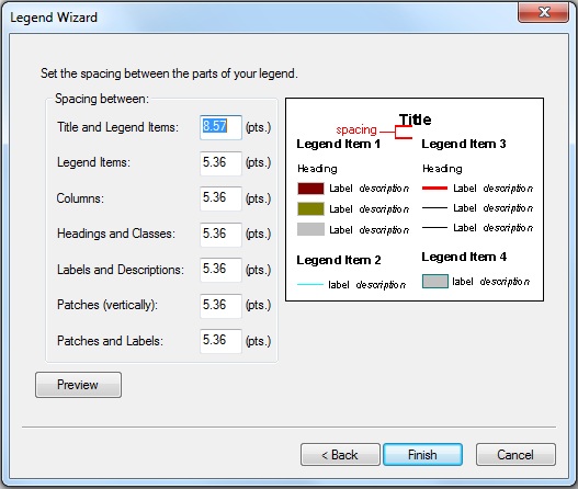
Now you can choose border line characteristics. Click Next
and set spacing between the parts of your legend and click Finish.
The legend will show up on the layout view. Follow the same steps,
create legend for "New Data Frame". Also, insert scale bars and north
arrow for both view frames.
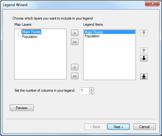 |
 |
| Fig. 14. Select Legend Items
|
Fig. 15. Set legend title
|
 |
 |
| Fig. 16. Set Border Line |
Fig. 17. Set Spacing
between Parts |
Finally, round off your map by setting the title of the layout to "Population
of Cambridge, MA, 1990" and adding your name, today's date, and appropriate
credits to the data source. When you're happy with the way that it looks, save
your map as an ArcMap document file (with suffix, mxd), and (if you wish) print out your map. Later on, we will also explain how to save it as a PDF file that you can submit to our Stellar website for homework.
B. Explanatory Mapping
In this section of the lab we will create a map that makes a specific
point.
Explanatory maps try to zero in on more specific questions than
exploratory
maps.
Hence, your choice of normalization, classification methods, and
the like should be suited to the particular relationship or hypothesis
that you postulate. Here we will ask -- and suggest an answer to -- the
question, "What is the relationship between land use and home prices?"
Map Land Use and Sales Prices
Open a new empty document (or start up a second instance of ArcMap) and add at least these data layers from your local directory (C:\TEMP):
- Landuse85.shp
- Sales89.shp
Remember to set the same map and Display units for the data frame. Rename
this data frame "Land Use and Sales Prices."
Open the table for Landuse85.shp (click once on the layer to
activate it and click right mouse button and select Open Attribute Table)..
The field called "Landuse" is the only one we're interested in.
Refine the Symbolization
Open the layer properties for Landuse85.shp.
This shapefile is the Cambridge portion of the land use maps that MassGIS maintains for the State.
Updated shapefiles and further documentation is available from MassGIS at: http://www.mass.gov/mgis/laylist.htm (Click the 'land use' links in the 'Physical Resources' section of the 'vector data' group.)
Change the "Symbology" to "Unique Value" and select "Landuse" as the
"Values Field" then click "Add All Values." Your data is now classified
by land use category. Notice that the colors the program automatically
chooses are quite random. You can edit them manually, but MassGIS (and associated state and federal agencies) have already standardized sets of colors to use to designate various land uses. We have saved these symbology settings in a form that you can import into ArcMap. Notice
in the top right-hand corner of the window an Import button. If you click the Import button, you can import symbology
definitions from other layer files or import symbology definitions from an ArcView (a previous
version of ArcMap) legend file.
Fortunately for you, a legend was previously prepared for this layer using
ArcView. Click the 'import ... from an ArcView 3 legend file' button in the 'import symbology' window, navigate to the usual C:\TEMP
directory and select the file landuse.avl (the avl stands for
ArcView legend). Click OK. Your layer should pick up the
saved symbolization choices. By default, ArcMap orders the categories (values)
alphabetically, but we would rather group the residential categories together
and have them at the top of the legend. Moving the categories helps us understand
them better and will "read" much better on our final map. To move categories,
simply click on a symbol and click the up and down arrow buttons in the right
side of the window. Locate it where you would like it to be. Move the residential
categories to the top:
- HIGH DENSITY RESIDENTIAL (R1)
- MED. DENSITY RESIDENTIAL (R2)
- MULTI-FAMILY RESIDENTIAL (RO)
When you are done click Apply to register your changes.
Open the layer properties for Sales89.
Using "Realprice" as your "Classification Field," try out the "Legend Types"
"Graduated Color" and "Graduated Symbol." Also try the classification schemes
"natural breaks," "quantile," and "equal interval." Remember the question we
were interested in? Have these exploratory symbolization exercises shown you
the relationship between sale price and land use? It's very difficult to see
any type of pattern with so many data points, especially in a place like Cambridge,
where high and low income neighborhoods are so close together. We'll now abandon
the automatic classification settings and use some of our expertise to determine
the classes. We'll look only at very high-priced properties and very low-priced
properties. Change the number of classes to "3" in the layer properties
- Symbology tab and click Classify button.
Change the first number shown in "Break Values" from something
like 490196 to 100000 and second number to 750000. Now you have three categories,
less than 100000, more than 750000, and in between. Click O.K. and Change the
color and size of second category (realprice from 100000 to 750000), so that
extreme values, lower than 100000 and higher than 750000, stand out. Give
the points bright colors that will show up on top of the land use layer. Notice
that the high-priced properties are in the lowest density areas. We're on our
way to developing an explanatory map that helps visualize a spatial relationship that we deem to be relevant! (Later in the semester, and in other classes such as 11.220 and 14.30, we will discuss ways of determining whether the relationsihps are more than coincidence.)
We do not have time to cover all of the symbolization possibilities
in ArcMap. The built-in ArcMap help has some useful examples of
thematic
maps. To see them, select Help Topics from the Help
menu. The Help system can take some time to launch. When the ArcMap
Help window appears, click once on the "Contents" tab,
double-click
on the "Creating and Using Maps" book icon, double-click on the
"Choosing
colors and symbols" book icon, and double-click on "Types of thematic
maps." For example, you may wish to change the symbol size associated with each sale so that it is larger for expensive homes. A good choice would be to make the radius of a sales 'dot' be proportional to the square root of realprice. (Do you see why you might want the square root?)
Creating a Layout
Using the same techniques outlined above in the "Enhanced Layouts" section, create an attractive
layout of the "Land Use and Sales Prices" view.
As an added refinement, tag your map with logos that can associate it with MIT and the department or computing lab. To do this, add a "picture frame" to your layout that includes
a CRON or DUSP plus an MIT logo. You will need to use Insert > Picture menu to insert onto your map the small MIT logo plus either the CRON logo or the
following Urban Studies and Planning department logo. They can be found (as JPEG or GIF files) in M:\data\images:
- mitlogo.jpg(small MIT logo)
- crnlogo.jpg (CRON logo)
- logo-dept-11.gif (DUSP logo)
Make sure to save your map document file before continuing with the
next part of this exercise.
IV. Comparing Mass State Plane projection with Latitude/Longitude
We would like you to create one more map to illustrate some of the effects of showing a map in different projections. Save the land use map you just created as a new ArcMap document with a different name (e.g., lab2_map3.mxd) so that you still have your previous land use map saved in a form that can be easily retrieved. Open up another Data Frame and copy-and-paste the 'landuse85' layer into the new data frame. Right-click the new data frame label, choose 'Properties' and click the 'coordinate system' tab. You will see that this shapefile layer is shown in NAD 1983 Mass state plane coordinates (for the mainland and using meters as the unit of measurement). This is because the shapefile is saved on disk with a landuse85.prj file that specifies this projection as the one that correctly interprets the XY values saved on disk. In the 'select a coordinate system' portion of the 'data frame properties' dialog box, choose Predefined/geographic-coordinate-systems (to choose lat/lon coordinates instead of projected coordinates) and then pick 'north-america' and 'north american datum 1983' . Click OK so that the new data frame is changed to show Cambridge landuse with decimal degree (lat/lon) coordinates. Create a layout with two maps showing Cambridge in the original Mass State Plane and the lat-lon coordinates. Label and annotate your map (with the north arrow, your name, etc. as discussed in the previous section) and add a sentence or two of text commenting on the difference between the two representations of Cambridge land use. In a few weeks, we will spend more time in lecture discussing coordinate systems and projections.
V. Exporting Maps from ArcMap
There are a number of reasons you might want to do something with your
map other than print it from ArcMap. You may want to create a JPEG or
PDF file for use on the web or just get the map into a graphics program
to add some finishing touches. Here we consider these two popular
formats.
PDF format: This is a format we will use often. Files in this
format can be read using a free program called Acrobat
Reader. This program comes in a standalone version and as a web
browser plugin. The benefit of this format over a JPEG and other bitmap
formats is that it's resolution independent. You can zoom in and out of
the map and print it at any scale. To create a PDF file from your
layout in ArcMap, select File > Export Map. The Export window
will show up. From the Export window, select the file location,
choose "PDF(*.pdf)" option for Save as type, type the File name you
want, then click Export.
JPEG format: Follow the same step describe above and choose "JPEG(*.jpg)"
as Save as type. Unfortunately, JPEG uses "lossy" compression, meaning that a
JPEG image is not fully faithful to the original. Artifacts caused by the lossy
compression are often visible in JPEG versions of maps. Also, like any bitmap
format, JPEGs have a fixed resolution, limiting the ability to zoom in effectively.
JPEGs are useful for overview graphics on web pages, while PDFs can be used
to supply the full detail.
VI. Lab Assignment
1. Create an exploratory map as described in III A, an explanatory map as described in III B, and the map from Part IV that compares the views in different coordinate systems,
Note: All the maps you produce should contain your name, a title, a readable legend (with some indication of classification choice for any thematic maps that categorize quantitative data), north
arrow, scale bar, data source attribution, and a CRON (or DUSP)
and MIT logo. It is OK if the first map (IIA) is a little messy (with all the streets and labels), but try to make the other two maps be less clutterred and more readable (as well as properly labeled and attributed).
2. Export the above three maps into .pdf format and upload your maps to our Stellar websites that we use to turn in homework exercises. There are separate Stellar websites for each class. Here are the URLs for the Stellar sites:
For 11.188, go to: http://stellar.mit.edu/S/course/11/sp12/11.188/
Navigate the site to the find the Homework page, select Lab Exercise #2, and follow the instructions to upload your PDF maps.
Since you are at MIT, it's pretty easy publishing your work on the web. As
you can see from the file 'tree' displayed in Windows Explorer, you already have a folder named "www" under your I:\
drive. If you save anything in your public "www" folder, then it is automatically visible to the world on the
Web. Now for this class, create a new folder named "11.188" under your I:\www
folder. Then save your pdf files from part II-A in that folder. You don't have to create a
special web page to do this. Just copy and paste your pdf file into the 11.188 folder
you just created. The directory listing, including the PDF file, will now be visible in a browser at this URL: http://mit.edu/<your-athena-name>/www/11.188
You are not required to put a PDF version of your map in your WWW locker - we just want you to know that it is possible and how you can do it. The lab exercise requirement is to upload your three maps to the appropriate Stellar homework site.
Lab 2 is due by the beginning of the class on Feb. 27, 2012.
Created by Thomas H. Grayson.
Includes significant portions originally written by Raj
Singh.
Modified for Fall 2000-09 by Thomas H. Grayson, Myounggu Kang, Jeeseong
Chung, Jinhua
Zhao, Xiongjiu Liao, Mi Diao. Yang Chen and Yi Zhu.
Last Modified 20 Feb.. 2012 by Joe Ferreira.
Back to the 11.188
Home
Page. Back to the CRON
Home Page.