We use maps to convey information to readers in an efficient, visual manner. To help the readers understand our intentions, we need an easily readable map that focuses attention on the main storyline and reasoning. To accomplish this, you need a clear map title, organized map legend, succinct map data-source/date/scale/north-arrow, and readable maps that highlight a defensible characterization of the spatial patterns and relationships. These are basic steps in map making but for want of time or some other reason, some of the work shortchanged some of these concerns and had overlapping map and legend; inappropriate symbol scales that make the map hard to read; no title, etc. Also, think about how the real estate of the page is utilized to convey your 'story'.
Pay attention to the following:
1).whether all the maps are complete (title, north arrow, scale bar, legend, data sources and date)
-layer orders: usually lines are above polygons and points are above lines
-identify symbology in the legend to indicate excluded features
2).whether all the maps are readable
-Change the confusing names of layers and headings(Med_HH_Inc, camborder)
-Identify the units of measurement ($?, million $?)
-Clarify choice of data classification method (quantile is recommended in this lab exercise)
-Exclude unnecessary information
3) Identifying the file type of your submission
-When you upload files to Stellar, be sure to add a pdf, jpg, png, etc. suffix to the filename.
Check Plus Examples: (drawn from class submissions with the student names removed)
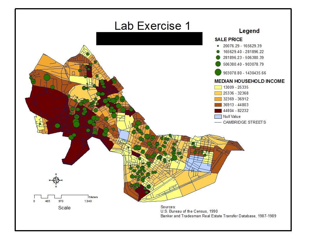
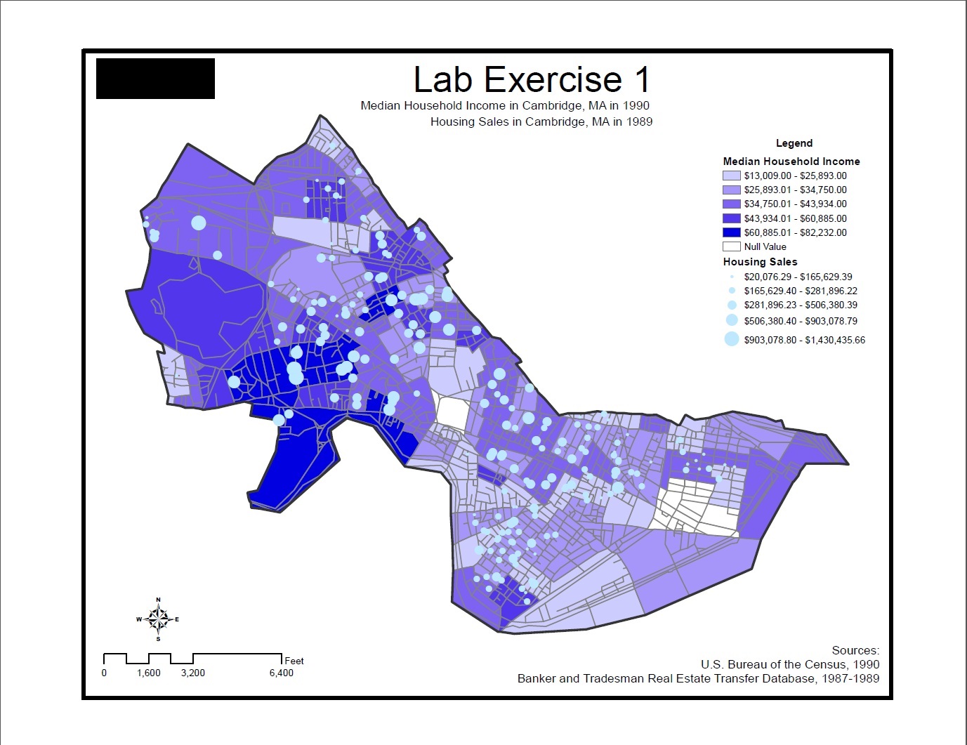
-Both maps are readable, but notice how the sales in the second map are more readable, despite sticking with the blue theme, because of the contrasting brightness, the omission of the black outline of the circles, and making the local streets are more subdued
Back to the 11.188 Home Page.