Massachusetts Institute of Technology
Department of Urban Studies and Planning
11.188: Urban
Planning and Social Science Laboratory
11.205:
Intro to Spatial Analysis (1st half-semester) |
Lab Exercise 3: Database Aggregation and Chart Creation
in ArcMap
Lab date: February 18, 2020 -=-=-= Due: February
26, 2020
In this lab exercise, we will examine the population density of
Massachusetts towns and explore them using ArcMap's data manipulation
and charting tools. The motivating example introduces one of the
complications that we listed when discussing GIS data models. When we
obtain maps and data from different sources, there may not be a
one-to-one match between the spatial objects in the map and the objects
of interest in the data table. For example. there are 351 towns in
Massachusetts, but the MassGIS shapefile of town boundaries has more
than 600 rows! Why so many? Because some towns are split into two or
more parts by rivers. Other towns include islands with boundaries that
don't connect with the other parts of the town. But the data source for
town-by-town population was census data reporting the total population
for each town. So, the usual way to create a population density map
won't work. If we try to draw a thematic map of population density by
dividing the listed population for each polygon by the area of the
polygon, the Boston harbor islands will show up as the densest part of
the state - with an average of 150+ people per square meter of land
area! Try it!
This issue is so problematic that the MassGIS website (http://www.mass.gov/mgis/)
now makes three different shapefiles available for download that map the
city and town boundaries for Massachusetts. The current version of the ma_towns00
shapefile is one of them (and is now called TOWNS_POLY). Another (now
called TOWNS_POLYM) has one row per city or town in the attribute table
and links the feature ID to a multi-part polygon that
includes all the polygons that are needed to draw the boundaries of all
parts of the town, including islands. The third shapefile
(TOWNS_ARC) contained multi-part-line features rather than polygon
features - one multi-part-line for each boundary between cities or
towns, the ocean, or a neighboring state. Originally, they had only the
one ma_towns00 shapefile - and the other two could be
constructed from the one - but enough confusion or misuse resulted that
they now provide all three.
In order to develop an appropriate thematic map of population density,
we must aggregate the area across all parts of each town before we
compute density as town-population divided by town-area. We will use the
'Summarize Table' function to create a new table from the
Attributes-of-Town table. We will also use the Chart functions to create
business graphics of Town density. Producing the charts will involve
another complication because of the multiple rows per town in the
Attributes-of-Town table. Handling this density-map problem will give us
a better understanding of ArcMap and, moreover, a better understanding
of the one-to-many problems that often complicate good data analysis
when we mix and match data from different sources.
Here is a link to the 'in-lab' notes: inlab_notes.html
I. Fixing the One City-Multiple Polygon Problem
First let's generate a quick-n-dirty (but wrong) population density
map. Use the MassGIS shapefile, matown00.shp,of
Massachusetts city and town boundaries from the class data locker. You
will also need to download the table, PopTown2010
which is saved as an Excel file in the class data locker. This
spreadsheet table was also downloaded from
MassGIS.� As usual, copy the spreadsheet and the entire
shapefile, matown00.shp, to a local drive
(C:\temp\...) before adding them to ArcMap and doing the join.� Join the
PopTown2010.xls table and the matown00.shp
shapfile (on the fields TOWN). Now, produce a thematic map of
the 2010 population divided by 'area'. Classify by quantiles. [NOTE:
One Town in Massachusetts has been renamed between the time that matown00.shp
was created and the population count for 2010 (in PopTown2010.xls).
The town on Martha's Vineyard that used to be called 'Gay Head' is now
called 'Agawam' (which is its old American Indian name). Don't bother
trying to match the Gay head row and, to avoid complications when you
summarize or join tables, we suggest that you exclude 'Gay Head'
and/or 'Agawam' from your tables.]
When zoomed in on Boston, the thematic map will look something like
this:
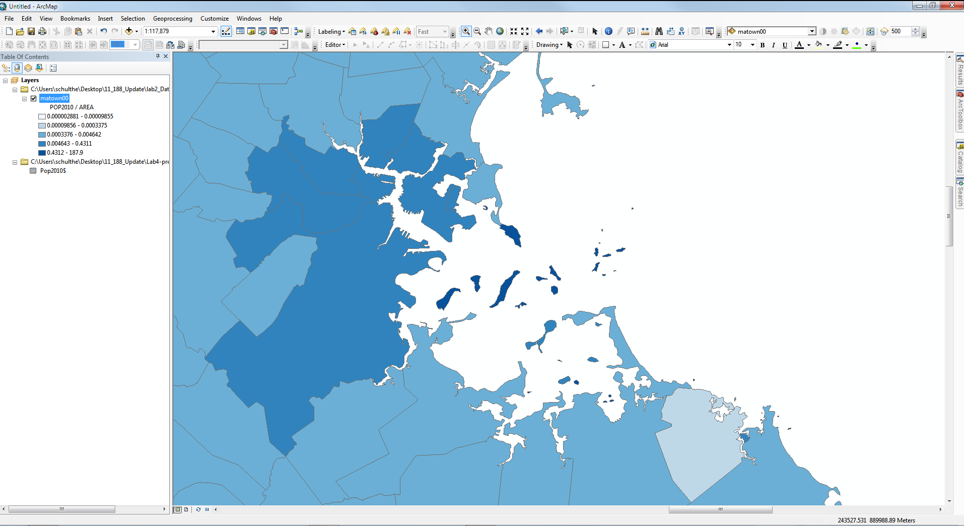
|
| Fig. 1. Population density map without
considering one-to-many relationship |
The results look strange and we notice that the density of some small
areas appears to be extremely high. On looking more closely, we find
that small islands in Boston Harbor have a small area but are associated
with all of Boston's population, thereby creating the
impression that these islands were extraordinarily densely populated.
The map units for 'area' are square meters, so the densest category
ranges (using quintile breaks) from 0.4 to 187.9 persons per square
meter! In fact, many of these islands have no population at all.
The basic problem is that the population data counted people in each
entire city (or town) whereas the map sometimes had multiple polygons
for a single city. In the case of Boston, for example, East Boston and
Charlestown are separated from the rest of Boston by Boston Harbor and
the Charles River and each of the harbor islands is represented by its
own polygon - and a separate row in the attribute table of matown00.shp.
Hence, we have a 'one-to-many' database problem whereby each city or
town may be associated with more than one spatial feature. We
can find a way to resolve this problem using ArcMap's 'Summarize Table'
function. In this part of the lab, you will solve this problem, with
some modest variations in the basic procedure. In particular, we will
strive to obtain a better estimate of population density by excluding
small islands of 100,000 square meters (10 hectares) or less.
In order to make it easier to compare different density calculations,
we can include the shapefile two times in the data frame and then
symbolize each layer differently. To accomplish this double-listing,
make a copy of the matown00 layer by right-clicking on
the layer to copy and paste it into the same dataframe. Now you have two
matown00 layers in your dataframe (without changing or
duplicating the on-disk shapefile).
Let's use one of the matown00 layers to focus on the
larger polygons and the other to handle the small islands that we assume
are uninhabited. To do this, rename one of the layers to Towns
and modify its layer properties so that the layer's definition (in the 'definition
query' tab of the layer properties window is defined by this
query:
( "Area"> 100000 )
Now modify the other copy of the matown00 layer so
that it is defined by this query:
( "Area"<= 100000 )
Rename this layer as Small Islands. Zoom into Boston
and the harbor and make sure that both the Small Islands
layer and the Towns layer are visible. The map now
looks no different than if we had only a single layer, but we can now
thematically shade the polygons of the Towns layer
without shading the small polygons in the Small Islands
layer. Do you understand why we will want to do this?
Next we want to create a new table that aggregates the area by town for
the Towns layer (matown00). The new
table will contain the name of the town, the total area for that town
(exclusive of the islands), and the town's population for 2000 and 2010.
Open the attribute table for the Towns layer first.
Since we want to do the aggregation by town, right click on the column
name "TOWN". On the pop-up menu, select Summarize. The
"Summarize" window appears.
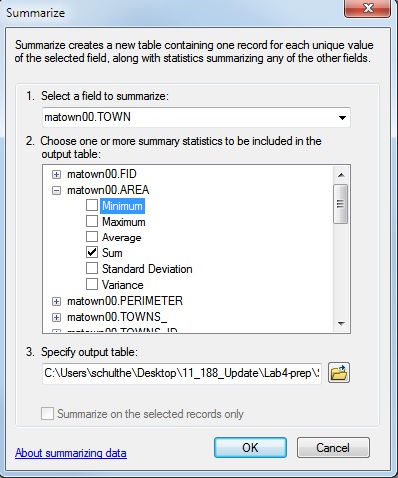
On the "summarize" window, select the TOWN field in
the table as the field to summarize. Make sure that none of the towns
are selected; if any are, then your summary table will contain records
for only those selected towns! Then, change the name of the output file
from the default to town_den.dbf, save as a dBASE
table, and adjust the path name to be sure it is a writeable local
directory such as C:\temp\[your-user-name]. We must
also specify what to do with the attribute fields (i.e., the columns)
that we want to compute by aggregating data across the several rows that
may apply to a single town. In our case, we want to select the Sum
for the AREA field, Minimum for POP2000,
and POP2010 fields, (Why don't we use sum for POP2000 and
POP2010? Can we use Maximum or Average for POP2000 and 2010?)
When you click 'OK,' ArcMap will ask you whether you want to add the
new table to the map document. Select Yes. town_den.dbf
will be added to your document. We now have the raw data we want -- the
town areas and the populations -- but we have not yet computed the
densities. Let's do that now. Using the techniques you learned in Lab
2 for editing data tables, add these fields to your town_den
table:
| AREAMI |
Town's area in square miles |
| POPD00 |
Population density per square mile in 2000 |
| POPD10 |
Population density per square mile in 2010 |
To convert square meters (the units of area used in Towns layer) to
square miles, divide by 2589988.
When you're finished with the calculations, join the town_den.dbf
table to the matown00 layer, as described in the
section entitled "Merging Data Tables" in Lab 2. Now create a
thematic map of the population density in 2010. Focus your map on
eastern Massachusetts just beyond the 'ring-road' part of Interstate 95
(also known as Route 128) - this is Boston's first ring road. (You can
add the major roads shapefile majmhda1.shp that you
used in lab #3 to locate the ring road or just use the MassGIS web
services that were added to the starting ArcMap document for earlier
labs. Just be sure to use a "local" copy of the major roads
shapefile instead of the one in the class data locker or you will slow
down ArcMap. Use the Small Islands layer to show the
islands but keep them colored white. Export a 'layout' version of your
map (with appropriate title, scale bar, north arrow, source, legend, and
annotations) to a PDF file and save it in your Athena (network) locker
space for subsequent uploading to Stellar.
If you have extra time, you can consider making a similar map
of the 2000 population density and comparing it with the 2010 density
map and developing a 'layout' with three maps that shows 2000 and 2010
population density plus the population density change between 2000 and
2010. BUT, finish the rest of the lab exercise before you try these
extra, optional steps!
II. Creating Graphs in ArcMap
ArcMap's charting tools are somewhat meager compared with, say, a
spreadsheet program like Excel. For example, you can't easily plot a
histogram of the population density that you just computed since it is
cumbersome (using ArcMap's table manipulation tools) to group the data
into intervals. Nevertheless, the charting tool is still handy for
exploring geographical patterns. To illustrate this, let's chart our
newly computed population density and examine the relationship between
population density and town size to see if bigger towns are more dense.
Go to View > Graphs > Create. This
opens the graph wizard. On the first wizard window, select "Bar" as the
graph type (either "Horizontal Bar" or "Vertical Bar"). And select
"towns" as the layer. Select PopD10 as the value field
to graph. Check the 'Add to legend' option and label X-axis ("Y-axis" if
you chose "Horizontal Bar") with TOWN name. Click
"Next," and make sure to check the option "Show all features/records on
graph". Type in the title Population density in 2010.
Click finish, and a graph will appear.
Notice that this graph is not very readable because it contains too
many towns - all 351. Although we request showing legend and labels,
they can't all show up. We can make it readable by selecting fewer
towns. Highlight the map window, make sure the matown00
layer is selected and use the point-and-drag selection tool  to highlight
several towns on the map. Notice that the chart window is *not*
updated automatically. If you have closed the chart window already, go
to View > Graphs > Graphs of Towns to open the
chart. Right click on the window bar of the chart to
open the chart property window. In the "Appearance" tab, check "Show
only selected features/records on the graph". Click OK. You'll notice
that the chart window now shows a bar chart of the population density only
for the selected towns.
to highlight
several towns on the map. Notice that the chart window is *not*
updated automatically. If you have closed the chart window already, go
to View > Graphs > Graphs of Towns to open the
chart. Right click on the window bar of the chart to
open the chart property window. In the "Appearance" tab, check "Show
only selected features/records on the graph". Click OK. You'll notice
that the chart window now shows a bar chart of the population density only
for the selected towns.
On closer inspection, you'll notice that the chart is still not what we
want. If you zoom in near Boston and select towns near Boston Harbor,
this time, the chart will be updated automatically. Maximize the chart
window so you can see more detail, and you'll notice that Boston shows
up more than once in the bar chart. This is because the attributes
of matown00 table has more than one row for
Boston -- one for each harbor island and for other isolated parts of
Boston such as East Boston and Charlestown. Each piece of Boston is
estimated to have the same density (i.e., the corrected density that we
computed in Part I) but we would like to have
Boston (and the other towns) show up only once on the chart.
We can accomplish this by using the table town_den.dbf
that we created in Part I in order to compute a more meaningful
population density. At the moment, this table is joined into the
attributes of matown00 table (so we were able to
create a thematic plot of population density in Part I). We still want
that thematic map, but we also want to work with the grouped table to
get a meaningful chart. To do this, we can 'relate' the grouped table town_den.dbf
to attributes of matown00. Make a new copy
within the Data Frame of the matown00 layer and rename
it Town_chart. Open its layer property window and go
to the tab joins and relates. Since it is a copy of
the matown00 layer, it keeps all joins that the matown00
layer has. Remove the existing joins of Town_chart
first and then add a 'relate' in the same manner that we previously
'joined' the town_den.dbf to the layer. After setting up the 'relate'
click Apply. [Do you understand why we need a
non-joined copy of town_den.dbf in order to get the
chart that we want with only one row per town?
Want to read up on joining and relating tables?]
Using 'relate' instead of 'join' helps us get a meaningful chart
without duplicate towns. However, it makes it harder to highlight towns
on the map by selecting rows in the town_density.dbf
table. If town_density.dbf were joined to
the attributes of Town_chart, then selecting
a row in attributes of Town_chart will
select the corresponding row in town_density.dbf.
However, the behavior is different for related tables. In
ArcMap (unlike an earlier version called ArcView), selecting rows in one
table does not automatically select corresponding rows of a related
table. To see the corresponding rows in a related table, you should
click table options in the top of the table and select related
tables > [name of relation]. Then the corresponding rows
in the town_density table will be shown. [You
could have more than one table related to a mapped layer, so you need
to be able to specify which of these related tables should be used to
determine your desired selection of rows to highlight.]
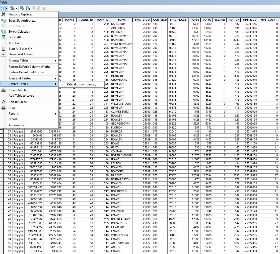 |
Fig. 2. View related
tables
Linking in this manner is useful here because we can now select towns
on the map, which will in turn select rows in both tables. We
can then use town_den.dbf to make a meaningful chart,
since this table has only one row per town, unlike matown00.
Make sure the Town_chart layer is active. Select
several towns around Boston, including the city of Boston. Then, open
the attribute table of Town_chart layer. Select options.
On the pop-up menu, go to related tables > town_den.
The town_den table appears. Compare the number of the selected records
in these two tables. [Do you understand the difference and the reasons
why we have set up the map, table, and charts in this manner?]
Next, we can edit the properties of the chart we created earlier so
that the data source is town_den.dbf. Open the graph
property window, under the Series tab, choose town_den
as the table containing the data. Choose POPD10 as the
field to graph. Make sure the option "Show only selected
features/records on the graph" is checked (its on the appearance
tab). Click OK and go back to the chart window. You'll see the updated
bar graph of population density -- with only one bar per town
(Note, that the images below are only examples and the numbers in your
images will be different depending upon which towns (or municipalities)
are in your selected set.) [NOTE: If you included Gay Head when
joining tables then, depending on how you summarized by town, computed
your density, and joined back to the matown00.shp
map, you might have an astronomically large value for the population
of Gay Head (instead of a NULL value because the Town was renamed and
Gay Head does not show up in the 2010 data). This large value will
distort your chart and you should exclude Gay Head from the chart.]
|
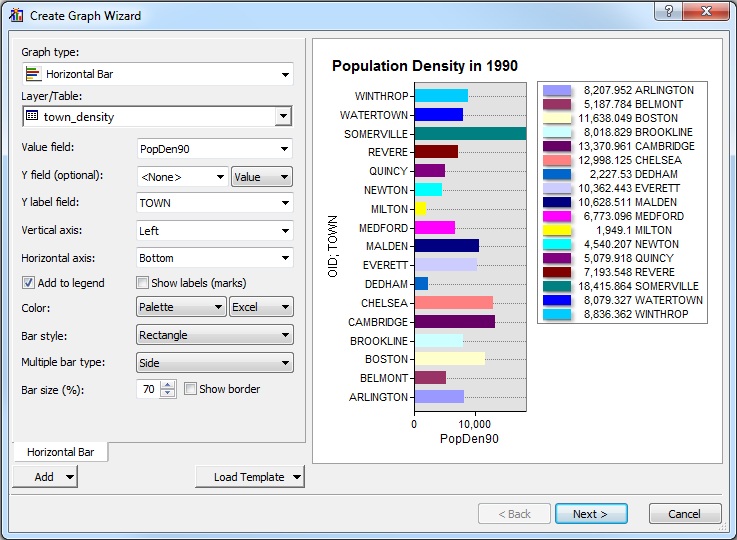
|
|
Fig. 3. Create a Chart in ArcMap
|
Notice that whenever you select a new set of the towns in Town_chart
layer, you need to update the selection set of the related table, town_den.dbf,
by opening the town_den.dbf from the attribute table of towns_chart
layer. (Go to Open Attribute Table> Click Related tables  > Relate:
Towns_den.) Update the graph in the graph property window as
well. Now test this by selecting a few towns from the map in the view
window.
> Relate:
Towns_den.) Update the graph in the graph property window as
well. Now test this by selecting a few towns from the map in the view
window.
Create a layout that includes a map indicating the dozen or so towns
you've highlighted on the map, a table listing those towns, and the
chart you created. You will need to add chart and table frames
to a basic map layout. Right click on your chart and select "add to
layout." Be sure to include Boston so we know that you've properly
aggregated the parts of the town. Create a PDF file from the layout and
save it in your athena locker (for subsequent uploading to Stellar).
III. Connecting ArcMap and MS-Access
We have now finished the lab exercises that generate meaningful
population density maps and charts despite the one-to-many issues
involved in linking population data to the detailed Massachusetts town
map. However, before concluding the exercise, let's get some practice
connecting ArcMap to MS-Access - the database management tool that
Microsoft includes in MS-Office and that ArcGIS uses for data
management. We can export tabular data from ArcMap into an��� MS-Access
database. However, there are two complications: (1) ArcMap only reads
the earlier (2003) MS-Access format (*.mdb) rather than the newer format
which is saved in *.accdb files (for version 2007+), and (2) while
ArcMap can read tables from any *.mdb database, it will only allow you
to export tables into ms-access databases that have been
initialized by ArcMap as a 'personal geodatabase.'
In order to address these two complications, we need to use ArcCatalog
to create a 'personal geodatabase.' The 'file' and 'personal'
geodatabases are each a container for holding various ArcGIS files. The
'file' geodatabase is portable across Windows and Unix platforms,
whereas the 'personal' geodatabase can only run on Windows since it is
really an MS-Access database. Use ArcCatalog to create a new personal
geodatabase in C:\temp. You will have trouble creating the
geodatabase directly from within ArcMap since your session will already
be connected to a default 'file geodatabase'. Instead, start ArcCatalog
separately from ArcMap. In ArcCatalog, navigate to the 'Folder
Connection' area, right-clcik on C:\temp\<<youruserid>>
(or whatever subfolder on C:\temp you have used as your working
directory for this lab) and then select 'New / Personal Geodatabse.'
Call it 'MyArcGISdatabase' (or something else that you can remember and
find easily. ArcCatalog will add the 'mdb' suffix to the name (as well
as insert into the database some internal tables for use by ArcMap).
Once MyArcGISdatabase.mdb is created as a 'personal geodatabase' close
ArcCatalog (so your personal database can be used by some other program
- namely, by ArcMap).
Now go to the ArcMap application that you used for the previous parts
of this lab (or a new ArcMap application - you can run ArcMap more than
once if your machine is fast and has lots of memory). Add a fresh copy
of the matown00 shapefile. [We could use one of
the matown00 layers already in you ArcMap table of
contents. However, these layers have been linked to the town_den table
and it will be less complicated to move only the original attributes
of matown00.] Right-click on the matown00
layer and choose 'open attribute table.' Now left-click the 'options'
button and choose 'export'. In the 'export data' popup window, click the
folder icon next to the 'output table' area and, in the 'saving data'
dialog box, set the 'save as type' to be 'File and personal geodatabase
tables' and then navigate to the directory in which you created your MyArcGISpersonal.mdb
database. (Note: this is where you will get an error
message if the personal database is still in use by ArcCatalog.) Double
click on MyArcGISpersonal.mdb and choose a name to be
used in ms-access for the attribute table that you wish to export into
ms-access. Call it matown00_att. Double-click on this
table to open it up in ms-access. Do you see any difference from the
same table when opened up in ArcMap? (Hint, notice the first few
columns.) We do not ask you to turn in anything using MS-ACCESS this
week, just get more comfortable moving data tables between ArcMap and
MS-Access. If you have time this week, practice generating a few queries
in ms-access. For example, try to compute the 1990 population density by
summing the area of each town before dividing each town's population by
its total area. Use the graphical user interface (GUI) to create a query
that produces the same table as the town_den.dbf table
created earlier in ArcMap. In order to do the equivalent of the
'summarize' command in ArcMap, you will need to 'group by' town name to
sum the area. The default query builder GUI in MS-Access does not
display the 'group by' option. You need to click on the 'Totals' option
in the 'Design' tab. [It is under the captial sigma symbol.]
A new row labeled 'Total' will appear in the bottom spreadsheet-building
part of the GUI. Drag the column 'Town' (with the town name) into the
first column of the spreadsheet-building part of the GUI. Note that the
new 'Total' row will now contain 'group by' under the Town column -
indicating that, when you run the query, the output table will be
summarized by each unique town name. Next, drag the AREA and POP90
columns into the spreadsheet-builder. This time, change the 'group by'
option in the 'Total' row to be 'sum' for the AREA column (so the area
entries will be summed for each town) and 'Min' or 'Avg' for the 'POP90'
so the population of each town will be listed. [Do you understand
why Min or Avg will accomplish this?] Run this query to see a
new three-column table with one row per unique town and columns showing
the town name, the sum of the area (in square meters) within each town,
and the population of each town. Next, you could save this query and
then build another one that divided POP90 by AREA to compute the 1990
population density for each town.
If you have extra time, you might also wish to experiment with other
chart types. In particular, experiment with plotting population density
vs. town size (area) and population change (the 2000/2010 population
ratio). Also, when building your query in MS-Access, right click on the
GUI title bar and choose SQL to view the standardized 'structured query
language' text for the query. When you do selections in ArcMap, the same
SQL language is used internally. You can edit the query text and then
right-click the tab to switch back to 'design' mode. However, if
MS-Access cannot understand your edits it will complain and leave you in
SQL mode!
Extra note
Another feature in ArcGIS (and ArcMap) that is different
from the earlier ArcVIEW is that the links are bidirectional
rather than unidirectional, which means that you can choose rows in town_den
table and see the corresponding rows and polygons of Towns
layer (instead of working only in the other direction). Let's test it.
First, open the town_den table and select a row in
Boston. Click the option button, then related
tables > [relate name]. Three tables will pop up: the Attribute
table of Towns, the Attribute table of
Small_islands, and the Attribute table of
Town_chart. That's because those three layers are basically
one coverage with different names.
IV. Assignment
Please submit your two PDF files on Stellar: the
population density map you made in Part I and the layout with the map,
table, and chart you created in Part II. There is no need to hand in a
hard copy just submit your files to the 11.188 Stellar site. The
assignment is due on Wednesday, February 26, 2020.
Created September 2001 and modified 2001-2017
by Joseph Ferreira, Jr. and Thomas H. Grayson, Jeeseong Chung.
Jinhua Zhao, Mi Diao. Yang Chen, Yi Zhu, Eric Schultheis, and Jingsi
Xu, and Hongmou Zhang.
Last modified: 15 Feb. 2020 by [jf].
Back to the 11.188
Home Page.
Back to the CRON
Home Page.