| 11.520: A Workshop on Geographic Information Systems |
| 11.188: Urban Planning and Social Science Laboratory |
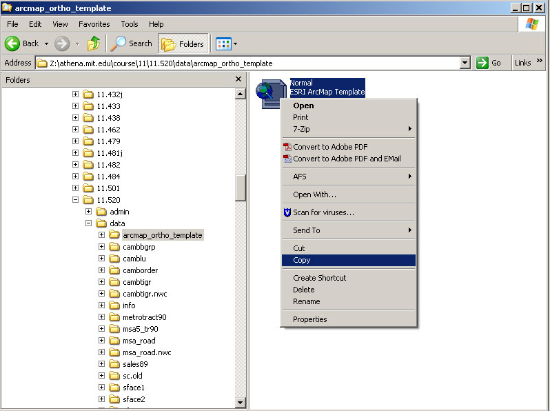
To use orthophoto in your map generation, first you need to copy a template file into your personal space.
Step 1. Copy a template file which include orthophoto macro file into your personal space.
1) Copy a template file named Normal.mxt under
"Z:\afs\athena.mit.edu\www\11.520\data\arcmap_ortho_template\"
|
|
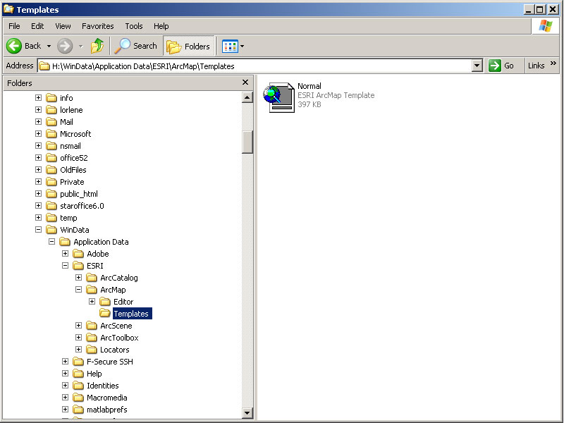
2) Paste the template file under "H:\WinData\Application Data\ESRI\ArcMap\Templates\"
|
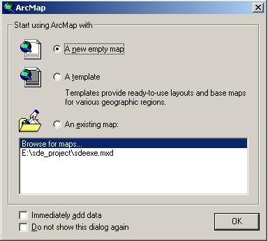
Step 2. Start ArcMap by follow the following steps to start ArcMap
1. click the Start button the left bottom corner.
2. Move the mouse over the item Programs.
3. Move the mouse over the item ArcGIS
4. Move the mouse over the item ArcMap and Click.
Please wait patiently for ArcMap to launch. The program takes awhile to come up.
When ArcMap first launches, you should see an "ArcMap" window, illustrated in Fig. 1, that prompts you to create or open a new map. Click A new empty map and OK button to make this window go away.
|
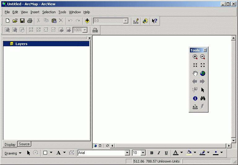
You should now be looking at an "empty" document which has "Untitled" in the title bar that looks like the image below.
 |
As in Lab 1, we will use 1990 U.S. Census data for Cambridge for this exercise. In ArcMap, add cambbgrp (in the Z:\athena.mit.edu\course\11\11.520\data directory). Open the Data Frame Properties (View > Data Frame Properties from the menu bar) window and set the "Map Units" to meters and the "Distance Units" to feet.
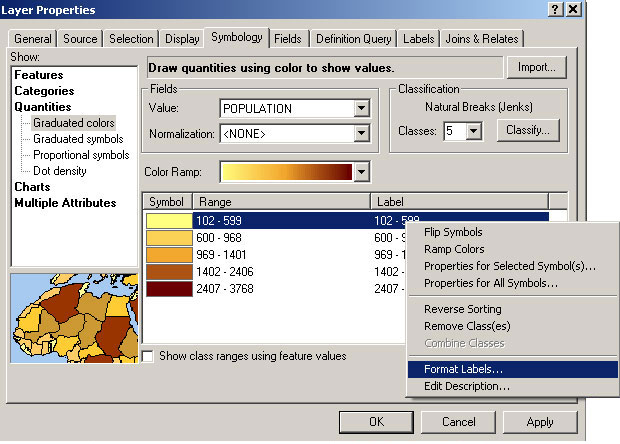
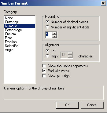
Use the Layer Properties window to change the name of this theme to Population. To change the number of decimal places, put the cursor on a label, click right mouse butten. It will open a Number Format window. Since numbers represent population, choose numeric and set the number of decimal places you want. In this case, set 1 for number of decimal degree.
|
|
You have created an unnormalized map of Cambridge population by block group. Your map isn't as meaningful as you might like since your thematic shading depends only on the raw number of people in each block group - regardless of whether a block group is itself large or small. In such cases where your raw data are not 'normalized' (i.e., adjusted to represent a compared-to-something-meaningful comparison), it is easy to generate a pretty looking map that is quite misleading. Shortly, we'll compare this thematic map with one that does normalize the population count. But, first, lets spruce up the map a bit.
Click on the Add layer button ![]() ,
and add majmhd1.shp from Z:\athena.mit.edu\course\11\11.520\data.
This is a MassGIS
(Massachusetts Geographic Information Systems) Major Roads Datalayer created
in December 2000.
,
and add majmhd1.shp from Z:\athena.mit.edu\course\11\11.520\data.
This is a MassGIS
(Massachusetts Geographic Information Systems) Major Roads Datalayer created
in December 2000.
Now let's adjust the characteristics of the major roads theme. First, change
the name of the layer to Major Roads. Next, open the Layer
Properties window and click the symbology tab and set
the properties as follows:
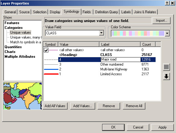
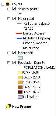
By default, ArcMap does not choose a very attractive symbolization scheme for the roads. You will need to adjust the symbols manually. Set the symbols as described in Table 1.
| Value | Color | Size | Style |
|
|
Red |
|
Solid |
|
|
Blue |
|
Solid |
| 3 | Dark Gray |
|
Solid |
|
|
Dark Gray |
|
Closely Dotted |
Now you will create a normalized map of the population
data. Normalizing means adjusting for effects that distort the way the
data appears. Here, you will compensate for the effect of land area on
population. Larger areas typically have larger populations than smaller
ones, but the actual densities of the areas may be quite different.
 |
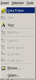
Create a new data frame by select insert "Data Frame" menu from the
menu bar. You should now see the "New Data Frame"
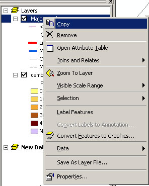
icon in the data frame window. Select the Major Roads layer under "Layers",
click the right mouse button and select "copy". Then select the "New
Data Frame", click the right mouse button and select "Paste Layer".
Now paste the Population layer into the "New Data Frame".
Remember to set the Map and Distance units for this new data frame.
|
|
 |

|
| Insert a New Frame | New data frame appears | Copy layers from existing frame | Paste layers to the new frame |
Open the layer properties to modify the Population layer. Adjust the number of decimal places to "1" and set the "Normalize by:" field to "Landacre." In ArcMap, the 'normalize by' option is used to pick an attribute that will be divided into the mapped attribute before doing the classification and shading. Hence, normalizing by landacre will create a population per acre measure. You should still be using the "Quantile" classification with 5 classes and "Orange Monochrome" color ramps. When you apply your changes, you will have a population density map. Change the layer's name to Population Density. Mathematically speaking, what did the setting the normalization field do to the population values? Is the population density map more consistent with your impression of the parts of Cambridge that are more crowded? Also, compare the result when you normalize by the 'Area' attribute rather than the 'Landacre' attribute. The 'Area' attribute is the area (in square meters) of each block group polygon whereas the 'landacre' measure excludes bodies of water (like the Charles River Basin).
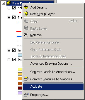
Since you have two data frame and data view displays only one frame at a time(you can show two maps in one layout view though. We will cover that soon), you need to activate a frame to see it. For example, if you want to see "New Data Frame", select "New Data Frame", click right mouse button then select "Activate".
|
You should be able to spot one or more areas in your two maps of Cambridge
where the discrepancy between them is especially apparent. In "Layers" frame
(the unnormalized map), highlight one of these by drawing a circle around the
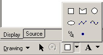
area with the New Circle tool ![]() .
To select the New Circle tool, you will first need to open the draw tool pop
up menu as shown in table 2 and select the New Circle from the pop up list of
icons that appears. The complete list of drawing tools is shown in Table 2.
.
To select the New Circle tool, you will first need to open the draw tool pop
up menu as shown in table 2 and select the New Circle from the pop up list of
icons that appears. The complete list of drawing tools is shown in Table 2.
 |
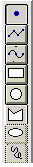 |
New Marker New Line New Curve New Rectangle New Circle New Polygon New Ellipse New Freehnad |
|
 to
add some text annotation near the circle explaining why you put it there (e.g.,
"Zone of High Discrepancy"). Use an economy of words. Choose font characteristics
that will make the text visible but not overwhelming. Note that like the drawing
tools, you can choose annotatino style from a pop up list. You can experiment
with these if you wish.
to
add some text annotation near the circle explaining why you put it there (e.g.,
"Zone of High Discrepancy"). Use an economy of words. Choose font characteristics
that will make the text visible but not overwhelming. Note that like the drawing
tools, you can choose annotatino style from a pop up list. You can experiment
with these if you wish.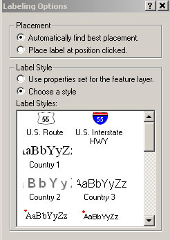 |
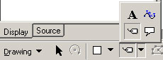
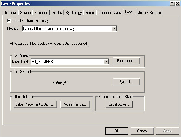
Interstate 90 (a.k.a. the Mass. Pike) extends east-west near the bottom of the image. As you identify links along this stretch, you should see that the "Rt-number" field is "90" and that the "Admin_type" is "1." From the metadata, you can see that an Admin_type of 1 indicates an Interstate highway. We want to label a few roads using this "Rt-number" field. Open the Theme Properties window for this theme. Click on the "Text Labels" icon and confirm that the "Label Field" is set to "Rt-number."
ArcMap has some nice cartographic goodies that will let us put highway shields
on the maps not unlike those you've seen in commercial road maps. Click the
Label tool ![]() from the pop up list, then Labeling Options window will come up. Check "Choose
a style" option and select the "U.S. Interstate HWY" sheild among
many label styles. Now click somewhere on I-90 where you would like the shield
to appear. It should have "90" inside. If you are unhappy with the label, use
the Del or Delete (not Backspace) key to erase it.
from the pop up list, then Labeling Options window will come up. Check "Choose
a style" option and select the "U.S. Interstate HWY" sheild among
many label styles. Now click somewhere on I-90 where you would like the shield
to appear. It should have "90" inside. If you are unhappy with the label, use
the Del or Delete (not Backspace) key to erase it.
Other limited access highways visible in this view are Interstate 93, Mass. State Route 2, and a tiny stub of US 1. Place labels on I-93 and Mass. 2 and ignore US 1. Note that Mass. 2 should not get an Interstate shield since it is a state highway (Admin_type = 3); instead use a round, square, or oval shield. The full set of label tools is shown in Table 3. ArcMap gives you some control over the fonts and colors that appear in the shield symbols. You may open Layer Properties window, select Labels tap and click Symbol button to open the Symbol Selecter window, which gives you the chance to alter the settings. You can experiment with this if you wish, but it is not necessary for this exercise. Once you've placed a shield symbol on the map, you can open Properties window by double clicking the label you inserted, click the Change Symbol button and it brings up Symbol Selecter widnow. Then you can change the characteristics of the shield.
|
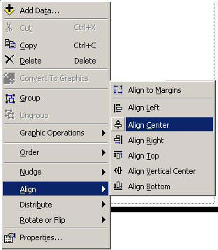
In this layout we want the two view frames to be the same size and lined up
vertically, with "Layer" frame higher on the page than "New Data Frame." Fortunately,
ArcMap has tools to resize and align layout elements. Select the Arrow Pointer
tool ![]() .
Move "View1" near the top of the page and "View2" near the bottom, resizing
them, if necessary, so that they both fit. You may also need to move the other
layout elements. Now, hold down the Shift key, and click on both frames
to select them. Click the right mouse button and choose Align Center
from the Align menu.
.
Move "View1" near the top of the page and "View2" near the bottom, resizing
them, if necessary, so that they both fit. You may also need to move the other
layout elements. Now, hold down the Shift key, and click on both frames
to select them. Click the right mouse button and choose Align Center
from the Align menu.
 |
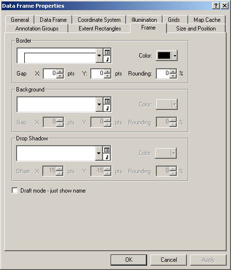
Now let's spiff up the frames by adding a border line around their edges. Select one of the view frames and click the right mouse button. Choose properties from the bottom of the drop down menu list. Properties window will come up. Select Frame tab then set the characteristics of border lines as you wish (we recommend keep default settings for this lab.) and click OK. You should see a black line forming a tight box around the view frame. Repeat this procedure for the other view frame.
 |
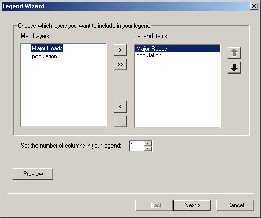
Now, you need a legend, a scale bar, and a north arrow to make the layout view
to a map. First, let's insert a legend for "Layers" frame, Activate
the view frame either click it or click the name of data frame(Layers), click
the right mouse button, and select activate from the drop down list. Then select
the Insert menu from the menu bar, and select legend.
Legend Wizard window will come up. Using the legend wizard, you can choose which
layers to be shown in the legend. For this exercise, select all the name of
layers shown in Map Layers space and click ">"
button. Selected layers will be shown in the Legend Items space.
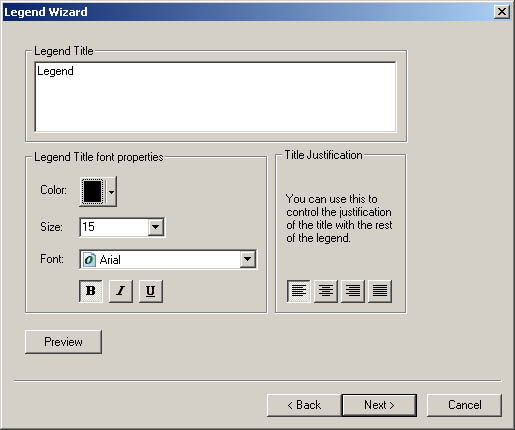
Click Next. Change the legend title, set font, color and click
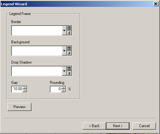
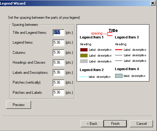
Next. Now you can choose border line characteristics.
Click Next and set spacing between the parts of your
legend and click Finish. The legend will show up on
the layout view. Follow the same steps, create legend for "New Data Frame".
Also, insert scale bars and north arrow for both view frames.
|
|
| Fig. 14. Select Legend Items | Fig. 15. Set legend title |
|
|
| Fig. 16. Set Border Line | Fig. 17. Set Spacing between Parts |
Finally, round off your map by setting the title of the layout to "Population of Cambridge, MA, 1990" and adding your name, today's date, and appropriate credit to the data source. When you're happy with the way that it looks, save your project, and print out your map. This exploratory map is your answer to Question 1 in the Lab Assignment.
Open the table for Landuse85.shp (click once on the layer to activate it and click right mouse button and select Open Attribute Table).. The field called "Landuse" is the only one we're interested in.
Fortunately for you, a legend was previously prepared for this layer using ArcView. Click the Import button, navigate to the usual Z:\athena.mit.edu\course\11\11.520\data directory and select the file landuse.avl (the avl stands for ArcView legend). Click OK. Your layer should pick up the saved symbolization choices. By default, ArcMap orders the categories (values) alphabetically, but we would rather group the residential categories together and have them at the top of the legend. Moving the categories helps us understand them better and will "read" much better on our final map. To move categories, simply click on a symbol and click the up and down arrow buttons in the right side of the window. Locate it where you would like it to be. Move the residential categories to the top:
Open the layer properties for Sales89. Using "Realprice" as your "Classification Field," try out the "Legend Types" "Graduated Color" and "Graduated Symbol." Also try the classification schemes "natural breaks," "quantile," and "equal interval." Remember the question we were interested in? Have these exploratory symbolization exercises shown you the relationship between sale price and land use? It's very difficult to see any type of pattern with so many data points, especially in a place like Cambridge, where high and low income neighborhoods are so close together. We'll now abandon the automatic classification settings and use some of our expertise to determine the classes. We'll look only at very high-priced properties and very low-priced properties. Change the number of classes to "3" in the layer properties - Symbology tab and click Classify button. Change the first number shown in "Break Values" from something like 474099 to 100000 and second number to 1000000. Now you have three categories, less than 100000, more than 1000000, and in between. Click O.K. and Change the color and size of second category (realprice from 100000 to 1000000), so that two extreme values, lower than 100000 and higher than 1000000, stand out. Give the points bright colors that will show up on top of the land use layer. Notice that the high-priced properties are in the lowest density areas. We're on our way to making an explanatory map!
We do not have time to cover all of the symbolization possibilities in ArcMap. The built-in ArcMap help has some useful examples of thematic maps. To see them, select Help Topics from the Help menu. The Help system can take some time to launch. When the ArcMap Help window appears, click once on the "Contents" tab, double-click on the "Creating and Using Maps" book icon, double-click on the "Choosing colors and symbols" book icon, and double-click on "Types of thematic maps."
As an added refinement, add a "picture frame" to your layout that includes a CRN and a MIT logo. You will need to use Insert > Picture menu to insert following JPEG files in Z:\athena.mit.edu\course\11\11.520\data:
Make sure to save your map document file before continuing with the next part of this exercise.
We have developed the MIT/MassGIS Digital Orthophoto
web site and now you will get the chance to experiment the MIT OrthoPhoto
function. Before bringing orthophot into ArcMap, we will make a button, which
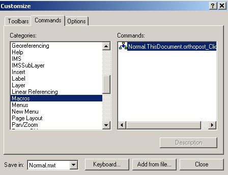
will activate the orthophoto function. First select Tools > Customize
then Customize window will come up.
Select Commands tab and scrolling down the Categories
list until you find "Macro". Click
"Macro". Then "Normal.ThisDocument.orthopost_Click()"
will be shown in the Commands list. Click and drag
the macro from the Commands list and drop it on the
toolbar. Click close. Now you should have a Orthophoto button
![]() on your toolbar.
on your toolbar.
 |
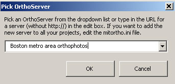
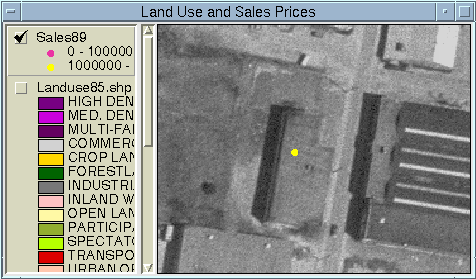
In your "Land Use and Sales Prices" view, turn off Landuse85.shp and leave Sales89 active. Now click on the Orthophoto button. It will bring up Pick OrthoServer Window. Accept the default, "Boston metro area orthophots" After a delay of a few seconds, an orthophoto should just fill the view area. Zoom out to confirm that this is the case.
|
Now zoom in tightly on the sale point, so that the area contains only a few buildings. Click on the Get Ortho button again. If you're fortunate, you may see your point right on top of a fairly clear image of the building that was sold! Your view should resemble Fig. 20.; the specific building may be different.
 |
PDF format: This is a format we will use often. Files in this format can be read using a free program called Acrobat Reader. This program comes in a standalone version and as a web browser plugin. The benefit of this format over a JPEG and other bitmap formats is that it's resolution independent. You can zoom in and out of the map and print it at any scale. To create a PDF file from your layout in ArcMap, select File > Export Map. Exoprt window will show up. From the Export window, select the file location, choose "PDF(*.pdf)" option for Save as type, type the File name you want, then click Export.
JPEG format: Follow the same step describe above and choose "JPEG(*.jpg)" as Save as type. Unfortunately, JPEG use "lossy" compression, meaning that a JPEG image is not fully faithful to the original. Artifacts caused by the lossy compression are often visible in JPEG versions of maps. Also, like any bitmap format, JPEGs have a fixed resolution, limiting the ability to zoom in effectively. JPEGs are useful for overview graphics on web pages, while PDFs can be used to supply the full detail.
For Question 3 in the Lab Exercise, create PDF files of the layouts you created in Part II of today's lab and put them on your web space. Since you are at MIT, it's pretty easy publishing your work on the web. As you can see in the explorer, you already have a folder named "www" under H:/ drive. If you save anything in "www" folder, they are automatically up on the web. Now for this class, create a new folder named "11.520" under your H:\www folder. Then save your pdf files in that folder. You don't have to create a good web page for this. Just copy and paste your pdf files into the 11.520 folder you just created. For those who are not MIT students and do not have web spaces, please email pdf files to the TA(jschung@mit.edu).
Created by Thomas H. Grayson.
Includes significant portions originally written by Raj
Singh.
Modified for Fall 2000 by Thomas
H. Grayson.
Modified for Fall 2001 by Thomas
H. Grayson.
Modified 18 Sep. 2001 by Thomas
H. Grayson.
Modified 11 Sep. 2002 by Myounggu
Kang.
Last Modified 12 Sep. 2003 by Jeeseong
Chung.
Back to the 11.520 Home
Page.
Back to the CRL Home
Page.
Please send comments about this page to the 11.520 class staff <11.520staff@mit.edu>.