| 11.520: A Workshop on Geographic Information Systems |
| 11.188: Urban Planning and Social Science Laboratory |
We firstly need to Log onto a PC that can run ArcGIS and access the class data lockers. We will use a WinAthena PC such as those in MIT Room 37-312 or in CRN facilities. The user name and password are the same as our Athena IDs and passwords.
Step 1. Find the lab instruction on the class website.
Launch any web browser on your PC's desktop, either Mozila Firefox, the Netscape web browser, or Internet Explore and open the page you are reading now: http://web.mit.edu/11.520/www/labs/lab1. Keep this exercise open in a web browser while you work. You may print a copy of this exercise if you wish, but we recommend working directly from a browser window. If you are working in the lab of Building 37, one of the monitor can be used to display the lab instruction. To do that, you can grab the browser with your mouse and move to the empty screen.
Step 2. Attach 11.520 Locker
Much of our class data reside in the course locker, 11.520. This locker is accessible via the Andrew File System (AFS) as Z:\afs\athena.mit.edu\course\11\11.520. However, ArcMAP can have trouble trying to read upper-level directories on AFS drives. (ArcMAP insists on trying to find mapable data in each sub-directory that it examines. The upper-level directories on AFS are spready among machines around the world and ArcMAP will spend forever looking.) Since we will use the class locker repeatedly, we might as well map the locker to a 'virtual' local drive and avoid this problem. To map the class locker to your M:\ driver, open a DOS command window, click Start and choose "Run.... "
In the DOS command window, type: "attach -Dm 11.520" and press enter. This will mount //afs/athena.mit.edu/course/11/11.520/ to drive m:\ for access to the class locker 11.520. Later we will add data from this locker.
Step 3. Start ArcMap by following these steps:
1. click the Start button the left bottom corner.
2. Move the mouse over the item Programs.
3. Move the mouse over the item ArcGIS
4. Move the mouse over the item ArcMap and Click.
Please wait patiently for ArcMap to launch. The program takes awhile to come up. Notice that in the program group of ArcGIS, there is another one called ArcCatalog, which we will use soon.
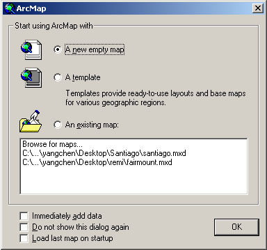
When ArcMap first launches, you should see an "ArcMap" window, illustrated in Fig. 1, that prompts you to create or open a new map. Click A new empty map button to make this window go away.
 |
| Fig. 1. ArcMap's Starting
Window |
You should now be looking at an "empty" document which has "Untitled" in the title bar that looks like the image in Fig. 2.
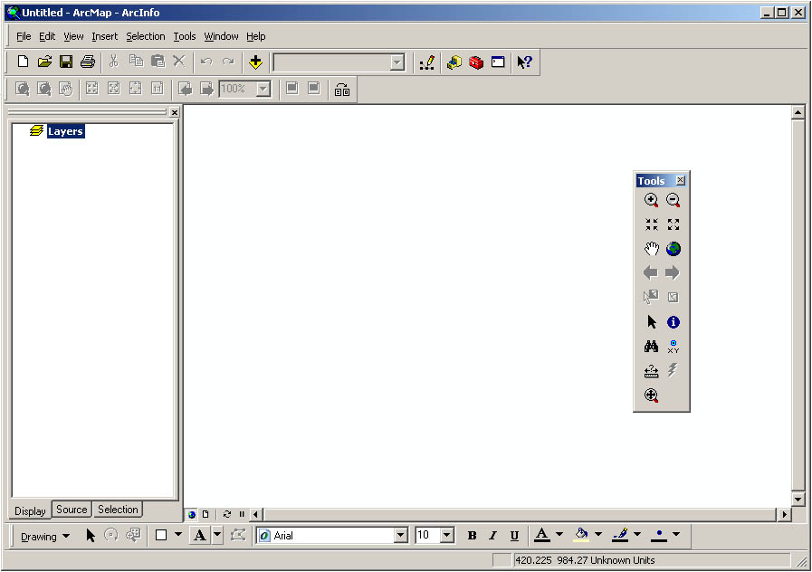 |
| Fig. 2. The Untitled map document
|
What's on the interface, besides the pan and zoom tools? Some drawing tools (see the bottom of the window), some menus which give you access to customizing tools among other things, and some map management tools. We will use many of these in this course.
We are now ready to begin looking at data sets. You will spend most of your time in this map document window, experimenting with good ways to symbolize a data set and overlaying various spatial data sets to create a map. Typical spatial data sets include ArcInfo coverages and ArcMap shapefiles.
When a data set is brought into a map document, we will call it a layer. We need a new term because the same data set can be used to build many different layers, depending on the symbology used and other variables.
We can add data sets to this map by clicking on the "Add Data" button  in the toolbar. Try this now. We'll start by adding a data set of the Cambridge
city boundary, which is stored at M:\data.
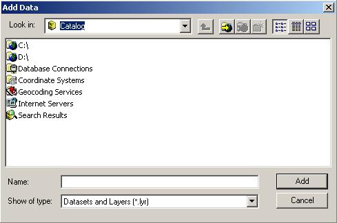 |
| Fig. 3. Add Data |
Note that the dialog box for adding data begins with Catalog. Local drivers
such as C and D are registered with Catalog by default. You need to register
other drives manually. Click the "Connect to Folder" Button  .
.
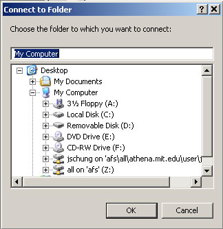
In the "Connect to Folder" window, choose [M:\] then [data] from directory tree. It contains all data sets needed for this lab.
 |
|
| Fig. 4. Connect data folder |
|
Click OK and go back to the "add data" window. Now you are in the right directory, you should be able to see a number of data sets in the window. Select the camborder data set, which contains the border of the city of Cambridge, and then Add it.
Now, let's add another dataset, the cambrige tiger file, in an alternative
way. Click the ArcCatalog icon ![]() on ArcMap's
toolbar. This starts ArcCatalog. The alternative way to start it is to start
it from the program groups. Since you have already registered drive M.
You can see it in the Catalog window. Otherwise, you need to register it by
clicking the Connect to Folder button, which is under the edit menu.
You could also register the same class data locker as: Z:\afs\athena.mit.edu\course\11\11.520\data.
Browse the folders as you do it with windows explorer and find cambtigr.
To add this dataset to ArcMap, you can grab it with your mouse and move to your
ArcMap window.
on ArcMap's
toolbar. This starts ArcCatalog. The alternative way to start it is to start
it from the program groups. Since you have already registered drive M.
You can see it in the Catalog window. Otherwise, you need to register it by
clicking the Connect to Folder button, which is under the edit menu.
You could also register the same class data locker as: Z:\afs\athena.mit.edu\course\11\11.520\data.
Browse the folders as you do it with windows explorer and find cambtigr.
To add this dataset to ArcMap, you can grab it with your mouse and move to your
ArcMap window.
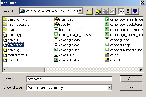 |
| Fig. 5. Adding Cambridge border coverage via drive Z: |
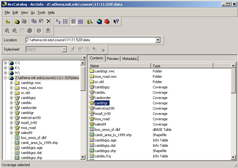 |
| Fig. 6. Add data from ArcCatalog |
Now add the following two layers to your ArcMap, with either of the two above methods. (Since you have already registered the M and/or Z drives, you don't need to register them again).
You should be able to get a map window looking like the following figure.
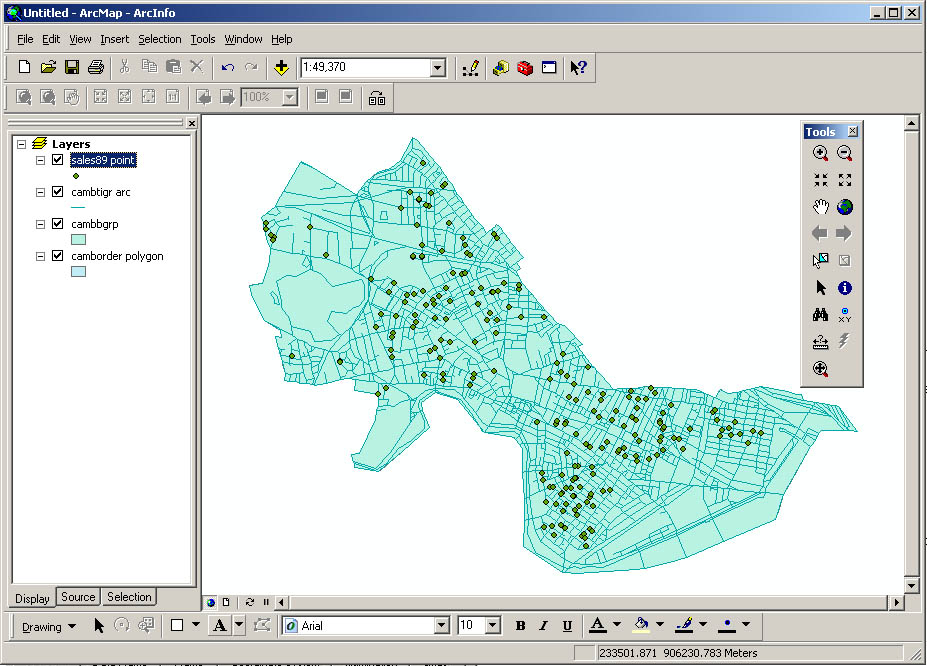 |
| Fig. 7. ArcMap window with GIS layers |
These four layers are currently visible. To activate a layer or deactivate it, just click on the box next to that layer's title. If the box is checked it means that the layer is visible. Initially, all the checkboxes are checked, and all data will be visible in the data display area. Experiment with turning layers on and off.
Notice that some layers may obscure others. That's because the themes are drawn from bottom to top as listed in the data frame area. You can change the drawing order of the layers by clicking and dragging a layer in the data frame area. Try this now to see how the display changes while you arrange the layers in different ways. But finally, they should appear in the following order:
Your window should now resemble the above figure. Note that since ArcMap chooses the initial colors for themes randomly, your window will probably have different colors than those shown here. Also, the name of the layers may also be a bit different, depends on whether you use a coverage or a shape file.
At this point it is important to set a few properties for this document file. Select Data Frame Properties under the View menu. The "data frame properties" window will show up. Click "general". The window looks like the following figure.
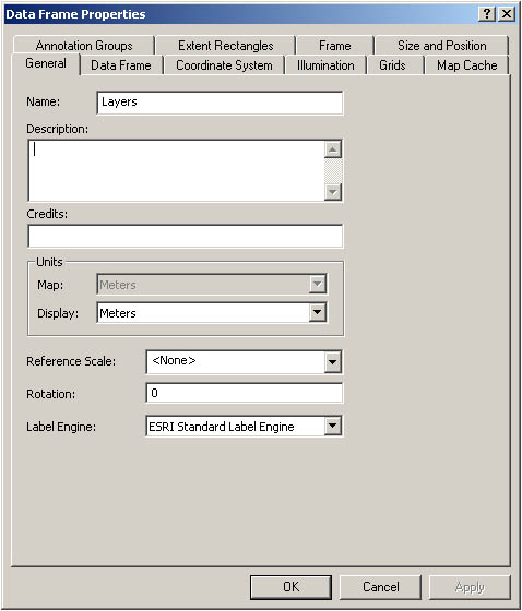 |
| Fig. 8. Data Frame Property
Window |
Now change the name of the view from layers to Lab Exercise 1. Also notice that in this dialog box the map units are set to meters, in which the spatial coordinates of the data are actually stored in the files on the disk. The display units, in contrast, refer only to how distances will be measured for display. We can set this to any units we like; we suggest feet here because that is a familiar unit (for Americans) and is appropriate to the scale of the map.
Now take a few minutes to familiarize yourself with some toolbar buttons. You can pan and zoom in the view window. First, you may wish to enlarge both the ArcMap window and the data display area so that you can see more detail in the image. Also try these buttons out by clicking on them in the toolbar, then clicking in the data display area:
| Zoom In |  |
Click to zoom in on that location. Click and drag to zoom to a particular bounding box. |
| Zoom Out |  |
Click to zoom out centered on the location of the click. |
| Pan |  |
Click and drag to pan around the map area. |
Discover functions of the other buttons on the toolbar on your own. Notice that as you move your mouse cursor over the button, a line of descriptive text will appear, which explains the function of the button.
Click on the small boxes next to the each layers to make them invisible. Then turn on the layer Cambbgrp in the data frame. Now you can see the outlines of Cambridge Census block groups.
Click once on the info ("i") tool  .
This button is located in the toolbar. Move the mouse into the map window and
click on a block group. The attributes associated with that block group appear
in a popup window. To see the data for all of the block groups, move your mouse
over the name of the layer in the data frame and do a right click. On the pop-up
menu, choose "open attribute table". Notice that if you click on a
record in the table, the corresponding block group is highlighted on the map.
Now we can save the map document to our working directory. Do this by clicking
the save button  . Go to your Athena
locker, which is your I: drive. We suggest you create a sub-directory
called 11.520 or 11.188 within your I:\Private
directory. Within this directory, you should create another folder called lab1.
Now you can save your map document file to this directory. Give this document
file whatever name you like. It does not save all the data you are using - only
the file locations, date frame properties, symbol information and the like that
are needed for ArcMAP to recreate the same state of your work that existed when
you saved the file. (Hence, the saved document file - with an .mxd
filename extension - will not work properly if the class locker is not mapped
to the same drive as it was when you saved the file.)
Click on the check box next to the Cambtigr layer to make it visible. You should see all Cambridge roads (plus some other features such as railroads) being drawn on the map then. If you had moved, say, Cambgrp above Cambtigr in the legend, the TIGER(Topologically Integrated Geographic Encoding and Referencing system) arcs would then be quickly covered up by the block groups. If so, you can fix this by dragging the Cambtigr layer up above the Cambbgrp layer. Now we see TIGER arcs on top of the block groups.
The name Cambtigr may not be meaningful to everyone viewing this display. We can easily rename the layer in the property window to something more readable. Right click once on the word Cambtigr and select Properties from the pop up menu. Under "General", change layer name from Cambtigr to Cambridge TIGER. Notice that the data source (listed under "Source:") does not change. After you click the OK button, you will see the new layer name in the data frame. You may need to need to make the data frame window wider to see all the text. Move the mouse over the line to the right of the data frame area. When the cursor changes to an I-beam with arrows on either side, you can click and drag to resize the data frame area.
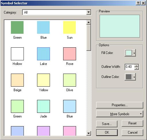 |
| Fig. 9. Symbol Selector Window
|
For now, the layer Camborder is actually not visible even when the box is checked. To make it visible we can drag it above the Cambridge TIGER layer. However, it obscures the roads. Instead of moving Camborder to the bottom again, we can change the way it is displayed so that the border is drawn but the area is not filled in. Double-click on the legend, which is the rectangle under the layer name Camborder in the Symbol Selector window as shown by Fig. 10, Click once on the downward arrow of the "Fill Color" option, which is at the middle right. And then choose "No Color". This sets the fill color of the shape to none (i.e., transparent). The fill pattern had been the colored box, meaning that shapes should be filled with a solid color.
Also, increase the outline width from 0.40 to 2. Click "OK". Now you are able to see clearly at the same time the boundary of the city and the block group boundaries.
Likewise, you can improve the way to visualize the tiger lines. Try that by yourself.
Double-click on Cambbgrp to open the layer property window. This time we will manually symbolize the theme. Up to now, all the layers have used the default legend type, "Single Symbol." Now, under "Symbology:" select "Quantities" and then "Graduated Color." Change the classification field value to "Med_hh_inc." Notice that ArcMap automatically divides the income data into five ranges and assigns a color to each. These colors will not actually be shown in the map until we explicitly tell ArcMap to do so.
|
|
| Fig. 10. Symbology
Window |
Often we will want to make some adjustments to the way these ranges are created. To do so, click on the Classify button. The Classification window will appear. Under "Classification Method:" select "Quantile" and click OK.
|
|
| Fig. 11. Classification
Window |
Back in the symbology window notice that the ranges have changed to reflect
the new classification scheme. Now click Apply to make this new
scheme take effect in the map. You've made your first thematic map, with median
household income divided into 5 categories, each consisting of 20% of the block
groups. If some boundaries of some block groups are highlighted, select the
feature selection tool ![]() ,
and then click on the blank map area.
,
and then click on the blank map area.
Notice that the first income range is 0 - 23472. On the surface, this may seem fine, but actually in this data set, the value zero is used to indicate that there is no data for that block group, not that the median income is zero (which is extremely unlikely). You can confirm that the zero value is an outlier by taking a quick look at the raw data. Close the property window and bring forward the attribute table of Cambbrp. Right click the layer's name in the data frame and select Open Attribute Table on the pop-up menu.
Scroll to the right in this window until you see the Med_hh_inc
column. Right click on the column heading for Med_hh_inc; it
will be highlighted in reverse video when you do so. Now sort the rows in ascending
order using the Sort Ascending option  .
You should end up with a window that resembles Fig. 12. Notice that there are
three blockgroups with zero values, and the next higher value is 13009.
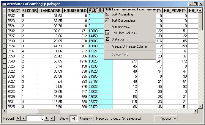 |
| Fig. 12. Sorted
Attributes of Cambbgrp |
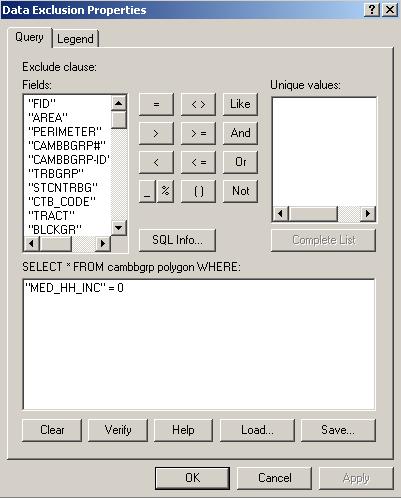
We can prevent such situations from distorting our maps by specifying a "null value" in the classification. Go back to the classification window and click on the Exclusion button. The Data Exclusion Properties window will appear.
Specify the query as what is shown in Fig. 13. And then go to the Legend Tab. Type in "Null Value" in the label field. Make sure the check box for Show Symbol for Excluded Data is checked. Click OK. to close the window. Notice that all but the last of the ranges changed; in particular, the first range is now 13009 - 25335.
 |
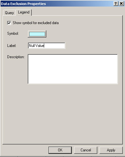 |
| Fig. 13. Exclude Non Value Records | |
Now we can experiment with different classification methods. Try going back to the symbology window, click "classify" button and classifying Med_hh_inc by "Standard Deviation" instead of "Quantile." The mean should match the mean generated under statistics. In fact, once you become a proficient map maker, you might not use these preset classification schemes at all. You could type your own ranges into the "Value" field of the Legend Editor, basing your ranges on standard deviation, variance, quartiles, quintiles, or any other defensible scheme you devise.
What are these different classification methods about? Now is good time to use the ArcGIS online help system to get some more information. Select ArcGIS desktop help from the Help menu. The help system may take some time to load. In the ArcGIS Desktop Help window, click on the "Index" tab. In the keyword box, type the first few letters of the word you're looking for, i.e. classification. You will find "classification schemes" in the returned query list. Click "display", then select "Standard classification scheme" in the pop up window, explanation for the classification method will show up in the right area.
More thematic mapping
Now let's go back to the ArcMap window. Right click once on the Cambbgrp layer and select Copy from the pop up menu. Right click on the data frame name Lab Exercise 1, select Paste Layer from the pop up menu. Now you will have two identical Cambbgrp layers in your data view. Rename the new layer from Cambbgrp to Households. You can do this as by bringing up the layer property window, as indicated in the previous section. However, you can also do it by click the layer name twice, as you change a file name in a windows explorer. (notice that it is not a double-click.)
Now let's make a basic thematic map showing the number of households per block group. Double-click on the new layer named Households to load the symbology window. Under "Symbology" select "Graduated Color". Change the classification field from Med_hh_inc to Households. Click on the Classify button to open the Classification window. Use these options:
Type: Quantile
Number of classes: 5
Right click once on the Households layer and select Copy from the pop up menu. Right click on the data frame name lab exercise 1 and Select Paste layer from the pop up menu. Now we have three versions of the block groups visible in the legend. Change the name of newest one from Households to Household Density. Double-click on the new layer to load its property window. Change the normalization field from NONE to Landacre. Remember to go to the classification window and change the classification method to Quantile. The default one is Natural Breaks.
Instead of showing raw counts of households per block group, the Household Density layer shows households per acre in each block group. The density layer normalizes the raw counts by dividing them by the land area. Note that a density map is more meaningful than a map of block-group counts since the counts are so sensitive to where you draw the block group boundaries. If some block groups were divided in two, the thematic map of counts in each block group would change a lot, but the density wouldn't change. Use the checkboxes to toggle the visibility of the layers. Notice how different the two maps look and understand that household density is quite different from total households. Also understand what the normalize command did. It took the number of households in the block group and divided it by the number of acres in the block group. Normalization of data is an important issue that we will return to during the semester.
Make a new copy of the household density layer and change its name to Household Density SD. Load its symbology window with a double-click on the layer name. Make sure your classification field is "Households" and that you are normalizing by "Landacre." Click on the "Classify..." button and choose "Standard Deviation" (accept the defaults for the other fields). Apply your changes. This map helps us see how much density differs across the city. We see mainly light colors (within +/- 1.5 standard deviation from the mean), leading us to believe that Cambridge households are relatively evenly spread around the city. This makes sense because there are no (or few) 40-story high density apartment buildings, few areas with single-family homes on large lots, and few completely nonresidential districts.
Mapping point data
So far we've only looked at polygon data. Mapping point data (often called dot density mapping) offers new challenges and opportunities. Make the layer sales89 visible. We see that property sales were pretty evenly spread across the city in 1989 (except in a few block groups, most notably around MIT). Simply looking at where sales were isn't very interesting in this case.
Load the symbology window with a double-click. Choose the "Graduated Symbol" legend type and classify on "Realprice" and classify by "Quantile." Apply your changes. This gives us an idea of where the high-priced sales were. Go back into the symbology window and experiment with manually changing the colors and sizes of the dots. Also make a copy of the theme and try mapping the data using "Graduated Color" instead of "Graduated Symbol." Which method do you think is better?
Configure your data display window to show Income shaded thematically, Cambridge TIGER, sales89, and Camborder. Turn off all other layers. Now you are ready to make a map. Under the View menu select Layout View. You get a default map layout in the data display area. We've worked with data layers in the data view, and now we are working with a layout document. Although we can print a map directly (using the Print command under the File menu), it is impossible to control exactly how it will look on the page without using a layout. Besides the GIS layers, a layout usually also include a title, legend, scale bar and north arrow. These are the most basic components of a map.
This default map layout has no title, scale bar or legend. You can either insert these components one by one or apply a template. Let's first apply a template. Click the last button on the layout tool bar, which is "change layout".
 |
| Fig. 14. Layout
Tool bar |
Select "LetterLandscape.mxt" under General tab and click "finish" button.
|
|
| Fig. 15. Applying a map Template |
This template adds legend, North arrow and scale bar to the map layout. But the map title is still empty.
|
|
| Fig. 16. Map Layout After Applying a Template |
To add the title, double click on <Double click here to enter the title>. In the text box of the property window, type in Lab Exercise 1.
Additionally, we need to add a few more elements to the map:
Let's add the data source first. Click Text under the Insert menu. A small text box shows up in the middle of the map. Double click the text box to bring up the property window. In the Properties dialog box that comes up, type:
Sources:
U.S. Bureau of the Census, 1990
Banker and Tradesman Real Estate Transfer Database, 1987-1989
Note that you can use the <Enter> key to insert line breaks in the text. Once you click OK, the text is placed wherever you clicked in the layout window. You can move this text by dragging it with the mouse. You can double click on the text, bring up the property window and change the font and size until you are satisfied.
In the same way, we can add two subtitles. Underneath the title Lab Exercise 1 add two subtitles in smaller text that read "Median Household Income in Cambridge, MA in 1990" and "Housing Sales in Cambridge, MA in 1989." Also add your name and today's date somewhere on the map.
Feel free to move and resize the elements to make your map look more attractive. You can also go back to the symbology window to adjust the existing symbology. Once you change the symbology, the change will be applied to the map layout automatically. You don't need to create the layout again. Try your best to make the map readable and attractive. Although it is hard to make a real attractive one this time, we expect your map should be much better than than Fig. 16.
Before you print out the map, make sure that none of the visible features in your map are selected -- these will show up highlighted in yellow on the map. If they are, they will also show up highlighted on your printout, which you probably don't want.
Now you can print with confidence. Select Print from the File menu. Click Setup button and select the name of the printer in the room where you are doing the lab (see "Printing Notes" below) and click the OK button. Make sure your printout actually shows up! Getting acceptable paper output isn't always as easy as you'd think. You can't be sure it will work until you have the piece of paper in your hands. Make sure to turn your printout in, as this is your lab assignment.
When printing directly to a printer, make sure to select the correct printer.
Common choices include:
When saving your maps to a file for later printing or use in a graphics or paint package, click on the "Print to File" option to save the file to disk in EPS format for printing or export later. Make sure this filename ends with .eps or .ps.
Remember to save your work again by clicking the disk icon. ArcGIS can save the status of your session in the map document file, which typically has a .mxd extension. The map document file does not contain the data sets itself, but rather stores pointers to their locations. Your thematic map properties and layouts are also stored in the document file.
After you have done more work on a map document that you previously saved, you could save your changes under a different name by using Save As instead. Try this now, saving a copy of your map document as lab_1copy.mxd. Saving variations of your map documents under different filenames is a good practice. The map document files themselves are typically not too large, so you making lots of map document files should not waste too much disk space.
Next time, when you reopen the map document file with ArcMap, it should look
just the same as when you saved it this time. You can try it now if you have
additional time.
If you finish the lab assignment with time to spare, you may want to return to this layout window and experiment with the other templates and various styles of the map components.
Checking out more of the ArcGIS online help (started from the Help menu) is also a good idea. Throughout the class we will expect you to try to answer your own questions about ArcGIS by consulting the online help and the class notes before asking the class staff. Of course, if you get stuck, we are here to help.
Turn in the printout of the layout you produced in Part IV to your instructor. The lab assignment is due by the START of class on Monday, Sept. 17, 2007.
Created by Raj Singh.
Modified for Fall 2001 on 7 Sept. 2001 by Thomas
H. Grayson.
Modified for Fall 2002 on 4 Sept. 2002 by Joseph
Ferreira.
Modified for Fall 2003 on 3 Sept. 2003 by Jeeseong
Chung.
Modified for Fall 2004 on 13 Sept. 2004 by Jinhua Zhao.
Modfied for Fall 2005 on 4 Sept. 2005 by Xiongjiu Liao Xiongjiu
Liao.
Modfied for Fall 2006 on 8 Sept. 2006 by Mi Diao Mi
Diao.
Last Modfied for Fall 2007 on 25 Aug. 2007 by Yang Chen Yang Chen.
Back to the 11.520
Home Page.
Back to the CRN Home Page.
Please send comments about this page to the 11.520 class staff <11.520staff@mit.edu>.