Moving phosphors on the screen –
now I understand
“It has a dynamic plot – literally!”
Convolution Haiku:
Lines blue, red, and green
Moving phosphors on the screen –
now I understand
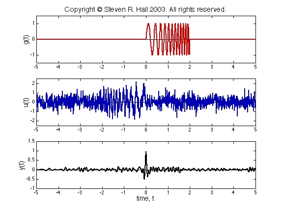
On this page, we show the convolution of a (noisy) radar chirp with a chirp detector. The signals are shown in this plot; the convolution operation is shown in this movie. You can read an explanation of what's happening here.
In the movie above, there are three dynamic plots. In the upper plot, u(t) is shown in blue, and g(t-τ) is shown in red. As t increases, the curve g(t-τ) slides to the right. In the middle plot, the product g(t-τ)u(τ) is shown in green. So the convolution y(t)=g(t)*u(t) at time t is equal to the area under the green. As t increases, the convolution is plotted out in the bottom plot as the black curve.
The impulse response g(t) is known as a chirp, or swept sine. It's called a chirp, because if it's an audio signal, it makes a chirping sound. (Well, perhaps it's a little more like a whoop.) The input u(t) in this case is the pulse returned to the radar. Because the returned signal has low energy, random noise obscures the return pulse. It's clear from the plot of u(t) that the pulse occurs somewhere near t=0, but it's hard to tell just where. By running u(t) through the system G, we can pick out when the chirp occurs.