Human Use Analysis:
2018 Audi Q5 Infotainment System
A deep dive by Drew Walker
March 8th, 2018
The Problem, The Opportunity
As a car enthusiast, I've always found in-vehicle infotainment systems to be incredibly cumbersome. In general, vehicle software has not kept pace with what we've come to expect from the likes of Apple and Google. This frustration came to a head recently when traveling in my mother-in-law's Audi Q5. The vehicle is a 2017 model year and largely represents the latest and greatest for in-vehicle interface and technology as it won the Business Insider infotainment system of the year. A major selling point for the vehicle, is the onboard Wi-Fi that can travelers can connect their smartphones to.
On a recent trip, I wanted to connect to the network, but it had a password. My mother-in-law first attempted to find the network settings but was not successful. After several comments such "it's very complicated" and "this thing is very frustrating," she suggested for me "look in the manual in the glove compartment." I tried my hand at navigating the menus, but after about ten minutes, I too gave up on trying to figure it out. In the end, we resorted to calling a friend who told us the password (ironically it was 1234567). This to me screamed opportunity for user experience analysis and critique.
Product Requirements
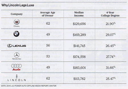
Audi vehicles are a more expensive product segment of the overall automobile market. On average, Audi owners are 50 years old and have a median income of over $180,000 per year. This demographic has traditionally owned vehicles and are used to traditional vehicle controls, but want a premium features and technology.
Primary features of infotainment systems are: 1) Control of the vehicle audio systems, 2) Make and receive phone calls, 3) Provide navigation services, and 4) Control miscellaneous vehicle settings. Modern systems typically employ buttons, knobs and touchscreens to control this system. Control for these systems should be easy and safe to use while driving the vehicle and often voice activation systems are used for hands-free control.
Controls Analysis
Touchscreen vs. Physical Buttons
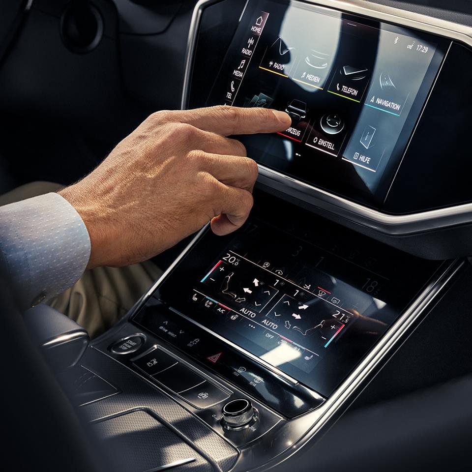
The system does not use a touchscreen like many other vehicle infotainment systems. Rather it relies on a main control knob, a set of buttons and a trackpad. Skipping the touch screen can be seen as an advantage or disadvantage. Most users today are very comfortable with touch screens and find the usage more intuitive than other types of controls. It also provides for more dynamic use of space instead of relying on permanent buttons that could be used for other vehicle features. On the other hand, using touch screens while moving can be a challenge. Accurate and intentional screen touches can be difficult on a driver due to the G-forces, vibrations and requirement to look carefully at the screen. Control knobs and buttons provide a physical and consistent touch sensation that can be less focus intensive. Also, touching the actual screen can lead to fingerprints and smudging over time which may hurt the screen visibility. In general, I think it's a good choice to rely on physical buttons for system control due to safety concerns, but the menus should be intuitive and consistent with the button design.
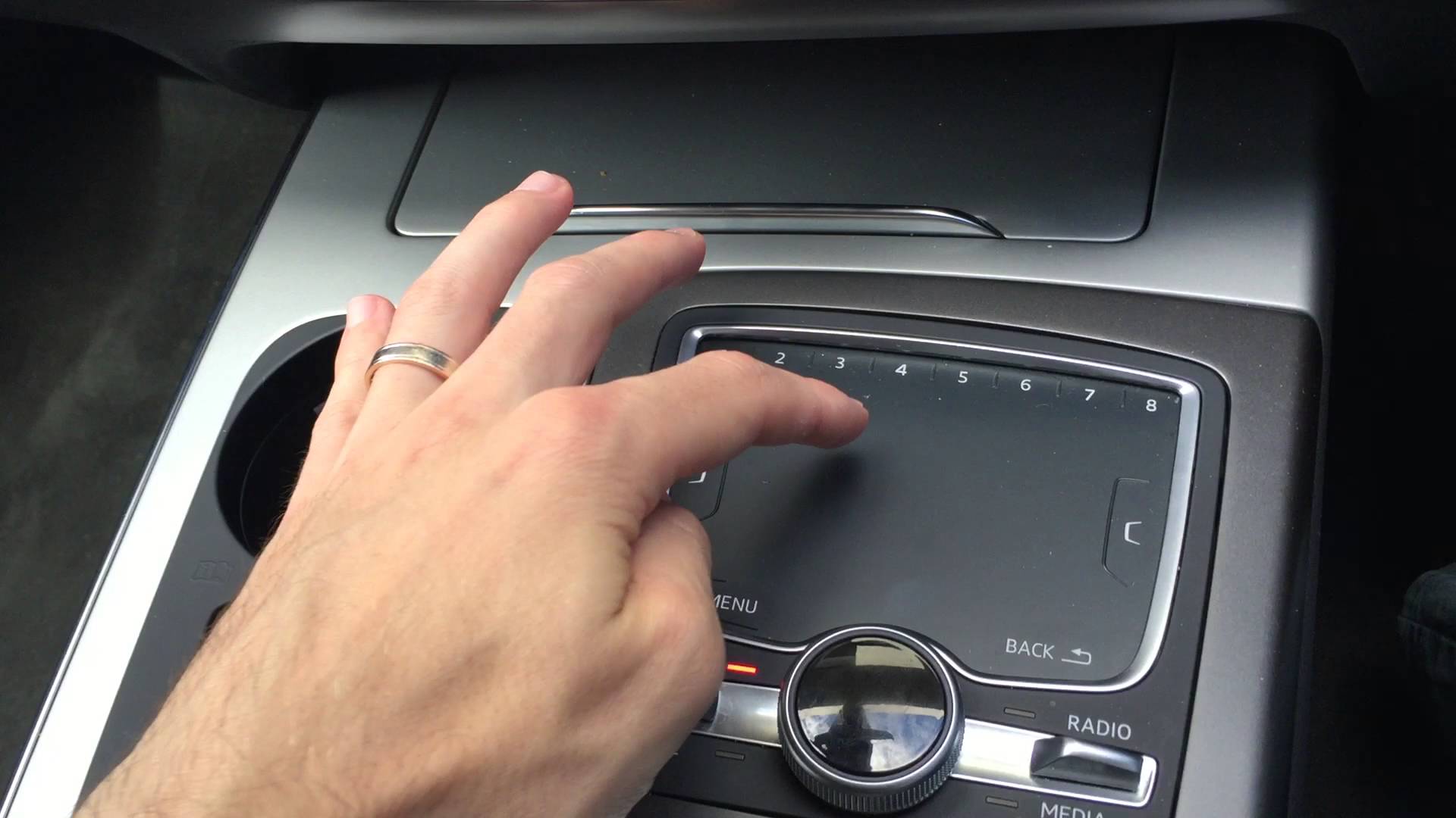
Knobs and Rockers and Pads, Oh My!
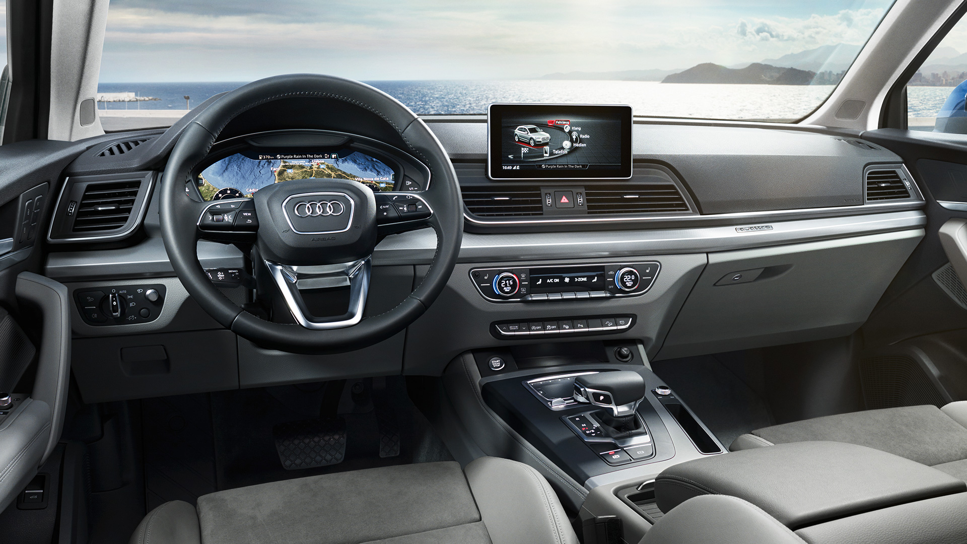
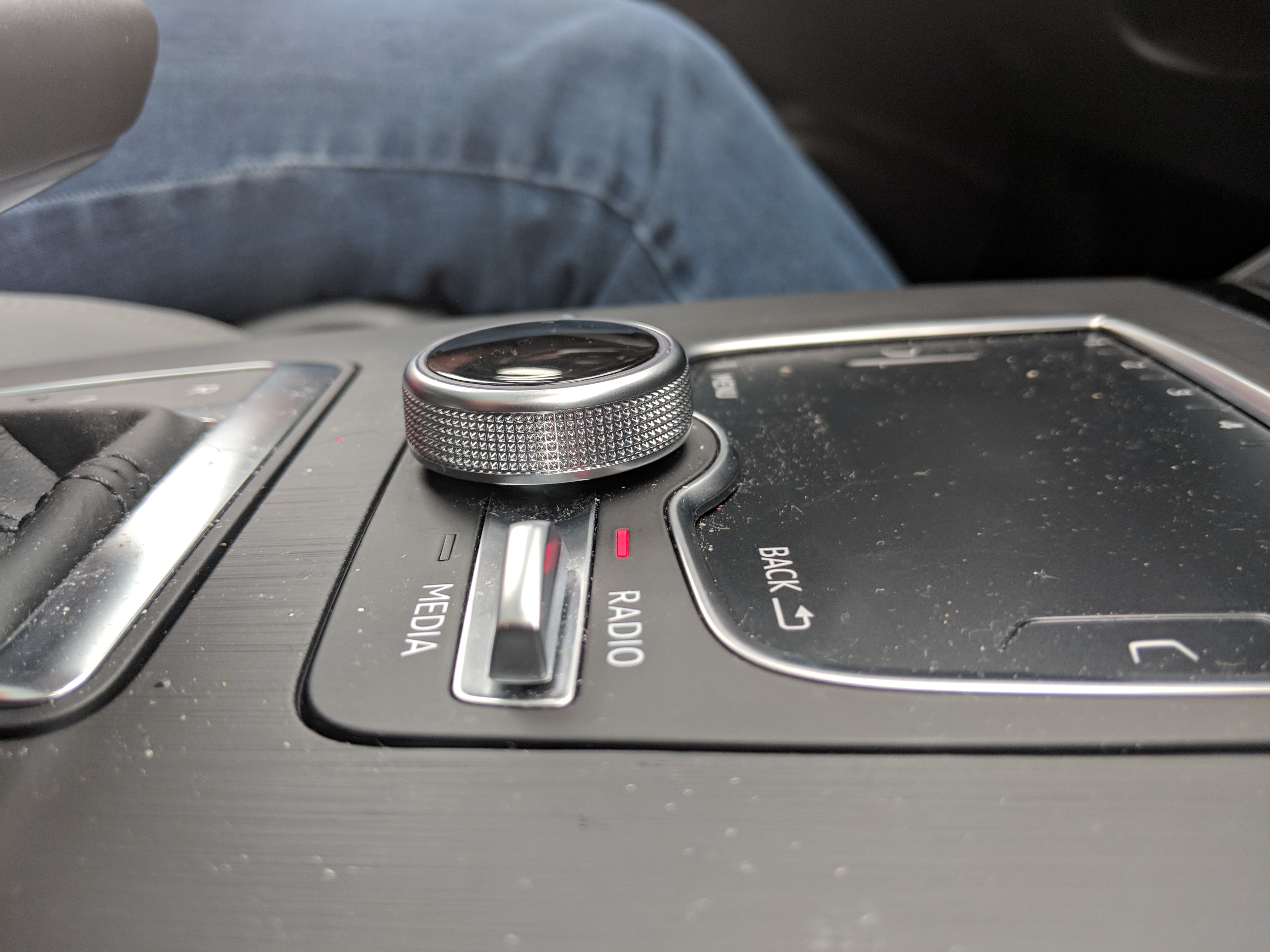
The main control knob is about 2" in diameter and is centrally located on the console. A knurled exterior makes it easy to feel and grip and a ring light on the top face make it easy to see in the dark. The feel of rotation is a satisfying click with about 25 discrete positions. To select a highlighted item, the knob can be pushed down without too much effort or accidental clicks. The knob can also be slid slightly in four directions for additional functionality. This feature is slightly more difficult to use due to the stiffness and propensity to rotate instead.
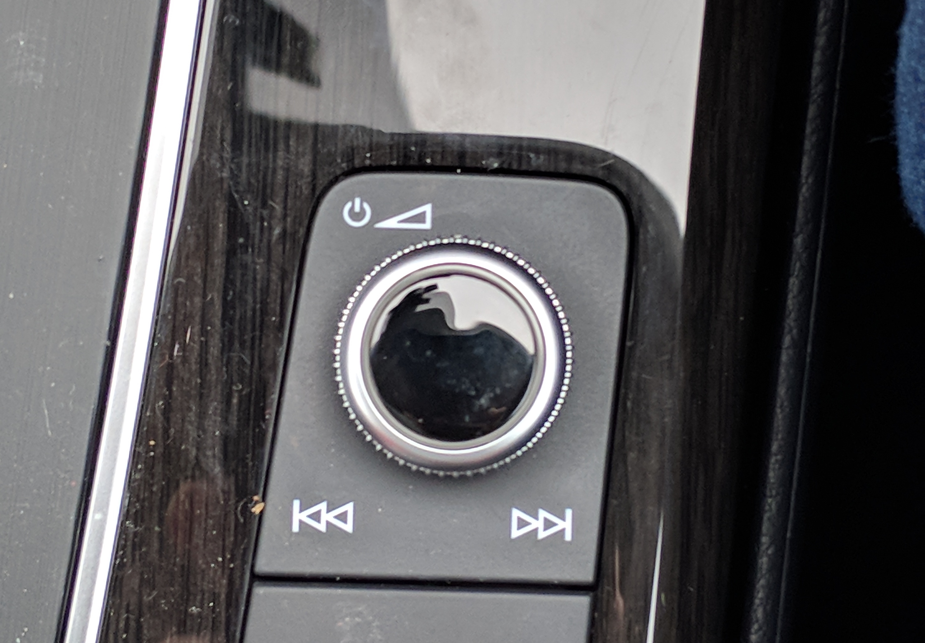
A similar design is also deployed for a second volume control knob. This device is about 0.75" in diameter but has the same action as above. This button is located on the far-right side of the center console, opposite the driver. I found it to be slightly out of reach and also awkward when another passenger rides in the vehicle as their knee often covers the knob. This appears to be an intentional design because the right side driver version mirrors this layout. Clicking this knob actually turns off the sound for the vehicle, which is subtly indicated by the power icon. Track or preset skipping can be done by sliding the knob right or left.
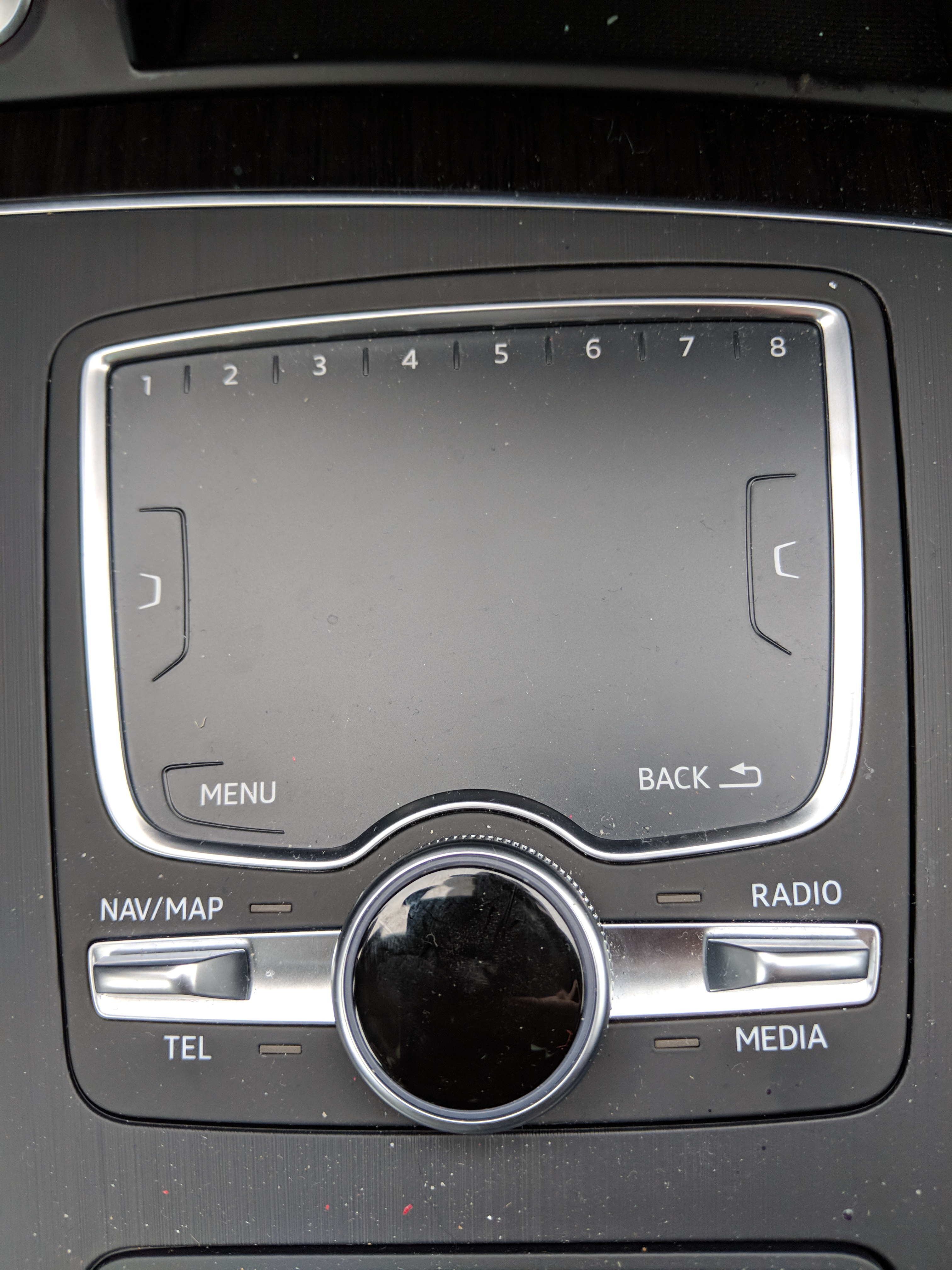
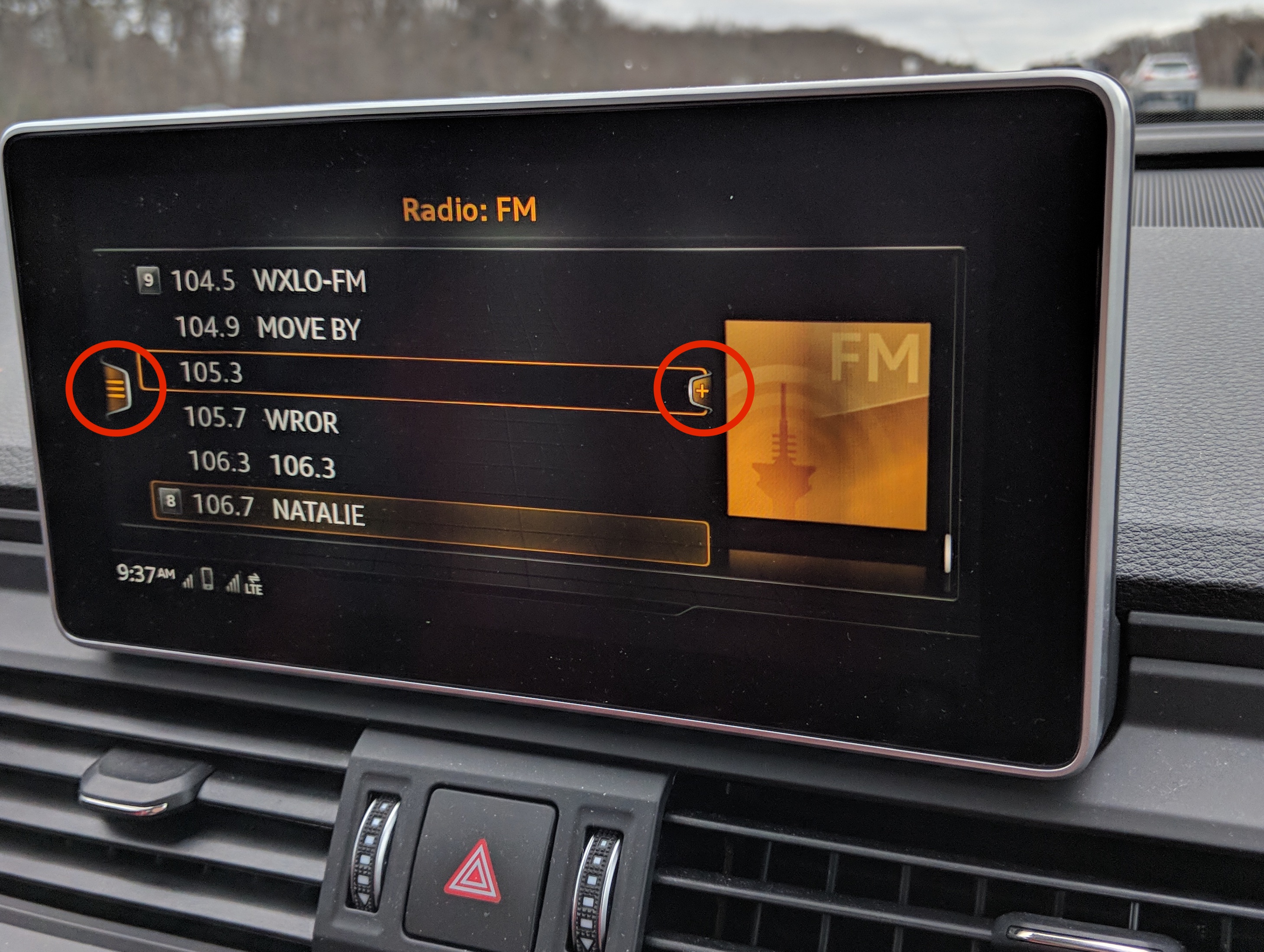
In addition to the knobs, two rocker buttons are featured on either side of the main control knob. These serve as quick access to primary features of the infotainment system: Navigation, Phone, Radio, and Media. In principle these are a good idea because it provides quick access most activities performed in the car, and by using physical buttons the driver can easily perform the task without looking. Where the system falls short is on the button design. The two, dual-direction rockers are used here. I found this to be a bit ambiguous on first use. A simple should button with a boss feature would be adequate in this case.
A unique feature of the physical controls is the trackpad used for text input. The 3" x 5" pad is located behind the main control knob and features two shoulder buttons and a row of numbered presets across the top. Typical text entry options with button or scroll controls are very cumbersome, so I applaud the effort to make this more seamless. However, the character recognition capability of the trackpad was inconsistent at best. More on that later.
Lastly, two soft buttons (menu, back) are featured near the trackpad with small boss features for feel. The menu button simply brings you to the main menu page. The back button, in theory should take you up a level in the menu hierarchy but seems to operate differently throughout the system.
Interface Analysis
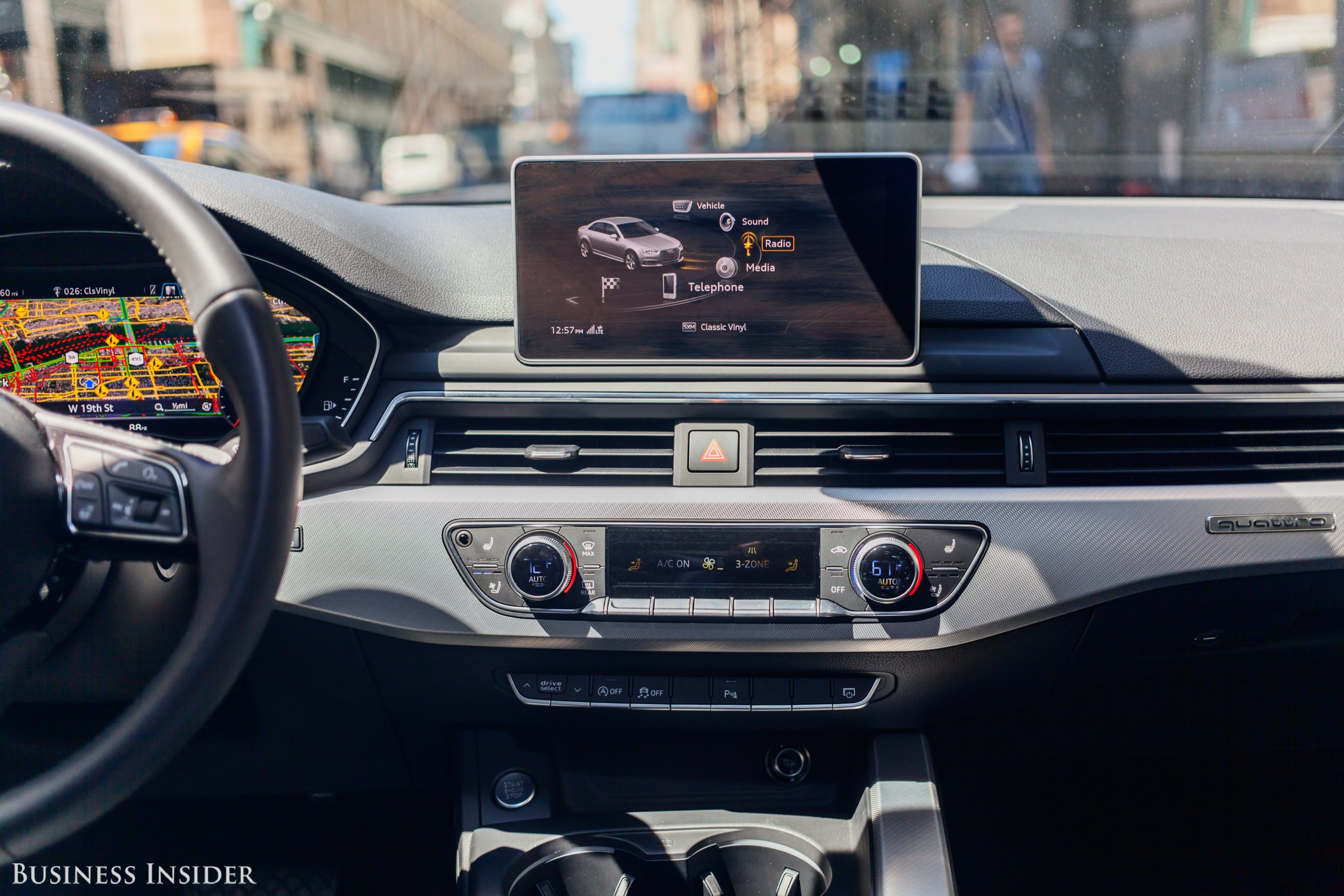
The main display is a 4" x 8" landscape screen mounted on the dash. It sits at a comfortable level that is below the exterior field of view, but not too low that requires you to take peripheral vision off the road. Brightness, sharpness and contrast were not an issue.
Main Menu
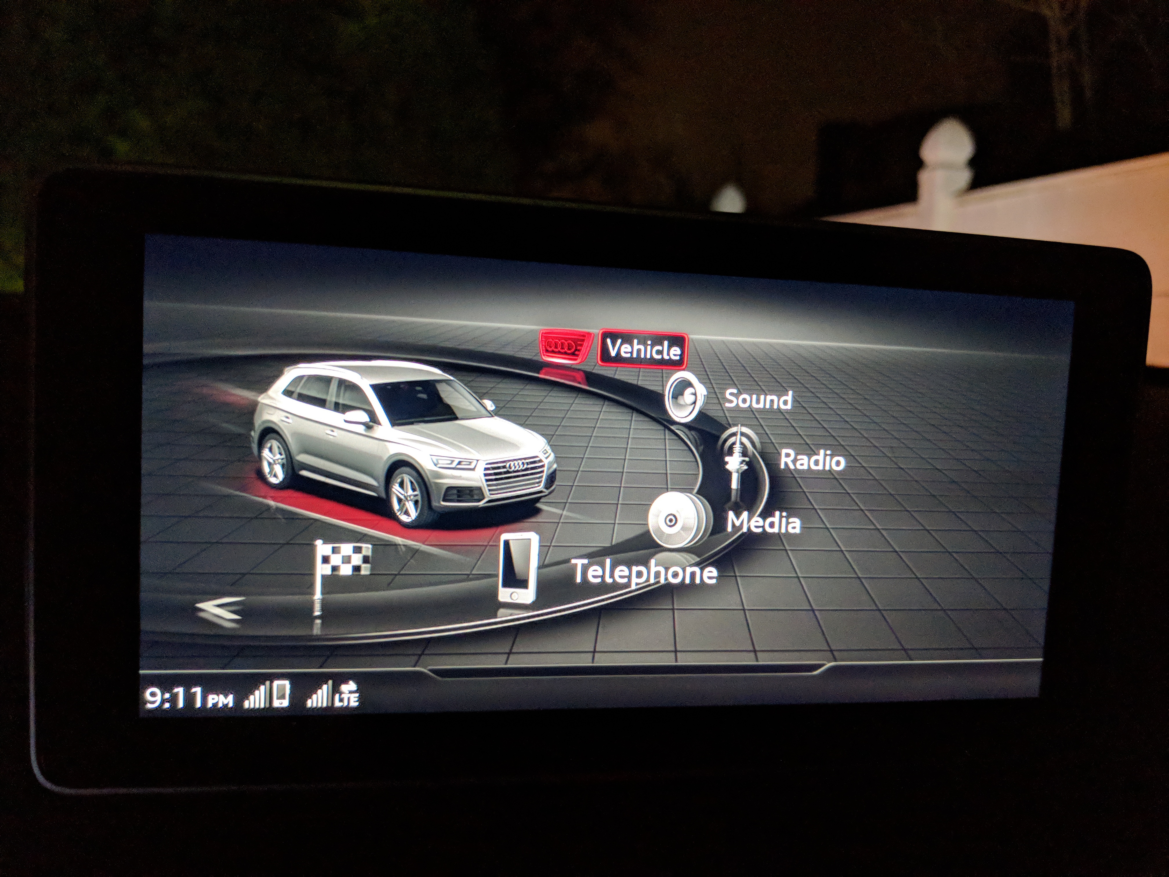
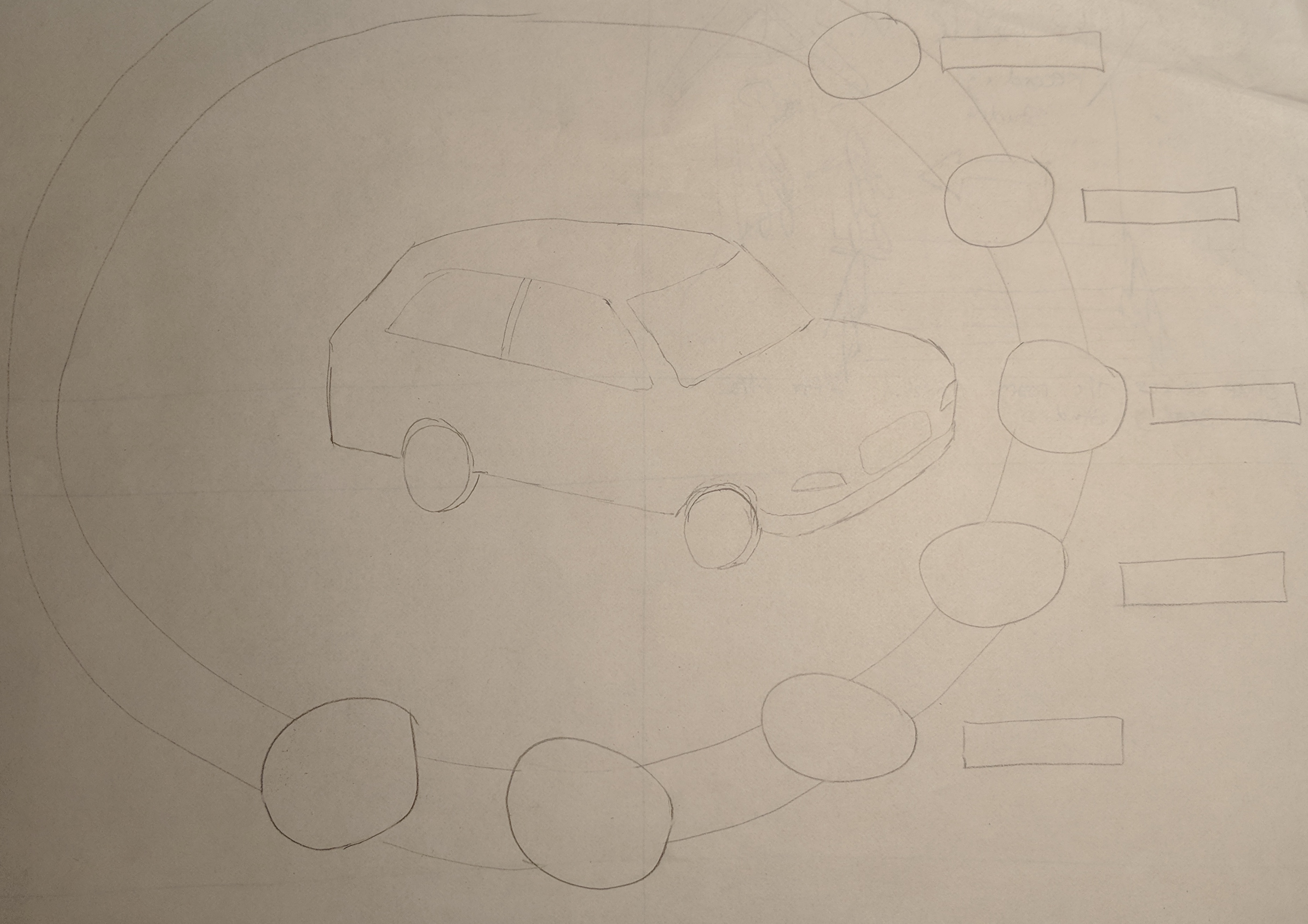
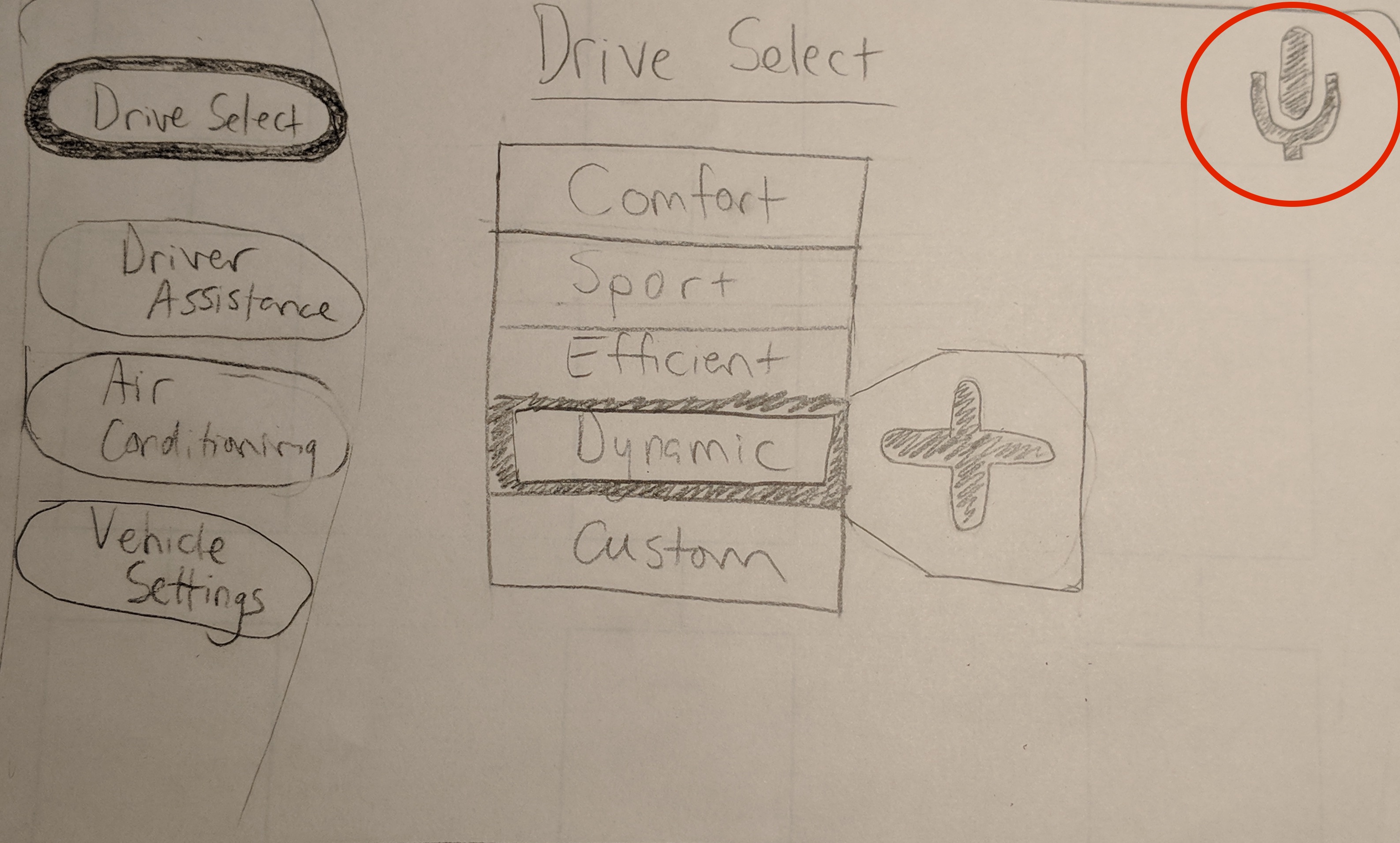
To access the main menu, one obviously pushes the menu button. The button location feels somewhat marginalized for this important task and creates some confusion on where to start. Once in the main menu, the vehicle is shown with a projected ring around it with icons/descriptions for each sub-menu. The symbols and color generally relate to the sub-menu, but I found I was relying on the text descriptions more than symbology. The ring around the vehicle serves as a good indicator for how to use the control knob. Rotations on the knob scroll through the sub-menu options. There are 10 different sub-menus which are not all visible from the starting point of the main menu. I feel that this many is not required and a consolidation of several would be apt. Also, much of the right half of the screen is unused, so moving the entire scroll graphic to the right could allow the user to see more of the hidden menu options.
Menu Hierarchy
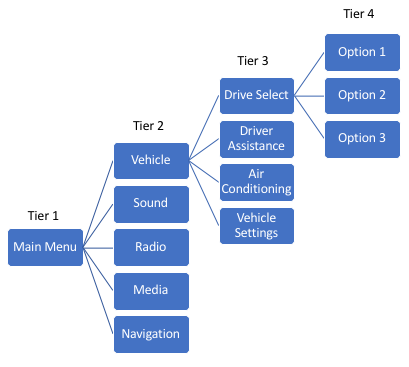
Menus are laid out in a typical hierarchical format. This is a reasonable and natural way to organize these sub-menus, but several aspects of the navigation and user interface make this somewhat challenging. The first confusing point, is that upon making a selection from the main menu (Tier1), the display actually skips the Tier 2 choice and defaults to a Tier 3 pane. To change which third tier setting you are located in, you must use the left side soft button on the track pad and Tier 2 options are shown. The problem here is that the display icon indicating the Tier 2 options is very inconspicuous and does not match the icon on the physical button. For the first ten minutes of using the product, I did not realize this level of menus existed...
Lastly, there is an even more subtle final tier of menu options that are denoted by a small "+" symbol in-line with each sub-menu line. This final menu is specific to each option and can contain critical settings. This menu eluded my awareness even longer than the one above. In the last five minutes of conducting this review I finally discovered the "Wi-Fi Settings" option, revealing the password solving the mystery that inspired this review.
Text Input
In non-keyboard environments, text entry can be very cumbersome. The traditional scrolling alphabet text input option is available, but the addition of the trackpad is meant for users to draw each letter to avoid the endless scrolling. I found this system to be inconsistent at best and also unknown to the vehicle's owner.
Depending on the input field, numbers, letters or a combination could be possible. When letters or numbers were possible, the system was least accurate. Certain letter/number pairs were commonly confused: (S, 5), (G , O , 0), (2, Z), (1, I, l). For certain combinations, the success rate was as low as 10%. This becomes very frustrating for the user and difficult to fix when driving. When the input field was constrained to letter or numbers only, the success rate was dramatically improved. There were occasional mistakes by in general the system was usable.
Smartphone Interface
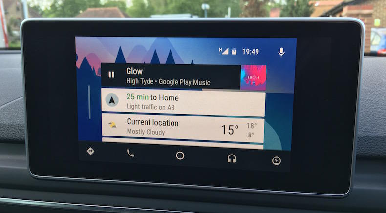
Audi provides a means for connecting a smartphone directly to the infotainment through its Audi Smartphone Interface option. This enables Android Auto or Apply CarPlay to be natively displayed and controlled the infotainment system. I was only able to test Android Auto on the vehicle, but the experience was very encouraging.
Android Auto allows for easy streaming of audio content from apps on your phone as well as access messages and calls. The crowning feature of Android Auto though, is the use of Google Assistant. Google Assistant is a voice recognition platform that can be used to control any feature within Android Auto such as calls, streaming and directions. While useful on a smartphone, Google Assitant is especially useful for the driving use case. Without the need to navigate any menus or take hands off the steering wheel, drivers can simply say "Hey, Google" to initiate a command without pressing any other buttons.
Summary
The Good
Menu design is intuitive for scrolling. Avoiding touch screen provides a safer driving experience. Screen is appropriately sized and located. Easy to read. Lots of controls for all aspects of vehicle from sound, to driving, to lighting. Can connect smartphones and use Android Auto or Apple CarPlay.
The Bad
Menu hierarchy and navigation is confusing. Many hidden menus and navigating around can be a challenge. Different behaviors from back button and some sub-menu options take you between main menu options (ie. Navigation to Map). Text input is still a challenge even with the trackpad. A slight improvement over alphabet scroll, but inconsistency requires the scroll option as backup.
The Ugly
The voice command feature is almost unusuable...
Redesign Suggestions
Alleviate menu navigation confusion
This is a major pain point. Rather than skipping from the main menu right to the third-tier pane, it would be better to give choice of the second-tier options first. Alternatively, this default selection could be made clearer by displaying the other second tier options in a faded side panel. Furthermore, the subtle fourth-tier menu should be made more explicit with a larger icon and a matching physical button on the trackpad. Alternatively, a preview pane to the right could show these final tier options.
Simplify the main menu
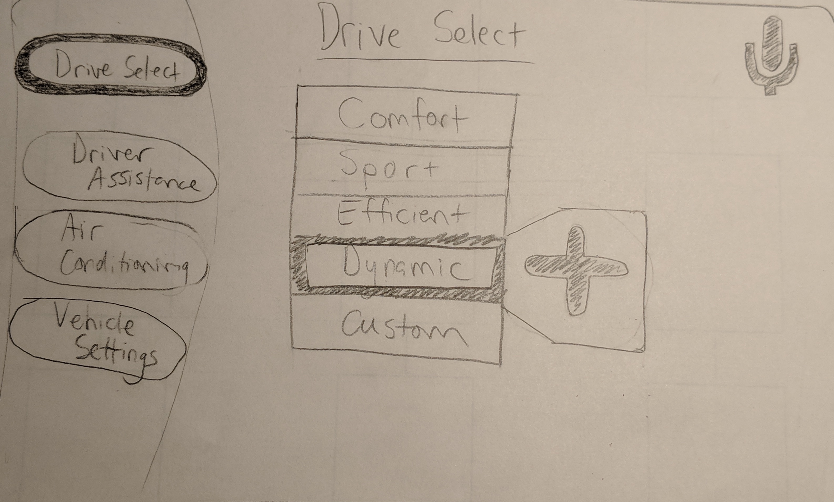
Several of the main menu options can be combined into a single selection, such as Maps and Navigation. The naming scheme for each menu option should also be clearer, for example "Vehicle" as a menu option is very ambiguous. Lastly, the home screen could be more effectively used to display all main menu options without having to scroll.
More tightly integrate Android Auto and Google Assistant
Currently, the Android Auto app sits on top of the existing interface. To access the features such as radio or vehicle controls, one has to exit Android Auto. Music and directions still play, but the experience could be improved. I would like to see the permanent use of Google Assistant integrated into the existing infotainment system. Instead of the poor voice commands currently in-use, Google machine learning could be deployed to search for and control all features of the car. This would simplify the navigation, calling and audio streaming tasks dramatically resulting in a safer and less stressful user experience.