In an effort to retain a lesson about issues involved with designing electronic presentations, we have retained old versions of parts of our web site.
Below are some design options we decided not to incorporate into our top level homepage:
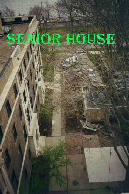
We originally planned to have a sequence of images showing the inside of Senior House in the style of a guided tour. We photographed these images, but ultimately did not use them.
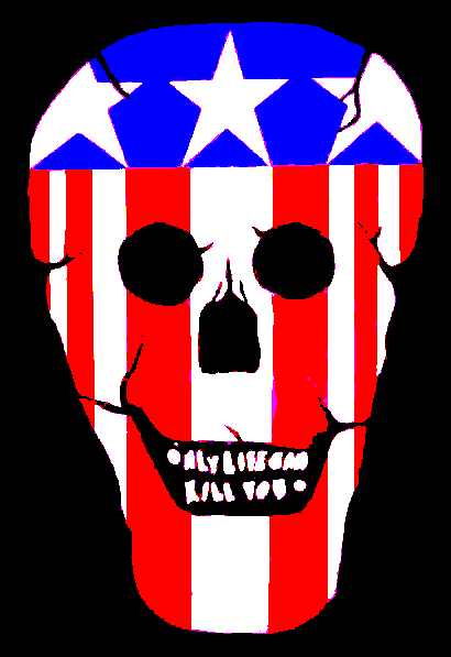
We decided that these images are too big, and that the purpose of our site should focus on the artwork of Senior House. We changed the introductory image to the Sport Death symbol. The following sequence shows the process by which we photographed the symbol and electronically enhanced the colors:
Original photo: 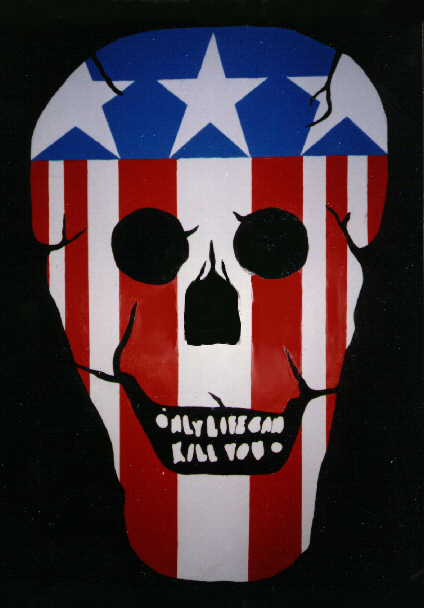 Modified image:
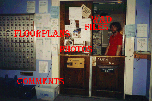
Finally, we worked on the buttons that link to the WAD files and new
Photo Gallery concept. Here are the original buttons:
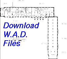
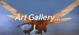 However, these buttons are too large and do not look like buttons.
Also, I used the transgif program to make the wad file icon
blend into the background. I thought this would be an enhancement, but
it turned out to make the button less visible.
However, these buttons are too large and do not look like buttons.
Also, I used the transgif program to make the wad file icon
blend into the background. I thought this would be an enhancement, but
it turned out to make the button less visible.