A Visual Guide to Swing Components
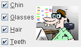
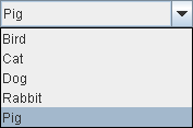
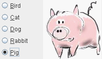
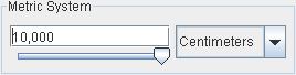
Basic Controls
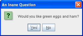
Simple components that are used primarily to get input from the user;
they may also show simple state.
|
|
|
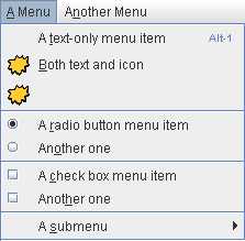
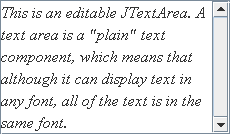
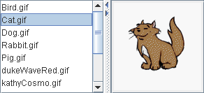
Interactive Displays of Highly
Formatted Information
These components display highly formatted information that
(if you choose) can be modified by the user.
|
|
|
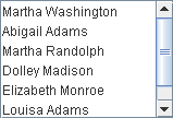
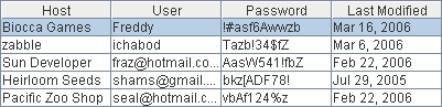
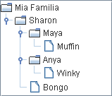
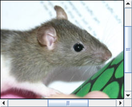
Uneditable Information Displays
These components exist solely to give the user information.
|
|
|
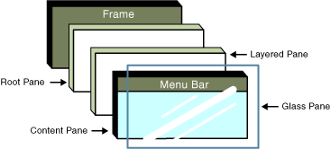
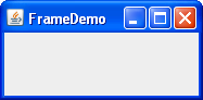
Top-Level Containers
At least one of these components must be present in any Swing
application.
|
|
|
General-Purpose Containers
These general-purpose containers are used in most Swing applications.
|
|
|
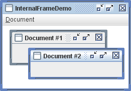
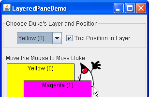
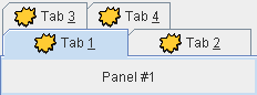
Special-Purpose Containers
These special-purpose containers play specific roles in the UI.
|
|
|

