This protocol was submitted by Matt Kaeberlein
Once you have finished the life span experiment, you should have data for 50 or so mother cells telling you the number of daughter cells produced by each given mother cell. I use Microsoft Excel to store and plot my data. First I'll deal with how to plot the data and then how to analyze the data to determine whether two strains have a statistically significant difference in life span.
I actually enter my raw data directly into an excel spreadsheet. You can download a sample spreadsheet from one of my life span experiments here.
A small example would look as follows.
| Mother Cell | Total Daughters | ||||||||||
| 1 | 1 | 1 | 2 | 2 | 1 | 2 | 1 | 1 | 2 | 13 | |
| 2 | 1 | 1 | 1 | 1 | 2 | 1 | 1 | 1 | 1 | 10 | |
| 3 | 1 | 1 | 1 | 1 | 0 | 0 | 0 | 0 | 0 | 4 | |
| 4 | 1 | 2 | 2 | 1 | 2 | 0 | 1 | 0 | 0 | 9 | |
| 5 | 1 | 1 | 1 | 1 | 1 | 2 | 2 | 1 | 0 | 10 | |
| 6 | 1 | 2 | 2 | 1 | 1 | 2 | 1 | 1 | 1 | 12 | |
| 7 | 1 | 1 | 2 | 2 | 2 | 2 | 2 | 2 | 2 | 16 | |
| 8 | 1 | 1 | 1 | 2 | 1 | 2 | 1 | 1 | 1 | 11 | |
| 9 | 1 | 1 | 1 | 2 | 1 | 1 | 1 | 1 | 1 | 10 | |
| 10 | 1 | 1 | 2 | 1 | 1 | 2 | 0 | 2 | 1 | 11 | |
You need to make a different spreadsheet for each strain. The data here would represent 9 timepoints (columns) for 10 mother cells (rows). The number displayed in each of the central boxes is the number of daughters removed from the given mother at the given timepoint.
The only data you actually end up plotting is found in the "total daughters" column. At the end of an experiment, the mean life span of your strain is obtained by calculating the mean of each number in the left most column.
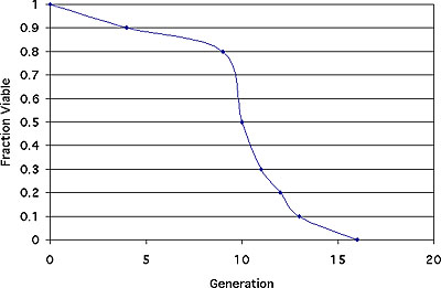
To plot the data, you first need to calculate the fraction (or percentage) of cells viable after n generations. I just make a table in Excel and do it manually. The table for the above data would look like this.
| Generation | Fraction of Cells Still Alive |
| 0 | 1 |
| 4 | 0.9 |
| 9 | 0.8 |
| 10 | 0.5 |
| 11 | 0.3 |
| 12 | 0.2 |
| 13 | 0.1 |
| 16 | 0 |
It's easiest if you first sort the data found in the "total daughters" column from Table 1 and then generate Table 2. See the sample life span file for more details. The resulting life span curve is shown below.
.
 |
 |
 |