| |
|
|
|
| |
|
|
|
| |
|
|
|
| |
|
|
|
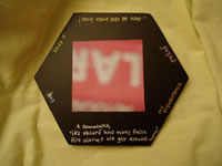
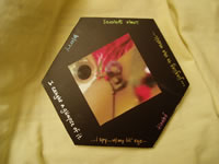
A close-up of a telephone cord brings to mind the phrase sometimes I get so frustrated. The wandering hand of a classmate picks up this segment, positions it next to an alarmist hexagon saying then all Hell broke loose!, and reads the juxtaposed fragments aloud. She recalls a difficult conversation, then tells her friends about the project. They think about how arguments have affected their lives.
Our project began with the desire to create a narrative that required users to travel through many levels of association. Users can explore the combinations arising from juxtaposition, memories, colors, and text.
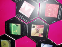
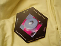
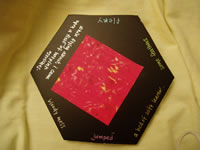
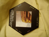
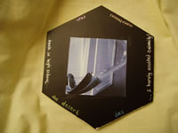
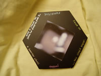
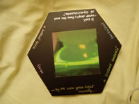
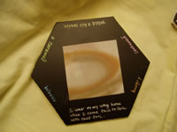
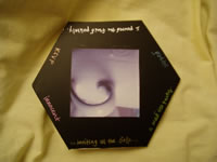
The inspiration for our images came from trivial objects that surrounded us in our dormitories or around campus; in essence, what we associate with our daily lives. Most of these photographs were intentionally blurry in order to eliminate any bias from users' previous experience with the subjects of these photos. The users could then associate pictures freely based on color, form, or lines.
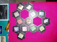
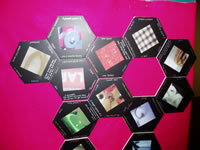
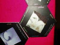
We then searched for a mode of connecting each picture, looking for shapes that could be easily combined. After looking at various polygons, hexagons were chosen for their uniformity and the easiness with which they could be juxtaposed. The six sides also provided ample space for different texts surrounding each picture.
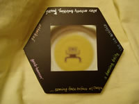
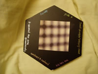
After choosing images that stimulated various feelings or ideas, we created texts that matched our own associations with the pictures. These texts were based either on the object or on the appearance of the picture. For example, the water fountain evoked the memory of back in high school, whereas the comforter cover looked like a geometrical grid and inspired the label of tic tac toe. To provide some structure, six categories of text were chosen for each side of a hexagon: noun, verb, adjective, phrase, random statement, and a sentence. These were color-coded by category: violet verbs, gold phrases, green nouns, blue adjectives, silver sentences, and orange random bits.
We tried to make the design as flexible as possible, in order to draw meaning from various combinations. When the user assembles these hexagons, the images and the texts will hopefully evoke associations in their minds. By providing partial narratives and showing readers pieces of our puzzle, we will create a web of associations that create narratives that are unique to each individual viewer.
The technical evolution of the project was fairly straightforward, driven by a continuous discovery of what didn't work, and improving on the next available strategy. The initial version consisted of three hexagons cut from foamcore. This foamcore was black on one side, and white on the other. The black color was aesthetically pleasing, separated the words and the images, and created a contrast that allowed the text to be easily readable. In effect, the black side reflected how the users were mostly in the dark. The white side would shed some light on the image itself, disclosing the subject of each photograph.
One of the initial hexagons was cut with sides that measured two inches in length. It was immediately determined to be insufficient; there just wasn't enough room for the images in effective combination with the text. The other hexagons, with three-inch-long sides, were deemed a perfectly spacious-yet-not-unwieldy size. These beginning versions had very rough edges, even after smoothing with sandpaper. This problem was resolved by using new blades to cut the foamcore of our final version, resulting in neat edges.
The images on the beginning version were printed on standard white paper and simply taped to the center of the hexagons. This non-uniform bonding made the edges of the paper curl up, so we replaced the tape with a gluestick, administering a uniform coating of adhesive.
We also considered laminating the hexagons with clear packaging tape in order to compensate for wear-and-tear. A number of variations on the laminating concept were attempted, including complete lamination of the hexagon, lamination of the image only, and no lamination. The packaging tape proved to be too shiny; the reflection of lights detracted from the images. The lamination was ruled out in favor of a plain matte appearance. We also used silvery gel pens to write the text, which stood out against the black background and complemented the simple style.
Beginning plans for the text included various parts of speech, phrases, sentences, and symbols. . The symbols became more of a stopping point or stumbling block, not really making sense in connecting each hexagon. We replaced the symbol category in favor of a wildcard bit of text. These range from monotonous to RSVP to a hamster wheel. The parts of speech worked well in combinations together, and we narrowed this field down to the verb, the noun, and the adjective. These three one-word categories were balanced by the longer sentences, phrases, and random bits. For consistency, we used verbs conjugated in the past tense, as well as only the pronouns it and I. These created segments similar to many narrative tales about past tasks.
Assembling the hexagons was initially going to have free-standing hexagons that one could store in a box like a jigsaw puzzle. However, due to the easily destructible material, we mounted the hexagons using Velcro and felt. The only color of felt available at the time of purchase was hot pink. At first nonplussed, we eventually realized that the bright hue contrasted with and emphasized the subtle black hexagons quite well.
With the symmetric black hexagons against a hot pink felt backdrop, the project immediately catches the eye of the reader. However, once the readers progress past the aesthetics of our project, minds immediately throw out the question, What the heck are we supposed to do with all of these pieces??
An essential focus of our project: leave it to the users' interpretations. There are no real instructions to follow, but the users must decide how to arrange the hexagons into some kind of pattern, which pictures look good next to each other, what order in which to read the text, which sides of the hexagons to read. We tested the finished product on the nonlinear narrative class at the Massachusetts Institute of Technology. Some of our guinea pigs tried to arrange the hexagons according to what they saw (or thought they saw) in the images, while others looked at the words and tried to control the story they created. An equally effective mode of arrangement involved throwing the pieces into the air and reading them where they landed.
After assembling and reading the stories created, additional meaning can be woven from the images accompanying the words. Some images may be exactly what the words are describing; however, some words could show a direct contrast to a reader's perception of the photograph. For example, the picture of the red hat is definitely fiery, but how is that connected to While flying about, I came upon a field of hot pink ostriches? No two readers will glean the same meaning from the same image, text, or combination thereof.
Each reader will mentally meander through the project by means of word, image, color, and/or shape association. The six levels of association that we identified are:
These colorful images, shapes, and texts will stimulate various connections between our narrative and the people it encounters. Rather than traveling chronologically, users will wander through invisible lines connecting our pieces to their puzzle.
|
|