Line graphs visualize trends among dense data sets, which are sometimes listed in an accompanying table in a report. Data points are plotted with relation to a vertical axis showing the dependent variable and a horizontal axis showing the independent variable. A line is then drawn through these points to display significant trends, as shown in Figure 8, an example of a single line graph.

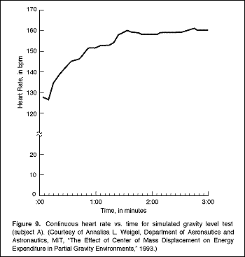
The intersection of the x and y axes is always the zero point. Put a break point on the y axis if the data span a range too large to fit in your graph, as shown in Figure 9.
If for some reason zero is not the starting point for your axes (because the values are too high, for example), then state that explicitly in prose within the figure or indicate it on the axes themselves.
To use line graphs effectively, follow these guidelines:
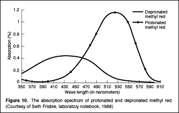
Multiple line graphs show comparison between two (or more) data sets for the same value, as shown in Figure 10, in which data for the item of study in Figure 8 are not compared with data for another item.