Understanding Max, Min, and Average graphs
by Bill Cattey
Last Modified: $Date: 2003/06/11 22:16:59 $
Understanding Max, Min, and Average graphsby Bill CatteyLast Modified: $Date: 2003/06/11 22:16:59 $ |
| On this page: |
24 Hour Caveat |
Maxused |
Minused |
Average
The graphs are of percent utilization for an entire day. |
|---|---|
|
24 Hour Caveat |
Important: The average is over a 24 hour day. This means that an average utilization of 33% means the seats in the cluster were fully utilized for an 8 hour workday. Private systems in offices are never expected to go above that utilization. When an Athena cluster shows above 33% average usage, and they often do, it means that students are going outside the professional work day to get work done. (Such is reasonable in a school.) This also means that if you see average usage above 66%, it means that students have to schedule times in all 3 shifts in order to get work done.) |
|
Maxused |
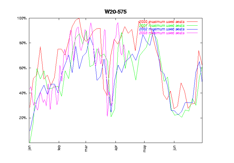
The "Maxused" graph is the highest percent utilization found through the whole day. If there is 100% in this graph, it means that at some point during the day all systems were in use and there were no seats free. This is useful for understanding peak usage, but we don't know if the usage was 100% for 5 minutes, or for the whole day. However, if this graph showed 0%, it would indeed mean that the cluster was empty for the whole day. 
This graph shows that there were indeed times when every seat was in use, and when lines were forming. These times seem to correspond to the end of term crunch time. The red year 2000 line appearing always higher than the green 2001 line both of which appear nearly always higher than the blue 2002 line is how we conclude that usage has been trending downwards. The appearance of the magenta 2003 line above one of the other lines is how we conclude that 2003 reverses the trend. This pattern of lines is visible in most of the usage graphs. |
|
Minused |
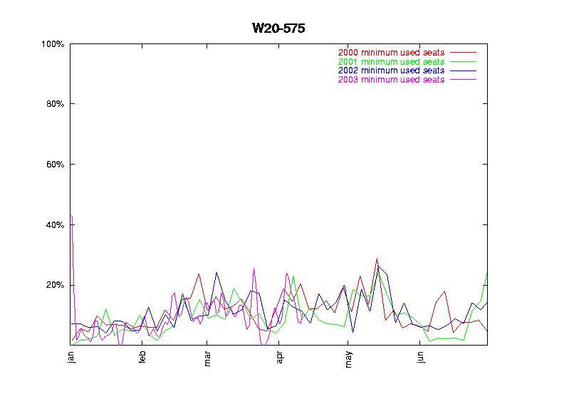
The "Minused" graph is the lowest percent found through the whole day. If there is 0% in this graph, it means that at some point during the day, no systems were in use and all seats were free. This is useful for understanding peak emptiness, but does not tell if all seats were free for 5 minutes, or the whole day. However, if this graph showed 100%, it would indeed mean that the cluster was full for the whole day. 
This graph shows that the Student Center Cluster was almost never empty, and that there were days when the minimum usage was nearly 30%, (i.e. that it went a whole day with a whole work-day-load of utilization). |
|
Average |
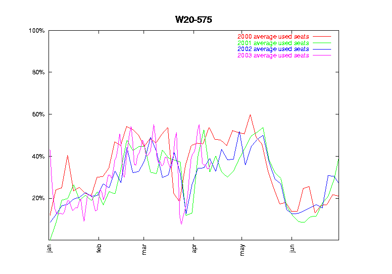
The average utilization is computed by summing the number of seats in use for each and every interval, and then dividing by the number of intervals. (There are 288 5-minute intervals in a day.) This 'average number of seats used' is then scaled as a percentage of the number of seats in the cluster to get an average percent utilization. This average, then gives us a good sense of how full the cluster is throughout the day. If every interval showed every seat in use, the average would be 100%, representing all seats in use for 24 hours. A 33% average utilization indeed would match all seats in use for an 8 hour workday. 
This graph shows that the student center is pretty much fully utilized for an 8 hour work day, and that we often approach the 66% utilization symptomatic of lots of work being done with users forced to come back a lot in the mornings and the evenings. |