Tools to analyze lists and blogs
• Tools to analyze Blogs and Lists
• Active worlds chat visualization tool kit
• http://iuni.slis.indiana.edu/tutorials/chatvis/
Instrument for Chats visualization (documentation enclosed)
Instrument for Chats visualization (documentation enclosed)
• Blobviz ***
• http://www.blogviz.com/blogviz/
Blogviz is a flash driven visualization model for mapping the transmission and internal structure of top links across the blogosphere. It explores the idea of meme propagation by assuming a parallel with the spreading of most cited URLs in daily weblog entries. Blogviz is currently a portrait of blogosphere’s topic activity during the first 64 days of 2005. Nevertheless, the model was developed to easily incorporate different timeframes. Blogviz will continue to expand in the future, to the possible point of including real-time data.
Blogviz is a flash driven visualization model for mapping the transmission and internal structure of top links across the blogosphere. It explores the idea of meme propagation by assuming a parallel with the spreading of most cited URLs in daily weblog entries. Blogviz is currently a portrait of blogosphere’s topic activity during the first 64 days of 2005. Nevertheless, the model was developed to easily incorporate different timeframes. Blogviz will continue to expand in the future, to the possible point of including real-time data.
• Groupscope
• http://www.groupscope.com/overview.html
source : Dean Krikorian, Ph.D., President groupscope.com
commercial
GroupScope software is designed to help individuals, groups, and organizations build and assess communication networks using innovative 2D and 3D visualization and dynamic network tools. Users can glean network patterns without knowledge of complex network statistics. We offer custom interface and data mining solutions, facilitating tailorable reports and minimal data entry
. example5-2.gif
source : Dean Krikorian, Ph.D., President groupscope.com
commercial
GroupScope software is designed to help individuals, groups, and organizations build and assess communication networks using innovative 2D and 3D visualization and dynamic network tools. Users can glean network patterns without knowledge of complex network statistics. We offer custom interface and data mining solutions, facilitating tailorable reports and minimal data entry
.
example5-2.gif
• Issue Scraper ****
• http://www.issuescraper.net/index.php
The IssueScraper is a Software that performs comparative analysis of blogs and news. It watches the movement of stories across media spaces. It is built with wizards to enable step-by-step story mapping. The software also has a free analysis path.
The IssueScraper is a Software that performs comparative analysis of blogs and news. It watches the movement of stories across media spaces. It is built with wizards to enable step-by-step story mapping. The software also has a free analysis path.
• Netscan***
• http://netscan.research.microsoft.com/
The Netscan System provides detailed reports on the activity of Usenet newsgroups, the authors who participate in them, and the conversation threads that emerge from their activity. Using the Netscan tool users can get reports about any newsgroup for any day, week, month, quarter, or year, since September 1999.
Netscan data is updated .
Netscan can be used to:
• Find newsgroups where others share your unique interests.
• Monitor the health of newsgroups related to your interests and pursuits.
• Stay informed on current events and the latest trends.
• Locate sources for technical assistance and information.
• Examine troubling issues and hot topics not covered in product documentation.
• Track the participation of your favorite authors across Usenet newsgroups.
• Social circles *
• http://www.marumushi.com/apps/socialcircles/
Social Circles is a web application that reveals the social networks that emerge in mailing lists. dynamic option (play) but restricted to certain mailing lists
Social Circles is a web application that reveals the social networks that emerge in mailing lists. dynamic option (play) but restricted to certain mailing lists
• Observatoire presidentielle ****
• http://www.observatoire-presidentielle.fr/
Le site Observatoire Présidentielle 2007 de RTGI SAS est un lieu de veille et d'analyse du web consacré aux prochaines élections présidentielles. Le Tendançologue permet de suivre le bruit médiatique que font les principaux hommes politiques (analyse sites d'actualités en ligne, les blogs et les newsgroups ou groupes de discussion) le µtendançologue présente la courbe de l'indice weBuzz qui est le cumul du bruit généré par chaque présidentiable sur ces trois sphères d'information et a Blogopole c'est l'ensemble des blogs de citoyens qui alimentent le débat politique en France c'est à dire tant les hommes politiques, les militants, les sympathisants que les commentateurs et analystes. tout ceci etant tres bien explique sur leur site.
Le site Observatoire Présidentielle 2007 de RTGI SAS est un lieu de veille et d'analyse du web consacré aux prochaines élections présidentielles. Le Tendançologue permet de suivre le bruit médiatique que font les principaux hommes politiques (analyse sites d'actualités en ligne, les blogs et les newsgroups ou groupes de discussion) le µtendançologue présente la courbe de l'indice weBuzz qui est le cumul du bruit généré par chaque présidentiable sur ces trois sphères d'information et a Blogopole c'est l'ensemble des blogs de citoyens qui alimentent le débat politique en France c'est à dire tant les hommes politiques, les militants, les sympathisants que les commentateurs et analystes. tout ceci etant tres bien explique sur leur site.
• Technorati **
• http://technorati.com/
Currently tracking 112.8 million blogs and over 250 million pieces of tagged social media.
Technorati is the recognized authority on what's happening on the World Live Web. The Live Web is the dynamic and always-updating portion of the Web. search, surface, and organize blogs and the other forms of independent, user-generated content (photos, videos, voting, etc.) increasingly referred to as “citizen media.”But it all started with blogs. A blog, or weblog, is a regularly updated journal published on the web. Some blogs are intended for a small audience; others vie for readership with national newspapers. Blogs are influential, personal, or both, and they reflect as many topics and opinions as there are people writing them.
• Examples of Blogs visualization
• Anymails
• http://carohorn.de/anymails/
a dynamic visualization of an email inbox, based on the metaphor of microbes. all emails are categorized in 6 person groups: family and friends, school, job, e-commerce, unclassified, & spam.An animal conveys the condition of an email message: the age of an email is shown by the size & opacity of the animal. the status of an email (i.e. unread, read, responded) is shown by the number of hair/feet & velocity. users can select messages & group them by different attributes, such as sender, status or time.
a dynamic visualization of an email inbox, based on the metaphor of microbes. all emails are categorized in 6 person groups: family and friends, school, job, e-commerce, unclassified, & spam.An animal conveys the condition of an email message: the age of an email is shown by the size & opacity of the animal. the status of an email (i.e. unread, read, responded) is shown by the number of hair/feet & velocity. users can select messages & group them by different attributes, such as sender, status or time.
• Digg Labs
• http://labs.digg.com/
Example of Digg visualization. Digg is a place for people to discover and share content from anywhere on the web. From the biggest online destinations to the most obscure blog, Digg surfaces the best stuff as voted on by users. It is a place where people can collectively determine the value of content.
Example of Digg visualization. Digg is a place for people to discover and share content from anywhere on the web. From the biggest online destinations to the most obscure blog, Digg surfaces the best stuff as voted on by users. It is a place where people can collectively determine the value of content.
• Email Map
• http://christopherbaker.net/projects/mymap
Author(s):
Christopher Paul Baker
Institution:
(unknown)
Year:
2007
URL:
http://christopherbaker.net/projects/mymap
Project Description:
This Email Map, created by Christopher Baker, is a piece of custom designed software capable of rendering the relationships between Christopher and individuals in his address book by examining the TO:, FROM:, and CC: fields of every email in his email archive. The intensity of the relationship is determined by the intensity of the line. The tool allows one to explore different relational groupings and periods of time, revealing the temporal ebbs and flows in various relationships. In this way, this tool is a veritable self-portrait, a reflection of Christopher's associations and a way to locate himself at various points in history.
As the author explains: "Email became an integral part of my life in 1998. Like many people, I have archived all of my email with the hope of someday revisiting my past. I am interested in revealing the innumerable relationships between me, my schoolmates, work-mates, friends and family. This could not readily be accomplished by reading each of my 60,000 emails one-by-one".
This project can be viewed as a large scale static print (40"x40" archival inkjet) or as an up-to-date dynamic visualization. The interactive program is written in Java and uses Processsing, MySQL and various other libraries. The software includes a custom IMAP email client and a VCF address book parser, which enables the inclusion of VCard photos. This particular visualization strategy was influenced by similar circular relational structures such as CAIDA, SCHEMABALL, GNOM, etc. Much of my initial email visualization research was influenced and inspired by the work of Judith Donath's Sociable Media Group at MIT - particularly the work of Fernanda Viegas.
• ITP Students list conversation / ex
•
http://www.auscillate.com/itp/listview/
Author(s):
Josh Knowles
Institution:
(unknown)
Year:
2007
URL:
http://www.auscillate.com/itp/listview/
Project Description:
ITP Student List Conversations is a visualization of the e-mail conversations that have occurred on the ITP (NYU graduate program) student e-mail list. The amount of conversation between two people is determined by how much they participate in the same discussion threads.
The strength of the connection between two people is determined by multiplying the number of e-mails they each send to the same thread and adding together these numbers for each thread. So if you and I each sent 1 message to a thread, we get 1 connection "point" added to our "score." If we each sent 3 messages to a different thread, we would get 9 connection points (3x3). More connection points are represented by heavier lines connecting two people.
The project was developed using Processing along with some PHP and MySQL, and it traced messages sent between September 1st, 2006 and January 10th, 2007.
http://www.auscillate.com/itp/listview/
Author(s):
Josh Knowles
Institution:
(unknown)
Year:
2007
URL:
http://www.auscillate.com/itp/listview/
Project Description:
ITP Student List Conversations is a visualization of the e-mail conversations that have occurred on the ITP (NYU graduate program) student e-mail list. The amount of conversation between two people is determined by how much they participate in the same discussion threads.
The strength of the connection between two people is determined by multiplying the number of e-mails they each send to the same thread and adding together these numbers for each thread. So if you and I each sent 1 message to a thread, we get 1 connection "point" added to our "score." If we each sent 3 messages to a different thread, we would get 9 connection points (3x3). More connection points are represented by heavier lines connecting two people.
The project was developed using Processing along with some PHP and MySQL, and it traced messages sent between September 1st, 2006 and January 10th, 2007.
• Segoland
• http://www.desirsdavenir.org/index.php?c=blogs_annuaire
Author(s):
(unknown)
Institution:
desirsdavenir.org
Year:
2007
URL:
http://www.desirsdavenir.org/index.php?c=blogs_annuaire
Project Description:
Segoland is a visual representation of 1054 local blogs and websites that supported the 2007 French presidential candidate, Segolene Royal. It displays an intricate network of sites, divided by political party and geographically placed throughout the French territory. By materializing the existing bonds between them, this chart makes it possible to emphasize the vast network of influences on the Web.
• The map is the territory
• http://www.aalab.net/projects/maps/
Visualizing on-line community, links to conversation maps (the warren sacks one or some of the media lab projects)
Visualizing on-line community, links to conversation maps (the warren sacks one or some of the media lab projects)
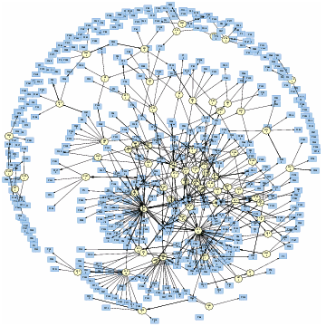
• The political Blogosphere
• http://www.issuenetwork.org/pres/news_networks2/images/8.gif
uthor(s):
Jodi Dean, Zachary Devereaux and Andrei Mogoutov
Institution:
Govcom.org Foundation, Amsterdam
Year:
2004
URL:
http://www.issuenetwork.org/pres/news_networks2/images/8.gif
Project Description:
The Govcom.org Foundation, an Amsterdam-based organization dedicated to creating and hosting political tools on the Web, and its collaborators have developed a software tool that locates and visualizes networks on the Web. The Issue Crawler, at http://issuecrawler.net, is used by NGOs and other researchers to answer questions about specific networks and effective networking more generally. One may also do in-depth research with the software.
This image represents the entangled network of the most popular political blogs on the net. The graph build with Issue Crawler was produced by John Hawkin for issuenetwork.org (the workshop site by the Govcom.org Foundation), using a list available at rightwingnews.com
• The world as a blog
• http://www.brainoff.com/geoblog/
Real time & updating display of weblog postings, around the world, great but useless
Real time & updating display of weblog postings, around the world, great but useless
• Twingly
• http://www.visualcomplexity.com/vc/project.cfm?id=468
Author(s):
(unknown)
Institution:
Primelabs, Sweden
Year:
2006
URL:
http://www.twingly.se/ScreenSaver.aspx
Project Description:
Twingly screensaver tries to map the global activity of the blogosphere in a dynamic 3D globe view of the Earth. The engaging visualization is a real time rendering of blog posts represented as bars standing over the continents. The motivation of the Primelabs team is obvious: "The fact that every blog is an ordered record of thoughts and opinions makes the aggregated data of many blogs very valuable. With a large amount of data from various blogs it is possible to analyze the spread of ideas and monitor the effects of a campaign or public knowledge of a brand. Without the time axis, a statistical report is just a snapshot in time. With the concept of time, a new dimension is added to the equation."
As the authors explain in their blog: "Twingly is an aggregation of the global blogosphere into a single database. The immense power of this data will be made available to our customers through a number of applications. With sustained innovation over a long period of time we are continously improving the tools available for connecting to the blogosphere".
To use Twingly screensaver you need a PC with Windows and a graphics card supporting OpenGL.
• Visualizing online social roles
• http://www.cmu.edu/joss/content/articles/volume8/Welser/
a collection of data visualization methods that reveal the specific characteristics of communications between Usenet newsgroups members. the visual analysis focuses on distinguishing "signatures of role", such as identifying so-called "answer people", individuals whose dominant behavior is to respond to questions posed by other users.
for instance, the "authorlines" visualization represents the volume of contributions for a single author across a year. each vertical strip represents one week. each circle represents a thread in which the actor participated during this week. red circles represent threads initiated by the selected author, while blue circles indicate threads initiated by someone else that were replied to by the selected author. the diameter of a circle represents the number of messages posted by author to that thread during that week.
• Visualization of blogspace
• http://www.visualcomplexity.com/vc/project_details.cfm?id=422&index=422&domain=
Jonathan Schull visualizations of Blogspace ( BlogTree.com, blog genealogy site). Each registered blog owner records the pre-existing blogs that inspired their own blog. made with python to crunch the data and re-cast for graphviz. Graphviz lays the graphs out and renders them.
Jonathan Schull visualizations of Blogspace ( BlogTree.com, blog genealogy site). Each registered blog owner records the pre-existing blogs that inspired their own blog. made with python to crunch the data and re-cast for graphviz. Graphviz lays the graphs out and renders them.
• We feel fine
• http://www.wefeelfine.org/mission.html
Exemple de representation / capture des emotions sur le web/blog =interessant / a importer pour weblog science / interessant a exploiter si exhibition (ressemble a Hansen / listening post)
Exemple de representation / capture des emotions sur le web/blog =interessant / a importer pour weblog science / interessant a exploiter si exhibition (ressemble a Hansen / listening post)