Massachusetts Institute of Technology
Department of Urban Studies and Planning
| 11.188: Urban Planning and Social
Science Laboratory |
| 11.205: Intro to Spatial Analysis (1st half-semester) |
| 11.520: Workshop on GIS (2nd half-semester) |
Lab Exercise 5: Raster Spatial Analysis
Out: Wednesday, March 31, 2021, 2:30 pm (EST) --
Due: Wednesday, April 7, 2021, 2:30pm (EST)
Overview
The purpose of this lab exercise is to exercise some of these
spatial analysis methods using raster models of geospatial phenomena. Thus
far, we have represented spatial phenomena as discrete features modeled in
GIS as points, lines, or polygons--i.e., so-called 'vector' models of
geospatial features. Sometimes it is useful to think of spatial phenomena
as 'fields' such as temperature, wind velocity, or elevation. The spatial
variation of these 'fields' can be modeled in various ways including
contour lines and raster grid cells. In this lab exercise, we will focus
on raster models and examine various ways to work with
raster files in QGIS.
We will use raster models to create a housing value 'surface' for
Cambridge. A housing value 'surface' for Cambridge will show the high-
and low-value neighborhoods much like an elevation map shows height. To
create the 'surface' we will explore QGIS's tools for converting vector
data sets into raster data sets--in particular, we will 'rasterize' the
1989 housing sales data for Cambridge and the 1990 Census data for
Cambridge block groups.
The block group census data and the sales data contain relevant
information about housing values, but the block group data may be too
coarse and the sales data may be too sparse. One way to generate a
smoother housing value surface is to interpolate the housing value at
any particular location based on some combination of values observed for
proximate housing sales or block groups. To experiment with such
methods, we will use a so-called 'raster' data model and some of QGIS's
capabilities.
The computation needed to do such interpolations involve lots of
proximity-dependent calculations that are much easier using a so-called
'raster' data model instead of the vector model that we have been using.
Thus far, we have represented spatial features--such as Cambridge block
group polygons--by the sequence of boundary points that need to be
connected to enclose the border of each spatial object--for example, the
contiguous collection of city blocks that make up each Census block
group. A raster model would overlay a grid (of fixed cell size) over all
of Cambridge and then assign a numeric value (such as the block group
median housing value) to each grid cell depending upon, say, which block
group contained the center of the grid cell. Depending upon the grid
cell size that is chosen, such a raster model can be convenient but
coarse-grained with jagged boundaries, or fine-grained but overwhelming
in the number of cells that must be encoded.
In this exercise, we only have time for a few of the many types of
spatial analyses that are possible using raster data sets. Remember that
our immediate goal is to use the cambbgrp and sales89
data to generate a housing-value 'surface' for the city of Cambridge.
We'll do this by 'rasterizing' the block group and sales data and then
taking advantage of the regular grid structure in the raster model so
that we can easily do the computations that let us smooth out and
interpolate the housing values.
The in-lab discussion notes are here: Lab #5 notes
I. Setting Up Your Work Environment
Launch QGIS and add the five data layers listed below (after copying
them to a local drive using the method described in earlier lab
exercises):
|
|
Census 1990 block group polygons for Cambridge |
- Q:\data\cambbgrp_point.shp
|
Census 1990 block group centroids for Cambridge |
|
|
U.S. Census 1990 TIGER file for Cambridge |
- Q:\data\camborder polygon.shp
|
Cambridge polygon |
|
|
Cambridge Housing Sales Data |
Since your access to the class data locker may be limited, we have
bundled all these shapefiles into a zipped file that also contains a
startup QGIS project document saved in two formats. This zipfile
is called lab5_raster.zip and can be found under
"Materials" on Stellar.
II. Converting a vector file to raster
As an example, we will see how to convert the camorder
polygon.shp file from a vector format to a raster format. This
is a single-polygon shapefile that contains the boundary of the City of
Cambridge. How many rows does this file have?
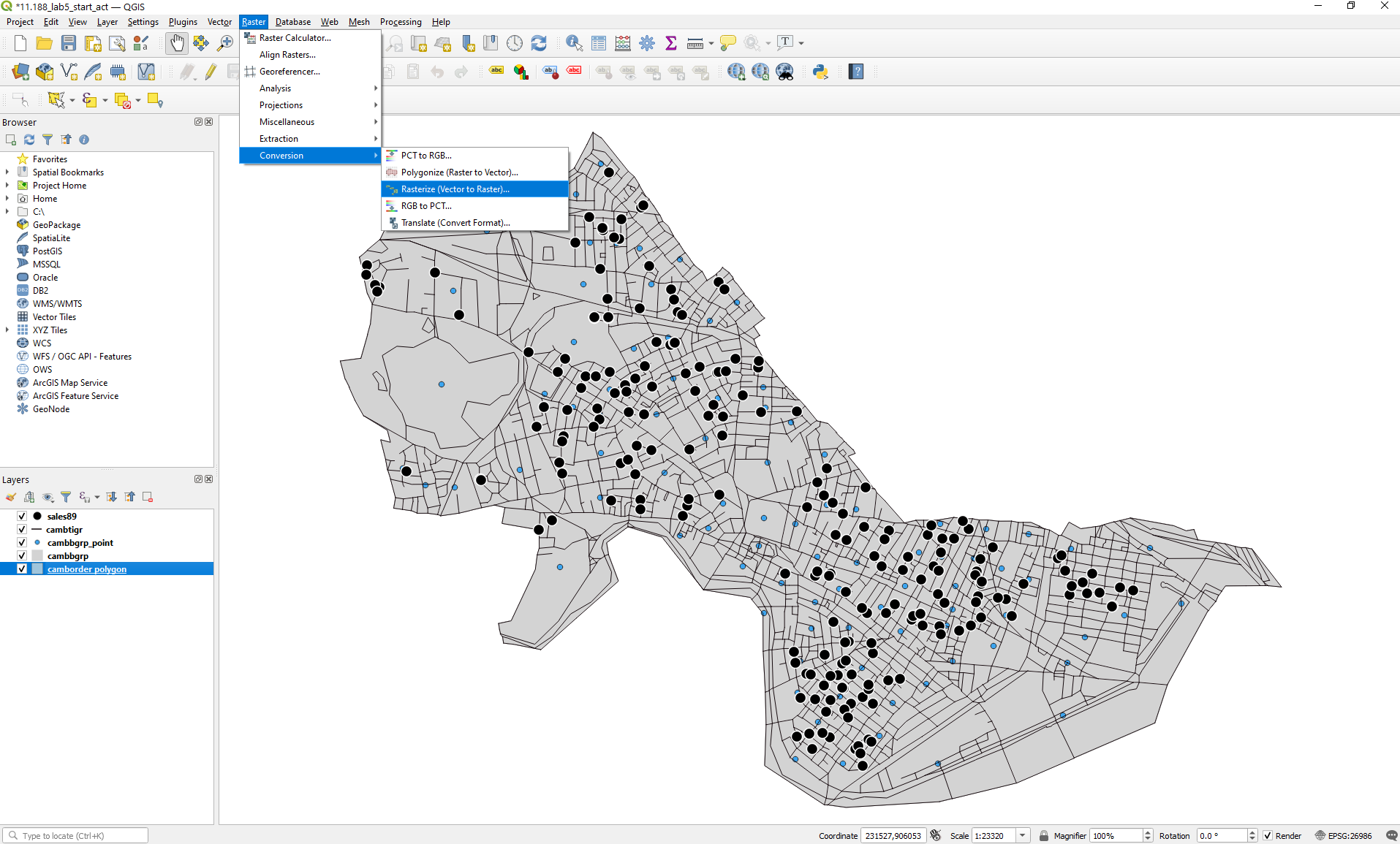
Click on "Raster" in the top ribbon in your QGIS window.
Then, scroll down to "Conversion" and select the "Rasterize
(Vector to Raster)" option.
- Select camborder polygon as the input layer
- Select "pixels" as the output raster size units
- What should we select for horizontal and vertical
resolutions (width and height)? What implications will our
choice of these values (high/low) have?
- When selecting the output extent, use the "Calculate from
layer" option to select the same extent as the camborder
polygon layer
- Save the output to a file on your local disc; name the file "cambordergd"
- Click "Run" to apply these settings
If successful, the cambordergd layer will be added to
the data frame window. Why is it not visible even when turned
on?
Since we did not join any other feature attributes to the grid, there
is only one row in the attribute table -- attribute tables for
raster layers contain one row for each unique grid cell value.
Since all our grid cells have the same COUNTY value, there is only one row
in this case.
III. Interpolating Housing
Values Using SALES89
This part of the lab will demonstrate some raster techniques for
interpolating values for grid cells (even if the grid cell does not
contain any sales in 1989). This is the first of two methods, we will
explore to estimate housing values in Cambridge. Keep in mind that there
is no perfect way to determine the value of real
estate in different parts of the city.
A city assessor's database of all properties in the city would
generally be considered a good estimate of housing values because the
data set is complete and maintained by an agency which has strong
motivation to keep it accurate. This database does have drawbacks,
though. It is updated at most every three years, people lobby for the
lowest assessment possible for their property, and its values often lag
behind market values by several years.
Recent sales are another way to get at the question. On the one hand,
recent sale numbers are believable because the price should reflect an
informed negotiation between a buyer and a seller that results in the
'market value' of the property being revealed (if you are a believer in
the economic market-clearing model). However, the accuracy of such data
sets are susceptible to short-lived boom or bust trends, not all sales
are 'arms length' sales that reflect market value and, since individual
houses (and lots) might be bigger or smaller than those typical of their
neighborhood, individual sale prices may or may not be representative of
housing prices in their neighborhood.
Finally, the Census presents us with yet another estimate of housing
value--the median housing values aggregated to the block group level.
This data set is also vulnerable to criticism from many angles. The
numbers are self-reported and only a sample of the population is asked
to report. The benefit of Census data is that they are widely available
and they cover the entire country.
We will use sales89 and cambbgrp to
explore some of these ideas. Let's begin with sales89.
The sale price is a good indication of housing value at the time and
place of the sale. The realprice column has
already adjusted the salesprice to account
for the timing of the sale by adjusting for inflation. How can we use
the sales89 data to estimate housing values for
locations that did not have a sale? One way is to estimate the housing
value at any particular location to be some type of average of nearby
sales. Try the following:
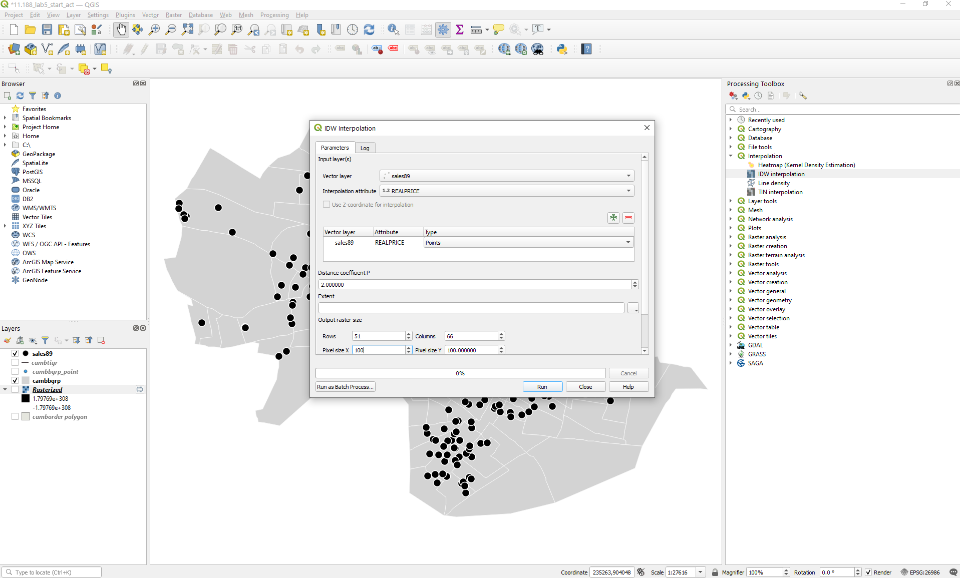
- Click on "Processing" in the top ribbon of your
QGIS window and select the "Toolbox" option
- Search for "Interpolation" in the Processing
Toolbar and expand it
- Select the "IDW interpolation" option (What
is IDW?)
- Vector layer: sales89
- Interpolation attribute: REALPRICE
- Click on the green "+" button to add this
combination
- Distance coefficient: 2 (default)
- Extent: Calculate from layer camborder polygon
- Output raster size:
- Pixel size X: 100
- Pixel size Y: 100
- Interpolated: sales89_pw2_1
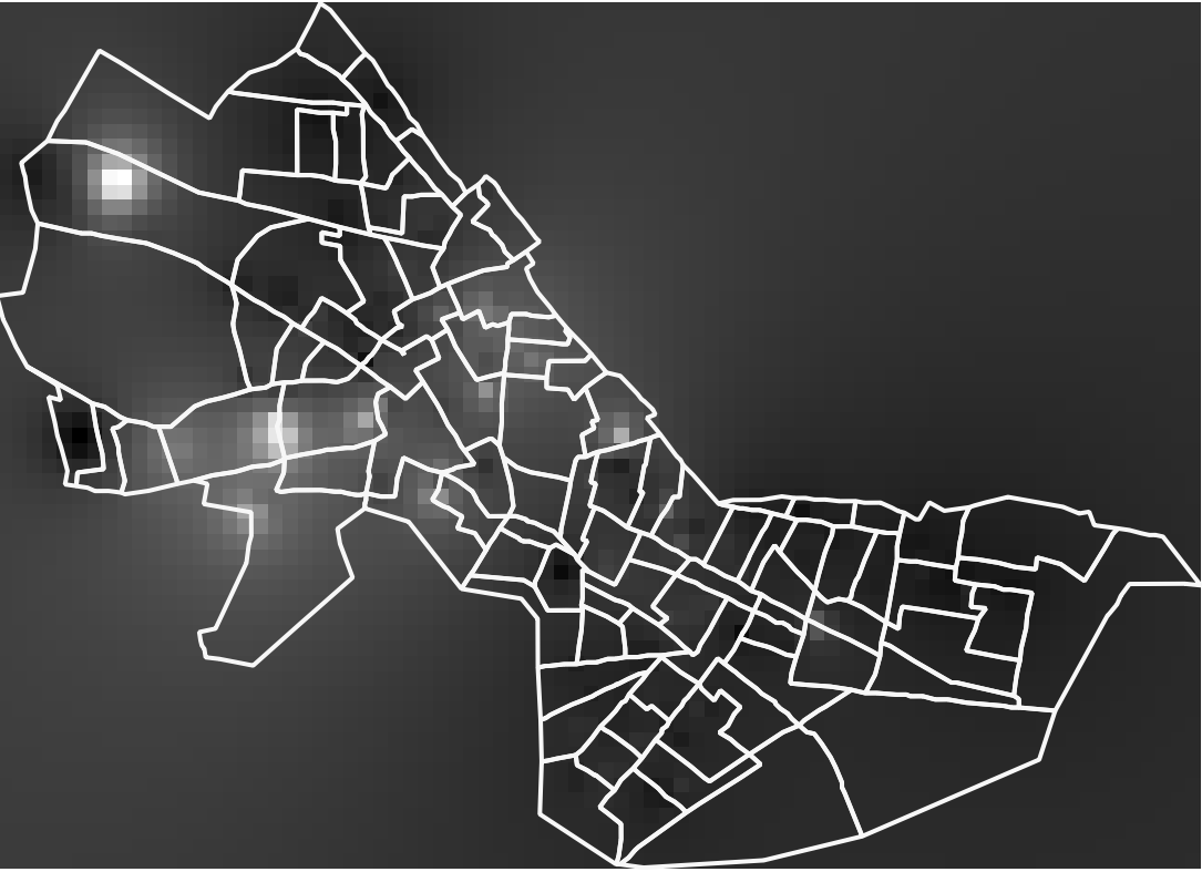
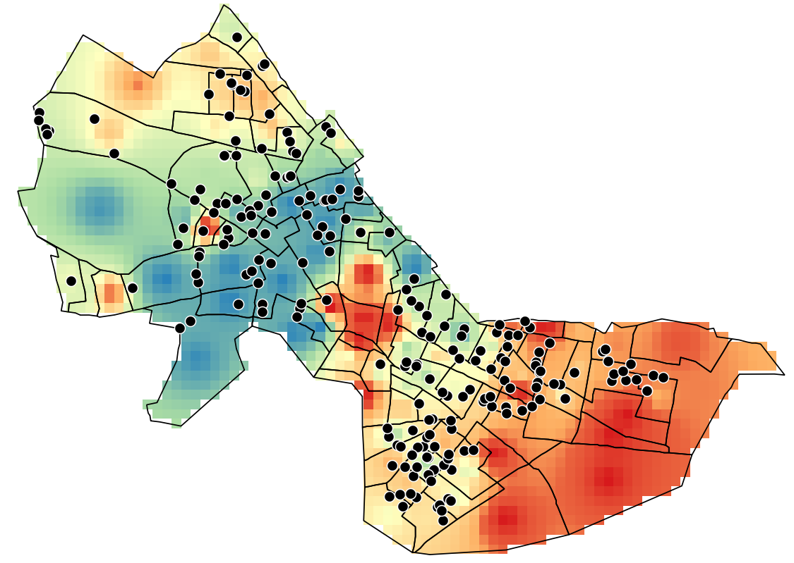
Click on "Run". You should see something like the following: (I
made the fill transparent and the border bold white for the cambbgrp
layer so the block groups show up for context)
The interpolated surface is shown thematically by shading each cell
dark or light depending upon whether that cell is estimated to have a
lower housing value (darker shades) or higher housing value (lighter
shades). Based on the parameters we set, the cell value is an inverse-distance
weighted average of all the sales. Since the power factor was
set to the default (2), the weights are proportional to the square of
the inverse-distance. This interpolation heuristic seems reasonable,
but the resulting map doesn't tell us much about the spatial
variation. The surface extends far beyond the Cambridge borders (all
the way to the rectangular bounding box that covers Cambridge).
How about introducing a graduated symbology?
- Right-click on the sales89_pw2_1 layer and
click on "Properties"
- Navigate to the "Symbology" layer - this looks a
little different from what you'd seen earlier for vector layers
- Select "Singleband pseudocolor" as the render
type
- Select "Spectral" as the color ramp (this is
merely a personal design choice; you can choose any other color
ramp)
- Now invert the color ramp so low values are blue and high values
are red (a personal design choice again)
- Select "Quantile" as the mode and 9
classes
- You can choose to select "0" as the label
precision for better legibility (a personal design choice)
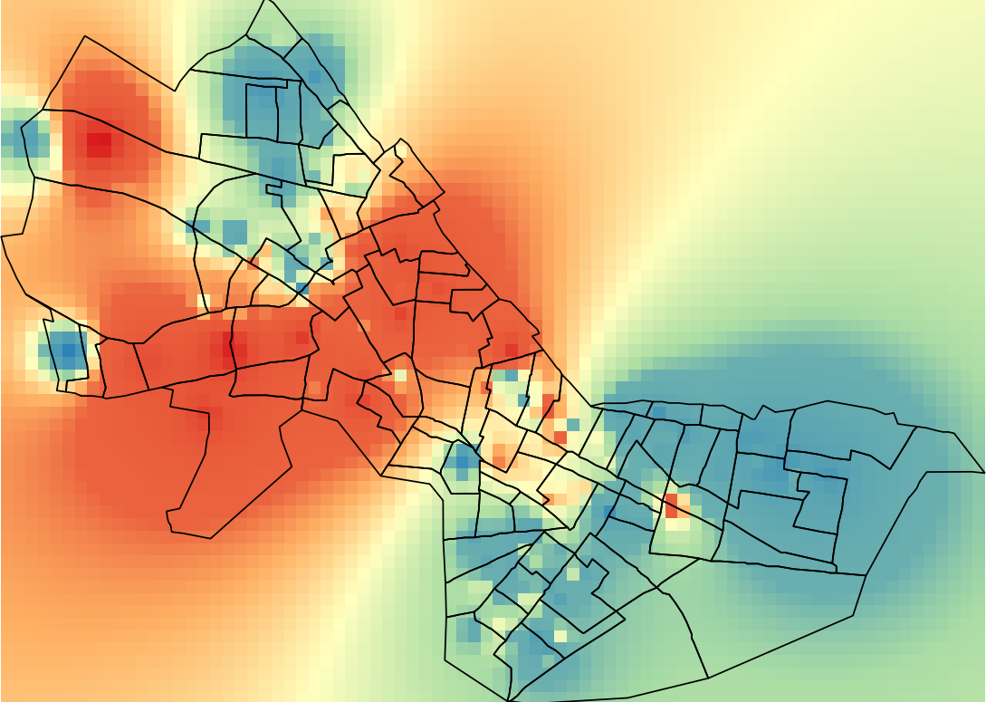
You should see something like the following: (I changed the
border color to black for the cambbgrp layer for
legibility)
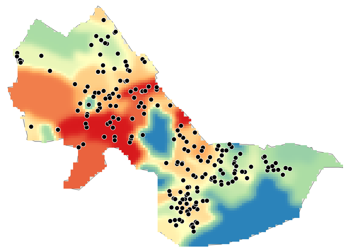
This is much better. We can clearly see spatial variation in housing
sale prices (red: high, blue: low). But why are we seeing a rectangle?
Can we 'clip' (or 'mask' in raster terminology) this rectangle to the
boundary of the City of Cambridge? Try the following:
- Click on "Raster" in the top ribbon of your QGIS
window
- Select the "Extraction" option and then the "Clip
Raster by Mask Layer" feature
- For the pop-up window, select the following:
- Input layer: sales89_pw2_1
- Mask layer: camborder polygon
- Check the box for "Keep resolution of input layer"
- Save the output file as sales89_pw2_2
You'll find that the output file sales89_pw2_2
follows the boundary of Cambridge. Unfortunately, it is a
monochromatic blob. Go through the steps to adopt a symbology that we
discussed above, and you'll see the following:
Note that all the values inside Cambridge are the same as before, but the
cells outside Cambridge are 'masked off'. Why did the values
inside Cambridge not change?
To understand how good the interpolation is, let us consider the
highest-valued sale as an example. This sale is located in the
north-west corner of Cambridge and has SALES89_ID
= 55, PRICE = 1425000, REALPRICE
= 1430435.66. Use the "Identify Features" tool (Ctrl +
Shift + I, or the icon with an arrow over an "i" symbol in the QGIS top
ribbon) to identify this particular sale. After turning on this feature,
right-click on the point with this sale and select "Identify All".
Within the "Identify Results" pane, you'll find all
active layers containing that point to show up. Look at sales89_pw2_2
and expand the layer until you see a 'Band 1' value. How
much is the interpolated value? [To be reported in assignment]
To get some idea of how the power coefficient will affect the result,
redo the interpolation (using the same mask) with the power set to
different values (0, 1, 2, 3, 4, and 5). Use the "Identify
Features" tool to obtain the interpolated values for the grid
cell containing the highest-valued sale. How do you think
the interpolated values will change with respect to the power
coefficient? Are higher values of the power coefficient better? What
tradeoffs are implicit in our selection of an appropriate power
coefficient? [To be reported in assignment]
[Side Note] None of these interpolation
methods is 'correct'. Each is plausible based on a heuristic
algorithm that estimates the housing value at any particular point to be
one or another function of 'nearby' sales prices. The general method of
interpolating unobserved values based on location is called 'kriging'
(named after South African statistician and Mining Engineer Danie G.
Krige) and the field of spatial statistics studies how best to do the
interpolation (depending upon explicit underlying models of spatial
variation).
IV. Interpolating Housing
Values Using CAMBBGRP
Another strategy for interpolating a housing value surface would be to
use the median housing value field, MED_HVALUE, from
the census data available in cambbgrp. There are
several ways in which we could use the block group data to interpolate a
housing value surface. One approach would be exactly analogous to the sales89
method. We could assume that the block group median was an appropriate
value for some point in the 'center' of each block
group. Then we could interpolate the surface as we did above if we
assume that there was one house sale, priced at the median for the block
group, at each block group's center point. A second
approach would be to treat each block group median as an average value
that was appropriate across the entire block group. We could then
rasterize the block groups into grid cells and smooth the cell estimates
by adjusting them up or down based on the average housing value of
neighboring cells.
Let's try the first approach. This approach requires block group
centroids, which are provided in the cambbgrp_point
shapefile. Creating a centroid shapefile from a polygon
shapefile is fairly straightforward if you use the "Centroids"
Geometry tool for vector layers. Look at this
link for more detailed instructions.
- Choose the 'Processing > Toolbox >
IDW interpolation' tool.
- Select cambbgrp_point as your input layer and MED_HVALUE
as your interpolation attribute. Keep the default settings for the
other fields.
- Set the extent to be the same as camborder polygon,
and the pixel sizes to be 100.
- Name this layer hvalue_point and run the analysis.
- Mask the layer to the border of Cambridge and apply the graduated
symbology (Quantile with 9 classes) described above.
- Call this layer hvalue_point_2.
How much is the interpolated value in the grid cell within
hvalue_point_2 containing
the highest-valued sale? [To be reported in assignment]
Next, let's use the second approach (that is, using the census block
group polygon data) to interpolate the housing value surface from the
census block group data.
- Convert the cambbgrp shapefile to a raster file
using MED_HVALUE as the 'burn-in' field and the
pixel size as 100x100; keep other default settings
- Name the output layer cambbgrpgd
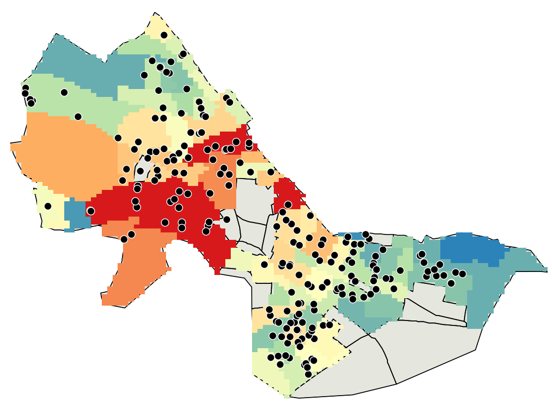
You should see the following after applying the graduated symbology:
How is this different from the previous interpolation with
centroids? Why are there gray-colored holes in this interpolation?
Let's go through the process of rasterizing cambbgrp
again, but with one difference. This time around, we will assign a value
of 1 as a "specified nodata value to output bands".
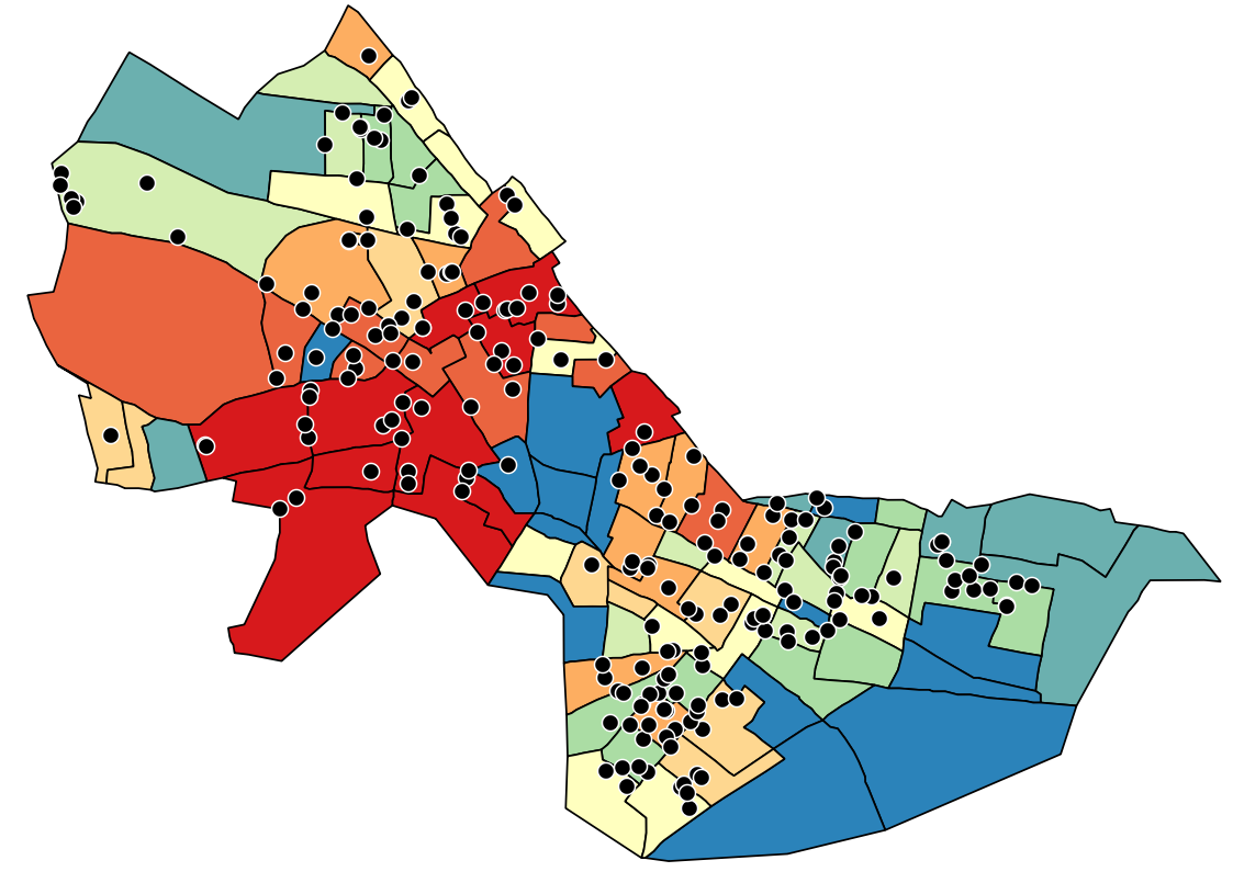
We see the following for the new output layer (call it cambbgrpgd_2):
Why does it look (almost) exactly like the vector-based
thematic map of median housing value? What would happen if we
reduced the pixel size from 100x100 to 1x1?
Let us now smooth the cambbgrpgd_2 grid layer using a
filter tool. Filters are often used in image processing (e.g., satellite
images) where each cell value is recalculated to be the average of all
the neighboring cells - a 'weighted focal mean'.
This is done so that we can obtain smooth transitions of cell values and
minimize abrupt changes or drop-offs - essentially with the objective of
creating a smooth surface. Try the following:
- Click on "Processing" in the top ribbon of the
QGIS window and open up "Toolbox"
- Look for "SAGA", expand it, and go to the "Raster
filter" option
- Select the "Gaussian filter" tool (there are
other filters available here, but we are using Gaussian filter for
simplicity; you can read more about these filters here
or in the QGIS
documentation)
- Grid: cambbgrpgd_2
- Standard Deviation: 1 (default)
- Search Mode: Circle
- Search Radius: 3 (default)
- Filtered Grid: cambbgrpgd_3
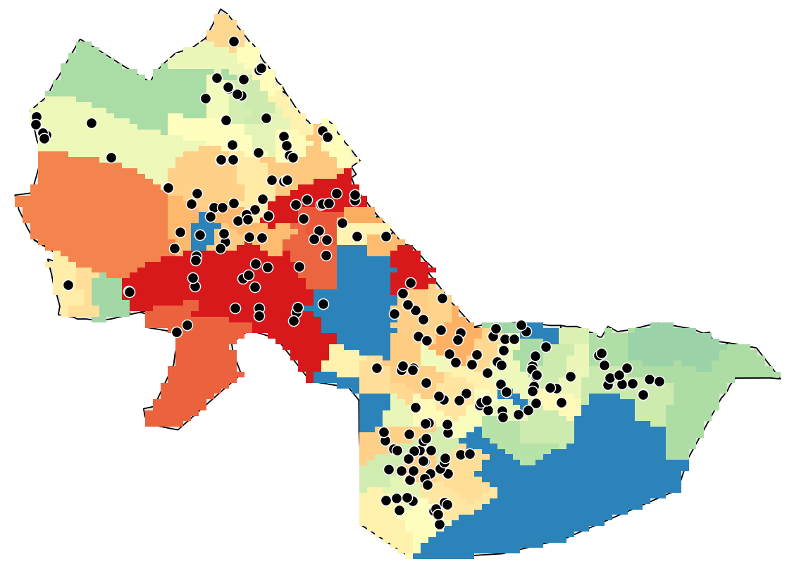
You should see the
following after applying the graduated symbology (Quantile
with 9 classes):
What are
the interpolated values in the grid cell containing
the highest-valued sale for the following layers? [To be reported
in assignment]
- hvalue_point_2: Interpolation
using home values at the block group centroid
level
- cambbgrpgd_2: Interpolation using
home values at the block group polygon
level (unsmoothed)
- cambbgrpgd_3: Interpolation using
home values at the block group polygon
level (smoothed)
Comment briefly on some of the
characteristics of this interpolated surface of MED_HVALUE compared
with the ones derived from the sales89 data. Are the hot-spots
more concentrated or diffuse? Does one or another approach lead to a
broader range of spatial variability? [To be reported in assignment]
V. Combining Grid Layers Using the Map
Calculator
Finally, let us consider combining the interpolated housing value
surfaces computed using the sales89 and MED_HVALUE methods. Since we
have two sources of data that may influence how we estimate housing
values, we can combine our interpolated values to obtain 'final'
estimates through, e.g., a simple average. Try the following:
- Click on "Raster" in the top ribbon of the QGIS
window and select the "Raster Calculator" tool
- Write the formula ("cambbgrpgd_3" + "sales89_pw2_2") /
2
- Save to the output layer raster_calc and click "OK"
You should see the following after applying the graduated symbology (Quantile
with 9 classes):
How much is the interpolated value in the grid cell within
raster_calc containing the
highest-valued sale? [To be reported in assignment]
The map calculator is a powerful and flexible tool. For example, if you
felt the sales data was more important than the census data, you could
assign it a higher weight with a formula such as:
("cambbgrpgd_3" * 0.7 + "sales89_pw2_2" * 1.3) / 2
The possibilities are endless--and many of them won't be too
meaningful! Think about the reasons why one or another interpolation
method might be misleading, inaccurate, or particularly appropriate. For
example, you might want to compare the mean and standard deviation of
the interpolated cell values for each method and make some normalization
adjustments before combining the two estimates using a simple
average.
We have only scratched the surface of all the raster-based
interpolation and analysis tools that are available. And, we have
shortchanged the discussion of what we mean by 'housing value' -- e.g.,
the sales and census data include land value. If you have extra time,
review the QGIS documentation regarding raster analysis and try
computing, and then rasterizing and smoothing, the density surface of
senior citizens (and/or poor senior citizens) across Cambridge and the
neighboring towns. We will work with a density surface of poor senior
citizens in Homework #3.
Please use the
assignment page to complete your assignment and upload a single
PDF file (named "lastname_Lab5.pdf") to
Stellar.
Created by Raj Singh and Joseph
Ferreira.
Modified for 1999-2015 by Joseph
Ferreira, Thomas H. Grayson, Jeeseong Chung, Jinhua Zhao, Xiongjiu
Liao, Diao Mi, Michael Flaxman, Yang Chen, Jingsi Xu, Eric Schultheis,
and Hongmou Zhang.
Last Modified: March 31, 2021 by Rounaq Basu.
Back to the 11.188 Home Page. Back
to the CRON Home Page.
