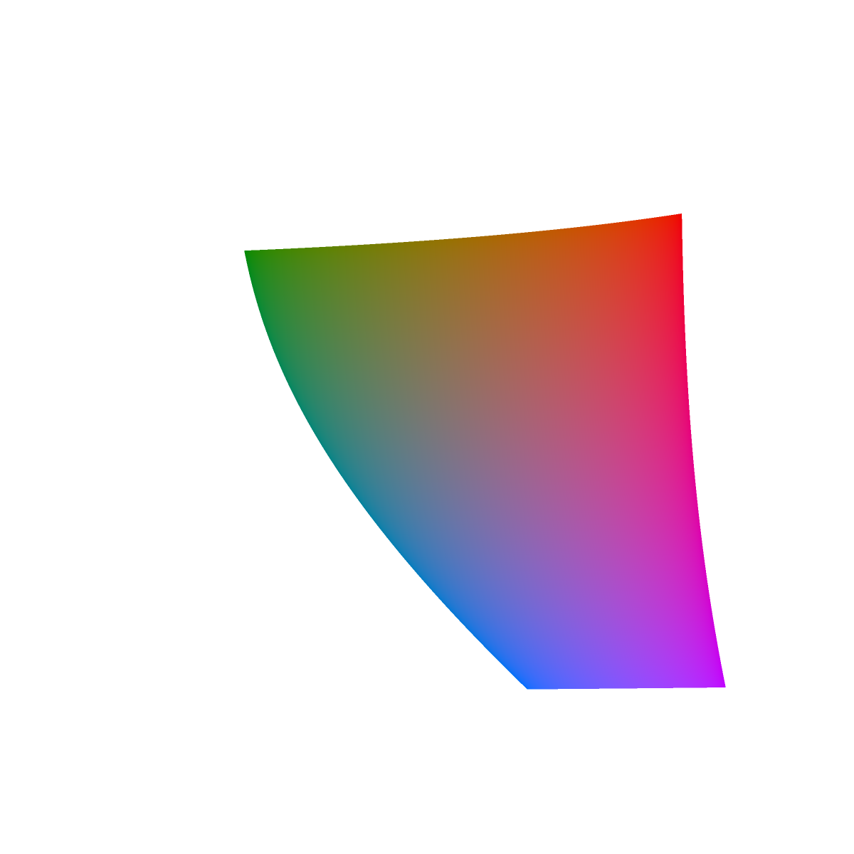
We explore the range of RGB colors (the sRGB gamut) projected into CIE L*a*b* (CIElab, Lab) color space, as implemented in the Haskell colour package.
The first image below is a slice of the CIE L*a*b* color solid through the plane L = 50, halfway between 0 (black) to 100 (white). The "a" and "b" coordinates have range ±128. The shape is slightly different from -- the bottom is slightly narrower than -- the image of the slice at L=50 on Wikipedia, so I wonder what is going on. It might be the choice of white point. We chose white_point=Data.Colour.CIE.Illuminant.d65 for everthing in this discussion.
(Most of the images on this page have been scaled down with HTML. Right click and View Image to embiggen.)

The inside of the cross section is kind of boring being mostly grayish, so in the image below we fill the cross section by connecting the origin (a=0, b=0) with line segments of the color at edge. We do this because we are mostly interested in the extent (outer edge) of the sRGB gamut in CIE L*a*b*. And it makes the pictures prettier.
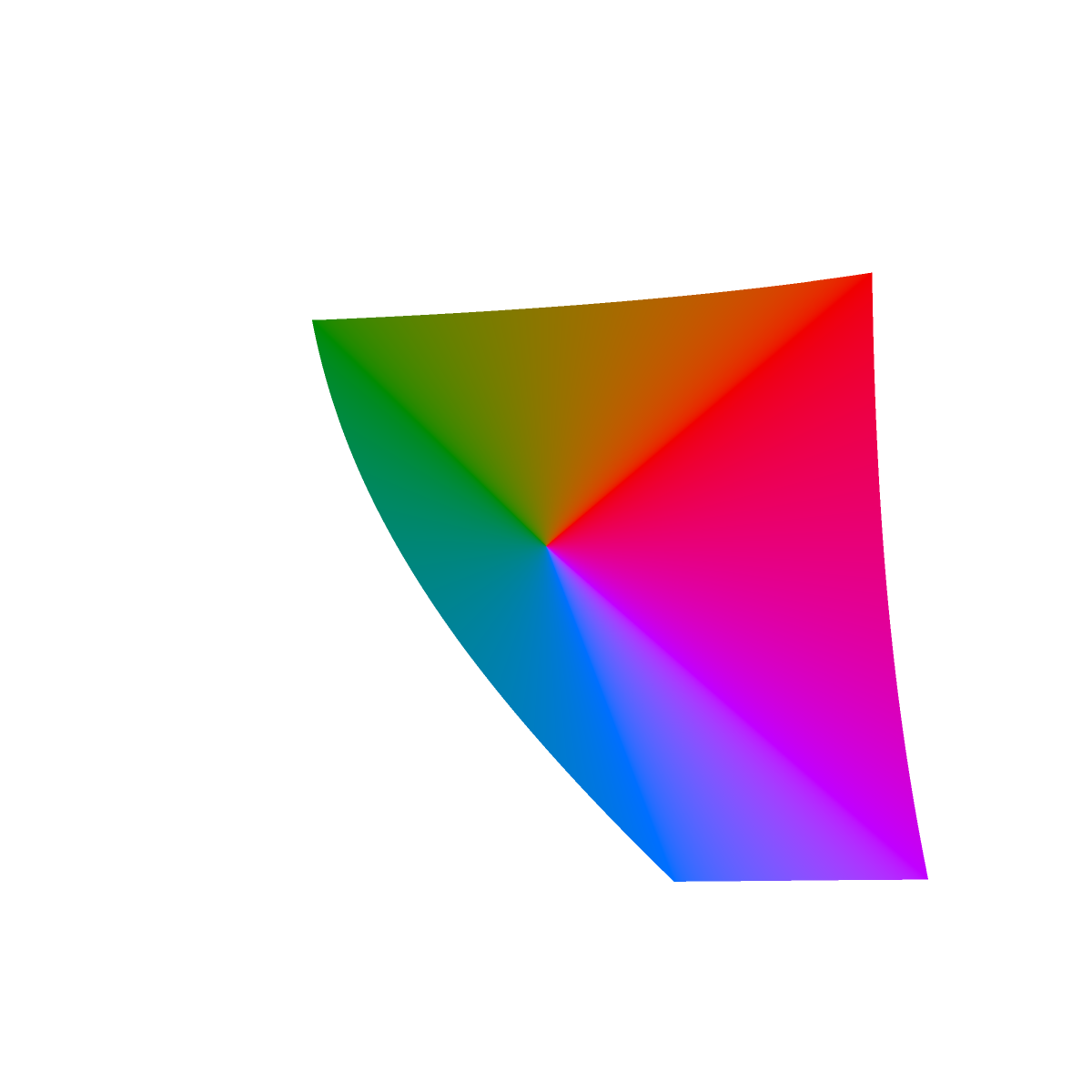
Finding the edge of the cross section, i.e., the last representable color still within the sRGB gamut, was an exercise in root finding.
Below are 13 other slices colored similarly. The lightness values are as follows.
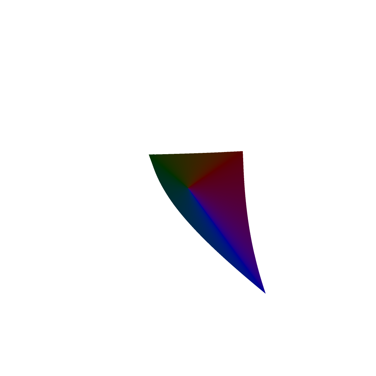
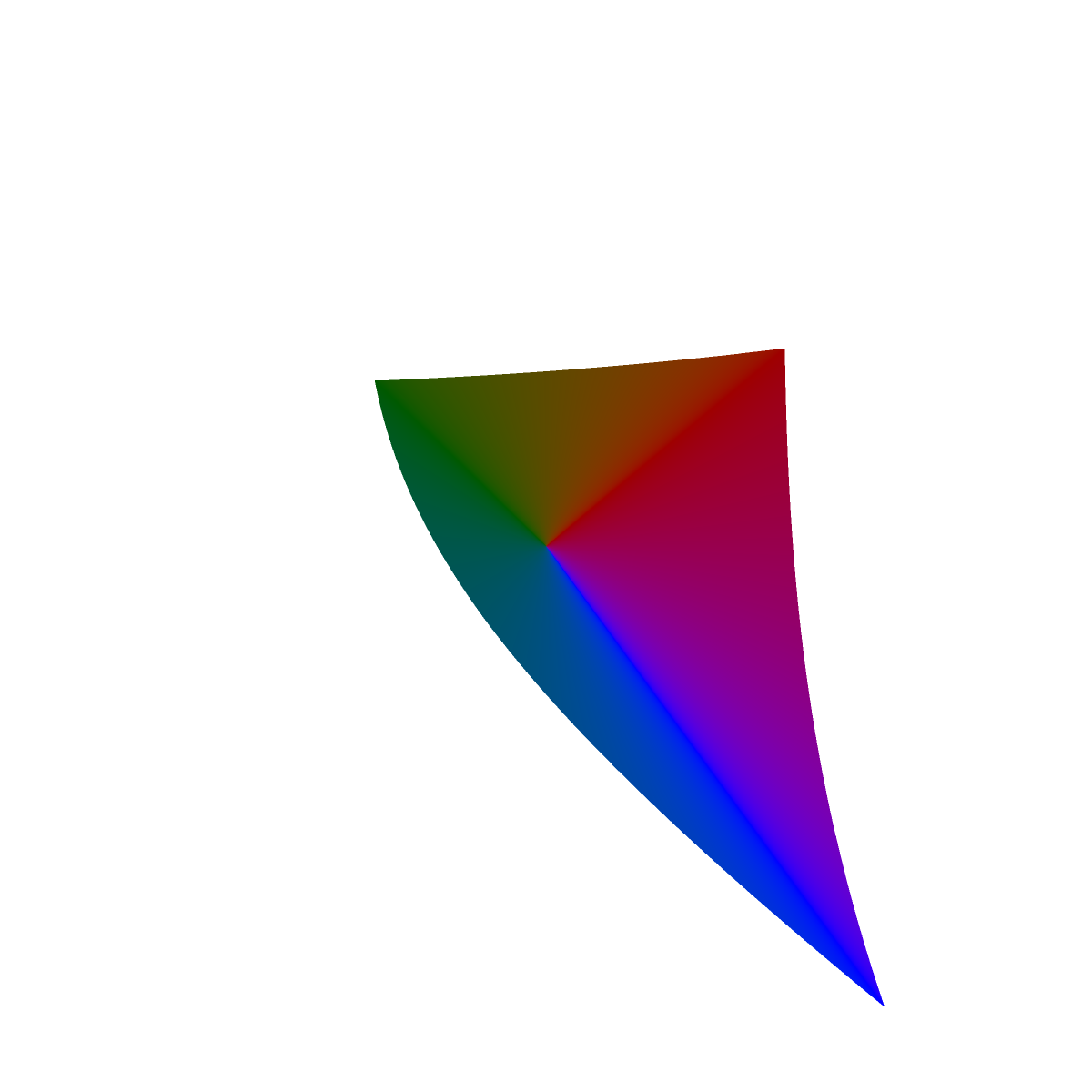
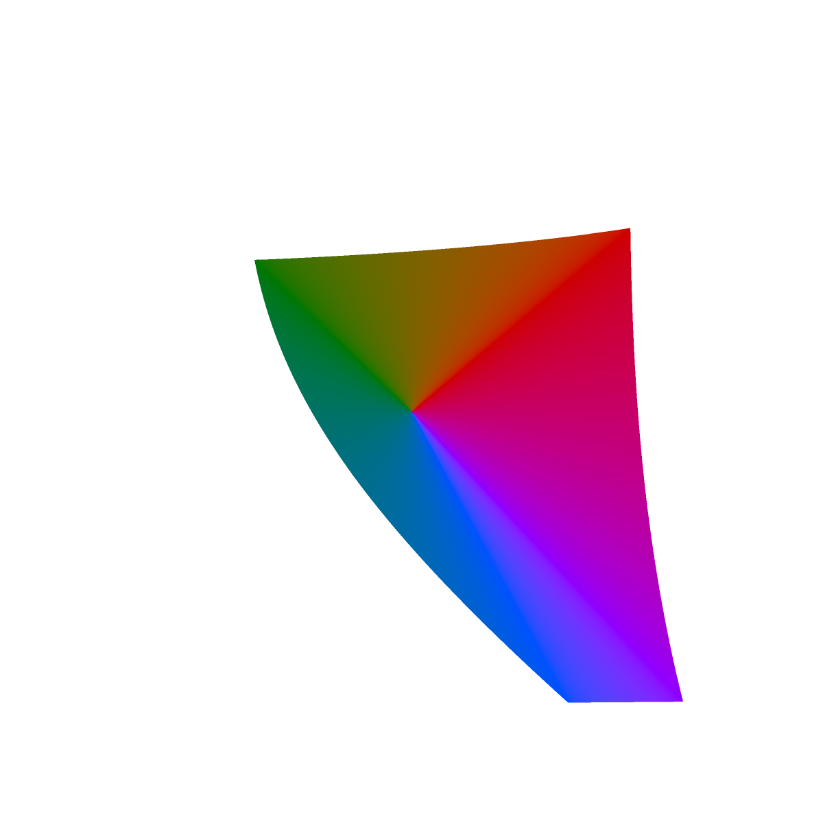
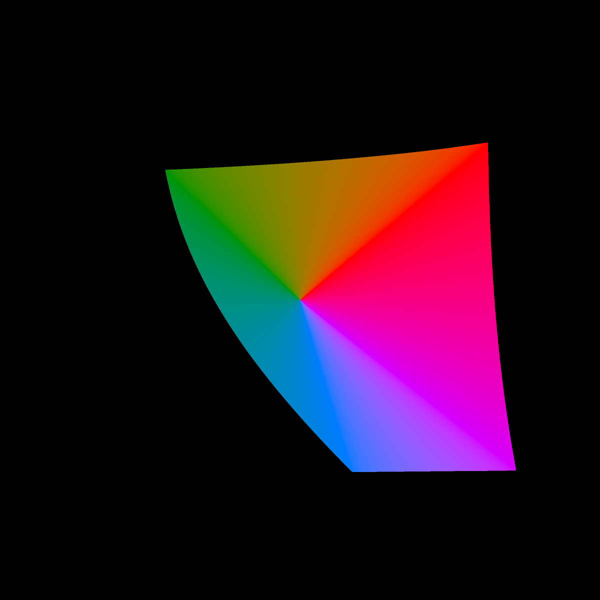
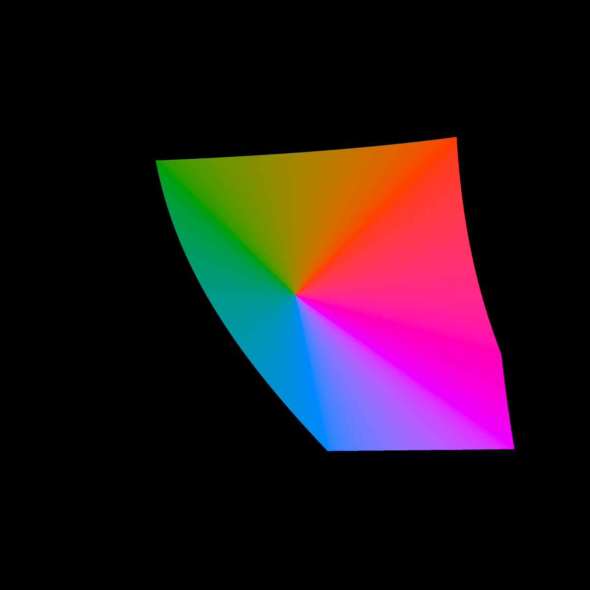
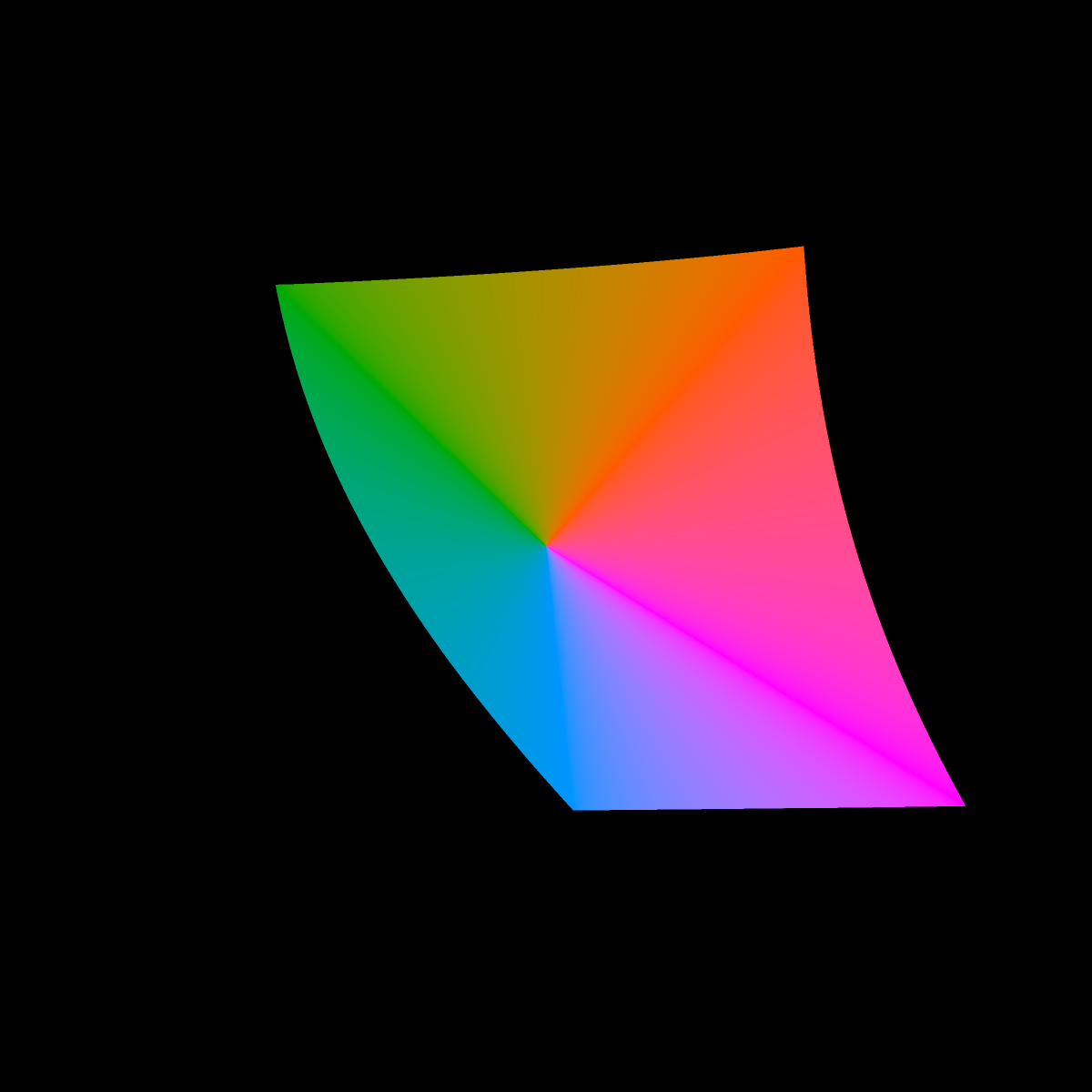
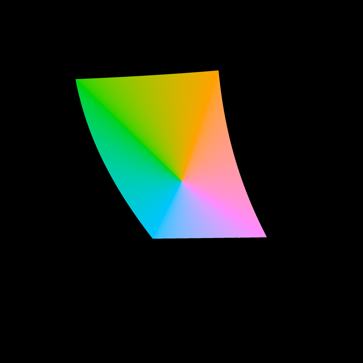
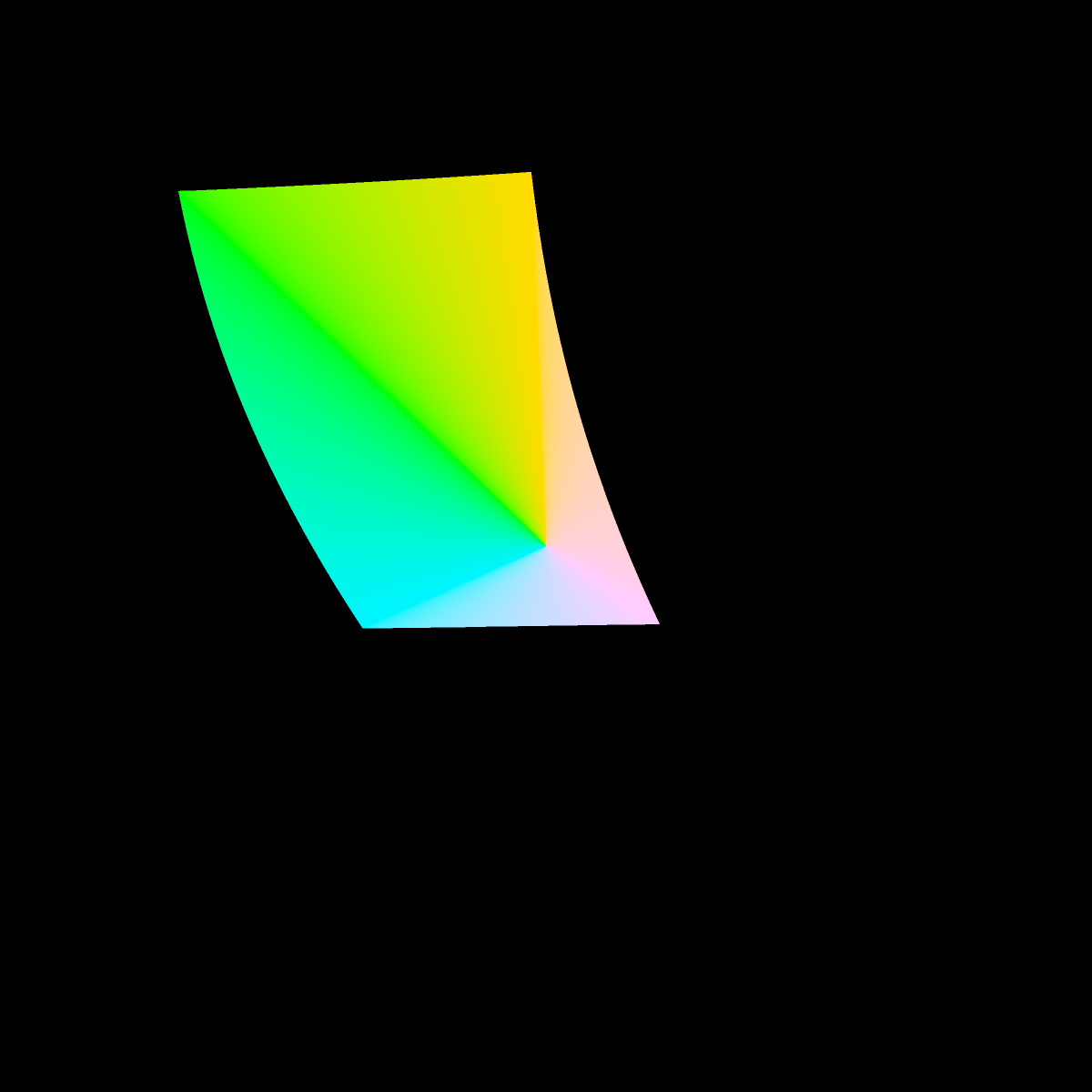
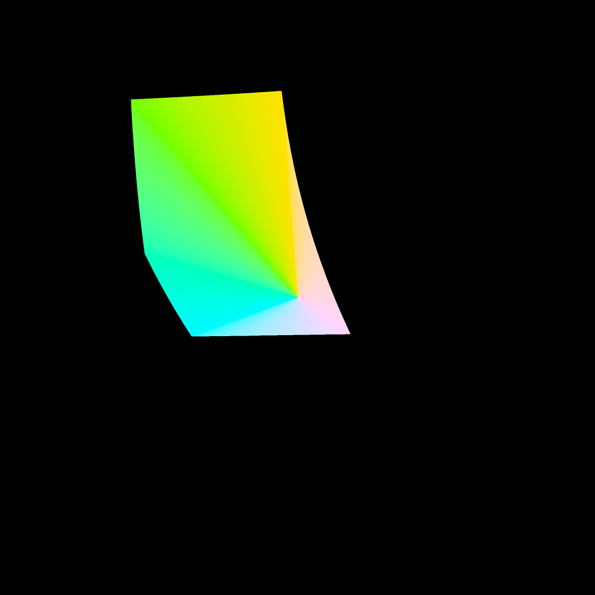
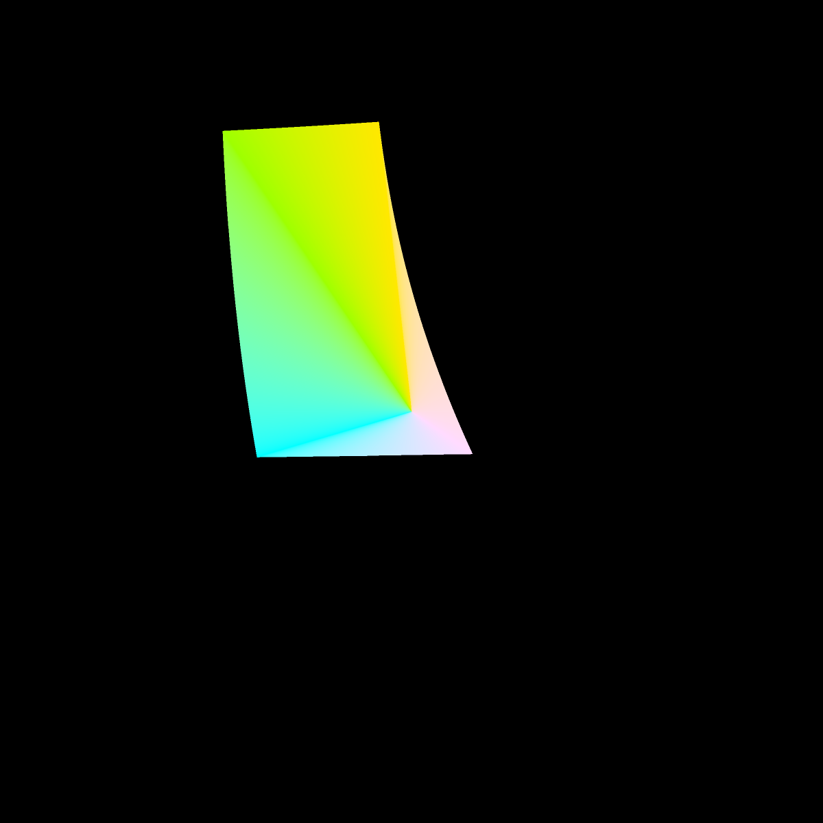
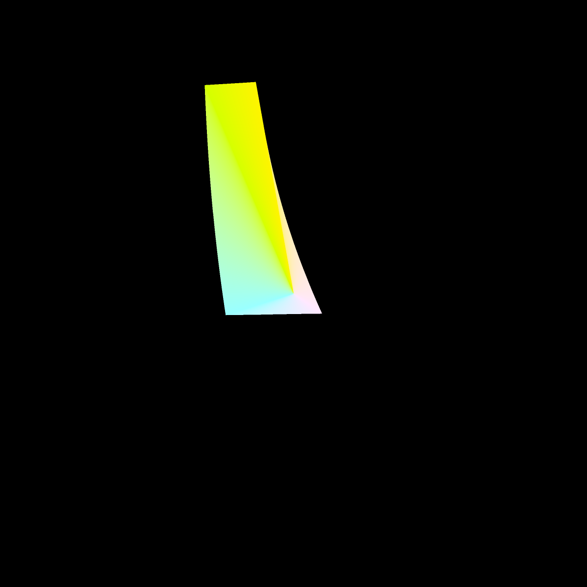
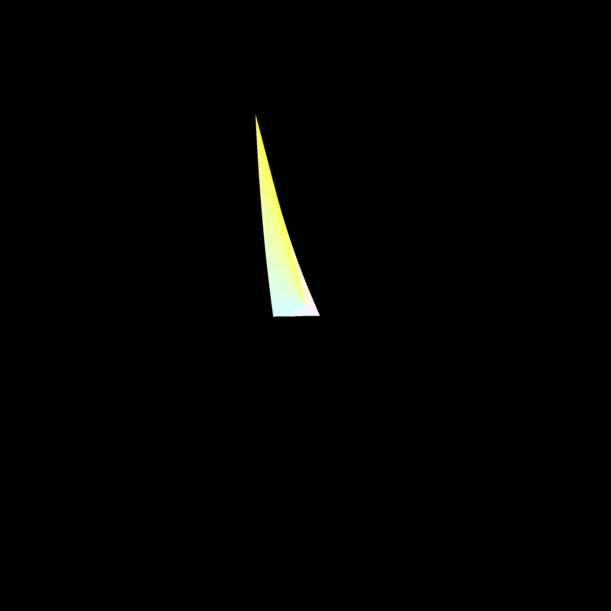
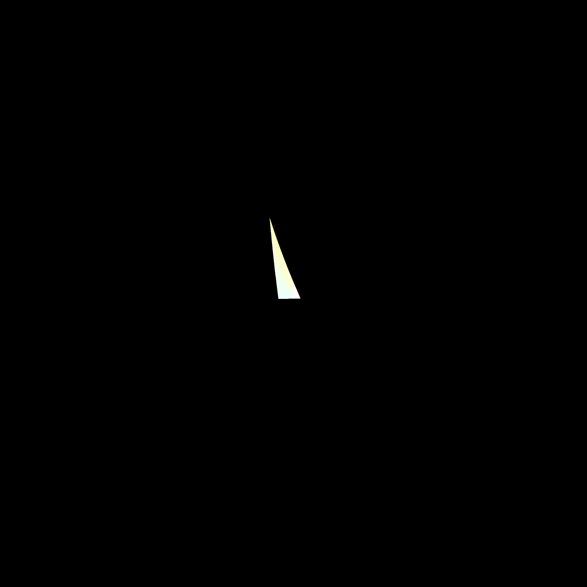
It might be fun to 3D print or or render the solid with 3D graphics someday. It seems to have a complicated shape. For 3D graphics, it would be most natural for the rendered color of the solid at each surface point to be the actual color of the solid, incorporating no reflected lights or shadows. However, such a lighting model will probably prevent the solid's sharp edges from being easily visible.
Above, we presented only 13 slices of the CIE L*a*b* color space. The first image below depicts the outer edge colors of 1024 slices. The vertical axis is lightness (L). The horizontal axis is the angle from the a-b origin. On my monitor, there are curious ridges corresponding to the saturated colors. I suspect it has to do with gamma.

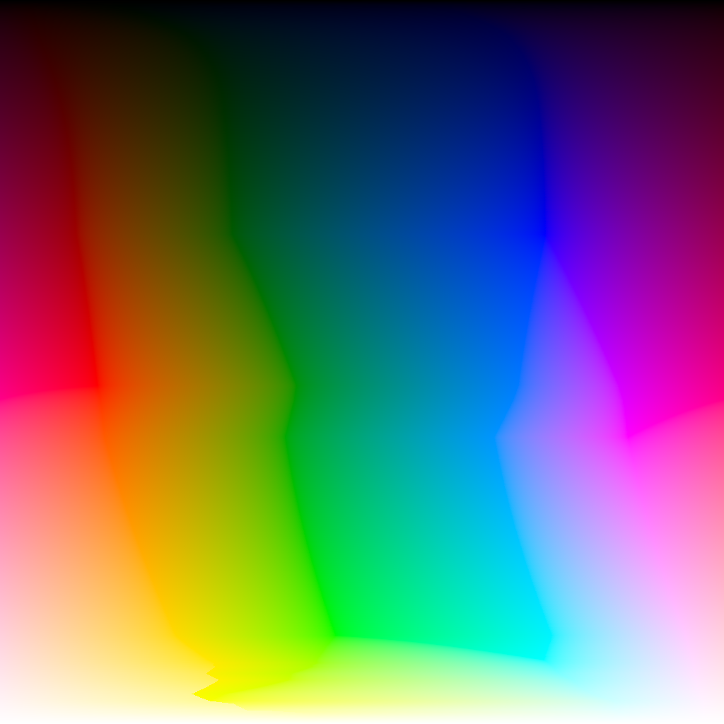
However, the appeal of the CIE L*a*b* color space is perceptual uniformity; that is, perceptual differences in color can be calculated by Euclidean distance. The second image above has each row individually rescaled for perceptural uniformity. In other words, the horizontal axis is the proportion of the perimeter of cross section.
Marching along the perimeter of the cross section was another exercise in root finding. At each step, we seek the next point on the perimeter a constant distance away (and remember that finding any point on the perimeter itself requires root finding). Because we don't know the perimeter of a cross section in advance, we arbitrarily choose a small step size, achieving a set of points separated by that step size (except from the final point to initial point), then crudely rescale the those points into 1024 steps.
The image above on the right was the "magnum opus" of this project, taking days to compute. Here is a raw data file of the (a,b) coordinates of the perimeter at 1023 levels of lightness. Some combination of Implicit Differentiation and Automatic Differentiation might have computed this more efficiently.
We can take any row of this image to extract a band of uniform lightness and uniform rate of color change. Below on the top row is two copies of the band at L = 53.3203125, the lightness with the longest perimeter. This happens to be very close to the lightness of pure red. On the bottom row is the same band shifted 25 pixels. The color distance between the rows is roughly constant, so ideally there should be equally sharp contrast along the entire boundary. (But on my monitor this appears not to be the case: we will explore this more further below.)


We can sample this band at multiples of phi (the golden ratio) to get an infinite palette of colors widely spaced from each other, all at the same lightness.
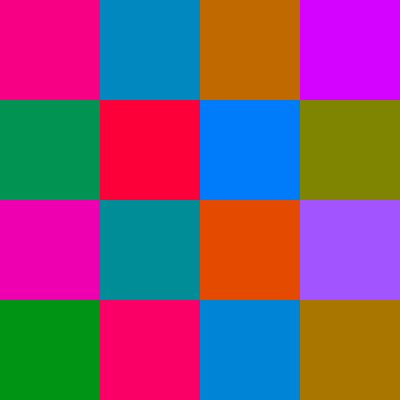
Palette entries 0, 5, 8, 13 are similar because the Fibonacci sequence approximates the golden ratio.
For a fixed size palette, one can probably do slightly better by particle repulsion on the cross section itself, though I have not implemented this.
Next, abandon the constraint of equal lightness and instead focus on the saturated RGB colors. The outline of next image projects has only the saturated RGB colors projected orthogonally to the a-b plane. The edge colors are then radially connected to the origin as before. Someday, it might be fun to render this in 3D as a minimal surface.
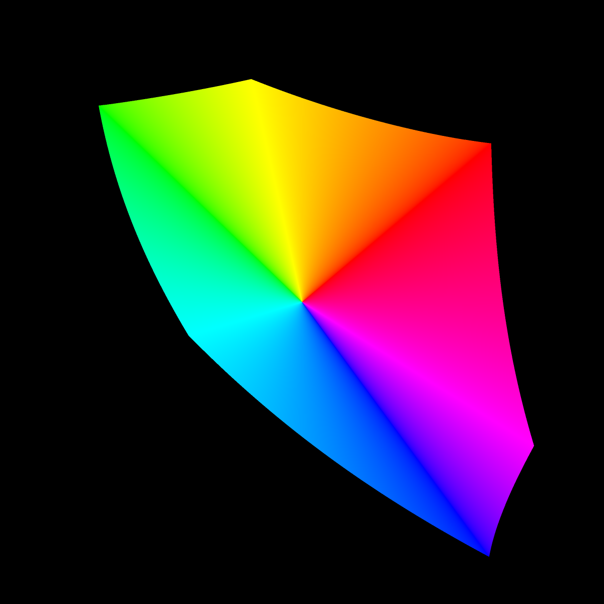
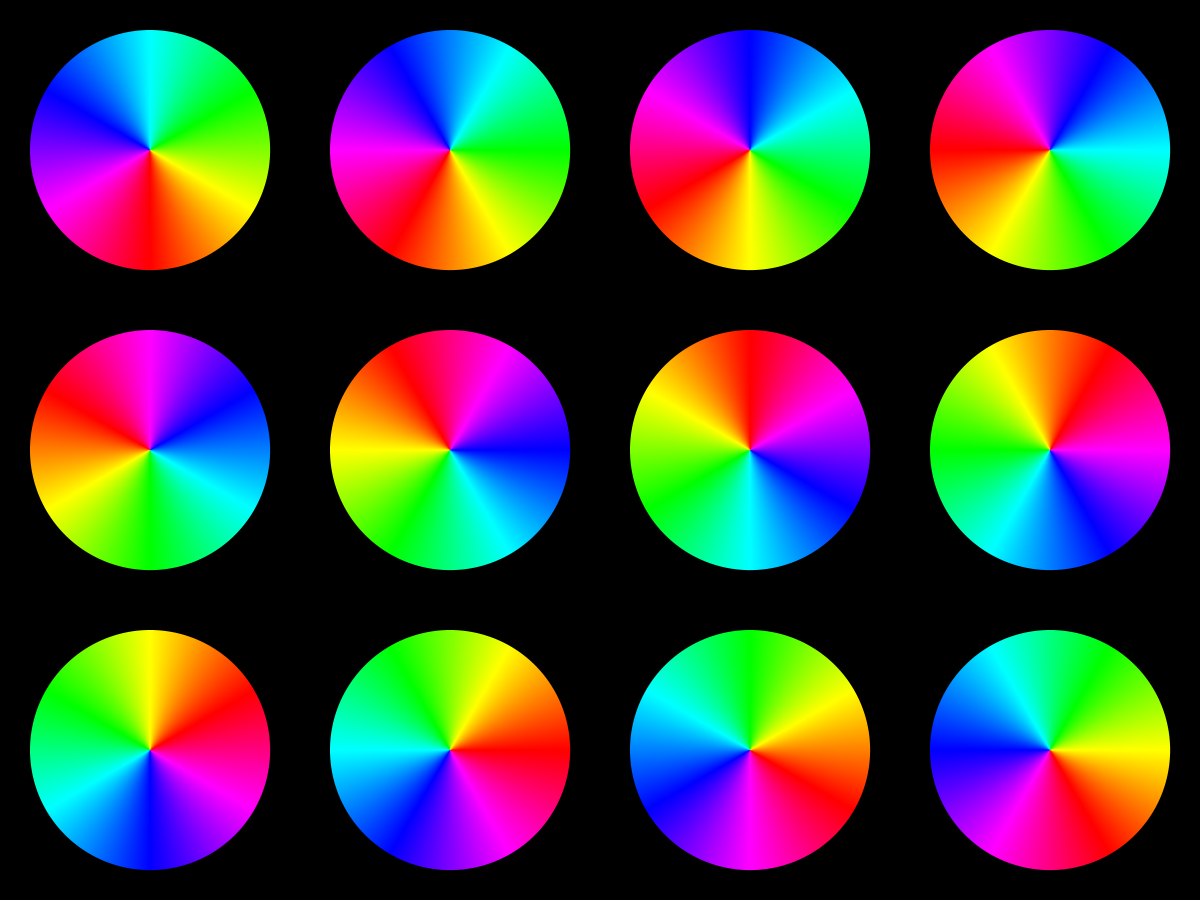
I discovered that the appearance of the above image on my LCD display radically changes depending on the position of my head: the width of the colors changes. (CRTs I suspect do not have this problem.) The image below may better illustrate the effect. Move your head up and down (or left and right) and notice how (or if) the color sectors change in width. I especially notice it in the blues. Also, here is a webpage with the same circles tiling the background.
The first image below shows the saturated colors scaled in distance for perceptual uniformity. The second image is without correction, a typical color palette moving in RGB space at constant speed, using all the saturated colors of the rainbow.


The upper image below gives the same perceptually uniform rainbow except extended (looped) a bit to better see the region around red. The lower image is the same, except shifted by 20 pixels. The color distance between the rows is roughly constant, so ideally there should be a boundary line of constant contrast across the whole width. On my monitor, this appears not to be the case: the rows blend in the red-magenta area. As before, on LCD displays, the contrast may depend on the viewing angle.


Color distance calculator and convertor
| rgb(55,0,255) | rgb(147,0,255) |
The above two colors are separated by a distance of 18.9955 according to this online color distance calculator, whose results are in close (but not exact) agreement with my code. The colors appear quite different.
| rgb(255,0,69) | rgb(255,0,33) |
The above two colors are separated by a distance of 18.89. They appear similar.
| rgb(0,255,44) | rgb(0,255,100) |
The above two colors are separated by a distance of 19.108. They appear similar.
Based on the above examples, I'm less than convinced that L*a*b* space is good for defining perceptual color distance.