Back to portfolio
Friends

Designed and folded January 2022
Paper: 40cm double tissue
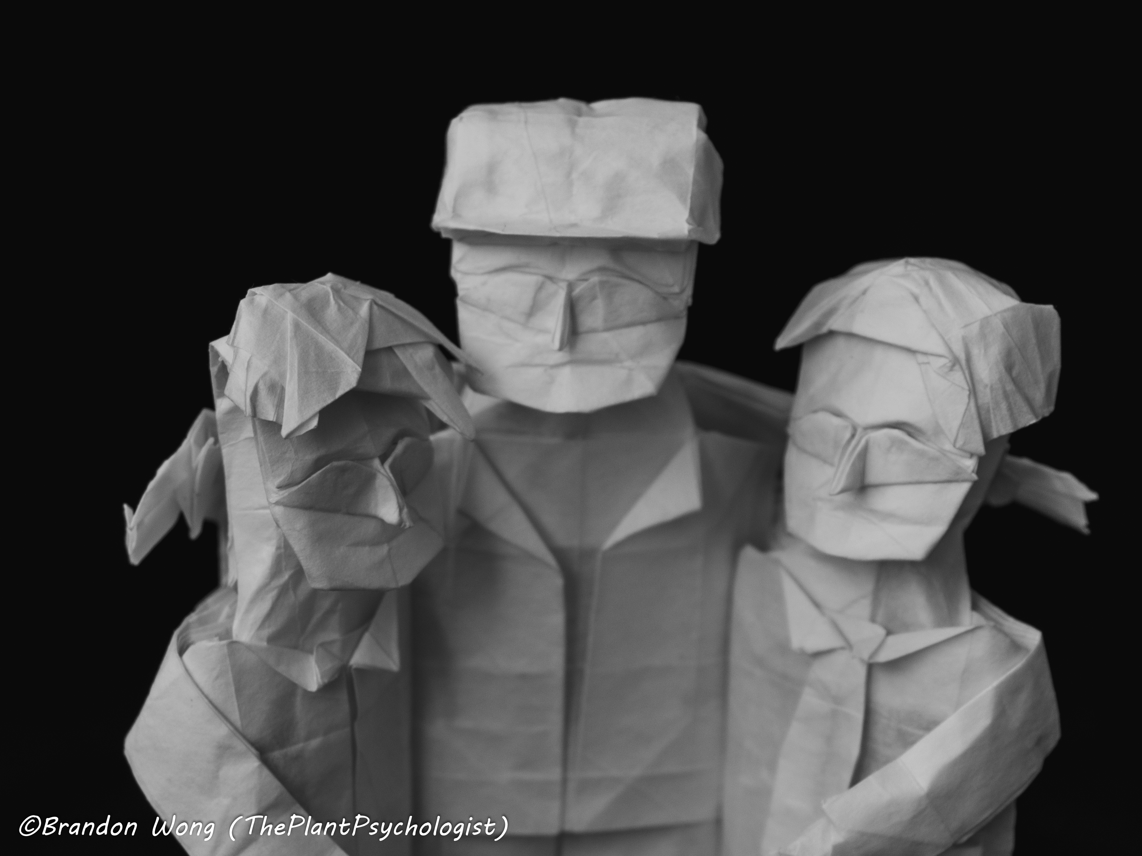
The trickiest and most crucial part of this design is, as always, the faces. Creating smiling faces is an endeavor I have been experimenting with for quite a while now.
There is still a lot more to learn, but I believe the trick is this: the mouth can vary from person to
person, but the crucial feature is the raised cheeks under the eyes. This is what differentiates an evil
smile from a genuinely happy one, or a forced smile from a calm but content expression.
So with these three friends, you will see that they all have slightly different mouths, but they
all have the same curved eyes and raised cheeks. And indeed they look pretty happy, as one should be
with one's buddies.
Random observation: when people get their photos taken individually, the smile is almost always
visibly forced. But when they take the photo as a group and their arms are over each others shoulders
and they have all the time in the world, these are pure and genuine grins, and it shows. So perhaps when
taking yearbook photos or profile pics or whatnot we should just take them as groups and then
crop out each face...

This design was another exploration of the technique used in the family
design--namely, multiaxial box pleating. In the family model, there are two axes, one for the
dad and one for the mom. This time, there are three axes, one for each friend.
Grid: 40x40
It may be surprising to have such a low grid size for a design consisting of three
figures; after all, it's not uncommon to have designs with a single figure using grid sizes
at 60 or higher. How do the friends accomplish this?
First of all, their proportions are those of children, so all their flaps and rivers can
be shorter and take up less space than an adult figure would need. (This was also done so that
the faces would be more focused than if half of the paper went to their pants). Second, their bodies
aren't really flaps (and that's where the multiaxial/non-uniaxial/unaxial stuff comes in); they are connected
from shoulders to heels, and their legs aren't separable because the pose doesn't require so. Finally,
the arms that wouldn't be visible in this pose were simply not included, which saves a lot of space.
Overall, this design is a nice example of reducing the structure to the bare minimum, and
it pays off.