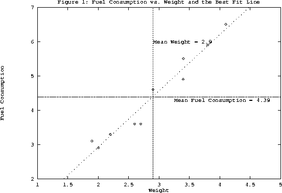
The simplest way to find out qualitatively the correlation is to plot the data. In the case of our example,
as seen from Figure 1, a strong positive correlation between y and x is evident, i.e.,
the plot reveals that as the weight increases, the fuel consumption increases as well.
How can we quantify the degree of correlation? This is usually done by specifying the
correlation coefficient R, defined as

R =    , ,
|
(1) |
Now, let's assume that a perfect linear relationship exists between the variables x and y.
i.e.,
yi = axi + b for
i = 1, 2, ... , n with a ![]() 0. Now verify using the definitions of
the mean and the variance that
0. Now verify using the definitions of
the mean and the variance that
![]() = a
= a![]() + b and
+ b and
![]() = | a|
= | a|![]() . This implies from Eq. 1 that
R = a/| a|. Or in other words, R = 1 if a > 0 and R = - 1 if a < 0. The case R = 1 corresponds to
the maximum possible linear positive association between x and y, meaning that all the data
points will lie exactly on a straight line of positive slope. Similarly, R = - 1 corresponds to the
maximum possible negative association between the statistical variables x and y. In general,
-1
. This implies from Eq. 1 that
R = a/| a|. Or in other words, R = 1 if a > 0 and R = - 1 if a < 0. The case R = 1 corresponds to
the maximum possible linear positive association between x and y, meaning that all the data
points will lie exactly on a straight line of positive slope. Similarly, R = - 1 corresponds to the
maximum possible negative association between the statistical variables x and y. In general,
-1 ![]() R
R ![]() 1 with the magnitude and the sign of R representing the strength and
direction respectively of the association between the two variables. For the data given in
Figure 1, R = 0.977 implying a strong positive correlation between the fuel consumption and the
weight of the automobile.
1 with the magnitude and the sign of R representing the strength and
direction respectively of the association between the two variables. For the data given in
Figure 1, R = 0.977 implying a strong positive correlation between the fuel consumption and the
weight of the automobile.