Massachusetts Institute of Technology
Department of Urban Studies and Planning
| 11.188: Urban Planning and Social
Science Laboratory |
| 11.205: Intro to Spatial Analysis (1st half-semester) |
| 11.520: Workshop on GIS (2nd half-semester) |
Lab Exercise 6: Raster Spatial Analysis
Start: Monday, March 30, 2020, 2:35 pm (EDT) -- No
Due Date (Optional due to Covid-19 interruption)
Administrative
- 11.188, 11.205, 11.520: revised schedule is here: https://docs.google.com/spreadsheets/d/1BJZc2j7E3WGLfCJNmoUxfaTZYWmtGsPeol9AsstWv0M/edit#gid=0
- Labs #5 and #6 are now optional (but content is needed for
homeworks)
- Homework #2, part 2: Due date postponed to Wednesday, April 1
- Homework #3 (raster analysis) is optional for all
- Test: postponed to 2:30 pm Monday, April 6, as 24-hour
take-home
- Preliminary project idea due: Wednesday, April 8
- Lab #7 (two parts) and individual project/presentation are rest of
assignments for 2nd half semester
- 11.205 (1st half semester) - some work dropped and some remains to be
done
- Lab #5: Optional turn-in, but content is needed to finish homework
#2, part 2
- Homework #2, part 2: Due date postponed to Wednesday, April 1
- Test: postponed to 2:30 pm Monday, April 6, as 24-hour
take-home
- 11.520 (2nd half semester)
- Starts on March 30 with Lab #6 (raster analysis)
- No test on April 6 IF you are only taking 11.520 AND you are *not*
in 11.205
- Lab #6 (today) and Homework #3 (posted on April 1) is optional for
all
- Lab #7 (two parts) and individual project/presentation are rest of
assignments
Settling into Online Learning - planning 2nd half of semester
- General guidelines for Remote Learning: http://web.mit.edu/11.188/www/remoteaccess/index.html
- Organization of today's session
- Welcome and round-table hello (20 minutes)
- Informal - we are all learning to work online as we go - with
patience and, often, serious distractions
- Rida and Joe: review plan for how we will use zoom
- Raise 'hand' and use breakouts as needed
- Share screen to see notes/illustrations, and for us to view
student screen
- Record sessions and post links on Stellar
- Everyone: brief hello, are you set with class software setup and
data; where are you (time zone)
- Do you have questions that need general discussion for all, or
in a private breakout?
- Review revised schedule and administrative notes (5 minutes)
- Record today's session in three parts:
- Introduction and round-table (first ~30 minutes)
- Review of 'Raster Analysis' lecture and introduction to Lab
#6 (45-60 minutes)
- Open Lab session (first ~30 minutes of remaining time)
-
First, a few maps and spatial analyses related to Covid-19 to
examine
- Spatial distribution across US of abnormally high body temperature
- State-by-state
timelines of projected hospital covid-19 demand:
Overview
We covered the basics of Raster Analysis methods in the
abbreviated lecture on the Wednesday before MIT shut down: Raster Lecture
The purpose of this lab exercise is to exercise some of these spatial
analysis methods using raster models of geospatial phenomena. Thus far, we
have represented spatial phenomena as discrete features modeled in GIS as
points, lines, or polygons--i.e., so-called 'vector' models of geospatial
features. Sometimes it is useful to think of spatial phenomena as 'fields'
such as temperature, wind velocity, or elevation. The spatial variation of
these 'fields' can be modeled in various ways including contour lines and
raster grid cells. In this lab exercise, we will focus on raster
models and examine ArcGIS's 'Spatial Analyst' extension.
We will use raster models to create a housing value 'surface' for
Cambridge. A housing value 'surface' for Cambridge will show the high-
and low-value neighborhoods much like an elevation map shows height. To
create the 'surface' we will explore ArcGIS's tools for converting
vector data sets into raster data sets--in particular, we will
'rasterize' the 1989 housing sales data for Cambridge and the 1990
Census data for Cambridge block groups.
The block group census data and the sales data contain relevant
information about housing values, but the block group data may be too
coarse and the sales data may be too sparse. One way to generate a
smoother housing value surface is to interpolate the housing value at
any particular location based on some combination of values observed for
proximate housing sales or block groups. To experiment with such
methods, we will use a so-called 'raster' data model and some of the
ArcGIS Spatial Analyst's capabilities.
The computation needed to do such interpolations involve lots of
proximity-dependent calculations that are much easier using a so-called
'raster' data model instead of the vector model that we have been using.
Thus far, we have represented spatial features--such as Cambridge block
group polygons--by the sequence of boundary points that need to be
connected to enclose the border of each spatial object--for example, the
contiguous collection of city blocks that make up each Census block
group. A raster model would overlay a grid (of fixed cell size) over all
of Cambridge and then assign a numeric value (such as the block group
median housing value) to each grid cell depending upon, say, which block
group contained the center of the grid cell. Depending upon the grid
cell size that is chosen, such a raster model can be convenient but
coarse-grained with jagged boundaries, or fine-grained but overwhelming
in the number of cells that must be encoded.
In this exercise, we only have time for a few of the many types of
spatial analyses that are possible using raster data sets. Remember that
our immediate goal is to use the cmbbgrp and sales89
data to generate a housing-value 'surface' for the city of Cambridge.
We'll do this by 'rasterizing' the block group and sales data and then
taking advantage of the regular grid structure in the raster model so
that we can easily do the computations that let us smooth out and
interpolate the housing values.
The in-lab discussion notes are here: Lab #6 notes
Before starting the exercise, review the introduction to raster
analysis in ArcGIS Help. Open ArcGIS Desktop Help from within
ArcMap or as a separate application in the ArcGIS folder. Search
for 'What is spatial analyst' to find:

I. Setting Up Your Work Environment
Launch ArcGIS and add the five data layers listed below (after copying
them to a local drive using the method described in earlier lab
exercises):
|
|
Census 1990 block group polygons for Cambridge |
- Q:\data\cambbgrp_point.shp
|
Census 1990 block group centroids for Cambridge |
|
|
U.S. Census 1990 TIGER file for Cambridge |
- Q:\data\camborder polygon.shp
|
Cambridge polygon |
|
|
Cambridge Housing Sales Data |
Set Display unit = meter. In this exercise you will
use "Meter" instead of using "Mile"
Since your access to the class data locker may be limited, we have
bundled all these shapefiles into a zipped file that also contains a
startup ArcMap document saved in two formats (for ArcMap versions 10.6
and 10.4). This zipfile is called lab6_raster.zip
in the class Dropbox, and the ArcMap document will startup in earlier
version of ArcMap that is 10.4 or later (including version 10.7.1 that
we used earlier in the semester and 10.6.1 that is installed in some of
the VMware virtual machines that you may be using.
II. Spatial Analyst Setup
ArcGIS's raster manipulation tools are bundled in the Spatial
Analyst extension. It's a big bundle so let's open ArcGIS's
help system first to find out more about the tools. If you haven't
already, open the ArcGIS help page by clicking Help > ArcGIS
Desktop help from the menu bar. Click the search
tab and search for "What is spatial analyst". During
the exercise, you'll find these online help pages helpful in clarifying
the choices and reasoning behind a number of the steps that we will
explore.
The Spatial Analyst module is an ArcGIS extension that must be
activated before we can use it. In some cases, you might need to install
it and activate it. Fortunately, it is already
installed on this lab's computers.
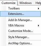
To activate the Spatial Analyst extension:
- Click the Customize menu
- Click 'Extensions' and check 'Spatial
Analyst'
- Click 'Close'
|
|
|
Fig. 1. Add Extension
Setting Analysis Properties:
Before building and using raster data sets, it is helpful to be
specific about the grid cell size, coordinate system, extent, etc.
ArcGIS will generally select usable defaults but, if we do not pay
attention to the choices, we will discover later on that the grid cells
for two different rasters have different sizes, do not line up, use
different coordinate systems, or have other problems. Let's begin by
specifying a grid cell size of 100 meters and an analysis extent
covering all of Cambridge.
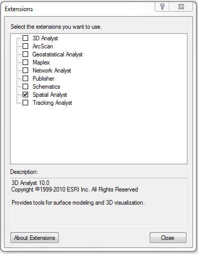
- To set the properties, click the Geoprocessing
> Environments. This opens the Environment
Settings window (if you get a script error ignore it
by clicking 'Yes').
-
|
Fig. 2. Set environments
attributes
- Expand the Workspace category, you should change
the Current Workpasce and Scratch Workspace to '
C:\TEMP\[your
            working folder]'
.
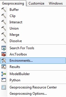
- You can set the current workspace to a system folder, a
geodatabase, or a feature dataset within a geodatabase. The main
idea behind the current and scratch workspace is that you set a
workspace once, then use only the base name when entering input
and output paths.
-
|
Fig. 3. Database name
components
- Later in this lab, the scratch workspace will be (re)set by
ModelBuilder. In short, ModelBuilder needs a writable workspace to
store intermediate datasets -- datasets that are of no use once a
model is run. The location for intermediate datasets is the
scratch workspace and we have sometimes reset this space to be
C:\temp (instead of on our H: drive) so we get better
performance and reliability by using a writable local drive
instead of our network locker.
- Expand the Output Coordinates category, set the
coordinate system for the grids to be 'Same as Layer cambbgrp'.
- Expand the Processing Extent
category, select 'Same as Layer camborder
polygon' for the Analysis Extent.
- This option sets the 'bounding box' for raster calculations.
Since it determines the precise location of the grid cell edges,
you want to know what it is and how to use the same extents for
other rasters you may determine later. Setting the extents to
match those of an existing layer that covers the area of interest
is one way to do this.
- Expand the Raster Analysis category, set the Cell
Size to be As Specified Below,
then specify
(Note: We leave the Mask layer as blank and will change it later.)
- Click 'OK' to apply the settings and you are ready to proceed with
the raster analysis.
Now that we've set the analysis properties, we are ready to create the
new raster layer by cutting up Cambridge into 100-meter raster grid
cells. We can use the Cambridge boundary shapefile for this purpose.
Convert camborder polygon to a grid layer
using these steps and parameter settings:
- In the ArcToolbox window, click Conversion Tools >
To Raster> Feature to Raster. The Feature
to Raster window will open up.
-
- Choose camborder polygon for the Input
features.
- Choose COUNTY for the Field.
(We just want a single value entered into every grid cell at this
point. Using the County field will do this since it is the
same across Cambridge)
- Set the location for the Output Raster Dataset
to be a writable local drive (such as
C:\temp) and
set the name of the grid file (cambordergd)
and click OK.
- Output Cellsize should be 100.
If successful, the CAMBORDERGD layer will be added to
the data frame window. Turn it on and notice that the shading covers all
the grid cells whose center point falls
inside of the spatial extent of the camborder layer.
The cell value associated with the grid cells (in the COUNTY field) is
25017--the FIPS code number for the county. Open the attribute table for
the CAMBORDERGD layer. Since we did not join any
other feature attributes to the grid, this is the only useful column in
the attribute table for CAMBODERGR. Note that there is
only one row in the attribute table -- attribute tables for
raster layers contain one row for each unique grid cell
value. Since all our grid cells have the same COUNTY
value, there is only one row in this case.
At this point, we don't need the old camborder polygon
coverage any longer. We used it to set the spatial extent for our grid
work, but that setting is retained as part of the new raster layer. To
reduce clutter, you can remove the camborder polygon
layer from your Data Frame.
III. Interpolating Housing
Values Using SALES89
This part of the lab will demonstrate some raster techniques for
interpolating values for grid cells (even if the grid cell does not
contain any sales in 1989). This is the first of two methods, we will
explore to estimate housing values in Cambridge. Keep in mind that there
is no perfect way to determine the value of real
estate in different parts of the city.
A city assessor's database of all properties in the city would
generally be considered a good estimate of housing values because the
data set is complete and maintained by an agency which has strong
motivation to keep it accurate. This database does have drawbacks,
though. It is updated at most every three years, people lobby for the
lowest assessment possible for their property, and its values often lag
behind market values by several years.
Recent sales are another way to get at the question. On the one hand,
recent sale numbers are believable because the price should reflect an
informed negotiation between a buyer and a seller that results in the
'market value' of the property being revealed (if you are a believer in
the economic market-clearing model). However, the accuracy of such data
sets are susceptible to short-lived boom or bust trends, not all sales
are 'arms length' sales that reflect market value and, since individual
houses (and lots) might be bigger or smaller than those typical of their
neighborhood, individual sale prices may or may not be representative of
housing prices in their neighborhood.
Finally, the census presents us with yet another estimate of housing
value--the median housing values aggregated to the block group level.
This data set is also vulnerable to criticism from many angles. The
numbers are self-reported and only a sample of the population is asked
to report. The benefit of census data is that they are widely available
and they cover the entire country.
We will use sales89 and cambbgrp to
explore some of these ideas. Let's begin with sales89.
The sale price is a good indication of housing value at the time and
place of the sale. The realprice has already
adjusted the salesprice to account for the
timing of the sale by adjusting for inflation. How can we use the sales89
data to estimate housing values for locations that did not have a sale?
One way is to estimate the housing value at any particular location to
be some type of average of nearby sales. Try
the following:
- Be sure your data frame contains at least these layers: sales89,
cambbgrp, and cambordergd.
- In the ArcToolbox window, click 'Spatial Analyst
Tools> Interpolation> IDW (Inverse Distance Weighted)'.
-
- Specify these options when IDW
window shows up: (We will explain what they mean shortly)
- Input points: "sales89".
- Z value field: "REALPRICE"
- Output raster: "[your working
directory]/sales89_pw2_1"
- Output cell size: "100"
- Power: "2"
- Search radius type: "Variable"
- Number of points: "12"
- Maximum distance: leave it blank
- Input barrier polyline features: leave it blank
- Click OK
- The grid layer that is created fills the entire bounding box
for Cambridge and looks something like this :
(When using Quantile, 9 classes)
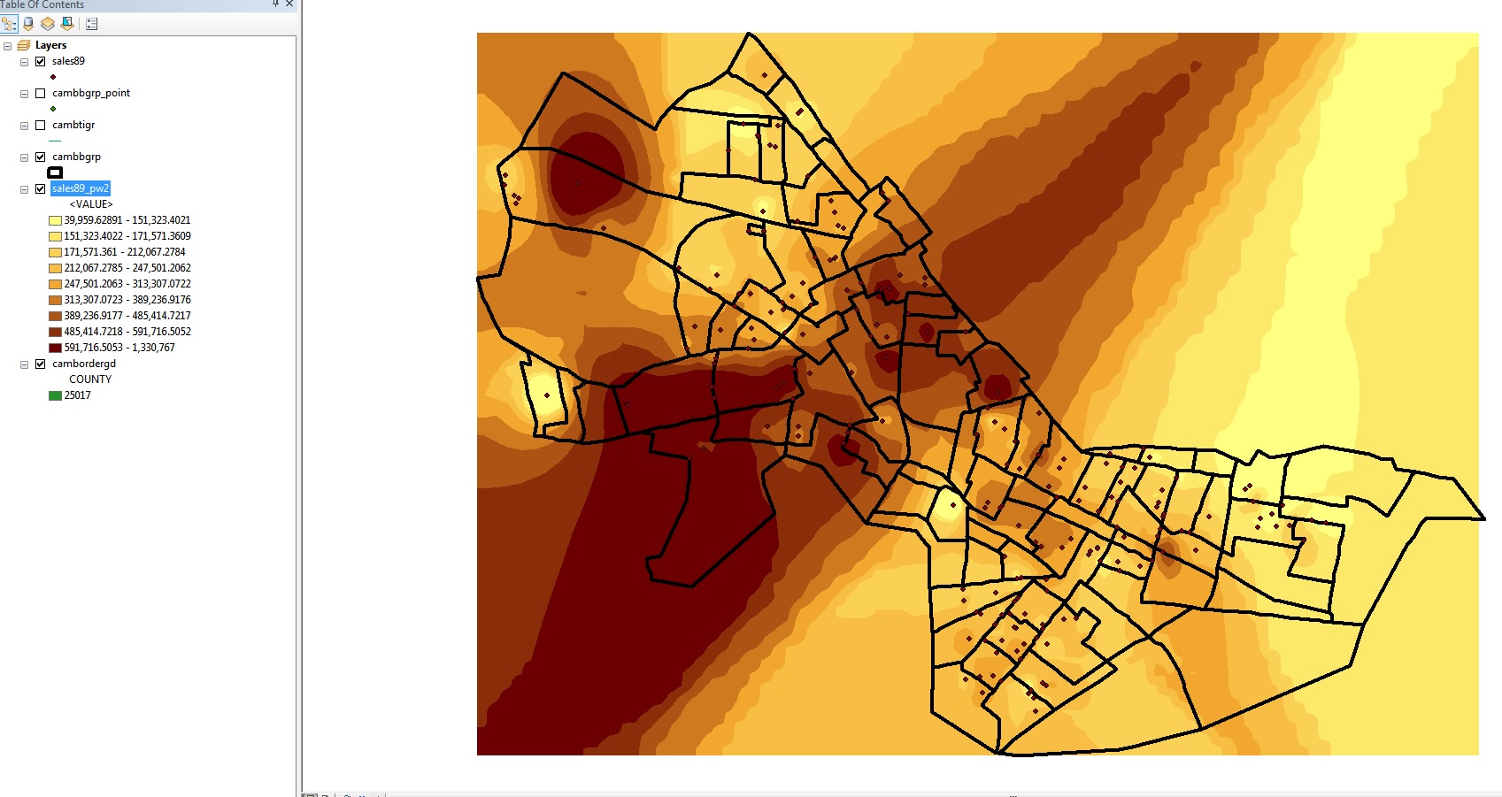
|
Fig. 4. Interpolation without mask
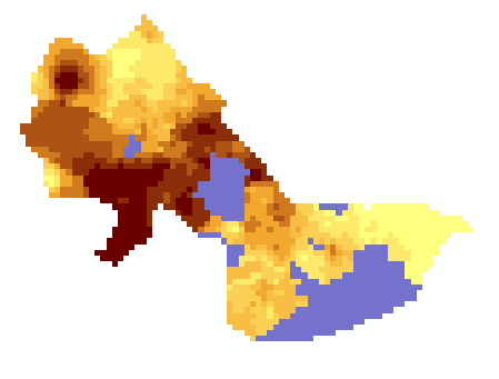
The interpolated surface is shown thematically by shading each cell
dark or light depending upon whether that cell is estimated to have a
lower housing value (lighter shades) or higher housing value (darker
shades). Based on the parameters we set, the cell value is an inverse-distance
weighted average of the 12 closest sales. Since the power factor
was set to the default (2), the weights are proportional to the square
of the inverse-distance. This interpolation heuristic seems reasonable,
but the resulting map looks more like modern art than Cambridge. The
surface extends far beyond the Cambridge borders (all the way to the
rectangular bounding box that covers Cambridge). We can prevent the
interpolation from computing values outside of the Cambridge boundary by
'masking' off those cells that fall outside of Cambridge. Do this by
adding a mask to the Analysis Properties as follows:
- Reopen the Geoprocessing > Environments > Raster
Analysis > Mask and set the analysis mask to be CAMBORDERGD
(the grid that we computed earlier from the camborder
coverage).
With this analysis mask set, interpolate the Realprice
values in sales89 once again and save it as sales89_pw2_2.
This sales89_pw2_2 layer should look like this:
(When using Quantile, 9 classes)
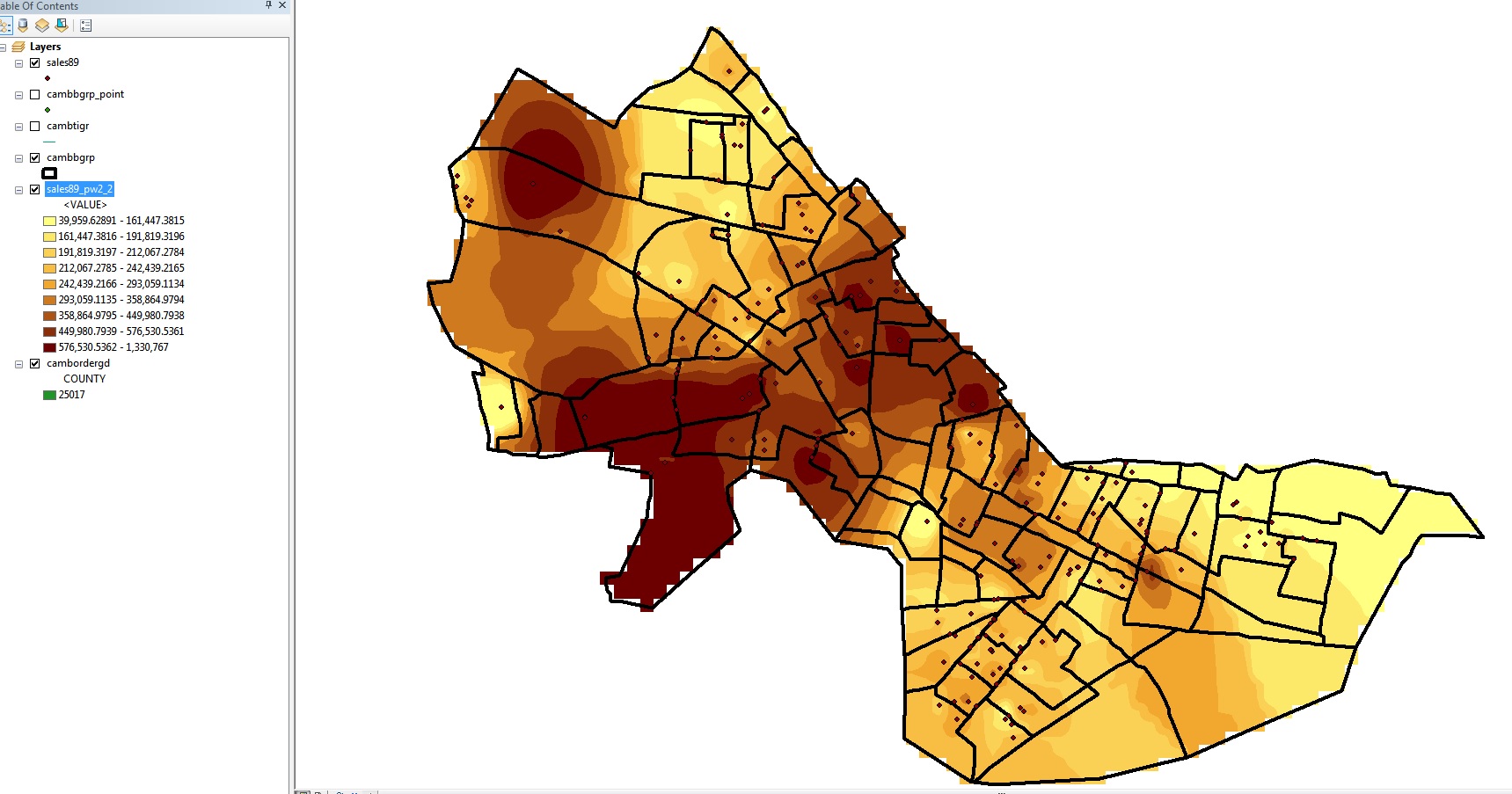
|
Fig. 5. Interpolation with mask
Note that all the values inside Cambridge are the same as before, but
the cells outside Cambridge are 'masked off'. [Note:
When you 'interpolate to raster' using inverse distance weighted (IDW)
in ArcMap, the thematic map display does a further smoothing of the
computed values for each cell so the map in Fig. 4 looks more like a
contour plot then the display of the discrete values for each grid cell
-- zoom in to see what I mean. But this is for display purposes only and
the grid cell values saved in the attribute table are a single value for
each grid cell as calculated via the IDW averaging.)
To get some idea of how the interpolation method will affect the
result, redo the interpolation (using the same mask) with the power set
to 1 instead of 2. Label this surface 'sales89_pw1.'
Use the identify tool to explore the differences
between the values for the point data set, sales89,
and the two raster grids that you interpolated. You will notice that the
grid cells have slightly different values than the realprice in sales89,
even if there is only one sale falling within a grid cell. This is
because the interpolation process looks at the city as a continuous
value surface with the sale points being sample data that gives an
insight into the local housing value. The estimate assigned to any
particular grid cell is a weighted average (with distant sales counting
less) of the 12 closest sales (including any within the grid cell). In
principle, this might be a better estimate of typical values for that
cell than an estimate based only on the few sales that might have
occurred within the cell. [Note: You need to use the
identify tool since the grid cell values are floating points not
integers and ArcMap will not display the attribute table for raster
grids with floating point values.] Examining attribute values for raster
grid cells is further complicated because the displayed map is based on
additional smoothing of the values (via cubic convolution, bilinear
interpolation, etc. You can see the choices in the 'display'
tab of the layer properties window.). You can force ArcMap to shade
individual cell values by choosing 'unique values' for
the 'show' option on the symbology
tab of the layer properties window. Explore the various options on the
symbology and display tabs to get a feel for how you can examine and
display raster grid cell values compared with the now familiar way of
handling vector layers. [Note, on some CRON machines, the video
driver will not shade unique values properly -- every cell will be
black even though the legend looks okay. In this case, resort to
the 'classified' instead of 'unique' option for symbology, set the
number of classes to, say, 20 and apply these choices. Then you
can use the 'identify' button to get cell values by clicking in the
high priced zones.]
On your lab assignment sheet,
write down the original and interpolated values for the grid cell in
the upper left (Northwest part of Cambridge) that contains the most
expensive Realprice value in the original sales89 data set.
Do you understand why the interpolated value using the power=1 model is
considerably lower than the interpolated value using the power=2 model?
There was only one sale in this cell and it is the most expensive 1989
sale in Cambridge. Averaging it with its 11 closest neighbors (all
costing less) will yield a smaller number. Weighting cases by the square
of the inverse-distance-from-cell (power=2) gives less weight to the
neighbors and more to the expensive local sale compared with the case
where the inverse distance weights are not squared (power=1).
Finally, create a third interpolated surface, this time with the
interpolation based on all sales within 1000 meters
and power=2 (rather than the 12 closest neighbors). To
do this, you have to set the Search radius type: Fixed
and Distance: 1000 in the Inverse Distance
Weighted dialog box. Call this layer 'sales89_1000m'
and use the identify tool to find the interpolated value for the
upper-left cell with the highest-priced sale. (Confirm
(!) that the display units are set to meters in View
> Data Frame Properties > General before interpolating
the surface. The distance units of the view determine what units are
used for the distance that you enter in the dialog box.) What
is this interpolated value for the cell containing the most
expensive sale and why is this estimate even higher than the power=2
estimate?
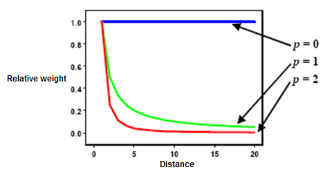
As indicated above, weights are proportional to the inverse of the
distance (between the data point and the prediction location) raised to
the power value p. If p = 0, there is no decrease with distance, and the
prediction will be the means of all the data values in the search
neighborhood. If p value is very high, only the immediate surrounding
points will influence the prediction (from ArcGIS Desktop Help webpage).
Note: None of these interpolation methods is
'correct'. Each is plausible based on a heuristic algorithm that
estimates the housing value at any particular point to be one or another
function of 'nearby' sales prices. The general method of interpolating
unobserved values based on location is called 'kriging' (named after
South African statistician and Mining Engineer Danie G. Krige) and the
field of spatial statistics studies how best to do the interpolation
(depending upon explicit underlying models of spatial variation). Recent
versions of ArcGIS offer an optional 'GeoStatistical Analyst' extension
that includes several tools for kriging and exploratory spatial data
analysis. (Check
out the ArcGIS help files which not only explain the geostatistical
tools in ArcGIS but also provide references.)
IV. Interpolating Housing
Values Using CAMBBGRP
Another strategy for interpolating a housing value surface would be to
use the median housing value field, MED_HVALUE, from
the census data available in cambbgrp. There are
several ways in which we could use the block group data to interpolate a
housing value surface. One approach would be exactly analogous to the sales89
method. We could assume that the block group median was an appropriate
value for some point in the 'center' of each block
group. Then we could interpolate the surface as we did above if we
assume that there was one house sale, priced at the median for the block
group, at each block group's center point. A second
approach would be to treat each block group median as an average value
that was appropriate across the entire block group. We could then
rasterize the block groups into grid cells and smooth the cell estimates
by adjusting them up or down based on the average housing value of
neighboring cells.
Let's try the first approach. This approach requires blockgroup
centroids, but we have already shown how to create them in earlier
lectures and labs. The Cambridge block group centroids have been saved
(along with a few of the columns from the cambbgrp
shapefile) in the shapefile cambbgrp_point. Make sure
that layer has been added to your Data Frame and then do the following:
- Choose the 'Spatial Analyst Tools> Interpolation>
IDW (Inverse Distance Weighted)' tool.
- Select cambbgrp_point as your input layer
and MED_HVALUE as your Z Value Field. Take
the defaults for method, neighbors, and power.
- Name this layer hvalue_point.
- Click OK and you should get a shaded
surface like this:
(When using Quantile, 9 classes)
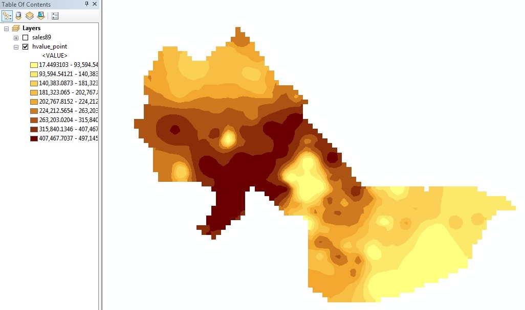
|
Fig. 6. Interpolation with centroids
of census block group polygons
Next, let's use the second approach (that is, using the census
blockgroup polygon data) to interpolate the housing value surface from
the census block group data.
- If you haven't already done so, add the cambbgrp.shp
to your data frame.
- Select Conversion Tools> To Raster> Feature to
Raster. The Features to Raster
window will show up.
-
- Choose cambbgrp for the Input
features.
- Choose MED_HVALUE for the Field.
- Output cell size should be 100
- Set the location for the output raster to be a
writable local drive (such as
C:\temp) and the name
of the grid file (cambbgrpgd) and click
OK.
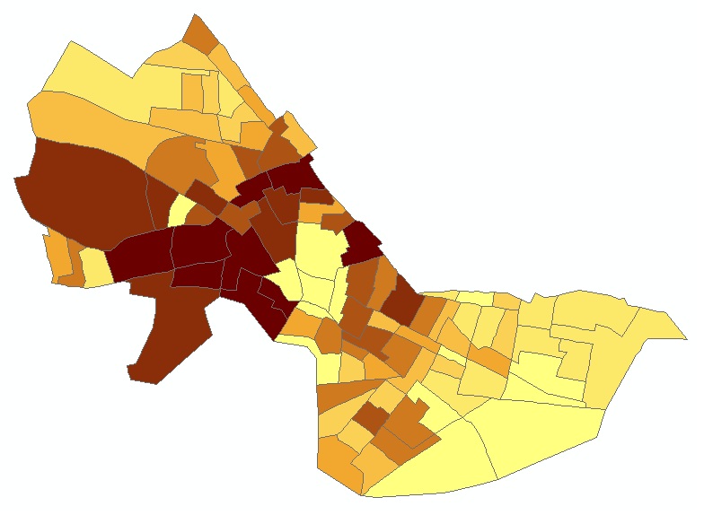
As you can see from the images below, except for the jagged edges, the
newly created grid layer looks just like a vector-based thematic map of
median housing value. Do you understand why this is the case (When using
Quantile, 9 classes)?
|
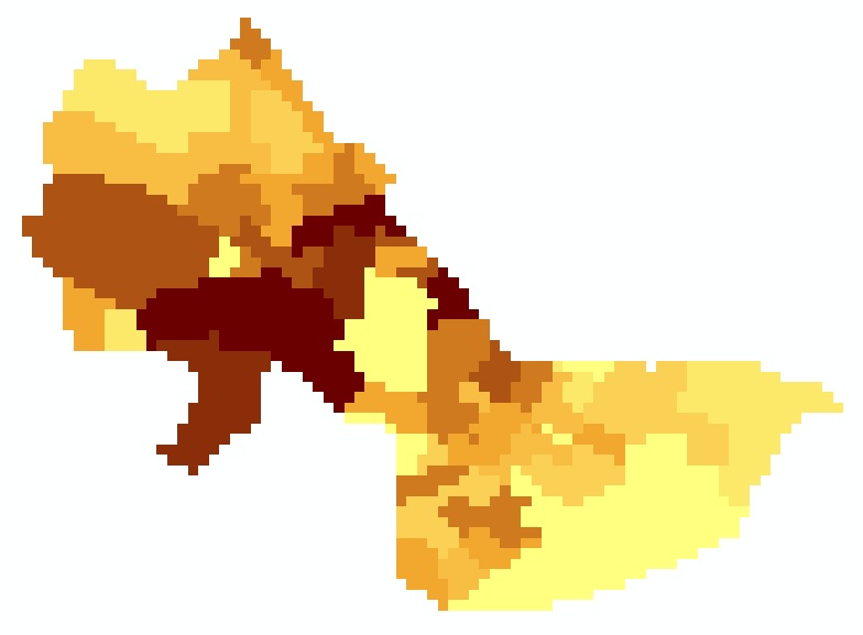
|
Fig. 7. Vector-based thematic map vs.
Raster-based thematic map
Examine its attribute table. Among the original 94 block groups,
there were 63 different housing values (including 0). The
attribute table for numeric raster grids does *not* have a row for every
grid cell. Rather it has a row for each unique grid cell
value. In this case, there are 63 rows --one for each
unique value of MED_HVALUE in the original cambbgrp
coverage. The attribute table for grid layers contains one row for each
unique value (as long as the cell value is an integer and not a floating
point number!) and a count column is included to
indicate how many cells had that value. Grid layers such as hvalue_points
have floating point values for their cells and, hence, no
attribute table is available. (You could reclassify
the cells into integer value ranges if you wished to generate a
histogram or chart the data.)
Finally, let's smooth this new grid layer using the Spatial
Analyst Tools> Neighborhood> Focal Statistics
option. Let's recalculate each cell value to be the average of all
the neighboring cells - in this case we'll use the 9 cells (a 3x3
matrix) in and around each cell. To do this, choose the following
settings: (they are the defaults)
- Input raster: CAMBBGRPGD
- Output raster: [your working space]/hvalue_poly
- Neighborhood: Rectangle
- Width: 3
- Height: 3
- Units: cell
- Statistic type : Mean
Click 'OK' and the hvalue_poly layer will be added
on your data frame. Change the classify method to "Quantile". You
should get something like, although not exactly the same as, this:
(When using Quantile, 8 classes)
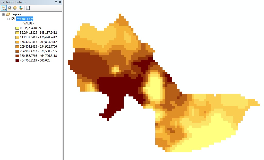 |
Fig. 8. Smoothing by neighborhood
statistics function
One might assume that selecting rows in the attribute table (for
hvalue_poly) would highlight the corresponding cells on the map. Try
it! However, the attribute table is not accessible
since the grid cell values are floating point numbers and ArcMap makes
the attribute table available for grid layers only if the values are
integers. [You could use the int()
function (in ArcToolbox) to create a new grid cell layer whose
values are obtained by truncating the hvalue_poly values to integers.]
Instead, use the 'identify' tool to click in the high value parts of Cambridge in order
to identify the highest valued grid cells. Find
the cell containing the location of the highest price sales89 home
in the northwest part of Cambridge. What is the interpolated
value of that cell using the two methods based on MED_HVALUE?
to click in the high value parts of Cambridge in order
to identify the highest valued grid cells. Find
the cell containing the location of the highest price sales89 home
in the northwest part of Cambridge. What is the interpolated
value of that cell using the two methods based on MED_HVALUE?
Many other variations on these interpolations are possible. For
example, we know that MED_HVALUE is zero for several
block groups--presumably those around Harvard Square and MIT where
campus, commercial, and industrial activities results in no households
residing in the block group that are owner-occupied and have a housing
value reported in the census data. Perhaps we should exclude these
cells from our interpolations -- not only to keep the 'zero' value
cells from being displayed, but also to keep them from being included
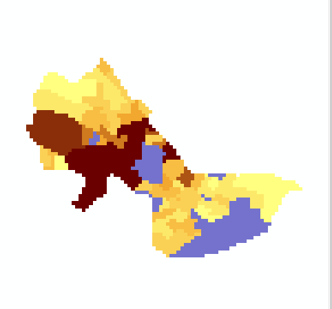
in the neighborhood statistics averages. Copy and paste the cambbgrp
layer into the same Data Frame and use the query tools in the Layer
Properties > Definition Query tab to exclude
all block groups with MED_HVALUE = 0 (which means
include all block groups with MED_HVALUE > 0 -- therefore, another
way to do this would be to select by attributes MED_HVALUE > 0).
Now, recompute the polygon-based interpolation (Hint: the major
difference between the first and second approaches of interpolating
housing values is that the former one is centroid-based, and the
latter one is polygon-based) and call this grid layer 'hvalue_non0'.
Select the same color scheme as before. In the data window, turn off
all layers except the original camborder layer
(displayed in a non-grayscale color like blue) and the new hvalue_non0
layer that you just computed. The resulting view window should look
something like the following (When using Quantile, 9 classes).
|
Fig. 9. hvalue_non0
Notice the no-data cambordergd cells sticking out
from under the new surface and notice that the interpolated values
don't fall off close to the no-data cells as rapidly as they did
before (e.g., near Harvard Square). You'll also notice that the
low-value categories begin above $100,000 rather than at 0 the way
they did before. This surface is about as good an interpolation as we
are going to get using the block group data.
Comment briefly on some of the characteristics of this
interpolated surface of MED_HVALUE compared with the ones derived
from the sales89 data. Are the hot-spots more concentrated
or diffuse? Does one or another approach lead to a broader range
of spatial variability?
V. Combining Grid Layers Using the Map
Calculator
Finally, let us consider combining the interpolated housing value
surfaces computed using the sales89 and MED_HVALUE methods. ArcGIS
provides a 'Raster calculator' option that allows you
to create a new grid layer based on a user-specified combination of the
values of two or more grid cell layers. Let's compute the simple
arithmetic average of the sales89_pw2_2 grid layer and
the hvalue_non0 layer. Select Spatial
Analyst > Map Algebra > Raster Calculator and
enter this formula:
("hvalue_non0" + "sales89_pw2_2") / 2 and
click Evaluate.
The result is a new grid which is the average of the two estimates and
looks something like this:
(When using Quantile, 9 classes)
|
Fig. 10. Raster Calculation
The map calculator is a powerful and flexible tool. For example, if you
felt the sales data was more important than the census data, you could
assign it a higher weight with a formula such as:
("hvalue_non0" * 0.7 + "sales89_pw2-2" * 1.3) / 2
The possibilities are endless--and many of them won't be too
meaningful! Think about the reasons why one or another interpolation
method might be misleading, inaccurate, or particularly appropriate. For
example, you might want to compare the mean and standard deviation of
the interpolated cell values for each method and make some normalization
adjustments before combining the two estimates using a simple average. For
the lab assignment, turn in a properly annotated PDF of your ArcMap
layout for this map. In addition, enter on the lab assignment answer
sheet your final interpolated value (using the first map-calculator
formula) for the cell containing the 20 Coolidge Ave sale on March
15, 1989. (in the Southwest part of Cambridge). This house was
the 5th most expensive 'realprice' in the dataset. Write this value
on the assignment sheet.
VI. Combining Grid Layers Using Weighted
Sum in ModelBuilder
Next, we can 'automate' some of these raster analyses by creating a
simple ModelBuilder model of one or another of the above steps. We can
do an identical analysis, or we can refine things somewhat using
additional capabilities of the "Weighted Overlay Tool".
Setup
To create a new ModelBuilder model, first make sure that you know where
ArcGIS is going to save your model. The location of saving a new toolbox
is the Current workspace. The default one on MIT's network is
H:\WinData\Application Data\ESRI\ArcToolbox." This should allow you to
access the same model from different workstations, but if you want to
share (or back up!) a model, it is good to know where it is located. In
general, if you are creating models specific to a particular project,
consider putting them in a directory near the project data. Therefore,
as indicated in the previous section, we have changed the Current
workspace to 'C:\TEMP\[your working folder]'. You can't
directly "open" or "save" ModelBuilder models. However you can move them
around in ArcCatalog.
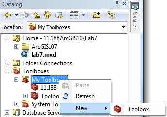
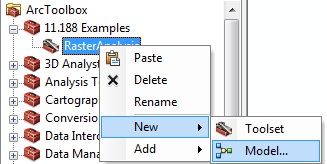
To Create a New ModelBuilder Model, first create a "Toolbox" to contain
it. In the Catalog window, right-click
the "My Toolboxes", and then click New> Toolbox, named as
'11.188Lab7'.
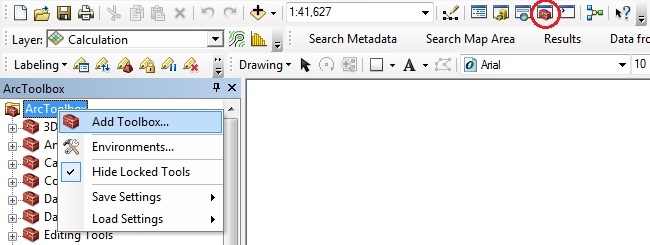
Open the main ArcGIS toolbox (red tools icon). Then right
mouse-click on ArcToolbox to get the contextual menu
shown, and select Add Toolbox to upload the
new toolbox '11.188 Lab 7'. You can also
simply drag and drop your toolbox.
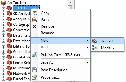
Once you have a container located in a writable folder, it would be
convenient to create a toolset(s) in order to organize tools within a
toolbox, and then you can create a new Model within it.
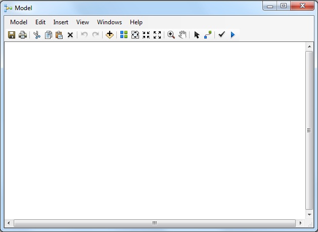
This will bring up and empty Model diagram window:
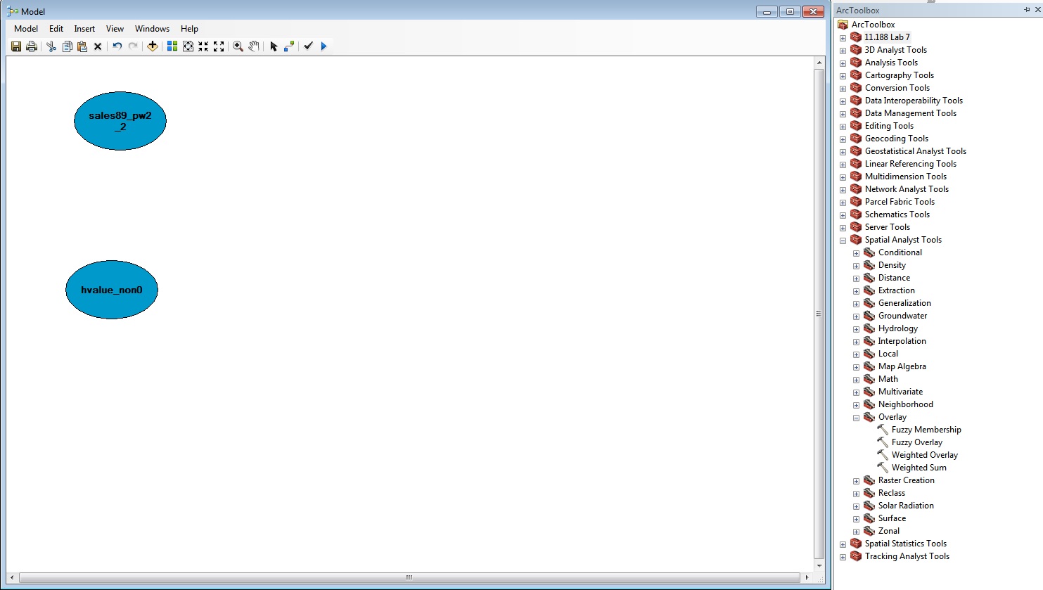
You should then be able to drag and drop your two grids (called
sales89_pw2_2 and havl_non0 in the
figure below) from the main map with "Table of
Contents" into the Model diagram window. You can also select layers to
add from a disk using the standard ArcGIS "yellow Plus" icon.
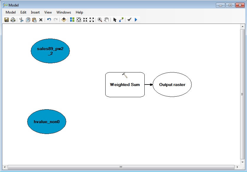
Once you have added your input data, you need to select the
geoprocessing operator you want to use. In this case, it is the
"Weighted Sum " (under Spatial Analyst Tools / Overlay in the
toolbox). Remember that if you cannot find a tool, there is an index and
a search available. Drag and drop the weighted overlay operator onto the
ModelBuilder window.
After dragging and dropping the 'weighted sum' operator, the model
window will look something like this:
Next, use the "connect" tool (third from the right) to link from source
data to the operator (you will need to select "Input Raster" to define
the connection). When your model is correctly connected, the operator
will turn yellow to indicate that it has all required inputs. Once you
make the connection (see below), double click on the Weighted Sum
operator. This brings up a dialog box in which you can specify the
weights to use for each input grid cell value. Click the triangular
'run' button to run the entire model.
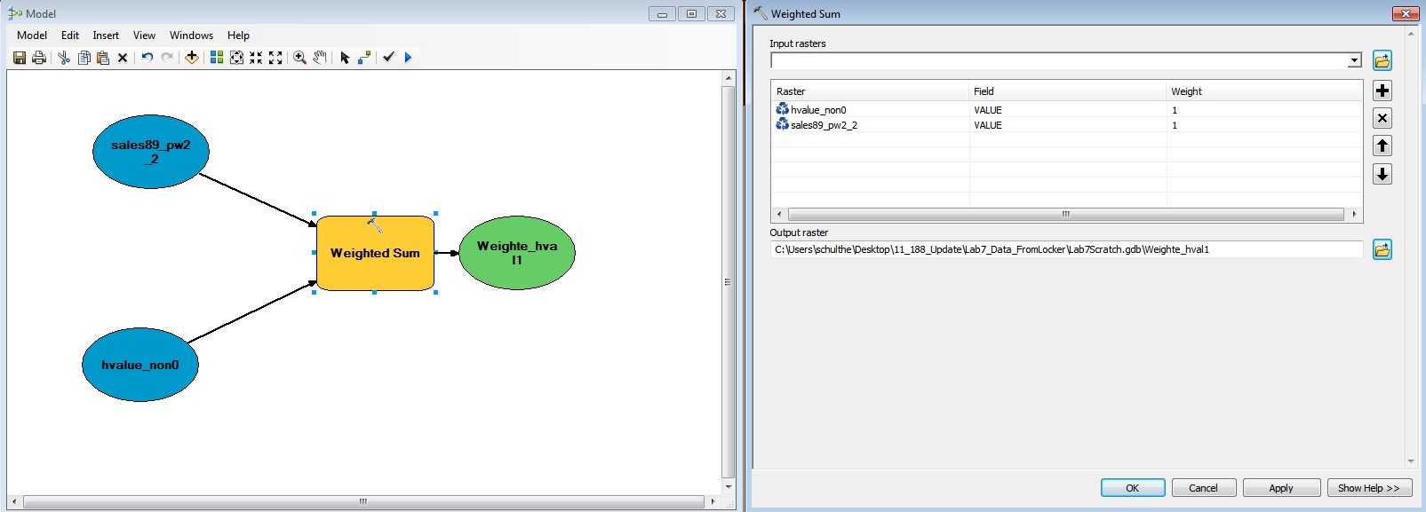
Try to create a weighted overlay in which the hvalue_non0
is weighted at 70% influence, and the sales89_pw2_2
layer interpolated from the sales_89 point has a 30% influence. When the
census-derived data is 0, you want the weighted overlay tool to fill in
with sales_89 estimates. Getting the weights to be handled correctly for
grid cells that are missing in one of the layers can be tricky and may
require adding additional steps to the model. Also, using map algebra to
combine raster layers can get tricky when you need to rescale grid
values or convert them to integer values before doing the map algebra
that you want. (ArcMap provides additional Math functions to help in
this regard. See, for example, the Int() function to
convert floating point grid cell values to integers.) For this exercise,
you do not need to turn in any results from your use of Model Builder.
However, we will make further use of Model Builder in Homework Set #3.
-----
We have only scratched the surface of all the raster-based
interpolation and analysis tools that are available. And, we have
shortchanged the discussion of what we mean by 'housing value' -- e.g.,
the sales and census data include land value. If you have extra time,
review the help files regarding the Spatial Analyst extension and try
computing, and then rasterizing and smoothing, the density surface of
senior citizens (and/or poor senior citizens) across Cambridge and the
neighboring towns. (We will work with a density surface of poor senior
citizens in Homework #3). Another suggestion is to use model builder to
cut out non-residential areas and reallocate population to the
residential portions of the block groups -- then compute population
density.
Please use the
assignment page to complete your assignment and upload it to
Stellar.
Created by Raj Singh and Joseph
Ferreira.
Modified for 1999-2015 by Joseph
Ferreira, Thomas H. Grayson, Jeeseong Chung, Jinhua Zhao, Xiongjiu
Liao, Diao Mi, Michael Flaxman, Yang Chen, Jingsi Xu, Eric Schultheis,
and Hongmou Zhang.
Last Modified: March 30, 2020 by Joe Ferreira.
Back to the 11.188 Home Page. Back
to the CRON Home Page.