Masachusetts Institute of Technology - Department of
Urban Studies and Planning
| 11.521 |
Spatial
Database Management and Advanced Geographic Information
Systems
|
| 11.523 |
Fundamentals
of Spatial Database Management
|
Lab 6: Metro Boston Modeling using TINs, Model Builder and Community
Viz
In-Lab 13 March, 2018 (due April 3, 2018)
Overview
- Quick tour of terrain models using ArcScene and a 'hillshade' map of
Boston
- Further work on East Boston housing value model
- Introduction to Community Viz scenario modeling extension (via an
introduction to MetroFuture's Community Vix model of Boston growth)
- Introduction to QGIS, using our East Boston sales data.
Lab #6 will be more open-ended than the previous 5 labs, but most of the
exercises are optional. The idea is to suggest several paths that build on
what we have done in previous labs. One theme is to build on the
visualization of East Boston land and housing values. A second theme is to
expand our use of model building tools to include expanded datasets and
spatial analysis interactions in our examination of metropolitan growth
and redevelopment. Another theme is to introduce you to an open source GIS
software option, QGIS. Only a few parts of the suggested exercises need to
be turned in. The primary focus will be the test next week and the
homework sets (Set B due on Thursday and the database design Set C due
March 23) Additional in-class notes are available here: lab6_inclass.txt
Modeling Housing Value in East Boston
--The last section
of this lab provides the instructions to model housing value in East
Boston in QGIS
Lab #5 demonstrated some raster techniques that helped us interpolate
residential sales data from East Boston to develop a housing value
'surface' for East Boston. However, the visualization was not
particularly satisfying since the number of sales was relatively small
and the variation in house cost/size sufficiently large to yield a
surface that is more bumpy than we might consider realistic. Here are a
few additional steps that you might try (but are not required parts of
this lab exercise):
(1) Use the 'zonal statistics' tools to aggregate, at the block level,
the housing values estimated from the raster surface that you developed
in lab#5. (Instead of averaging the sales prices you may want to
consider the building assessed value per gross square foot, plus
perhaps, the land value per square foot of lotsize.) Use the Boston
block shapefile (.\data\bosblocks05\blockmap05.shp) that was provided
for Lab #5 - or, better yet, make your own block-level map for East
Boston by dissolving the parcel boundaries that share the same block ID
(called 'WPB' for ward, precinct, and block) on each side of the
boundary. The zonal statistics tools are available in ArcToolbox. It can
be tricky to figure out which tool let's you join the result back to the
East Boston block shapefile. Only consider blocks that have some minimal
amount of housing on them - e.g., do not include the airport blocks, and
you may want to focus only on residential blocks with at least a few
triple deckers as we have done before.
(2) Once you have averaged the residential housing value for each block
and joined the result to the block shapefile, you can thematically shade
the blocks to get a housing value map. Copy this layer (and the parcel
and building layer) to ArcScene and extrude the building footprints and
the blocks to a height proportional to the roof heights (for footprints)
and average residential values (for blocks). Make the footprint layer
semi-transparent. Can you get a visualization that is not too cluttered
and conveys a sense of housing value as well as massing? If the building
extrusions make it hard to see the thematic shading of ground parcels,
you might consider adjusting the transparency of the building layer or
coloring the buildings based on your estimated value of their blocks.
(3) Try to add these steps to the Model Builder model that you started
in Lab #5.
Terrain models using ArcGIS and ArcScene
We have mentioned but not yet demonstrated the use of terrain models to
handle non-flat surfaces. If we had a terrain model for East Boston, we
would see the effect on land and housing values of the hills along the
northeast and southwest of East Boston. In lab today, I'll illustrate
the use of digital elevation models for 2-D 'hillshading' and walk you
through this short exercise that uses a TIN (triangulated irregular
network) surface model of Boston. For the lab demo, I will use a TIN
model only for the 'mainland' part of Boston - not for East Boston. You
can build a TIN for East Boston using the Digital Elevation Model and/or
Contour Maps available from MassGIS. For your convenience, however, I
have already built a TIN for East Boston from the 1:5000 elevation
contours that are available from MassGIS.
How the Boston TIN was constructed (just read, no need for you to do
this part)
- Build TIN from a digital elevation model (DEM)
- connect triplets of elevation points to form planar triangles
- thin out the triangulated network to form larger triangles where
nearby elevations/slopes are similar
- this triangulated irregular network models the surface as
interconnected planar triangles.
- Alternatively, build the TIN from an elevation contour shapefile
- Download 1:5000 scale elevation contours shapefile for Boston
(hp35.zip) from MassGIS
- In ArcToolbox, use the 'create TIN' tool in '3D analyst / data
management / TIN'
- To focus on East Boston, first export into east_boston_hp.shp
only those shapefile contours that intersect the East Boston
planning district
- Use the 'create TIN' tool to convert the East Boston
elevation contours into a triangulated irregular network
- The East Boston TIN is saved in a folder named east_boston_tin
in the class data locker: ./data/eboston_hp
- Shade each triangle in the TIN using a color based on elevation and
darkness based on slope/aspect (usually relative to 'sunlight' from
the northwest side)
- Display the TIN in ArcMap and/or in ArcScene and overlay other
vector coverages
Your Exercise: (Short and easy to do today though you can turn it
in on Tuesday after Spring Break)
-
This part will be demonstrated during lab:
- Load into ArcMap the Boston TIN layer in the class locker:
.\data\bostin\hyp_bos_tin AFTER copying the entire ./data/BOSTIN
directory tree to your local drive.) All the files that you need are
in this directory.
- Zoom in and view the layer properties to examine the data structure
- do you see how the color and shading are done?
- Start ArcScene by double-clicking on bostin_demo.sxd,
the saved ArcScene document.
- Experiment with the 3D interface
- Add an additional vector layer - try the road layer in the same
bostin directory
- Adjust the symbology to make the major roads wider, etc.
- Adjust the 'base heights' properties of the layer so the
roads are draped on top of the terrain (notice that roads
beyond the bostin extent disappear once you do this)
- Note some of the other layer properties and ArcScene
features (e.g., you can export a VRML file - virtual reality
markup language form of the 3D scene)
This is the part that you will need to turn in:
- Now, do a similar 3D visualization of East Boston
- start up ArcMap using eboston05_lab2_start.mxd
(in the now-familiar eboston05 folder)
- Copy the entire folder ./data/eboston_hp
folder from the data locker to C:\TEMP\eboston05
- Add the East Boston elevation contours (east_boston_hp)
and TIN (east_boston_tin) to your ArcMap session
- Open a new ArcScene session and build a view of East Boston
- Use a local copy of the East Boston TIN folder (east_boston_tin)
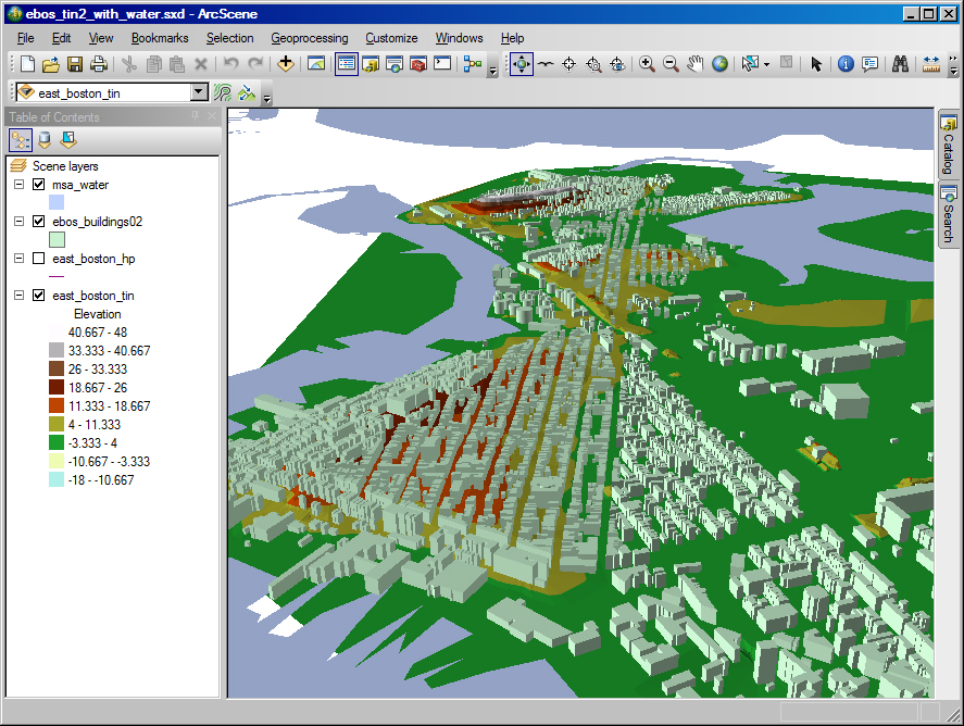
- Turn in a screen shot of East Boston with the building
footprints extruded to roof minus ground height (Roof-GND) above
the TIN surface model. The view should look something like this
(with some non-flat terrain evident in Orient Heights [upper middle
area] and Jefferson Point [lower center-left area]):
Modeling Metropolitan Growth and (Re)Development
This section introduces you to the 'Scenario 360' part of a modeling
tool called Community Viz that is a substantial 'extension' of ArcGIS
that was originally financed by the Orton Foundation. Community Viz is a
little like Model Builder on steroids. That is, you use it to develop a
model as a sequence of interconnected ArcGIS spatial data processing
steps. However, Community Viz goes further than Model Builder in
providing analytic templates for modeling complex interactions, and it
has wizards and tools to help in building and running the model.
Community Viz also focuses on scenario modeling - that is, playing out
the long term consequences of growth and development in the face of
various constraints and interactions regarding land use, accessibility,
environmental constraints, and the like.
A few years back, the ongoing MetroFuture regional planning effort for
metro Boston used Community Viz to model Boston devleopment out to 2030.
The Metropolitan Area Planning Council (MAPC) is the organization that
built the model. The Boston MetroFuture model is available for our use
but the Community Viz add-on tools are not licensed to run on CRON
machines. Nevertheless, the tutorial for Community Viz and some of the
documents for the MetroFuture model can give you a sense of what these
add-on models can do.
(1) Skim the scenario 360 tutorial in the 'proj11' portion of the class
locker: .\proj11\metrofuture\Scenario_360_Tutorials.pdf
(2) Read Your Guide to "Winds of Change" in
the class locker: :.\proj11\metrofuture\explore_scenario_woc.pdf
This document explains one of the four scenarios that
MetroFuture models using Community Viz. The 'indicators' and 'drivers'
on the last few pages are the assumptions and key relationships in the
Community Viz model that explain the results of modeling the effects of
a 'winds of change' strategy for metro Boston growth out to 2030.
If the Community Viz add-ons were installed, the following instructions
tell you how to run it for one of the tutorial datasets and for
MetroFuture.
(3) * Since the MetroFuture model is quite complex, start first with
one of the Community Viz 'tutorial examples'. I would illustrate
'Communityville' during lab time, if any of the lab machines could run
Community Viz. If and when the machines do run the model, be sure,
BEFORE RUNNING ANY COMMUNITY VIZ MODEL, to copy the entire CVFiles
directory tree to a local, writeable drive. The next several steps walk
you through exploring the Communityville sample model but cannot be done
in lab today.
(4) * Start Community Viz - Scenario 360 from the
Start/Community-Viz/Scenario-360 menu on the WinAthena PC. Once ArcGIS
comes up, you will see a new toolbar for scenario-360 and a dialog box
asking you to choose the saved analysis you would like to open. Browse
to your local copy
of Communityville and select it. Rerun the model after adjusting the
assumption about distance from bird nest. Note the reduction in allowed
development that is computed and displayed as the distance-from-nest
assumption is adjusted. Explore the diagram and formulas that codify the
spatial and mathematical relationships.
(5) * If Start/Community-Viz is missing, you may need to reboot the
machine. Also, after Communityville has been opened inside of ArcGIS,
you may see a message indicating that ChartFX is not working. In this
case, exit from ArcGIS since CommunityViz will not work. The machine
needs to run an 'msi' installation file in: C:\Program
Files\CommunityViz\Scenario 360\ChartFX\ChartFX.msi Unfortunately, you
do not have permission to run this file (otherwise you could just
double-click on the file to run it.) Depending upon the order of
consideration of bootup files, these charting tools occasionally do not
work. If you reboot the machine, the 'msi' file may get run properly
during the bootup. After running ChartFX.msi, go back to step (4) to
restart CommunityViz.
(6) * To run the MetroFuture model, copy the entire
directory: K:\proj08\CVFiles_metro to a local,
writeable directory. Then start CommunityViz as before (or start ArcGIS,
make sure the CommunityViz extension is loaded and viewable, and choose
scenario-360/analysis to browse to your local MetroFuture_BCCS_may2007
location).
(7) * Explore the effects of changing some of the assumptions for water
or type of housing. (Rerunning the model after you have changed these
assumptions takes some time, but much less than changes in many other
assumptions.)
* The CommunityViz extension to ArcGIS is not currently installed on
CRON machines in building 9 or those in W31-301 so we are not currently
able to run either the Community Viz tutorial or the MetroFuture model.
Nevertheless, the documentation and, especially, the material used in
MetroFuture public forums by MAPC provide a good sense of how the
indicators in the model can be used to foster discussion about
alternative futures.
Introduction to QGIS
We will use QGIS for this exercise, in order to introduce you to this free
and open source alternative to ArcMap. Both ArcGIS and QGIS allow you to
process, view, edit and analyze geographic information in a similar way.
However, each program has its own pros and cons. For example, ArcGIS
provides more statistical tools, easier projection tools, 3D visualization,
a network analyst, and a Model Builder that make it superior in this sense,
whereas QGIS has the advantage of being open source and having the option to
connect to plugins that perform a variety of analysis and
visualizations. Let's get to know QGIS better with a couple examples
(a) Symbolize a layer in QGIS
To get started with QGIS, familiarize yourself with the QGIS Interface.
Let's make a map showing the number of parcels in each of Boston's
blocks.
1. Open the QGIS Desktop version that is installed on Lab machines.
2. Add the Boston block shapefile (.\data\bosblocks05\blockmap05.shp)
that was provided for Lab #5 to your work space. In QGIS you need to be
aware of the type of data you are adding to your work space. To add the
blocks, click on the Add vector layer symbol (  )
and navigate through your folders to choose blockmap05.shp. Notice that
some of the other symbols on the left side of your screen are used to
add other types of data, such as rasters, relational databases
(Postgres, Oracle, SQLserver, ...), delimited text layers (such as a
.csv), etc.
)
and navigate through your folders to choose blockmap05.shp. Notice that
some of the other symbols on the left side of your screen are used to
add other types of data, such as rasters, relational databases
(Postgres, Oracle, SQLserver, ...), delimited text layers (such as a
.csv), etc.
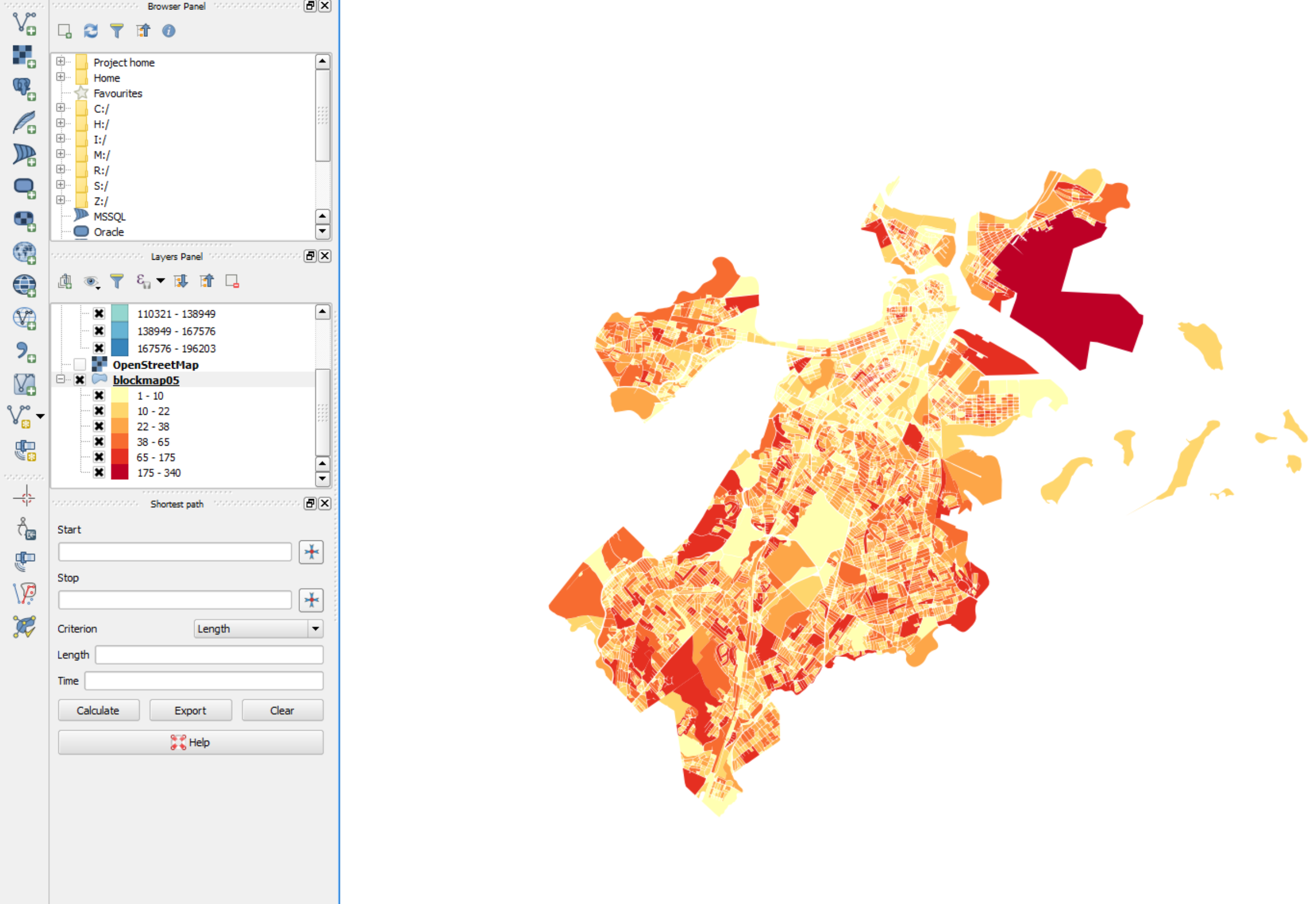
blockmap05 was built by dissolving the parcels of each block, so the
attribute table shows the count of parcels that fall within each block.
3. Make sure your shapefiles are projected in the desired coordinate
system. Click on the Project properties symbol located at the bottom of
your workspace and select from the Projected coordinate systems NAD 83 /
Massachusetts mainland, which is the projection we had been using in
ArcMap. Note that this setting controls the coordinate system used
in the display window. QGIS already learns the on-disk coordinate
system of the X/Y vector data stored in the shapefile by reading the
blockmap05.prj portion of the blockmap05 shapefile components.
4. Just like you do in ArcMap, right click on the layer and open the
properties window to symbolize it. To categorize numerical data,
change the single symbol option to 'Graduated'. This is the equivalent
to the 'quantities' option in ArcMap, whereas 'Categorized' is the
equivalent to 'Categories'. Select the column count and choose the mode
and number of classes that you consider more appropriate to display your
data. You can click on symbol to adjust the transparency and the line
weight of your shapefile, as well as the fill and corners of your
polygons.
(b) Use the 'zonal statistics' plugin in QGIS to aggregate, at
the block level, the housing values estimated from the raster surface
that you developed in lab#5.
Let's try to do something more complicated. We are going to repeat the
exercise of section 1, but now in QGIS.
1. Load the data that we need for the analysis. You already have the block
shapefile (.\data\bosblocks05\blockmap05.shp) that was provided in Lab #5
in your canvas. Now add the masked raster surface of land values in East
Boston that is stored in the class data (.\data\eboston05\w001001.adr).
Make sure you load them from a local drive; otherwise the analysis will
run very slowly. To import your raster, click on the Add Raster
Layer ( )
and add the w001001.adr file . You can also find this option under the
layer menu on top of your screen.
)
and add the w001001.adr file . You can also find this option under the
layer menu on top of your screen.
Notice that the symbol  looks
a lot like the Postgres logo. This option lets you add shapefiles from
PostGIS, the spatial data manipulation extensions to PostgreSQL.
We will introduce PostGIS later in the semester.
looks
a lot like the Postgres logo. This option lets you add shapefiles from
PostGIS, the spatial data manipulation extensions to PostgreSQL.
We will introduce PostGIS later in the semester.
2. We don't want to edit our original shapefile with the analysis, so
let's create a copy of it and let's call it blocks05_q. To do so, right
click on your layer and choose Save As... Select the directory where you
want to store it and make sure the coordinate system is NAD
83/Massachusetts mainland.
3. Let's use one of the QGIS Plugins (similar to ArcMap's tools). Go to
Raster and choose zonal statistics. Select the Raster layer you want to
analyze (w001001) and the Polygon layer (blocks05_q). Write your
initials as the output column prefix, and make sure the Mean is checked
in the statistic-to-calculate list. Click OK, and open the attribute
table of your polygon shapefile to check the new fields that were added.
If you can't find the zonal statistics plugin, go to the menu
Plugins > Manage and Install Plugins, search for zonal statistics
and click on install plugin.
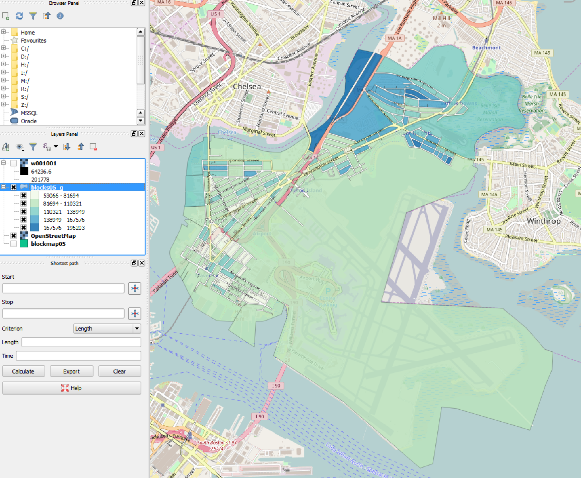
4. Now we need to symbolize our blocks according to the average land
value that derived from the vector layer. This time, select the column
<your initial>_mean and then click on Classify.
5. Finally, we need to add some context to our map. Let's try adding a
basemap from Openstreetmap. Search for the OpenLayers plugin in the
Manage and Install Plugins option under the Plugins menu, and install
it. Now go to Web > Open Layers Plugin > OpenStreetMap >
OpenStreetMap. Reorder your layers and play with their transparency
until you get a map that shows the story you want to tell.
QGIS does not have a layout view, and instead relies on a 'Print
Composer', which can be accessed by clicking on this symbol  .
You can learn how to use it in this link.
.
You can learn how to use it in this link.
(c) Connect QGIS to Postgres to add tables directly from our
server.
QGIS can handle the 64-bit vs 32-bit discrepancy that has caused us
some trouble during the semester whenever we have tried to import tables
from Postgres into ArcMap. We will show you how to make the connection
and import a table in this section:
1. Click on the Add PostGIS Layers symbol ()
and then choose 'New' in the Connections section of the pop-up.
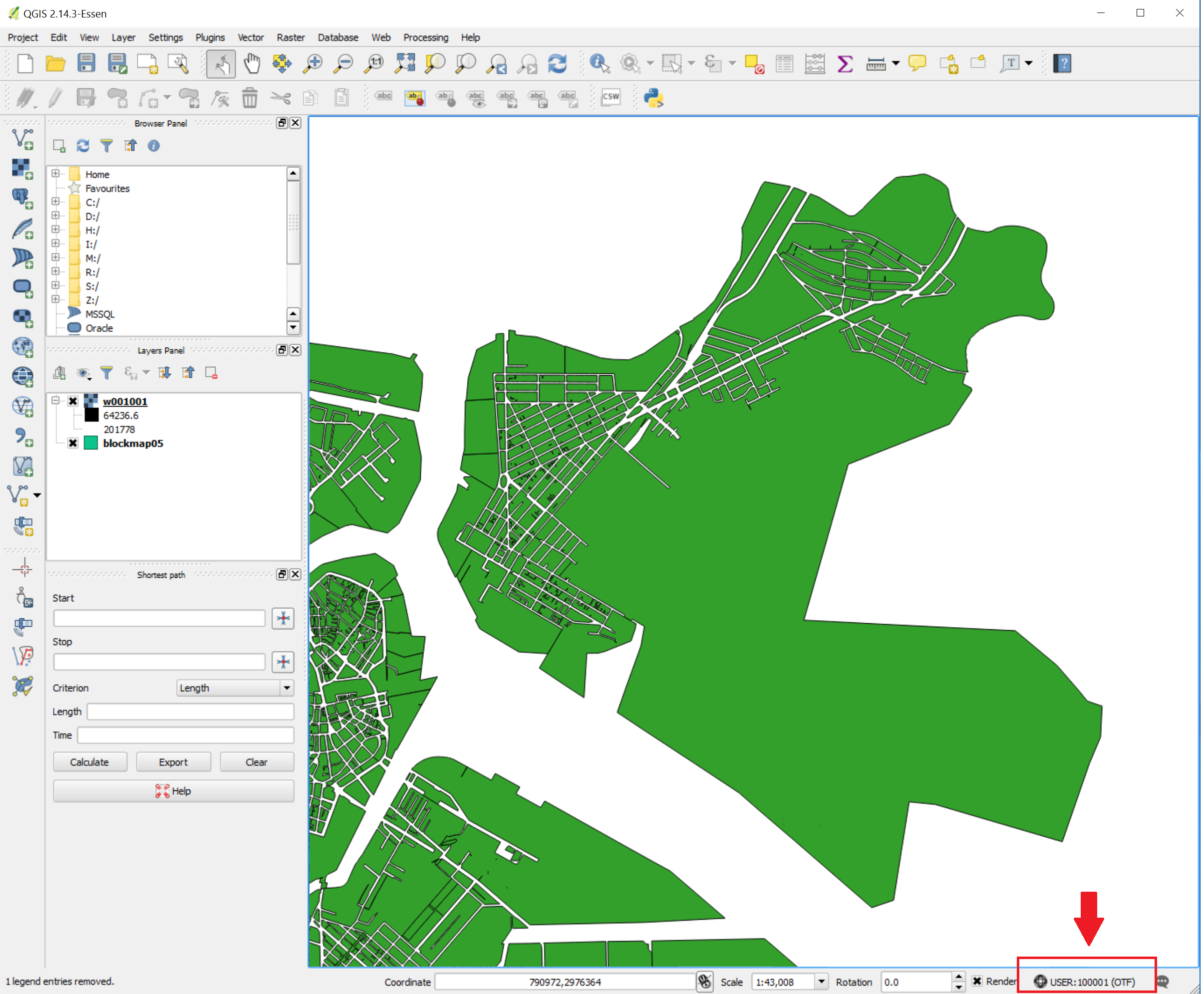
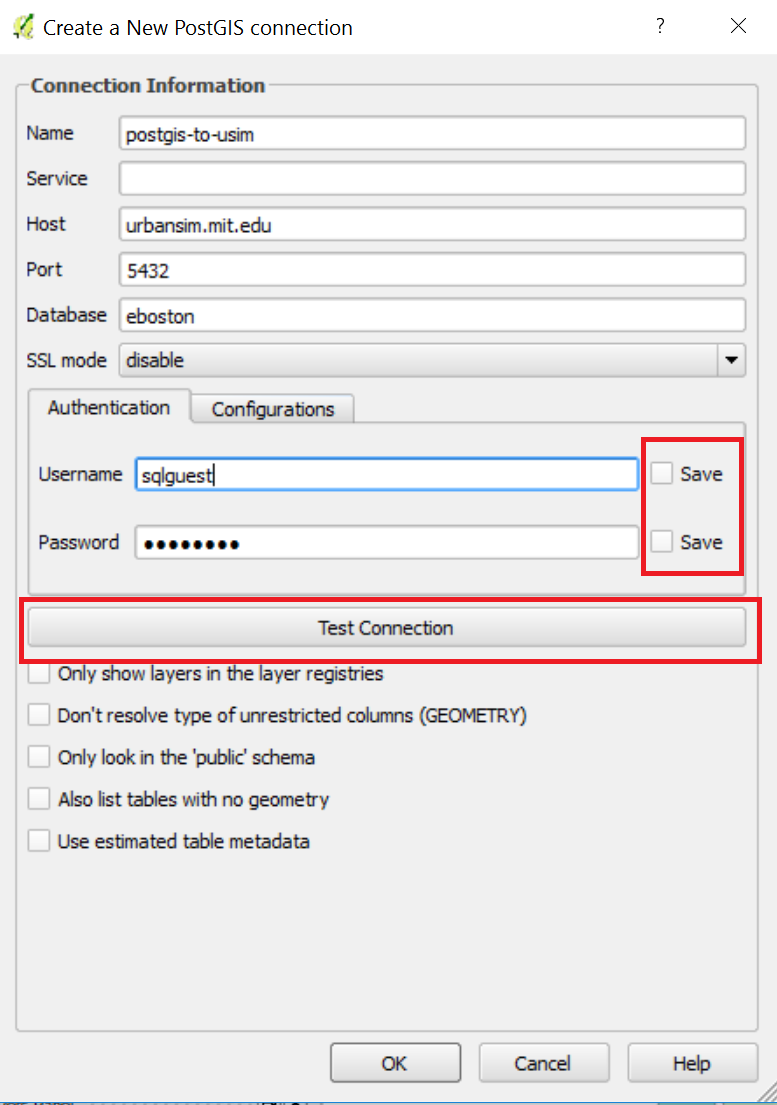
2. Fill all the required fields like the image below, but use your
personal account and connect to Postgres on 'cronpgsql.mit.edu' rather
than 'urbansim.mit.edu'. Remember you should not store your password
when working in a shared computer (and maybe not even n your own), so
don't check the save boxes. Test the connection, and click OK when you
receive a success message.
3. Now that you have the connection, click on 'Connect' and the Schema
will appear in the space below. Tell QGIS to also list tables with no
geometry, since so far we have only worked with alphanumeric tables on the
Postgres side. Navigate through the public schema and add the
ebos_parcels05 table to your workspace.
4. You can open the attribute table to check that it was imported
correctly. We could perform a variety of analyses with this table by
linking it, either spatially (displaying the centroids as points) or based
on a common field with a parcels shapefile. However, let's leave that for
another occasion so that you can have time to finish today's lab, study
for the test next week, or finish your pset B.
What to turn in
All that is required for this lab today, is the screen shot of the East
Boston terrain map that you developed in the second part. It
is due Tuesday, April 3, 2018 on Stellar (but you will
feel a lot better if you get it out of the way today or after the test
but before Spring Break!) . The rest of the lab is for your exploration.
Otherwise,you should concentrate on preparation for the test, wrapping
up current assignments and, after Thursday's lecture, the second
homework set on database design.
Home | Syllabus
| Lectures
| Labs | CRON
| MIT
Created by Joseph Ferreira (2008); last modified:
14 March 2017-8 [jf, josemg]