Solutions
Relocalization of the Control Box
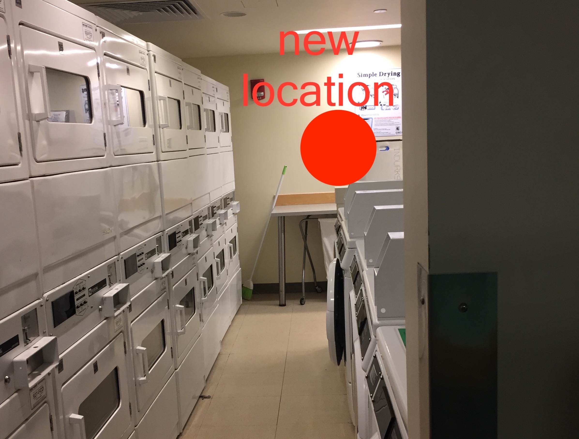
Relocating the control box in the Ashdown laundry would be a simple-to-implement redesign feature for the Tech-Cash system, while providing a major advantage to the user. By strategically placing the control boxes at the new specified locations, users are allowed a greater field of view thus allowing them to quickly verify if their machine number is correct or even avoiding them to actually memorize the machine number. Altogether, this simple redesign is actually providing an increase in usability for the Tech-Cash system by alleviating the users from simple but frequent difficulties due to its current location.

Enhance user interface and interactivity
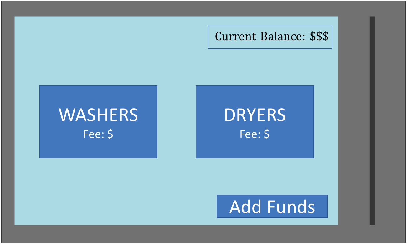
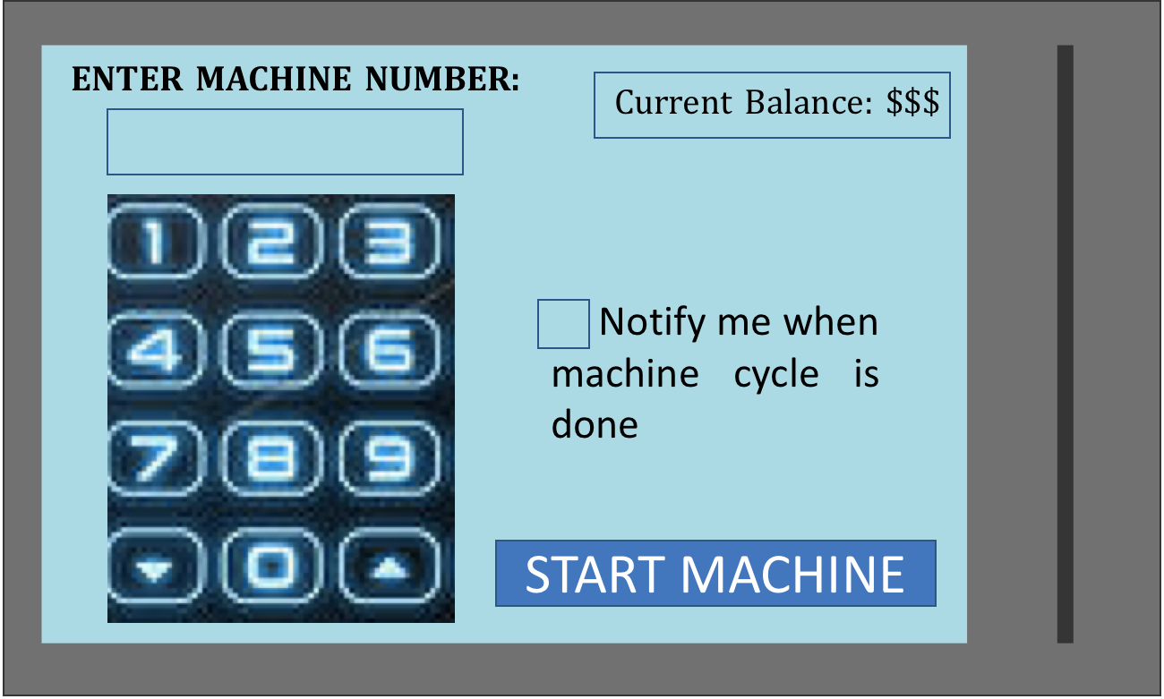
As described in the earlier part of this user-interface analysis, the Tech-Cash control boxes represent a major bottleneck to the user-experience; therefore for the purposes of this analysis, I propose a major redesign to the system (shown below). Starting with a larger display and pressure-sensitive, touch screen, the propose redesign would communicate multiple messages within one screen such as: simultaneously being informed of your current account balance and machine-use fee, compared to the inefficiency of the previous system in which the machine-fee message preceded the message with your current account balance ( a bit illogical in my opinion). By increasing the display area, thus adding multiple messages and user-options, this new set-up minimizes the steps for payment to only two-steps(comparable to payments with coins). Since the Tech-Cash system is well-integrated with each individual MIT student (given that it utilizes student-specific Kerberos account), enhancing user interactivity within the Tech-Cash control box like including "add funds" and "notify me" features seems as an exploitable addition.