Reading 15: Color

Source: UI Hall of Shame
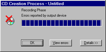
Our Hall of Shame candidate for the day is this dialog box from Adaptec Easy CD Creator, which appears at the end of burning a CD. The top image shows the dialog when the CD was burned successfully. The bottom image shows what it looks like when there was an error.
What does the squint test tell you about these dialogs? How could they use the color visual variable better?
Today’s reading is about choosing colors for a user interface.
Color is a property of the human visual system and how it responds to visible light of different wavelengths. (Other animals see different ranges of wavelengths).

Source: David Hall, CC0
So color is a subjective sensation. None the less, the human visual system has been extensively studied, so colors can be objectively measured and accurate numerical predictions made about color mixtures and color contrast.
We’ll discuss some of the properties of human vision that affect this decision, particularly the limitations of color vision. We’ll go over some models for representing colors, not just the familiar RGB model. And we’ll discuss some guidelines for choosing colors. The most important guidelines will be applications of rules we already discussed in graphic design: simplicity as much as possible, contrast where important.
Good references about color:
- Mark D. Fairchild, Color Appearance Models, 3rd Edition, Wiley, 2013 (going beyond colorimetry to appearance in context)
- Phil Green (editor), Color Management: Understanding and Using ICC profiles, Wiley, 2010 (in-depth on color management systems and color profiles)
- Colin Ware, Information Visualization: Perception for Design, Morgan Kaufmann, 2000 (for a design-oriented approach)
- Günther Wyszecki, W.S. Styles Color Science: Concepts and Methods, Quantitative Data and Formulae, Wiley Classics, 2000 (for a rigorous mathematical apprach rooted in experimental data)
Human Vision
The human eye is rather like a camera. So first, let’s look at a modern digital camera. They we can look at the human eye and see how it differs.
A Camera
A digital camera consists of a light-tight box with a flat photosensor, a lens, an iris and (for a still camera) a shutter. The photosensor has a regular array of **photosites* which convert light into electricity; the analog charge stored is amplified, measured with an analog to digital converter and sent to the image storage as a digital value for each photosite.
Colored filters in front of each photosite mean that some react mainly to red wavelengths, some to green, and some to blue. The filters are designed so that all visible wavelengths are covered, and the overlap between filters is carefully contolled so that all colors can be well distinguished.
An iris diaphragm allows the amount of light to be adjusted, and a shutter opens for a brief period to allow the image to be captured at the right exposure. (For a video camera, the photosensor is constantly scanned for each frame).
At the front, a compound lens gathers light from the scene and focusses it on the sensor. Multiple lens elements (some convex, some concave) made from glass with different refractive indices ensure that all wavelengths are focussed to a similar place. The position of some lens elements can be changed (by a motor, or by hand) to focus on nearby or far-away subjects as desired.
The interior of the camera is lined with matt black, light-absorbing material to cut down on internal reflections.
Human eye
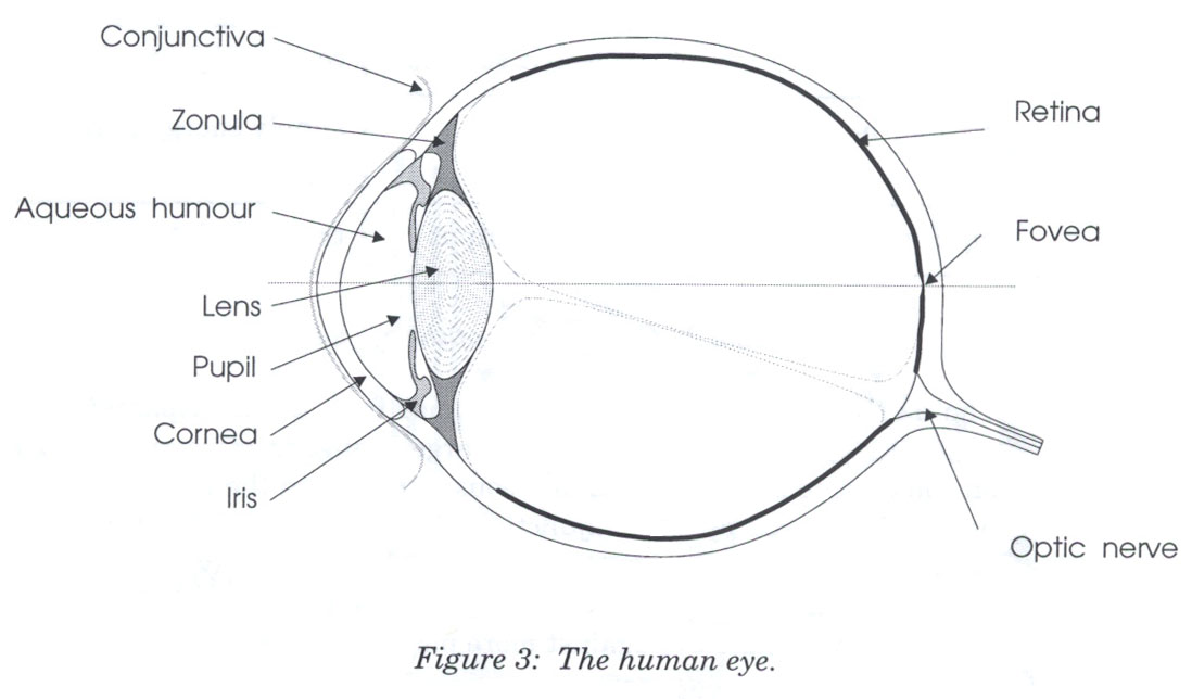
Source: Lilley, Lin, Hewitt, & Howard, Colour in Computer Graphics, University of Manchester.
Here are key parts of the anatomy of the eye:
- The cornea is the transparent, curved membrane on the front of the eye.
- The aqueous humor fills the cavity between the cornea and the lens, and provides most of the optical power of the eye because of the large difference between its refractive index and the refractive index of the air outside the cornea.
- The iris is the colored part of the eye, which covers the lens. It is an opaque muscle, with a hole in the center called the pupil that lets light through to fall on the lens. The iris opens and closes the pupil depending on the intensity of light. It opens in dim light, and closes in bright light.
- The lens focuses light. Under muscle control, it can move forward and backward, and also get thinner or fatter to change its focal length.
- The retina is the surface of the inside of the eye, which is covered with light-sensitive receptor cells.
- The fovea is the spot where the optical axis (center of the lens) impinges on the retina. The highest density of photoreceptors can be found in the fovea. The fovea is the center of your visual field.
- The blind spot is where all the nerves gather to go off to the brain. There are no photoreceptors here. Normally, you don’t notice this.
Camera/eye differences
- The retina is curved, not flat (this actually makes things easier, all parts are at a similar distance fromthe center of the lens. Curved photosensors are too hard to make, currently)
- The retina is not uniform; the central portion and the edges have different properties
- There is no compound lens. Just one simple convex lens (the aqueous humor) to do most of the focussing, and another simple convex lens to do fine focussing for close and far subjects. So not all wavelengths are focussed to the same point (the lens has chromatic aberration), as we will see later.
Retina

Source: Lilley, Lin, Hewitt, & Howard, Colour in Computer Graphics, University of Manchester.
There are two kinds of photoreceptor cells in the retina. Rods operate under low-light conditions - night vision. There is only one kind of rod, with one frequency response curve centered in green wavelengths, so rods don’t provide color vision. Rods saturate at moderate intensities of light, so they contribute little to daytime vision. Cones respond only in brighter light. There are three kinds of cones, called S, M, and L after the centers of their wavelength peaks. Short (S) cones have very weak frequency response centered in blue. Medium (M) and Long (L) cones are two orders of magnitude stronger, and their frequency response curves are almost the same.
Rods | Cones |
|---|---|
|
|
Retinal wiring
Evidence from after-images, and linguistic analysis (you can have a yellowish-green but not a greenish-red, for example) indicated that we do not percieve the cone outputs directly. In 1905, Ewald Hering and Johannes von Kries described color vision as three pairs of opponent colors: black-white, red-green, and yellow-blue.

Source: Lilley, Lin, Hewitt, & Howard, Colour in Computer Graphics, University of Manchester.
This hypothesis was later confirmed experimentally. The rods and cones do not send their signals directly to the visual cortex. Instead, the signals are recombined into three channels by the retinal ganglion cells.
Brightness is produced by the M and L cones (and the rod)s. This is the only channel really active at night. The other two channels convey color differences, red-green and blue-yellow. For the red-green channel, for example, high responses mean red, and low responses indicate green.
We can use opponent colors in UI design: red and green are good contrasting colors because they drive the red-green channel to opposite extremes (for people with normal color vision; see below for an important issue though). Similarly, black/white and blue/yellow are good contrasting pairs.
Also, because the simple lenses in the eye are not well-corrected, it is better to have yellow for the foreground (graphics, text) and blue for the background. The blue seems ‘further away’. Blue text on a yellow background is harder to see, and produces more eye strain.
Cones are mostly in the center of the eye.
Rods are mostly on the edges.
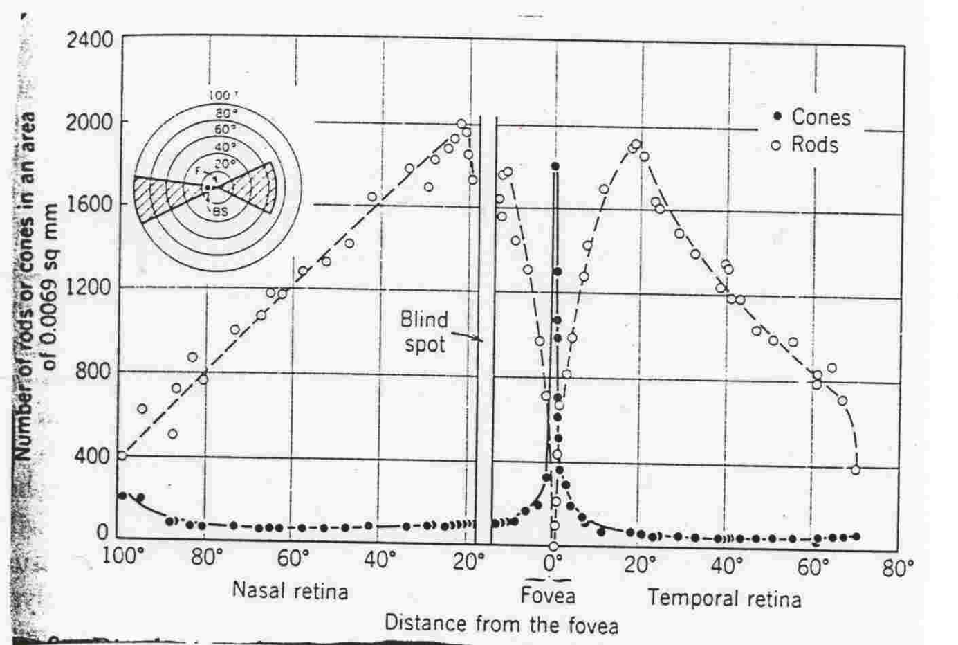
Rods and cones aren’t distributed evenly in the eye.
Most of the cones are in the center, most of the rods are on the edge. Because our eyes can move, we constantly scan the best part of the retina (the fovea) over areas of interest. Literally, what we see is a composite picture built in our brains.
Rods, since they’re on the edge and pick up very coarse-grained information (but are great at detecting contrast changes and movement), are what we use for most of our peripheral vision. Good for spotting predators! In fact, if you’re trying to spot shooting stars at night, you often pick out more things in your peripheral vision.
Also, we have many more L and M cones than S cones: around 40 L and 20 M for each S cone. Our sensitivity to small details that activate solely the S cones (blue and violet) is much less, as a result.
Atypical color vision
Color deficiency affects a significant fraction of human beings. Because it is a recessive trait and carried on the “X” chromosome, an overwhelming number of them are male (XY). Most of those affected have only minor problems, and it is often un-noticed until later in life. Atypical color response is a matter of degree (this is why the term “color blindness” is a poor one).
There are three kinds of color deficiency, which we can understand better now that we understand a little about the eye’s anatomy:
- Protanopia is missing or defective L cones. The consequence is reduced sensitivity to red-green differences (the L-M channel is weaker), and also reds are perceived as darker than normal.
- Deuteranopia is caused by missing or defective M cones. Red-green difference sensitivity is reduced, but reds do not appear darker.
- Tritanopia is caused by missing or defective S cones, and results in blue-yellow insensitivity.
Red/green deficiency affects about 8% of males and 0.4% of females. Blue/yellow deficiency is much much rarer.
Since color blindness affects so many people, it is essential to take it into account when you are deciding how to use color in a user interface. Don’t depend solely on color distinctions, particularly red-green distinctions, for conveying information. Microsoft Office applications fail in this respect: red wavy underlines indicate spelling errors, while identical green wavy underlines indicate grammar errors.
Traffic lights are another source of problems. How do red-green colorblind people know whether the light is green or red? Fortunately, there’s a spatial cue: red is always above (or to the right of) green. Protanopia sufferers (as opposed to deuteranopians) have an additional advantage: the red light looks darker than the green light.
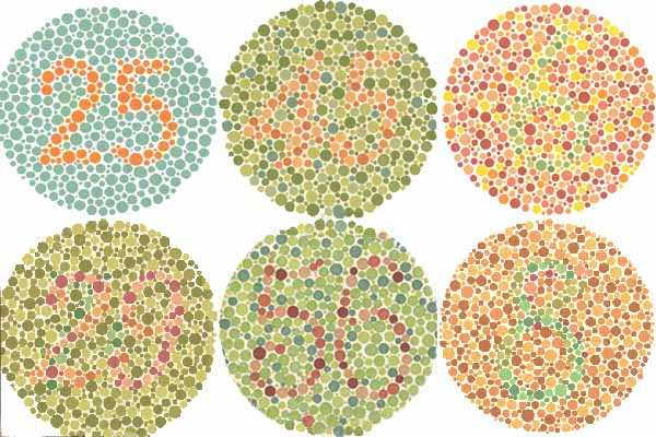
One of the most common ways to detect atypical color vision is using the Ishihara plates. Let’s look at a few - can you see the numbers hidden in each of the circles? If you have red-green deficiency, you have difficulty seeing the bottom number of the leftmost pair, or the top number of the middle pair, and you can’t see either number in the rightmost pair.
You can test yourself online in around 5 minutes.

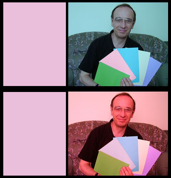
There are online tools for checking your interface against various kinds of atypical color vision. One good one is Vischeck. The figure here applied VisCheck to today’s hall of fame and shame example, to show what it looks like with red-green deficiency.

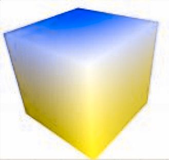
The bottom cube shows what colors in the top cube would look like to someone with red-green deficiency.
Consequences of chromatic aberration
Different wavelengths focus differently
Highly separated wavelengths (red & blue) can’t be focused simultaneously
Guideline: don’t use red-on-blue text
It looks fuzzy and hurts to read

The refractive index of the lens varies with the wavelength of the light passing through it. Just like a prism, different wavelengths are bent at different angles. So your eye needs to focus differently on red features than it does on blue features.
As a result, an edge between widely-separated wavelengths - like blue and red - simply can’t be focused. It always looks a little fuzzy. So red-on-blue or (worse!) blue-on-red text is painful to read, and should be avoided at all costs.
Apple’s ForceQuit tool in Mac OS X, which allows users to shut down misbehaving applications, unfortunately fell into this trap. In the dialog, unresponding applications are helpfully displayed in red. But the selection is a blue highlight. The result is incredibly hard to read.
Conseqences of S cone distribution
A number of anatomical details conspire to make blue a bad color choice when small details matter.
First, as we have seen, the fovea has very few S cones, so you can’t easily see blue features in the center of your vision (unless they have high contrast with the background, activating the M and L cones).
Second, older eyes are far less sensitive to blue, because the lens and aqueous humor slowly grow yellower, filtering out the blue wavelengths.
Finally, the lens gets weaker with age. Blue is at one extreme of its focusing range, so older eyes can’t focus blue features as well (and can’t focus on different distances as well, either).
As a result, avoid blue text, particularly small blue text, and blue markers on line charts.
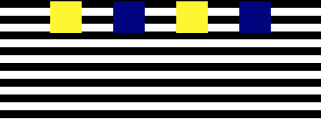
These four squares are all actually moving at the same speed. Due to the low density of S cones in the retina, your eye has more trouble distinguishing fine detail in the blue from the black, so the blue squares appear to be moving in a jerky fashion.
Color constancy: chromatic adaptation and memory colors
Chromatic adaptation
In the outside world, the color of the light changes constantly. Full sunshine is yellower than the light on a cloudy day; objects in shadow are illuminated with a bluer light; in a room lit with incandescent bulbs or candles the light is orange-yellow, and around sunset the light is strongly orange-red. The measured spectrum of light reflected from a given object is constantly changing. Despite this, we perceive that “the light changed” not “all the objects changed color”. Rather like a camera with auto white balance, our eye constantly recalibrates to what it sees as “white light”, and all other colors are judged relative to that white. This is called chromatic adaptation.
You can see this yourself with a sheet of white paper. Look at it indoors, in the evening with lights on; outside, shaded from direct sunlight. Tt still looks white. But if you take a picture (and have disabled auto white balance on the camera) you will see an orange sheet under tungsten light, and a cyan sheet in shadow, respectively.
Later in the reading we will examine the Lab color space, which takes chromatic adaptation into account.
Color constancy
Color constancy is another phenomenon that can modify our color perceptions. We unconsciously apply our knowledge of the world to what we see.
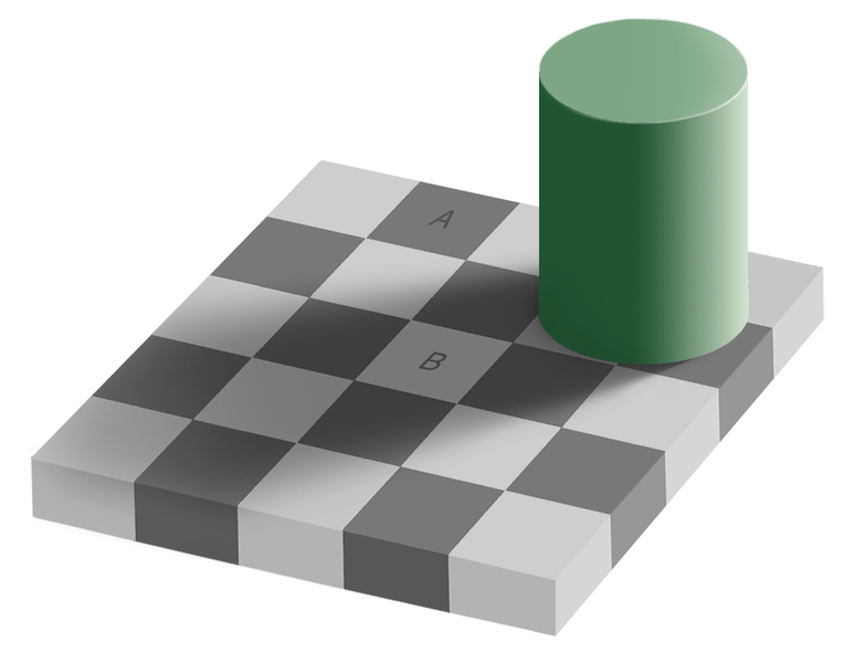
You’ve probably seen this image before. Measured in isolation, the color of A and the color of B are identical, but our brain sees them as different because of the shadow. We perceive colors as constant, if we have reason to, even if they are under different light.
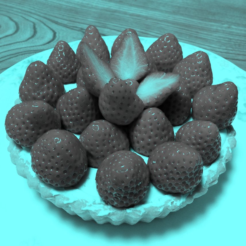
Despite the strange bluish lighting, we still see these as red strawberries. But there are no red pixels in the whole image. The strawberries are actually a neutral grey (#BCBCBC). The eye tries to adapt to the strongly cyan cast, and fails, but the state of partial chromatic adaptation, plus our memory of what strawberries look like, results in the sensation of redness.
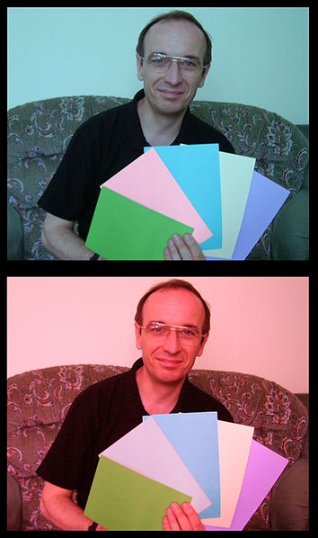
You can see an example of chromatic adaptation in these two images. Do any of those sheets of paper look like the same color?
We see the red lighting of the second picture and adapt our assumptions about the colors accordingly. From the point of view of colorimetry, the second sheet from the left is the same color in both pictures (it has the same RGB values). But from the point of view of color appearance, we see them as very different. If you wanted to make them look the same, they would need to have different RGB values!
We can explore this using an eyedropper tool or the Digital Color Meter in OS X or your OS.
These two rectangles are sampled (using the eyedropper in color selection) from the second sheet from each photo.
reading exercises
Which of the following are true? (choose all good answers):
(missing explanation)
Color Models
Red-Green-Blue (RGB)
Red: 0% - 100%
Green: 0% - 100%
Blue: 0% - 100%
Cyan-Magenta-Yellow (CMYK)
Used for printing
Red-Green-Blue (RGB)
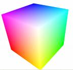
Now let’s look at how colors are represented in GUI software. At the lowest level, the RGB model rules. The RGB model is a unit cube, with (0,0,0) corresponding to black, (1, 1, 1) corresponding to white, and the three dimensions measuring levels of the red, green, and blue primaries. The RGB model is used directly by CRT and LCD screens for display, since each pixel in a screen has separate red, green, and blue components. Often, the values are given on a 0 to 255 (or 0x00 to 0xFF) scale, eight bits representing the full range for each color component, because the frame buffer in a graphics card is usually 8 bits deep.
By itself, RGB does not fully specify a color because there is no information on exactly what color the red, green and blue primaries are. sRGB aims to fix that by standardizing a common RGB color space. Colors on the Web are defined to be in sRGB. There are other RGB color spaces, such as AdobeRGB and ProPhoto (used in photography), and DCI P3 (used in digital cinema and 4k television).
Also, because our eyes see intensity on a logarithmic scale, the RGB values are stored in gamma corrected form:
R gamma = R linear to the power γ, where γ is typically 2.4. (and the same for G and B)
Gamma correction is the process of standardizing the intensity so that a linear response is obtained.
This was originally done to match the characteristics of Cathode Ray Tube (CRT) displays; when the red component of an RGB value (0-1) is mapped directly to a voltage applied to an electron gun, the intensity of light produced does not vary linearly from 0 to 1, but typically follows a power curve. In addition, gamma correction makes the values more evenly spaced and thus makes the best use of the limited 8-bit depth. Although CRT screens are rarely used nowadays, for backwards compatibility, modern flat screens are designed to produce the same overall transfer function.
An unfortunate consequence of this is that, when mixing or interpolating colors in RGB, the values should really be un-gamma-corrected to linear light intensities, interpolated, and the results re-corrected. Most software does not bother to do this, producing a range of visual artifacts as a result.
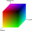
Cyan-Magenta-Yellow-Black (CMYK)
The CMYK (cyan, magenta, yellow, and black) is similar to the RGB model, but used for print colors. Instead of generating light like a screen, printed materials reflext the ambient light. Inks or pigments absorb some wavelengths more than others, producing colors. By the way, the K in CMYK stands for key; the black layer is printed last, and helps cover up small misalignments in the other colors.
Getting the right color in CMYK is quite tricky. It depends on the precise inks used, the paper, and the properties of the printing press. People either use swatch books of printed colors, or digital color management software (or trial and error, but that can get expensive!) to get consistent results. The details of color management, especially for print, is outside the scope of this course.
Standardized color measurement: CIE XYZ, Lab and LCH
The way that a color like pure red (RGB=1,0,0) actually looks depends strongly on the display’s characteristics, so your application can’t be sure it will get exactly the right color.
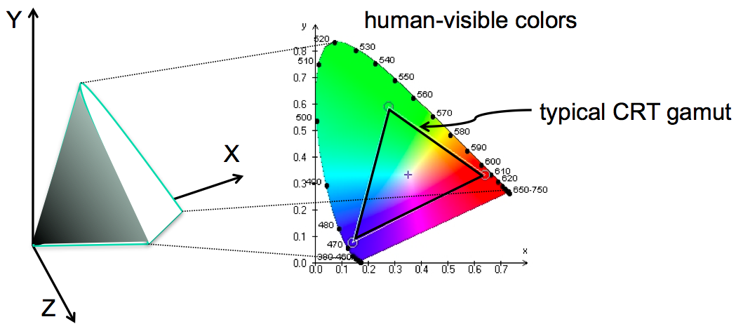
The science of colorimetry is concerned with accurate measurement and reproduction of color. Most of it is outside the scope of this course, but here are a few things you should know. Colorimetry stems from color matching experiments in the 1930s where a wide variety of colors had to be matched by varying the intensities of three colored lights. In any physical system, some colors will be out of gamut (not displayable); for example, many green and blue colors required a negative amount of the red light.
To get around that, the experimental data was transformed into a set of theoretical primary colors by the CIE (the International Committee on Illumination). The Y primary was defined to be the same as luminance (how light or dark something is) and the X and Z primaries defined to carry only color information, no luminance. X, Y, and Z are thus imaginary colors in the sense that they cannot be produced by a physical light source or perceived by the human eye. But they’re useful bases for the space, much like imaginary numbers are useful in algebra.
As a result, all human-visible colors are bounded within the positive octant – so that any visible color can be made as a mix of positive amounts of X, Y, and Z. The solid area on the left shows the visible colors perceivable to the human eye. Black is of course at the origin. To consider hue and saturation in isolation, we can also look at a plane of constant luminance, shown on the right. This ** chromaticity diagram** has a wedge-shaped slice showing the space of human-perceivable colors, with fully-saturated, pure-wavelength colors around its perimeter.
CIE XYZ is an additive, linear light colorspace useful for calculating color mixtures, but is not perceptually uniform. The distance apart of two colors in XYZ does not directly relate to how similar or different they appear. Luminance is accurately represented, but our eye sees lightness differences on a log scale. Chromatic adaptation is also not well shown in XYZ.

Source: Chris Lilley
CIE Lab has a central Lightness axis, going from black at 0 to the current white at 100. All colors are chromatically adapted to a color temperature of 5000K (D50) so that measurements made under different conditions can be compared with each other. The two color axes, a and b represent opponent colors. Positive a is a reddish magenta, negative a is a teal green. Positive b represents yellow, while negative b is a sky blue.
The distance between two colors in Lab colorspace accurately predicts how similar or different they look.
The gamut of a display (or indeed, a printer or a camera) is most accurately represented as a volume in Lab space.
Source: Chris Lilley
Instead of rectangular coordinates a and b, it is convenient instead to use a hue angle H (measured from the positive a axis) and a chroma, C (distance from the central Lightness axis, which is the same in Lab and LCH) which represents the colorfullness.
Chromaticity diagrams
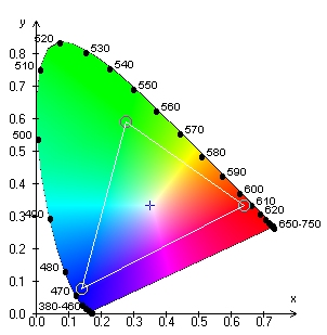
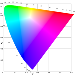
A chromaticity diagram is a 2D slice of a 3D colorspace (CIE XYZ or CIE Luv), along a plane of constant luminance. So it shows only hue and saturation. The curved edge corresponds to the pure, single-wavelength colors of a spectrum. The straight line joining the two ends of the curve indicates purple (a mixture of red and violet light).
This is a comparison of the CIE xy chromaticity diagram on the top, and the CIE uv chromaticity diagram on the bottom
One drawback of xy is that it’s not perceptually uniform - green occupies a huge chunk at the top of the wedge, while yellow is a narrow little line. It would be preferable if the distance in color space produced the same difference in perception in both areas.
One of the goals of the uv chromaticity diagram was to have the sizes of each area better conform to our perceptual mappings.
Gamuts
Any given display device can produce a range of colors (called the device’s gamut), defined by three colors used by the device as its primary colors - e.g., the exact colors of red, green, and blue in a screen’s pixels - and the white point. The gamut can be represented in 2D on a chromaticity diagram, where it forms a triangle or (more accurately, and using computer graphics) as a 3D shape in Lab.
Devices with different gamuts will produce different colors from the same RGB value. This problem can be addressed by calibrating the display device, producing an ICC profile that specifies how the device’s RGB space maps into a standardized space like XYZ or Lab. (ICC is the International Color Consortium).
If a given color is out of gamut, calibration will not make it displayable. Calibration just gives color consistency for colors which in gamut.
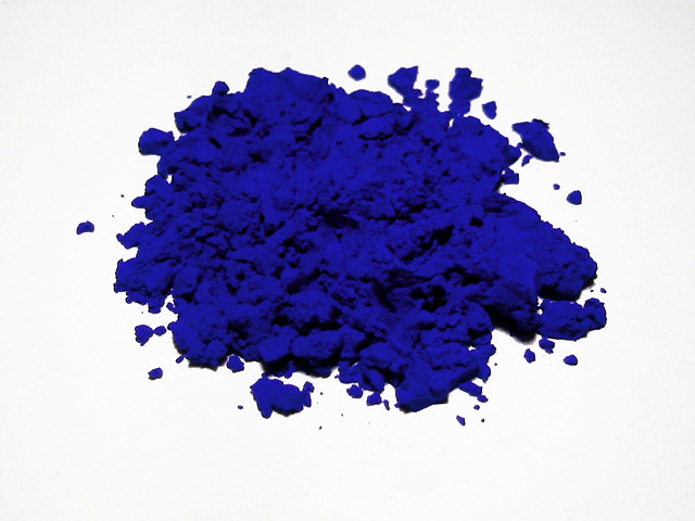
This is a picture of an ultramarine pigment, International Klein Blue. While the picture looks pretty intense, odds are good it’s not actually reproducing what it looks like in person, because the colors are outside of the gamut of your computer. If you were to see this image projected, it would also likely look different from what you see on your computer.
All these issues of limited gamut also apply to cameras as well as displays, of course. Cameras have gamuts (for the hues and saturations they can record) and response curves (to intensity) that require calibration and correction. To learn more about human perception and color, take 6.815/6.865 Digital and Computational Photography.
HSV and HLS
Hue-Saturation-Value (HSV)
Hue is wavelength of color
Saturation is amount of pure color
0% = gray, 100% = pure
Value is brightness
0% = dark, 100% = bright
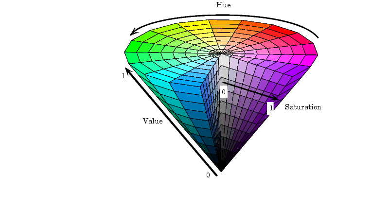
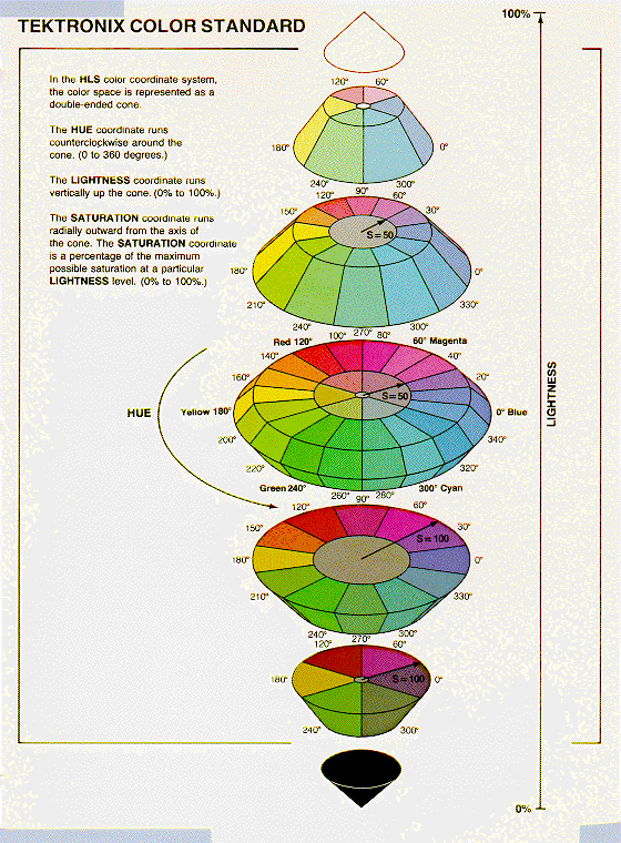
Hue-Lightness-Saturation (HLS)
White has lightness 1.0
Pure colors have lightness 0.5
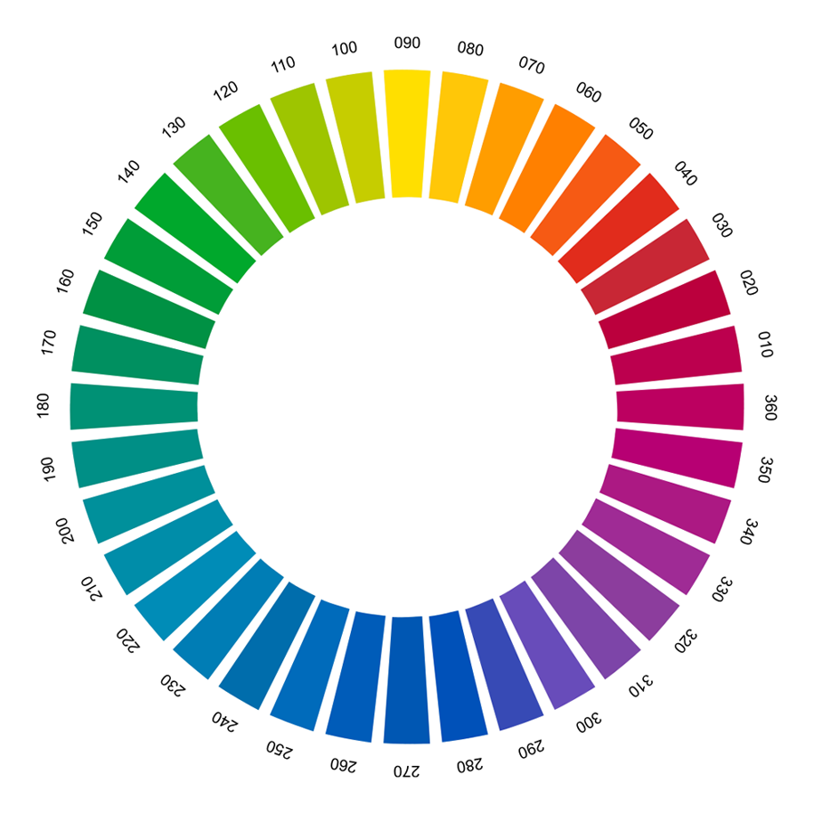
HSV (hue, saturation value) is another hue-wheel system, like LCH, and more useful for choosing colors in user interface design. HSV is a cone. We’ve already encountered hue and value in our discussion of visual variables. Saturation is the degree of color, as opposed to grayness. Colors with zero saturation are shades of gray. Colors with 100% saturation are pure color.
HSV is an approximation to the CIE LCH hue wheel system, but is calculated directly from RGB without taking into account colorimetry.
HLS (hue, lightness, saturation) is a close relative of the HSV model. HLS basically pulls up the center of the HSV cone to make a double-ended cone, which is symmetrical and more elegant. Note though, that in HLS and HSV two colors like pure yellow and pure blue have the same lightness or value, even though visually they are very different.
Many applications have a color picker that lets you pick HSV values as an alternative to RGB.
The Color Matching Game helps you practice your color matching skills for hue, saturation, and value.
reading exercises
Which of the following statements are true? (choose all good answers):
(missing explanation)
Design Guidelines

In general, avoid strongly saturated colors - i.e., the colors around the outside edge of the HSV cone. Saturated colors can cause visual fatigue because the eye must keep refocusing on different wavelengths. They also tend to saturate the viewer’s receptors (hence the name). One study found that air traffic controllers who viewed strongly saturated green text on their ATC interfaces for many hours had trouble seeing pink or red (the other end of the red/green color channel) for up to 15 minutes after their shift was over.
Use less saturated, “pastel” colors instead, which mix gray or white into the pure color.
The examples on top use colors with high saturation; on the bottom, low saturation. Shades of gray have minimum saturation.
Saturating one color in your vision can have a temporary effect on your perception of other colors. Think of when you take off colored sunglasses, for instance. You can use this to change perception in cool ways - for instance, making grass look greener - but it can also be detrimental.
To see what this feels like, look at a full screen of bright red for a little bit. Then look at a full screen of green. The green that you see will be more green than you can normally perceive, because your red-perceiving cones won’t be firing at all. This green is an imaginary color. It’s visible light, but it’s greener than the range of normal human vision.


In general, colors should be used sparingly. An interface with many colors appears more complex, more cluttered, and more distracting. Use only a small number of different hues.
The toolbar on top uses too many colors (many of them highly saturated), so none of the buttons stand out, and the toolbar feels hard to scan. In contrast, the toolbar at the bottom uses only a handful of colors. It’s more restful to look at, and the buttons that actually use color (like the Open File button) really pop out.
A simple and very effective color scheme uses just one hue (like blue or green, weakly saturated and in various values), combined with black, white, and shades of gray. On top of a scheme like that, a bit of red in an icon will pop out wonderfully.

Background colors should establish a good contrast with the foreground. White is a good choice, since it provides the most contrast, but it also produces bright displays, since our computer displays emit light rather than reflecting it. Pale (desaturated) yellow and very light gray are also good background colors. Dark backgrounds are tricky. It’s too easy to mess up the contrast and make text less legible, as shown in this example.
Finally, match expectations. One of the problems with the Adaptec dialogs at the beginning of this reading was the use of red for OK. Red generally means stop, warning, error, or hot. Green conventionally means go, or OK. Yellow means caution, or slow.
(But note that these conventional meanings for colors are culturally dependent, and what works in Western cultures may not work for all users.)
Given all these rules about what colors not to choose, what colors should you choose? There are no hard-and-fast rules here, but there are a few heuristics. The first heuristic is an old standby - use color schemes that seem to work well for other interfaces on the desktop or the web. There are several tools you can use to probe your web browser (Firebug for Firefox) or desktop screen (EclipsePalette for Windows, Digital Color Meter for Mac) to determine what color is being used by a particular display element.
Another effective heuristic is to find a photograph of a natural scene that looks appealing to you, and extract colors from it (using the same tools, or using the eyedropper tool in a paint program). The intuitive basis for this heuristic is that our visual systems evolved to easily perceive and appreciate the natural world.
Keep your choices simple. You can’t go far wrong by choosing one weakly saturated color and a few shades of gray. As soon as you choose two colors, however, you run the risks of an aesthetic clash between them. It’s good to get some other opinions on your choice, particularly if you might be somewhat colorblind yourself.
There are also some sites out there that help you choose colors. ColourLovers is a large collection of user-contributed color schemes, with ratings and votes. The NASA Color Tool helps select a palette of colors using HLS and view them side-by-side on sample data. The Contrast Ration site by Lea Verou lets you check for adequate, accessible levels of contrast (even if transparency is used, which other checkers fail to take into account).
reading exercises
Which of the following foreground/background text colors is a reasonable design choice? (choose one best answer):
(missing explanation)