As outlined on the
Grading & Expectations page, students
in Mission 2018 will communicate their ideas through team wikis and a final Project Web Site, due November 26th, and culminating with the final presentation on December 3th.
Our web guru,
Dr. Robert
Hildebrand,
along with TA
Mike Eddy, are
available to review work and provide design insight throughout the semester.
The
Office
of Education Innovation and Technology can answer questions about web communication
via wiki's and will provide an introduction to their effective use early in
the semester.
Class Wiki
The
Mission 2018 wiki, which contains a main community page and a host of "daughter" pages, including those representing each team, will serve as a repository for the research and brainstorming that different teams and their individual members are doing and will track class progress throughout the semester. As the semester progresses, general information, assigned readings, announcements, etc., will be posted on the main page. Team members can use their team wikis to share their work with each other, as well as contribute to one other's work. Each student should contribute to the team wiki to document their individual progress in the class, as well as share ideas and resources with their team members. As the transition from team-based research to class-based solution occurs, the class wiki will serve as a place for the students to share files, as well as comment and contribute to each other's work. The students will use this space to communally finalize the documents from which the Project Web Site will be created.
An important part of research is proper documentation and attribution. When you
present a fact, a graphic, or an opinion that is not your own on a web site,
in a presentation slide,
or in a paper, you
MUST reference it properly. Correct referencing
is not often part of a high-school curriculum, so familiarize yourself with the correct approach by consulting
Chapter 10
of the online version of the
Mayfield Handbook of Technical and Scientific
Writing for a brief treatment of this subject. We will use the American Psychological Association (APA)
citation style for this class.
By early November, each team must upload to the class wiki a draft version of their finished research and proposals. This work should be presented in considerable detail, and it will serve as an informational resource when the entire class decides on the final proposed plan. These documents should have a solid, professional look and it should be informative to anyone who might read it from outside the Mission 2018 community. Again, information and ideas must be properly cited.
Project Web Site
One of the principle assignments for the semester is the development of a coherent, highly informative description of the final Mission 2018 solution in the form of a Project Web Site. This will be your opportunity to provide a succinct review of the principle components of your overall solution as well as describe your implementation strategy in detail.
One effective approach to constructing a good Project Web Site is for each team to designate a delegate to a Project Web Site Committee, which will meet regularly throughout November. The Final Project Web Site must be fully operational on November 26st. The Final Project Website will be housed in an Athena locker inside the Mission 2018 web space.
General Web Site Design Tips
There are so many really cool things to do on web pages that it is easy to
get carried away; but it is important to realize that on a web site purported
to provide information, that too many special effects will dilute your message.
Remember that the focus of your web sites is content, not flash! Try to create
sites that are
not cluttered but will let your message come through loud and clear. Just
as on your computer screen, the user interface should be easily understandable
and intuitive, yet fade into the background so that it doesn't overpower
the content. You can learn about the principles of user-centered design here.
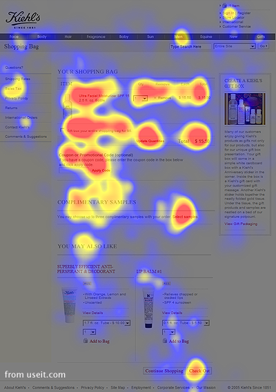
 Your class web site should strive for universal usability so that the maximum number of people can get your message. Implicit in good design is simplicity, so that clarity, order, and confidence come through to the user. Try to strike a balance between text and graphics. Too much text is dense and hard to read; whereas too many graphics can create confusion and lack of focal point(s). I'm a big fan of the Web Style Guide. Several sections from that book are particularly useful for beginners. For example, read this short article on visual design to give you some ideas. Also, give this article on line width and page length a quick read. If you aren't familiar with the notions of design grids, I'd read this as well. If you want to be a bit more quantitative you can research eye-tracking studies to see how users actually look at web pages.
Not everyone is a wizard of web design and we encourage each team to identify
their best person early in the semester so that when it comes time to make
the final website there is a small team that can work together.
Resources:
Although there are a plethora of sites with "How tos" on writing
HTML, use W3
Schools, HTML Primer,
and HTML Code Tutorial.
Cascading Style Sheets (CSS) really simplify web page design and are cached
by browsers so they don't cause a huge time penalty. CSS are nothing more
than formatting rules. Think font-size, margin-width, font-color and spacing.
They are stored in a file, in your page header, or in-line. Again,
there are thousands of sites that deal with CSS, but you might start with Open Sourcery,
the W3 Consortium, and CSS Tutorial.
Graphics can be created in any graphics program, but for the web you must
optimize them. Most web professionals use Adobe Photoshop® and
Adobe ImageReady®.
For example, when using a GIF file format (for text), do you really need
all 256 colors or will 32 do most of what you want? There's a big difference
in
file size. Also, be sure to experiment with photos and jpeg (jpg) settings
as often a 4 or 5 quality will work just fine and be much smaller. Check
out the Web Design Groups' Image
Use on the Web and also this
tutorial on jpeg.


 As outlined on the Grading & Expectations page, students
in Mission 2018 will communicate their ideas through team wikis and a final Project Web Site, due November 26th, and culminating with the final presentation on December 3th.
Our web guru, Dr. Robert
Hildebrand,
along with TA Mike Eddy, are
available to review work and provide design insight throughout the semester.
The Office
of Education Innovation and Technology can answer questions about web communication
via wiki's and will provide an introduction to their effective use early in
the semester.


