I. Early History of the Bulfinch Triangle
Throughout the course of its history, the Bulfinch Triangle has seen extensive changes in the way its land is used. These changes have been wrought by a variety of forces, such as new technologies and changes in the city’s infrastructure constructed by the government. These changes in land use can be traced back to even before there was solid land on the site.
Before the Triangle was developed, it was a region of wetlands known as the Mill Pond, shown in Figure 1. This was separated from the Charles River by a dam and was connected via canals to the Massachusetts Bay. According to Spirn, the Mill Pond had two main uses during this time. The first can be considered a primarily industrial land use. The mills surrounding the pond used the incoming tides as a source of hydraulic power. The second was as a waste disposal mechanism when the tides were receding [1]. These land uses show us that the Bulfinch Triangle had been an important part of the city even preceding its development.
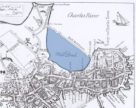 Figure 1: 1722 Map of Boston with the Mill Pond highlighted in blue. [2]
These land uses, however, were not compatible with each other. As Spirn tells us in The Granite Garden, roads paved throughout the 18th century were bowed outwards so water would flow towards the sides of the roads and into gutters, some of which drained into the Mill Pond. This newly invented method of waste disposal was unexpectedly effective, and the enormous amounts of waste dumped into the pond caused it to become stagnant, forcing it to be closed off from the bay [1].
Since the pond was no longer in use, it became the target of one of the city’s significant land reclamation projects, in which land from Beacon Hill was used to fill the Mill Pond. This is the first major example we see of how the introduction of new technology can cause significant changes in the site’s land use. As the Bulfinch Triangle continues to develop, we will continue to see how new technologies (particularly where the freight station was originally located) as well as changes in infrastructure help to shape and direct the growth of the site.
II. Bulfinch Triangle: 1808 - 1895
The plans for what would become of the Mill Pond after it was filled (shown in Figure 2) were drawn by a prominent architect by the name of Charles Bulfinch in 1808. Since there was no existing city grid around the triangle for Bulfinch to base his plans off, he used the dam that previously separated the Mill Pond from the Charles River to align the grid, giving rise to the distinct triangular shape. Interestingly, the plans included a canal running alongside the center street of the equilateral triangle, which is the most likely source of Canal Street’s name. It is unclear whether or not this canal ever existed, since freight lines were set up along the canal’s planned path soon after the site was built.
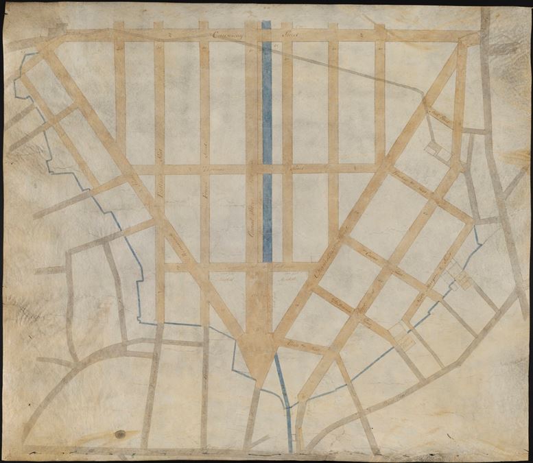 Figure 2: Mill Pond Plan of 1808 (a.k.a. Bulfinch Triangle Plan) [3]
The maps shown in Figure 3 tell an interesting story of how the primary mode of transportation in a site can affect the land use of the surrounding area. In Figure 3(a), we see the western side of the Bulfinch Triangle. The buildings in grey marked by “X’s” are all stables. Since the train running through the site was mainly used to transport raw materials, it is likely that townspeople in the area primarily travelled on foot, as well as by horse or carriage. Consequently, we see a large concentration of commercial land use around this cluster of stables. It is likely that these stables attracted a large number of horseshoe smiths. Other craftsmen were likely attracted to the area due to the increased amount of pedestrian traffic around the stables.
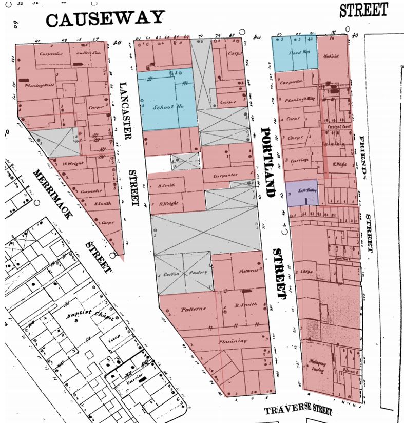 Figure 3(a): 1867 Sanborn map of the western side of the Bulfinch Triangle showing land use, which is denoted by the following colors: Red = commercial; Yellow = residential; Blue = institutional; Purple = industrial; Grey = transportation. [4]
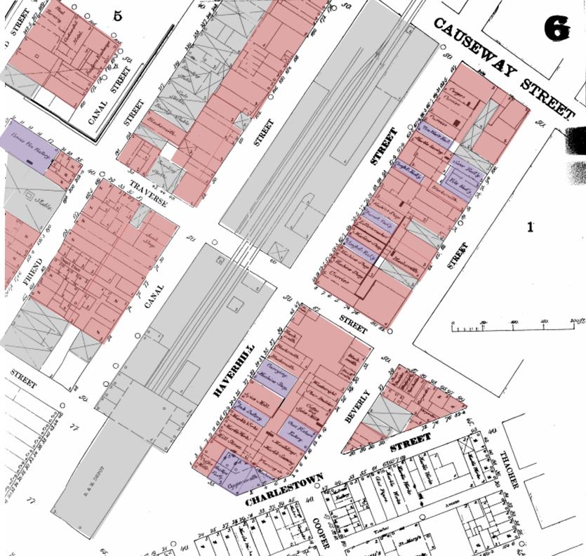 Figure 3(b): 1867 Sanborn map of the eastern side of the Bulfinch Triangle showing land use, which is denoted by the following colors: Red = commercial; Yellow = residential; Blue = institutional; Purple = industrial; Grey = transportation. [4]
On the opposite side of the Bulfinch Triangle, shown in Figure 3(b), we see a completely different story. The large grey buildings in this map compose a depot for a train that passes between Canal Street and Haverhill Street. The large concentration of commercial and industrial land use adjacent to the line strongly suggest that this was primarily used for freight trains. A freight line provides easy access to raw materials and goods, which supply and restock the neighboring businesses.
It is important to note that some of the land use marked as commercial (red) is also residential. However, most if not all of these residential buildings tend to have shops on the first floor. This is most likely due to the proximity of the freight line and heavy industry, which typically result in undesirable living conditions. These patterns in land use further prove how new technology in transportation can greatly affect how the city develops.
III. Bulfinch Triangle: 1895 – 1929
The Bromley map shown in Figure 4 depicts how land ownership was divided in the Bulfinch Triangle in 1895. Here we see some interesting land use trends that show us how the site has been evolving. One of the first major changes to note is that a rail line has been installed along Causeway Street. This resulted in a shift in the location of industrial buildings. It can be seen that the buildings to the right of the train station, where there used to be a large cluster of industrial buildings, are now owned by individuals. This indicates that the land use in this area is most likely a combination of commercial and residential. The shift in land use suggests that the depot that used to be situated adjacent to Canal Street is now being used more primarily as a passenger line.
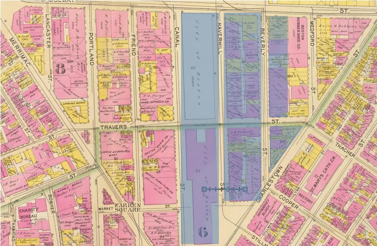 Figure 4: 1895 Bromley map of the Bulfinch Triangle showing land ownership. The highlighted region shows the buildings that were torn down in order to install the Central Artery. In this map, the yellow buildings are made of wood and the pink ones are made of brick. [5]
Furthermore, we see that buildings adjacent to Causeway Street tend to either be larger or share the same owner. This suggests that the land use along Causeway Street is likely a mix of commercial and industrial. The patterns discussed so far point towards the conclusion that the locations of industrial buildings and railroads in the 19th century are heavily correlated. Additionally, these patterns provide possible explanations for future changes in the city. For example, the freight line in Figure 4 occupies the same exact location that the Green Line overpass occupies in the early 21st century. It is likely that the railroads present in 1895 later evolved into the path of the Green Line. The migration of the freight lines towards the north can also explain why North Station is currently situated on the northern border of the site.
In order to continue to observe how changes in technology and transportation affect the site’s growth, we will look at a map of the Bulfinch Triangle in 1929 shown in Figure 5. Figure 5(a) shows the northern end of the Triangle. This map confirms our predictions regarding the Green Line overpass and the location of North Station. The building that previously housed the freight depot and later the passenger station has now become North Station, and the Green Line overpass is running along Causeway Street, thus replacing the freight line.
Additionally, there are now a large number of residential buildings. This coincides perfectly with the departure of the freight lines and the arrival of the subway station. This crucial shift in transportation has therefore brought about a major change towards the land use in the Bulfinch Triangle. The industrial buildings have become more spread out and the residential buildings are largely concentrated next to the subway station. As mentioned in Crabgrass Frontier, “there is a significant advantage in living within easy walking distance of the city’s stores and businesses” [6]. Proximity to a subway station allows residents to live further away from their place of work and still have a faster commute.
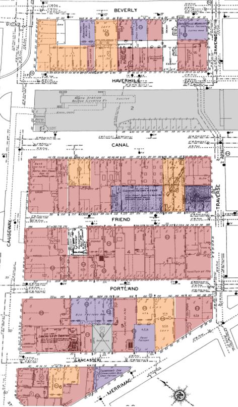 Figure 5(a): 1929 Sanborn map of the northern end of the Bulfinch Triangle showing land use, which is denoted by the following colors: Red = commercial; Yellow = Residential; Blue = institutional; Purple = industrial; Grey = transportation. [7]
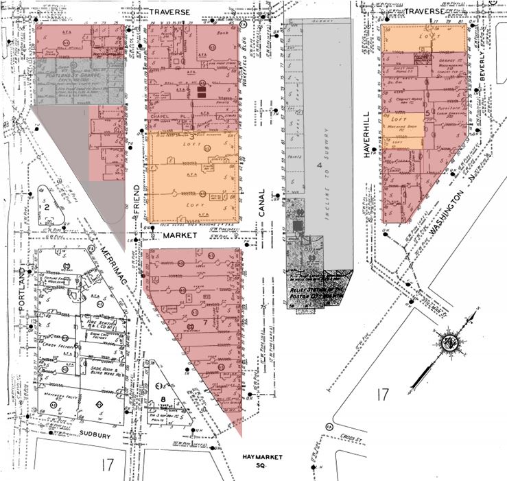 Figure 5(b): 1929 Sanborn map of the southern end of the Bulfinch Triangle showing land use, which is denoted by the following colors: Red = commercial; Yellow = Residential; Blue = institutional; Purple = industrial; Grey = transportation. [7]
Figure 5(b) shows the southern end of the Bulfinch Triangle in 1929. Here we see that the southern building of what used to be the depot/passenger station is now an incline for the subway to get up onto the overpass that runs along Causeway Street. Additionally, we see further confirmation that the subway has brought about an increase in residential homes to the area.
While there is still a sizable number of industrial buildings at this point in time, it is likely that these will slowly fade away due to the departure of the freight line and increase in pedestrian traffic. Figure 5 captures a transition period in the Bulfinch Triangle’s history brought about mainly by a shift in the primary mode of transportation in the site.
Additionally, on this map we can already see traces of the next major change in transportation. The westernmost block in Figure 5(b) shows a large area of vacant land where buildings previously stood. That plot of land has remained a parking lot up until the present day. The emergence of large parking lots and the highlighted buildings in Figure 4 point us towards the next major shift in technology and transportation: the automobile.
IV. Bulfinch Triangle: 1929 – 2013
The buildings between Canal Street and Beverly Street, along with the following row of buildings next to Beverly Street, were all condemned in order to install the Central Artery. This is a response to the fact that by 1927, “the automobile had reached the point of being an essential part of normal middle-class living” [6]. As Jackson mentions in the Crabgrass Frontier, this was a part of a nationwide movement in the late 1920s to build “express streets without any stop lights or intersections” [6]. The map of the Bulfinch Triangle in 2000 (Figure 6) shows yet another major shift in land use.
As predicted, the industrial land use has continued to diminish since the removal of the freight line. However, we now see a sharp decrease in residential land use as compared to the 1929 map. This is due both directly and indirectly to the installation of the Central Artery. The construction of the Central Artery itself directly lowered the residential land use since many of the buildings that were torn down to make room for the highway were in fact residential buildings (highlighted in Figure 4). Indirectly, the presence of a highway highly discourages people from taking up residence nearby due to high levels of noise and pollution.
 Figure 6: Bulfinch Triangle land use in 2000 [8]
While the expressway posed a significant problem for residential land use, it proved to be extremely beneficial to owners of small shops and businesses. The increasing traffic around the site allowed commercial land owners to flourish. Nowadays, the Bulfinch Triangle has become almost entirely consumed by small shops, restaurants and businesses. Warner states in Mapping Boston that national franchises and branded products grew radically during the rise of the automobile and “moved in upon local retailers, who suddenly found themselves disadvantaged” [9]. However, the Triangle seems to have been largely unaffected by that change since the presence of local retailers seemed to only grow ever stronger during the 20th century. Once again, we see proof that the emergence of new technology in transportation greatly affects the patterns of land use within the site.
Figure 7 shows a present day map of the Bulfinch Triangle. Here we see two major recent changes in transportation and infrastructure that may lead to future changes in land use. First is the removal of the Green Line overpass along Causeway Street. Second is the replacement of the Central Artery with an open park known as the Greenway. These changes have one thing in common: they make the Bulfinch Triangle a more attractive place to walk around. This not only benefits the small shop owner, further cementing the dominance of commercial land use in the Triangle, but also foreshadows a possible rise in residential land use once again, since the site once again has the benefit of a nearby subway station without the drawback of heavy industry or a highway.
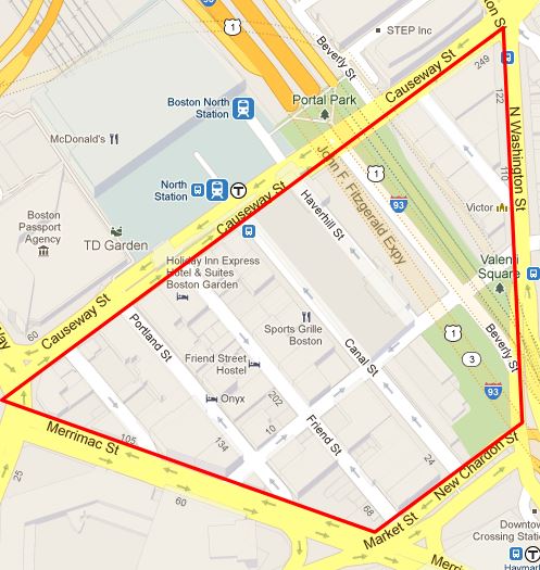 Figure 7: Present day map of the Bulfinch Triangle showing site boundaries (courtesy of Google Maps)
Time and time again, it has been proven that technology, transportation, infrastructure and land use within the Bulfinch Triangle are all heavily linked. A small change in technology, infrastructure or transportation can have an amplified effect on the land use within the site. Therefore, when there are major changes in transportation and infrastructure, or when there is a new technological breakthrough, we can expect to see drastic shifts in the patterns of land use prevalent in the site. The Bulfinch Triangle has undergone several of these shifts throughout its history. It is that very same history that suggests to us that the Triangle may just be about to undergo yet another major transformation.
V. References:
[1] A. Spirn. The Granite Garden: Urban Nature and Human Design. (Basic Books, 1984).
[2] J. Bonner. The Town of Boston in New England. (Boston, 1722).
[3] Reading the City. “Bulfinch’s Boston, the Triangle”. (2012). http://citiesandstories.blogspot.com/2012_12_01_archive.html.
[4] Sanborn Fire Insurance Map. (Boston, 1867). Sheets 5a, 6b.
[5] G. Bromley. David Rumsey Map Collection. “Wards 6, 8”. (Boston, 1895)
[6] K. Jackson. Crabgrass Frontier: The Suburbanization of the United States. (Oxford, 1985).
[7] Sanborn Fire Insurance Map. (Boston, 1929). Sheets 15, 16a.
[8] Boston Redevelopment Authority. “Charles Street/Cambridge Street”. (Boston, 2000)
[9] S. Warner. Mapping Boston. (The MIT Press, Cambridge, 1995). pp. 2-14.