Improvements
Based user experiences, the two main areas of improvement for Hubway are the kiosk and the general handle bar area on the bike, including the controls.
-
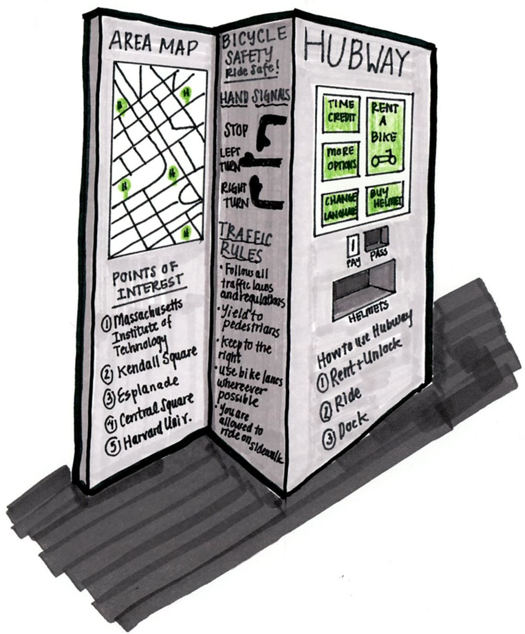
The Kiosk
- A larger and more responsive touch screen
A larger, tablet size, multicolor touchscreen has higher contrast for easier visualization of both payment directions and allows display of detailed maps.
- Locate kiosk next to physical map
By moving the kiosk and the area map closer to eachother, it makes it easier to find where you are and where you want to go while purchasing a pass.
- Cut down on unnecessary screens to buy pass
Removing on unnecessary screens would make the process of obtaining a pass less frustrating.
- Use sides of kiosk for additional important information
Using the sides of the kiosk to list rules of the road for biking (as well as other Hubway policies) would be a good use of extra large space, especially since many Hubway users are novice urban bikers and need this guidance.
- Inclusion of helment vending machine in kiosk
Hubway did pilot helmet vending machines in 2013, although the outcome of that pilot is not clear. Incorporating a helmet vending machine into the kiosk would make the kiosk footprint larger but allow users to more easily obtain a helmet.
- A larger and more responsive touch screen
-
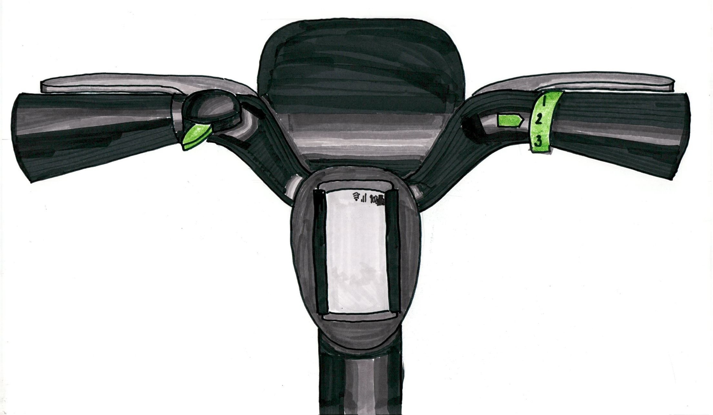
The Bike
- Bell that stays put on top of bike
A better bell stays on top of handle bars, has contrasting coloring to show how to operate it and has a better use mechanism so that users don't have to take their whole hand off of the handle bar to use it.
- Obvious gear shifter
Similar to the bell, a better gear shifter uses contrast to show function and more clearly signals the gear you are in.
- Cell phone holder in between handle bars for navigation
Many people use their cell phones for navigation. A sturdy cell phone holder would allow people to safely use their phones for navigation while riding.
- Bell that stays put on top of bike
References
- National Association of City Transportation Officials. "Bike Share in the US: 2010-2016." 2016. Accessible here.
- Toole Design Group and Pedestrian and Bicycle Information Center. "Bike Sharing in the United States: State of the Practice and Guide to Implementation." Prepared for USDOT Federal Highway Administration. 2012.
- Hubway Media Kit and Statistics. Accessible here.
- Goodyear, Sarah. "The Bike-Share Boom." Published on CityLab from The Atlantic, 2012. Accessible here.
- Institute for Tranportation and Development Policy. "The Bike-share Planning Guide." New York, NY, 2014. Accessible here.