Reading 09: More Learnability
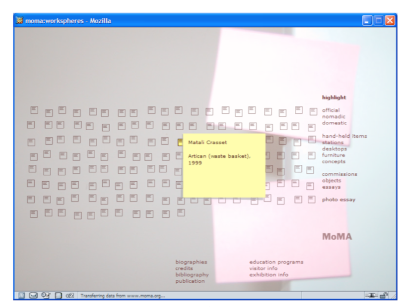
This Flash-driven web site is the Museum of Modern Art’s Workspheres exhibition, a collection of objects related to the modern workplace. This is its main menu. Mousing over any icon makes its label appear (the yellow note shown), and clicking brings up a picture of the object.
Go to the site and play with it, and we’ll talk about its learnability in class.
What real-world metaphor is used by this interface? How well does it do with knowledge in the head vs. knowledge in the world?
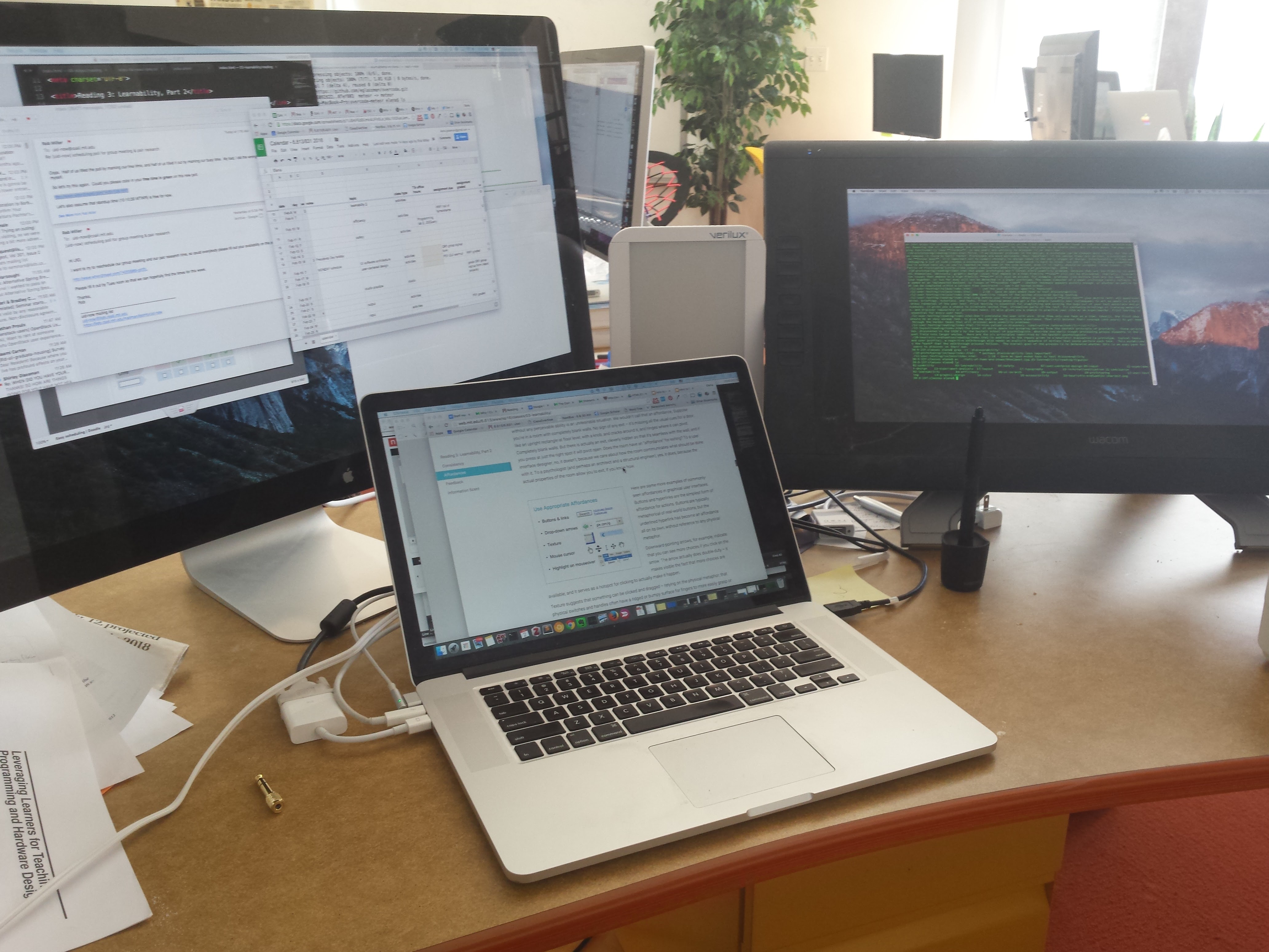
Here’s another example to think about. This is a snapshot of a desk with a laptop and two external monitors. Most laptops and operating systems are designed to handle multiple screens, when they are available. In this specific case, when the user connects each monitor to the laptop, OS X decides which windows will stay on the original screen and which will move to the new screen. It also arbitrarily arranges the monitors into a contiguous monitor that the mouse can travel across. The user can move the mouse to the edge of one screen, and if they move the mouse a little farther, it will appear on a different monitor. Not all edges are ‘portals’ to other monitors, and if monitors differ in size, only a subsection of the larger screen’s edge will teleport the mouse back to the smaller screen.
This can be arranged by the user, after the fact, in a Preferences submenu. However, when the mapping is first applied, it is arbitrary and it has no relationship to the actual arrangement of monitors.
- How can we help users learn how to move the mouse between monitors immediately after connecting another monitor?
- Are there opportunities to make the experience consistent whenever the user attaches a monitor?
- Are there any perceived affordances of or information scent about which sections of screen edge are now ‘portals’? What could be added to communicate where the new portals are?
- What feedback does the user get when they’re right? When they’re wrong?
Consistency
There’s a general principle of learnability: consistency. This rule is often given the hifalutin’ name the Principle of Least Surprise, which basically means that you shouldn’t surprise the user with the way a command or interface object works.
Similar things should look, and act, in similar ways. Conversely, different things should be visibly different.
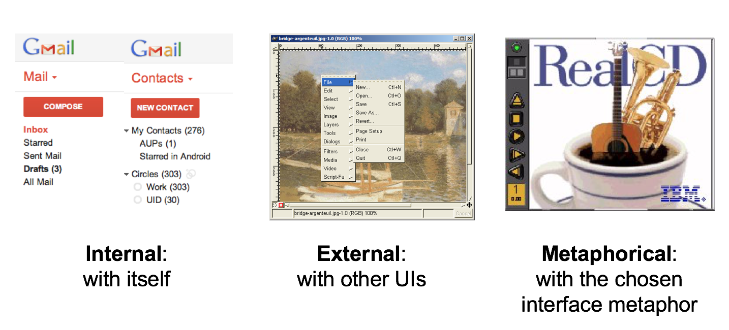
There are three kinds of consistency you need to worry about:
- Internal consistency within your application
- External consistency with other applications on the same platform
- Metaphorical consistency with your interface metaphor or similar real-world objects
In an earlier reading, we talked the RealCD interface, which has problems with both metaphorical consistency (CD jewel cases don’t play; you don’t open them by pressing a button on the spine; and they don’t open as shown), and with external consistency (the player controls aren’t arranged horizontally as they’re usually seen; and the track list doesn’t use the same scrollbar that other applications do).
Metaphors are one way you can bring the real world into your interface. RealCD is an example of an interface that uses a strong metaphor in its interface.
A well-chosen, well-executed metaphor can be quite effective and appealing, but be aware that metaphors can also mislead.
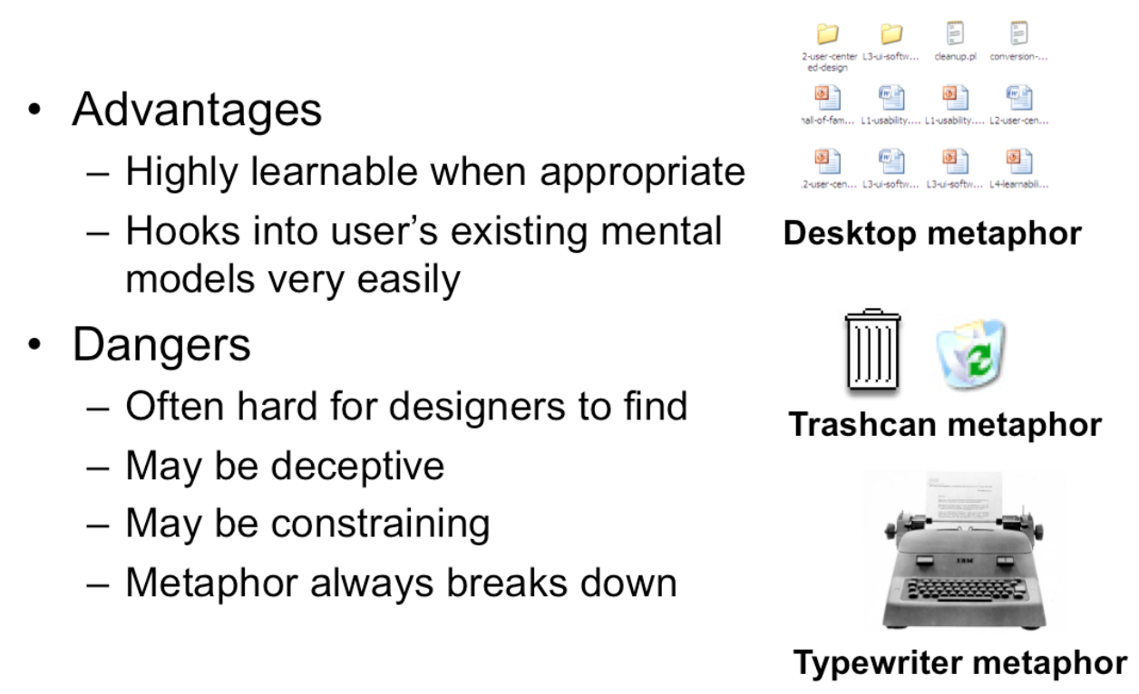
The advantage of metaphor is that you’re borrowing a conceptual model that the user already has experience with. A metaphor can convey a lot of knowledge about the interface model all at once. It’s a notebook. It’s a CD case. It’s a desktop. It’s a trashcan.
Each of these metaphors carries along with it a lot of knowledge about the parts, their purposes, and their interactions, which the user can draw on to make guesses about how the interface will work.
Some interface metaphors are famous and largely successful. The desktop metaphor – documents, folders, and overlapping paperlike windows on a desk-like surface – is widely used and copied. The trashcan, a place for discarding things but also for digging around and bringing them back, is another effective metaphor – so much so that Apple defended its trashcan with a lawsuit, and imitators are forced to use a different look. (Recycle Bin, anyone?)
But a computer interface must deviate from the metaphor at some point – otherwise, why aren’t you just using the physical object instead? At those deviation points, the metaphor may do more harm than good. For example, it’s easy to say “a word processor is like a typewriter,” but you shouldn’t really use it like a old-fashioned manual typewriter. Pressing Enter every time the cursor gets close to the right margin, as a typewriter demands, would wreak havoc with the word processor’s automatic word-wrapping.
The basic rule for metaphors is: use it if you have one, but don’t stretch for one if you don’t.
Appropriate metaphors can be very hard to find, particularly with real-world objects. The designers of RealCD stretched hard to use their CD-case metaphor (since in the real world, CD cases don’t even play CDs), and it didn’t work well.
Metaphors can also be deceptive, leading users to infer behavior that your interface doesn’t provide. Sure, it looks like a book, but can I write in the margin? Can I rip out a page?
Metaphors can also be constraining. Strict adherence to the desktop metaphor wouldn’t scale, because documents would always be full-size like they are in the real world, and folders wouldn’t be able to have arbitrarily deep nesting.
The biggest problem with metaphorical design is that your interface is presumably more capable than the real-world object, so at some point you have to break the metaphor. Nobody would use a word processor if really behaved like a typewriter. Features like automatic word-wrapping break the typewriter metaphor, by creating a distinction between hard carriage returns and soft returns.
Most of all, using a metaphor doesn’t save an interface that does a bad job communicating itself to the user. Although RealCD’s model was metaphorical – it opened like a CD case, and it had a liner notes booklet inside the cover – these features had such poor visibility and perceived affordances that they were ineffective.
When possible, the physical arrangement of controls should match arrangement of function
Best mapping is direct, but natural mappings don’t have to be direct if they have an easy mental model
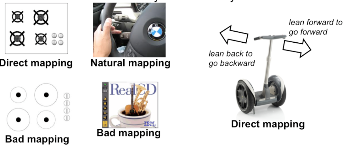
Another important principle of learnability is good mapping of functions to controls.
Consider the spatial arrangement of a light switch panel. How does each switch correspond to the light it controls? If the switches are arranged in the same fashion as the lights themselves, it is much easier to learn which switch controls which light.
A direct mapping means that the physical layout of the controls matches the physical arrangement of their functions. In a direct mapping, control A is to the left of control B if and only if function A (e.g. the light that’s turned on or off) is to the left of function B.
Direct mappings are not always easy to achieve, since a control may be oriented differently from the function it controls. Light switches are mounted vertically, on a wall; the lights themselves are mounted horizontally, on a ceiling. So the switch arrangement may not correspond directly to a light arrangement.
So sometimes the best that can be done is a natural mapping: the physical layouts are not identical, but a simple mental model can transform the controls to the functions and vice versa. The turn signal switch in most cars is a stalk that moves up and down (vertically), but the function it controls is a signal for turning left or right, horizontally. But the mapping is natural, because the turn signal stalk sits on the steering column, and the user can mentally map it to moving the stalk in the direction that the steering wheel will be turned, rather than the direction the car will move.
Other good examples of mapping include:
- Stove burners. Many stoves have four burners arranged in a square, and four control knobs arranged in a row. Which knobs control which burners? Most stoves don’t make any attempt to provide even a natural mapping.
- An audio mixer for DJs (proposed by Max Van Kleek for the Hall of Fame) has two sets of identical controls, one for each turntable being mixed. The mixer is designed to sit in between the turntables, so that the left controls affect the turntable to the left of the mixer, and the right controls affect the turntable to the right. The mapping here is direct.
- The controls on the RealCD interface don’t have a natural mapping. Why not?
- The Segway’s controls have a direct mapping. Why?
- Here’s a meta question about these readings. What’s wrong with the mapping of this bulleted list with respect to the slide above?
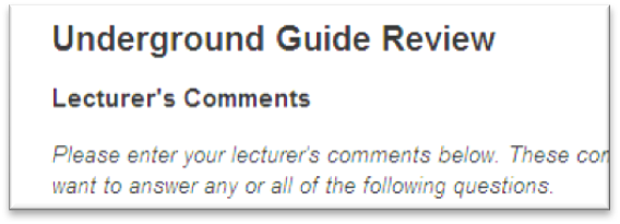
Another important kind of consistency, often overlooked, is in wording. Use the same terms throughout your user interface. If your interface says “share price” in one place, “stock price” in another, and “stock quote” in a third, users will wonder whether these are three different things you’re talking about.
Don’t get creative when you’re writing text for a user interface; keep it simple and uniform, just like all technical writing.
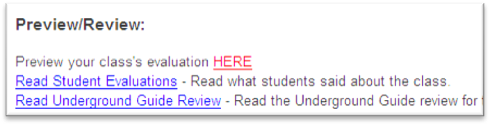
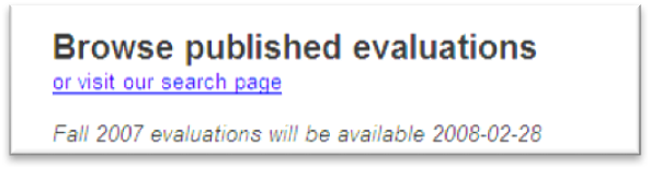
Here are some examples from the Course VI Underground Guide web site – confusion about what’s a “review” and what’s an “evaluation”.
Use common words, not techie jargon
But use domain-specific terms where appropriate
Allow aliases/synonyms in command languages
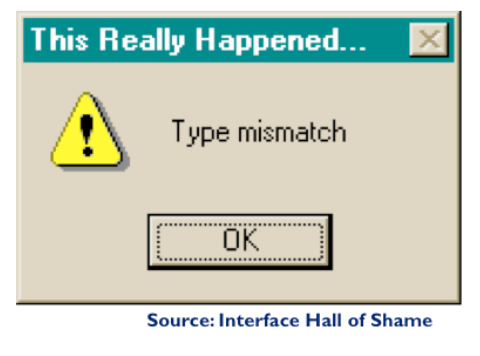
External consistency in wording is important too – in other words, speak the user’s language as much as possible, rather than forcing them to learn a new one. If the user speaks English, then the interface should also speak English, not Geekish. Technical jargon should be avoided. Use of jargon reflects aspects of the system model creeping up into the interface model, unnecessarily. How might a user interpret the dialog box shown here? One poor user read “type” as a verb, and dutifully typed M-I-S-M-A-T-C-H every time this dialog appeared. The user’s reaction makes perfect sense when you remember that most computer users do just that, type, all day. But most programmers wouldn’t even think of reading the message that way. Yet another example showing that you are not the user.
Technical jargon should only be used when it is specific to the application domain and the expected users are domain experts. An interface designed for doctors shouldn’t dumb down medical terms.
When designing an interface that requires the user to type in commands or search keywords, support as many aliases or synonyms as you can. Different users rarely agree on the same name for an object or command. One study found that the probability that two users would mention the same name was only 7-18%. (Furnas et al, “The vocabulary problem in human-system communication,” CACM v30 n11, Nov. 1987).
Incidentally, there seems to be a contradiction between these guidelines. Speaking the User’s Language argues for synonyms and aliases, so a command language should include not only delete but erase and remove too.
But consistency in wording argued for only one command name, lest the user wonder whether these are three different commands that do different things. One way around the impasse is to look at the context in which you’re applying the heuristic. When the user is talking, the interface should make a maximum effort to understand the user, allowing synonyms and aliases. When the interface is speaking, it should be consistent, always using the same name to describe the same command or object. This is quite similar to the 6.033 system design principle of being loose on inputs and strict on outputs.
What if the interface is smart enough to adapt to the user – should it then favor matching its output to the user’s vocabulary (and possibly the user’s inconsistency) rather than enforcing its own consistency? Perhaps, but adaptive interfaces are still an active area of research, and not much is known.
reading exercises
What kind of consistency is natural mapping? (choose one)
(missing explanation)
Affordances
Perceived and actual properties of a thing that determine how the thing could be used
Perceived vs. actual

Affordance refers to the perceived and actual properties of a thing, primarily the properties that determine how the thing could be operated. Chairs have properties that make them suitable for sitting; doorknobs are the right size and shape for a hand to grasp and turn. A button’s properties say “push me with your finger.”
Scrollbars say that they continuously scroll or pan something that you can’t entirely see. Affordances are how an interface communicates nonverbally, telling you how to operate it.
Affordances are rarely innate – they are learned from experience. We recognize properties suitable for sitting on the basis of our long experience with chairs. We recognize that listboxes allow you to make a selection because we’ve seen and used many listboxes, and that’s what they do.
Note that perceived affordance is not the same as actual affordance. A facsimile of a chair made of papiermache has a perceived affordance for sitting, but it doesn’t actually afford sitting: it collapses under your weight. Conversely, a fire hydrant has no perceived affordance for sitting, since it lacks a flat, human-width horizontal surface, but it actually does afford sitting, albeit uncomfortably.
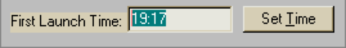
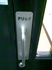
Recall the textbox from our first reading, whose perceived affordance (type a time here) disagrees with what it can actually do (you can’t type, you have to push the Set Time button to change it). Or the door handle here, whose nonverbal message (perceived affordance) clearly says “pull me” but whose label says “push” (which is presumably what it actually affords). The parts of a user interface should agree in perceived and actual affordances.
The original definition of affordance (from psychology) referred only to actual properties, but when it was imported into human computer interaction, perceived properties became important too. Actual ability without any perceivable ability is an undesirable situation. We wouldn’t call that an affordance. Suppose you’re in a room with completely blank walls. No sign of any exit – it’s missing all the usual cues for a door, like an upright rectangle at floor level, with a knob, and cracks around it, and hinges where it can pivot. Completely blank walls. But there is actually an exit, cleverly hidden so that it’s seamless with the wall, and if you press at just the right spot it will pivot open. Does the room have an “affordance” for exiting? To a user interface designer, no, it doesn’t, because we care about how the room communicates what should be done with it. To a psychologist (and perhaps an architect and a structural engineer), yes, it does, because the actual properties of the room allow you to exit, if you know how.
Don Norman, who originally imported the psychology term affordance into design and HCI, and popularized it with his wonderful book The Design of Everyday Things, now regrets the confusion of using the same word, “affordance”, for both the perception of use and the reality of use. He proposes that signifier as a better word for a perceived affordance, so that affordance can be reserved for actual affordances, as in psychology. (Don Norman, “Signifiers, not affordances“, Interactions 2008).
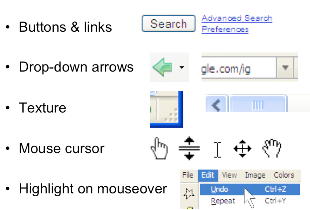
Here are some more examples of commonly-seen affordances in graphical user interfaces. Buttons and hyperlinks are the simplest form of affordance for actions. Buttons are typically metaphorical of real-world buttons, but the underlined hyperlink has become an affordance all on its own, without reference to any physical metaphor.
Downward-pointing arrows, for example, indicate that you can see more choices if you click on the arrow. The arrow actually does double-duty – it makes visible the fact that more choices are available, and it serves as a hotspot for clicking to actually make it happen.
Texture suggests that something can be clicked and dragged – relying on the physical metaphor, that physical switches and handles often have a ridged or bumpy surface for fingers to more easily grasp or push.
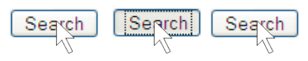
Mouse cursor changes are another kind of affordance – a visible property of a graphical object that suggests how you operate it. When you move the mouse over a hyperlink, for example, you get a finger cursor. When you move over the corner of a window, you often get a resize cursor; when you move over a textbox, you get a text cursor (the “I-bar”).
Finally, the visible highlighting that you get when you move the mouse over a menu item or a button is another kind of affordance. Because the object visibly responds to the presence of the mouse, it suggests that you can interact with it by clicking.
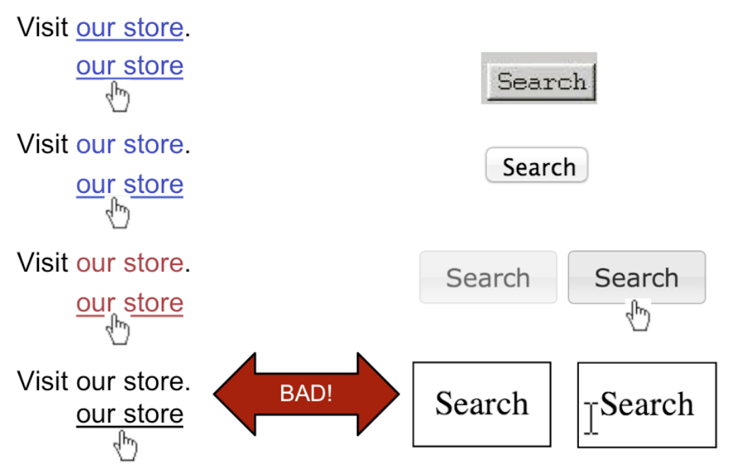
Hyperlinks and buttons have evolved and changed significantly. The top row shows how hyperlinks and buttons looked circa 1995 (on NCSA Mosaic, the first widely-used web browser, which used the Motif graphical user interface toolkit). What properties did they have that distinguished them and made them clickable? Which of those properties have been lost over time, presumably as users become more familiar with these objects? The drive toward simplicity is a constant force in aesthetics and user interface design, so affordances tend to diminish rather than increase.
The bottom row shows a hyperlink which has been simplified too far, and an HTML button that has been not only simplified but also lost its mouse cursor affordance. This goes too far.
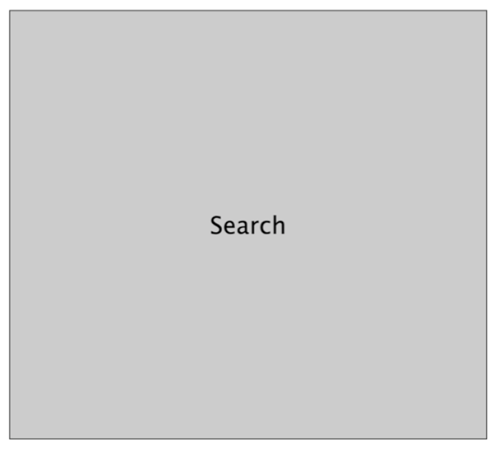
The story of affordances isn’t purely reductionist. Sometimes you can’t boil the affordance down to a single property like its color or a 3D border. This thing here is a button; but it’s so large, and has such a disproportionate relationship between the area and the label, that it loses its sense of clickability.
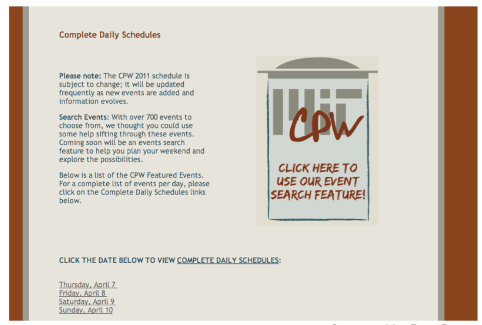
Here is the Campus Preview Weekend 2011 website. If the user wants an overview of all the events happening that weekend, the user may end up just clicking through the days individually, because those links (at the bottom) are the most salient affordances for interaction.
But it turns out that the graphic in the center page is actually a link to a nifty search interface that lets the user look at all the event listings in addition to other cool functionalities. Unfortunately the graphic doesn’t have strong affordances for interaction. It’s mostly a big logo, so what does a typical user do? Glance at it and then ignore it, scanning the page instead for things that look like actions, such as the clearly marked hyperlinks at the bottom. The “click here to search” text in the logo doesn’t work.
(example and explanation due to Dina Betser)
reading exercises
Which of the following are affordances for sleeping? (choose all good answers)
(missing explanation)
Feedback
Low-level feedback
e.g. push button
High-level feedback
model state changes
new web page starts loading
Hand-in-hand with affordances is feedback: how the system changes visibly when you perform an action.
When the user invokes a part of the interface, it should appear to respond. Push buttons should depress and release. Scrollbar thumbs and dragged objects should move with the mouse cursor. Pressing a key should make a character appear in a textbox.
Low-level feedback is provided by a view object itself, like push-button feedback. This kind of feedback shows that the interface at least took notice of the user’s input, and is responding to it. (It also distinguishes between disabled widgets, which don’t respond at all.)
High-level feedback is the actual result of the user’s action, like changing the state of the model.
One interesting effect of human perceptual system is perceptual fusion. Here’s an intuition for how fusion works. Our “perceptual processor” runs at a certain frame rate, grabbing one frame (or picture) every cycle, where each cycle takes T_p seconds. Two events occurring less than the cycle time apart are likely to appear in the same frame. If the events are similar – e.g., Mickey Mouse appearing in one position, and then a short time later in another position – then the events tend to fuse into a single perceived event – a single Mickey Mouse, in motion.
The cycle time of the perceptual processor can be derived from a variety of psychological experiments over decades of research (summarized in Card, Moran, Newell, The Psychology of Human-Computer Interaction, Lawrence Erlbaum Associates, 1983). 100 milliseconds is a typical value which is useful for a rule of thumb.
But it can range from 50 ms to 200 ms, depending on the individual (some people are faster than others) and on the stimulus (for example, brighter stimuli are easier to perceive, so the processor runs faster).
Perceptual fusion is responsible for the way we perceive a sequence of movie frames as a moving picture, so the parameters of the perceptual processor give us a lower bound on the frame rate for believable animation. 10 frames per second is good enough for a typical case, but 20 frames per second is better for most users and most conditions.
Perceptual fusion also gives an upper bound on good computer response time. If a computer responds to a user’s action within T_p time, its response feels instantaneous with the action itself. Systems with that kind of response time tend to feel like extensions of the user’s body. If you used a text editor that took longer than T_p response time to display each keystroke, you would notice.
Fusion also strongly affects our perception of causality. If one event is closely followed by another – e.g., pressing a key and seeing a change in the screen – and the interval separating the events is less than T_p, then we are more inclined to believe that the first event caused the second.
< 0.1 s: seems instantaneous
0.1-1 s: user notices the delay
1-5 s: display busy indicator


1-5 s: display progress bar

Perceptual fusion provides us with some rules of thumb for responsive feedback.
If the system can perform a command in less than 100 milliseconds, then it will seem instantaneous, or near enough. As long as the result of the command itself is clearly visible – e.g., in the user’s locus of attention – then no additional feedback is required.
If it takes longer than the perceptual fusion interval, then the user will notice the delay – it won’t seem instantaneous anymore. Something should change, visibly, within 100 ms, or perceptual fusion will be disrupted. Normally, however, ordinary low-level feedback is enough to satisfy this requirement, such as a push-button popping back, or a menu disappearing.
One second is a typical turn-taking delay in human conversation – the maximum comfortable pause before you feel the need to fill the gap with something, even if it’s just “uh” or “um”. If the system’s response will take longer than a second, then it should display additional feedback. For short delays, the hourglass cursor (or spinning cursor, or throbber icon shown here) is a common design pattern. For longer delays, show a progress bar, and give the user the ability to cancel the command.
Note that progress bars don’t necessarily have to be precise. (This one is actually preposterous – who cares about 3 significant figures of progress?) An effective progress bar has to show that progress is being made, and allow the user to estimate completion time at least within an order of magnitude – a minute? 10 minutes? an hour? a day?
A UIST 2006 paper by Harrison et al. called Rethinking the Progress Bar showed that you could lie in the progress bar (for example, showing 3/4 complete when the task is actually only 1/2 complete) in ways that caused users to feel like they didn’t wait as long.
Locus of Attention
The metaphor used by cognitive psychologists for how attention behaves in perception is the spotlight: you can focus your attention on only one input channel in your environment at a time. This input channel might be a location in your visual field, or it might be a location or voice in your auditory field. You can shift your attention to another channel, but at the cost of giving up your previous focus.
So when you’re thinking about how to make something important visible, you should think about where the user’s attention is likely to be focused – their document? The text cursor? The animated banner ads on the web site?
Raskin, The Humane Interface, 2000 has a good discussion of attention as it relates to mode visibility. Raskin argues that we should think of it as the locus of attention, rather than focus, to emphasize that it’s merely the place where the user’s attention happens to be, and doesn’t necessarily reflect any conscious focusing process on the user’s part.
The status bar probably isn’t often in the locus of attention. There’s an amusing story (possibly urban legend) about a user study mainly involving ordinary spreadsheet editing tasks, in which every five minutes the status bar would display “There’s a $50 bill taped under your chair. Take it!” In a full day of testing, more than a dozen users, nobody took the money. (Alan Cooper, The Inmates Are Running the Asylum.)
But there’s also evidence that many users pay no attention to the status bar when they’re considering whether to click on a hyperlink; in other words, the URL displayed in the status bar plays little or no role in the link’s information scent (which we’ll discuss next). Phishing web sites (fake web sites that look like major sites like eBay or PayPal or CitiBank and try to steal passwords and account informations) exploit this to hide their stinky links.
The Mac OS menubar has a similar problem – it’s at the periphery of the screen, so it’s likely to be far from the user’s locus of attention. Since the menubar is the primary indicator of which application is currently active – in Mac OS, an application can be active even if it has no windows on the screen – users who use keyboard shortcuts heavily may make mode errors – in this case, sending a keyboard command to the wrong application – because they aren’t attending to the state of the menubar.
What about the shape of the mouse cursor? Surely that’s reliably in the user’s locus of attention? It may be likely to be in the user’s center of vision (or fovea), but that doesn’t necessarily mean they’re paying attention to the cursor, as opposed to the objects they’re working with. Raskin describes a mode error he makes repeatedly with his favorite drawing program, despite the fact that the mode is clearly indicated by a different mouse cursor.
So far we’ve been looking at how to make the set of available actions visible. Let’s turn now to visualizing the state of the system.
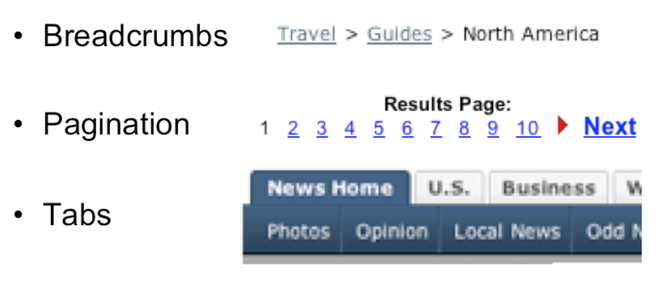
Navigation is one important kind of state to visualize – i.e., where am I now? On the Web, in particular, users are in danger of getting lost as they move around in deep, information-rich sites. We’ve already seen in previous readings a couple of patterns for preventing this by visualizing the user’s location. Breadcrumb trails show where you are as a path through the site’s hierarchy (e.g. Travel, Guides, North America), in a very compact form. Showing the hierarchy in a tree widget with the current node highlighted is another way to do it, but costs more screen space and complexity.
Pagination and highlighted tabs are similar patterns that show the user where they are, along with some context of where else they could go.
Continuous visual representation of model
What to visualize should be guided by the user’s tasks
It hardly seems necessary to say that the system model should be visualized in an interface. That’s one of the essential properties of a direct-manipulation interface: a continuous visual representation of the state of the application.
The hard design issues in model visibility tend to lie in what to make visible (i.e. which aspects of the model), and how to display it (i.e., in what representation). We’ll discuss the how, the visual representation, in much greater detail in a future reading on graphic design.
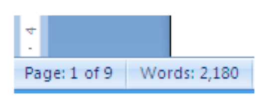
The what may involve a tension between visibility and simplicity; visibility argues for showing more, but simplicity argues for showing less. Understanding the users and their tasks (a technique called task analysis which we’ll discuss in a future class) helps resolve the tension. For example, Microsoft Word displays a word count continuously in the status bar, since counting words is an important subtask for many users of Word (such as students, journalists, and book authors). Making it always visible saves the need to invoke a word-count command.
- Selection highlight
- Selection handles
- Drag & drop mouse cursor
 dragging
 can’t drop
 - Keyboard focus

Still other state is stored in the view (or controller), not in the backend model. This “view state” is the current state of the user’s interaction with the interface.
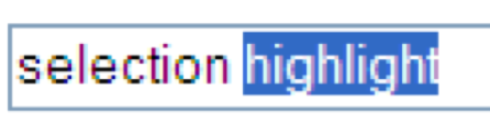
Selections are particularly important. When the user selects an object to operate on, highlight the object somehow. Don’t just leave the selection invisible and implicit. Selection highlighting provides important feedback that the selection operation was successful; it also shows the current state of the selection if the user has forgotten what was previously selected.
A common technique for showing a selection highlight in text is reverse video (white text on dark colored background). For shapes and objects, the selection highlight may be done by selection handles, or by a dotted or animated border around the object (“crawling ants”). Selection handles are appealing because they do double-duty – both indicating the selection, and providing visible affordances for resizing the object.
When the user selects objects or text and then operates on the selection with a command, keep it selected, especially if it changes appearance drastically or moves somewhere else. If the selected thing is offscreen when the user finally invokes a command on it, scroll it back into view. That allows the user to follow what happened to the object, so they can easily evaluate its final state. Similarly, if the user makes a selection and then invokes an unrelated command (like scrolling or sorting or filtering, none of which actually use the selection), preserve the selection, even if it means you have to remember it and regenerate it. User selections, like user data, are precious, and contribute to the visibility of what the system is doing.
Another form of view state is the state of an input controller, like a drag & drop operation. Drag & drop is often indicated by a cursor change.
And one more important form of view state is keyboard focus – showing which UI element on the screen will receive any keystrokes that the user types. For textboxes, the keyboard focus is conventionally shown by a blinking cursor. For other kinds of UI elements, like buttons and hyperlinks and windows, a colored outline or title bar shows the keyboard focus.
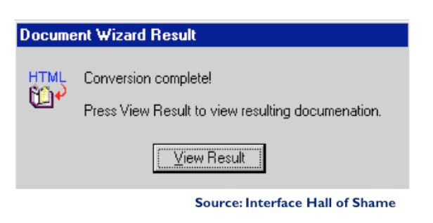
Feedback is important, but don’t overdo it. This dialog box demands a click from the user. Why? Does the interface need a pat on the back for finishing the conversion? It would be better to just skip on and show the resulting documentation.
reading exercises
Which of the following design features play a dual role – both as an affordance and as feedback? (choose all good answers)
(missing explanation)
Information Scent
Users depend on visible cues to figure out how to achieve their goals with the least effort. For information gathering tasks, like searching for information on the web, it turns out that this behavior can be modeled much like animals foraging for food. An animal feeding in a natural environment asks questions like: Where should I feed? What should I try to eat (the big rabbit that’s hard to catch, or the little rabbit that’s less filling)? Has this location been exhausted of food that’s easy to obtain, and should I try to move on to a more profitable location? Information foraging theory claims that we ask similar questions when we’re collecting information: Where should I search? Which articles or paragraphs are worth reading? Have I exhausted this source, should I move on to the next search result or a different search? (Pirolli & Card, “Information Foraging in Information Access Environments,” CHI ‘95.)
An important part of information foraging is the decision about whether a hyperlink is worth following – i.e., does this smell good enough to eat? Users make this decision with relatively little information – sometimes only the words in the hyperlink itself, sometimes with some context around it (e.g., a Google search result also includes a snippet of text from the page, the site’s domain name, the length of the page, etc.) These cues are information scent – the visible properties of a link that indicate how profitable it will be to follow the link. (Chi et al, “Using Information Scent to Model User Information Needs and Actions on the Web”, CHI 2001.)
A link should smell like the content it leads to
Hyperlinks in your interface – or in general, any kind of feature, including menu commands and toolbar buttons – should provide good, appropriate information scent.
Examples of bad scent include misleading terms, incomprehensible jargon (like “Set Program Access and Defaults” on the Windows XP Start menu), too-general labels (“Tools”), and overlapping categories (“Customize” and “Options” found in old versions of Microsoft Word).
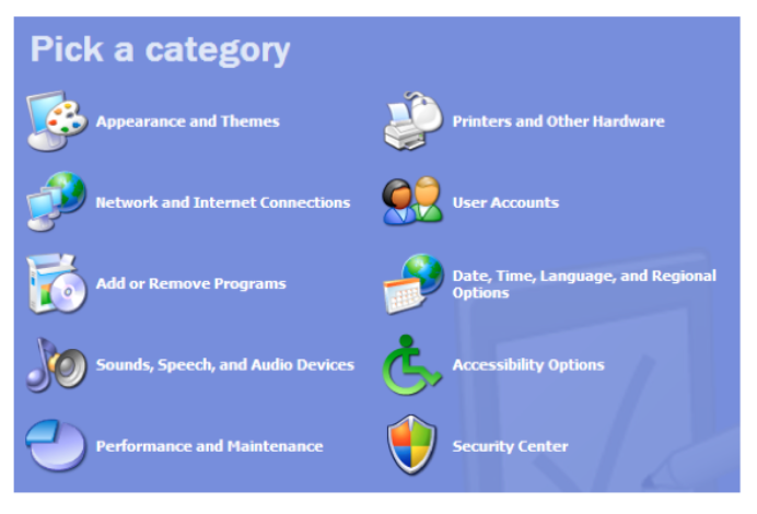
Examples of good scent can be seen in the (XP-style) Windows Control Panel on the left, which was carefully designed. Look, for example, at “Printers and Other Hardware.” Why do you think printers were singled out?
Presumably because task analysis (and collected data) indicated that printer configuration was a very common reason for visiting the Control Panel. Including it in the label improves the scent of that link for users looking for printers. (Look also at the icon – what does that add to the scent of Printers & Other Hardware?)
Date, Time, Language, and Regional Options is another example. It might be tempting to find a single word to describe this category – say, Localization – but its scent for a user trying to reset the time would be much worse.
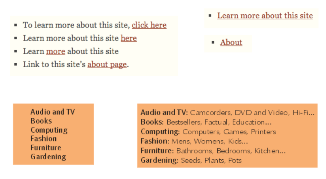
Here are some examples from the web. Poor information scent is on the left; much better is on the right.
The first example shows an unfortunately common pathology in web design: the “click here” link. Hyperlinks tend to be highly visible, highly salient, easy to pick out at a glance from the web page – so they should convey specific scent about the action that the link will perform. “Click here” says nothing. Your users won’t read the page, they’ll scan it.
Notice that the quality of information scent depends on the user’s particular goal. A design with good scent for one set of goals might fail for another set. For example, if a shopping site has categories for Music and Movies, then where would you look for a movie soundtrack? One solution to this is to put it in both categories, or to provide “See Also” links in each category that direct the user sideways in the hierarchy.
For the user, collecting information scent cues is done progressively, with steadily increasing cost.
Some properties can be observed very quickly, with a glance over the interface: detecting affordances (like buttons or hyperlinks, if they’re well designed), recognizing icons (like a magnifying glass), or short and very visible words (like Search in big bold text).
With more effort, the user can read: long labels, help text, or search result snippets. Reading is clearly more expensive than glancing, because it requires focusing and thinking.
Still more time and effort is required to hover the mouse or press down, because your hands have to move, not just your eyes. We inspect menubars and tooltips this way. Note that tooltips are even more costly, because you often have to wait a time for the tooltip to appear.
Clicking through a link or bringing up a dialog box is next, and actually invoking a command to see its effect is the costliest way to explore.
Exploration is important to learning. But much of this reading has been about techniques for reducing the costs of exploration, and making the right feature more obvious right away. An interface with very poor affordances will be very expensive to explore. Imagine a webpage whose links aren’t distinguished by underlining or color – you’ve just taken away the Glance, and forced the user to Read or Hover to discover what’s likely to be clickable. Now imagine it in a foreign language – you’ve just taken away Read. Now get rid of the mouse cursor feedback – no more Hover, and the user is forced to Click all over the place to explore. Your job as a designer is to make the user’s goal as easy to recognize in your user interface as possible.

Here’s an example of going overboard with information scent. There is so much text in the main links of this page (Search listings…, Advertise…, See…, Browse…) that it interferes with your ability to Glance over the page. A better approach would be to make the links themselves short and simple, and use the smaller text below each link to provide supporting scent.
reading exercises
Suppose this line appears on a web page:
Click here for more results.
What are its learnability problems?
(missing explanation)