Reading 13: Graphic Design
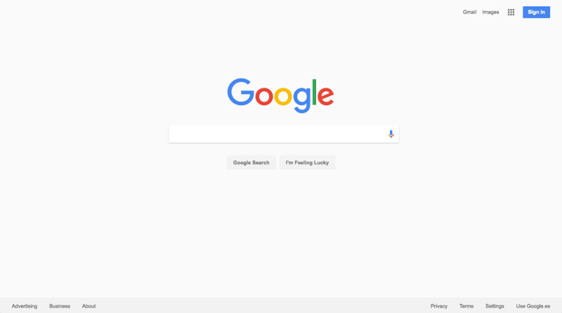
Google (search) is an outstanding example of simplicity. Its interface is as simple as possible. Unnecessary features and hyperlinks are omitted, lots of whitespace is used. Google is fast to load and trivial to use.
But maybe Google goes a little too far! Let’s take the perspective of a completely novice user coming to Google for the first time. What are the learnability obstacles to forming a mental model of what Google actually does and how to use it?
Today’s reading is the first in a series about graphic design for graphical user interfaces, and we want to explain why we’re doing this.
We’ve made a point (earlier) that this course is focused on usability, but many of the guidelines in the upcoming readings are more about aesthetics than pure usability. Serious mistakes in graphic design certainly affect usability, however, so we’re trying to help you avoid those pitfalls. There’s also a phenomenon, sometimes called the Aesthetic Usability Effect, that attractive user interfaces (like attractive people) are perceived as more usable, whether they are or not. Furthermore, design is not about decoration or about ornamentation. Design is about making communication as easy and clear for the viewer as possible.
But there’s a larger question here: in practice, should software engineers have to learn this stuff at all? Shouldn’t you just hire a graphic designer and let them do it? Some people think that the most important lesson a software engineer can learn from a course like 6.813 is “UI design is hard; leave it to the experts.” The person who told me that was a high-level designer at Microsoft Research. I was tempted to retort that designers shouldn’t bother learning to program either, but I don’t actually believe that so I held my tongue.
But there’s some substance to the argument: a little knowledge can be a dangerous thing, and that a programmer with a little experience in UI design but too much self-confidence can be just as dangerous as an artist who’s learned a little bit of HTML and thinks they now know how to program. But I prefer to believe that a little knowledge is a step on the road to greater knowledge. Some of you may decide to become UI designers, and this course is a step along that road.
In a commercial environment, you should hire experienced graphic designers, just as you should hire an architect for building your corporation’s headquarters and you should contract with a licensed building firm. Big jobs for big bucks require experts who have focused their education and job experience on those problem. One reason this course is useful is that you can appreciate what UI experts do and evaluate their work, which will help you work on a team with them (or supervise them).
But it’s also worth learning these principles because you can apply them yourself on smaller-scale problems. Are you going to hire a graphic designer for every PowerPoint presentation you make, every chart you draw, every web page you create, every blog post you write? Those are all user interfaces. Many interactions and communications in life have a user interface, and many of them are up to you to do-it-yourself. So you should know when to leave it to the experts, but you should be able to do a creditable job yourself too, when the job is yours to do.
Simplicity
Okay, we’ll shout some slogans at you now. You’ve probably heard some of these before. What you should take from these slogans is that
designing for simplicity is a process of elimination, not accretion
. Simplicity is in constant tension with other design guidelines that might otherwise encourage you to pile more and more elements into a design, “just in case.” Simplicity forces you to have a good reason for everything you add, and to take away anything that can’t survive hard scrutiny.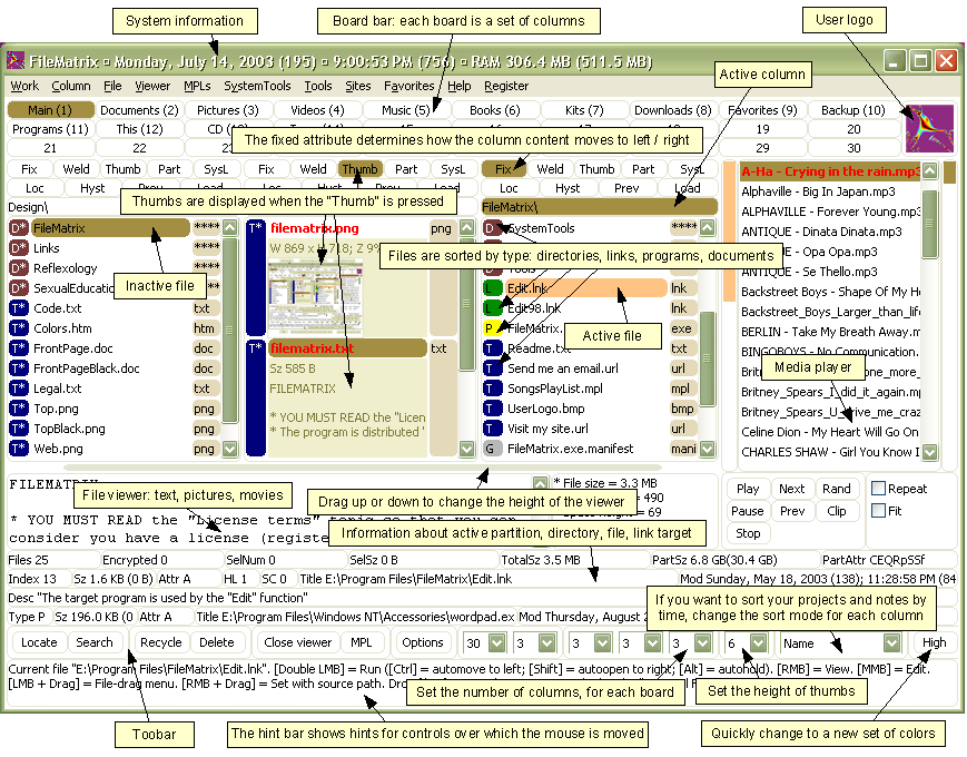
Source: Alex Papadimoulis
Although we’ll largely be looking at simplicity in graphic design today, the value of simplicity to user interface design is much broader than that. Keeping a design simple, with as few parts and pieces as you can, tends to improve a design on all our usability dimensions: learnability, efficiency, and safety.
Here’s a counterexample to illustrate. This is a program called FileMatrix. We have no idea what it does, but it seems to do it all. The complexity of this interface actually interferes with a lot of our usability goals: it’s less learnable (because there are so many things you have to learn), less efficient (because cramming all the functions into the window means that each button is tiny), and less safe (because so many things look alike, hence description slips are easy).
Incidentally, this may be a good example of designing for yourself, rather than for others. The programmer who wrote this probably understands it completely, and maybe even uses a significant fraction of those features; but few other users will need that much, and it will just interfere with their ability to use it.
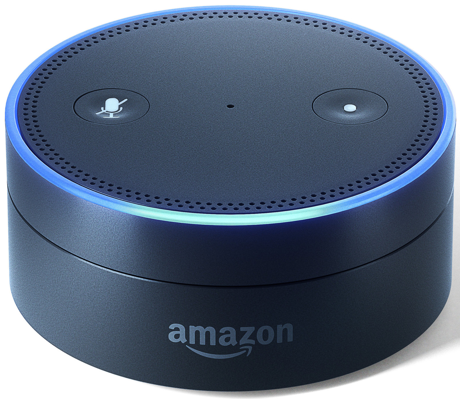
In contrast to the previous example, here’s the Amazon Echo Dot. The Echo is an outstanding example of simplicity. Its interface is as simple as possible: a dial, two buttons, a ring of lights, and speech. Unnecessary buttons and features are omitted.
Simplicity certainly makes an interface easier to learn, because there’s less to learn. But it can also make an interface faster and safer to use, even for an expert with that interface. Consider a remote control with 20 buttons on it. Suppose you’re an expert, so you know which button to push. But you only use 3 of those buttons regularly. Which would be faster – an interface with 3 fat buttons, or an interface with 20 little buttons? Which would be less error prone?
Remove inessential elements


Remove inessential features
Here are three ways to make a design simpler. Again, we’re focusing on graphic design (visual appearance here), but you can generalize these rules easily to other aspects of a design: the features that your application offers, the labels for buttons or form fields, the steps in a process, etc.
Reduction means that you eliminate whatever isn’t necessary. This technique has three steps:
- decide what essentially needs to be conveyed by the design
- critically examine every element (label, control, color, font, line weight) to decide whether it serves an essential purpose
- remove it if it isn’t essential. Even if it seems essential, try removing it anyway, to see if the design falls apart.
Icons demonstrate the principle of reduction well. A photograph of a pair of scissors can’t possibly work as a 32x32 pixel icon; instead, it has to be a carefully-drawn picture which includes the bare minimum of details that are essential to scissors: two lines for the blades, two loops for the handles. The standard US Department of Transportation symbol for handicapped access is likewise a marvel of reduction. No element remains that can be removed from it without destroying its meaning.
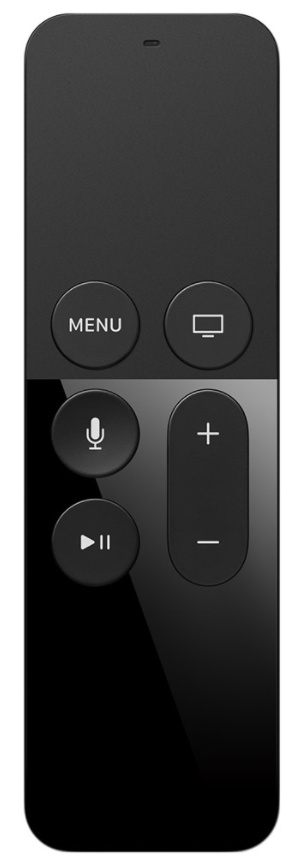
We’ve already discussed the minimalism of Google. The Apple TV remote is another notable example, about minimalizing functionality. It’s much simpler than comparable remote controls, which tend to be dense arrays of tiny rectangular buttons, all alike. Functionality has been aggressively removed from the remote, and replaced by onscreen UI or speech dialog UI.
Use a regular pattern
Limit inessential variation among elements
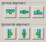
For the essential elements that remain, consider how you can minimize the unnecessary differences between them with regularity. Use the same font, color, line width, dimensions, orientation for multiple elements. Irregularities in your design will be magnified in the user’s eyes and assigned meaning and significance. Conversely, if your design is mostly regular, the elements that you do want to highlight will stand out better.
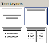
PowerPoint’s Text Layouts menu shows both reduction (minimalist icons representing each layout) and regularity. Titles and bullet lists are shown the same way.
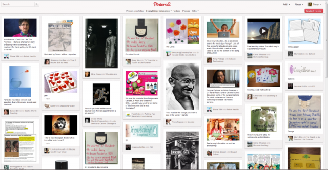
The uniform column width of grid layouts (like Pinterest shown here, in which the grid is very visible) is another common kind of regularity.
Combine elements for leverage.
Find a way for one element to play multiple roles
title bar: 
scrollbar thumb: 
breadcrumbs: 
pagination: 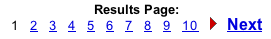
help prompt: 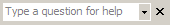
star ratings:


Another technique for simplicity is double duty, in which you try to combine elements to make them serve multiple roles in the design. Desktop and web interfaces have a number of patterns in which elements have multiple duties. For example, the “thumb” in a scroll bar actually serves three roles. It affords dragging, indicates the position of the scroll window relative to the entire document, and indicates the fraction of the document displayed in the scroll window. Similarly, a window’s title bar plays several roles: label, dragging handle, window activation indicator, and location for window control buttons. In the classic Mac interface, in fact, even the activation indicator played two roles. When the window was activated, closely spaced horizontal lines filled the title bar, giving it a perceived affordance for dragging.
The breadcrumbs pattern and the pagination pattern also do double duty, not only showing you where you are but also providing an affordance for navigating somewhere else. Pagination links, like a scrollbar, may also show you how many pages there are.
Netflix star ratings initially show how other users have rated a movie (red stars), but also serve as an input affordance for entering the user’s own rating (gold stars).
reading exercises
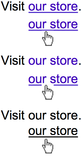
Consider the evolution of a hyperlink design through three successive iterations, shown here. Each design’s hover feedback is shown as well. Which of the following statements are true? (choose all good answers):
(missing explanation)
Principles of Visual Design
There have been many taxonomies of visual design principles, but these “big four” (sometimes also abbreviated as CARP) are generally considered some of the most essential and most date back to Jackson’s popular 1891 textbook Lessons on Decorative Design.
Try this exercise: Pick a business card from someone in a large company (as these tend to be designed by good professional graphic designers). These are typical examples of designs that look easy to the uninitiated but have actually had a lot of thought put into them.
- Observe how font sizes, weights, and colors have been used to create a visual hierarchy (contrast).
- Observe how information is grouped, and how every group is aligned with something else (proximity, alignment). You may even be able to imagine the invisible grid that every design element snaps to.
- Lastly, compare the business card to the company’s website or letterhead, and observe how some graphic elements have been repeated to create a brand identity across multiple mediums or even within the card, e.g. its two sides (repetition).
In the rest of this reading, we are going to talk about these four design principles in more detail. However, while design principles are useful tools, it’s important to remember that they are essentially rules of thumb. Just like with most rules, you need to understand them to know when it’s ok to break them. Can you think of cases where breaking these principles enhances communication?
Contrast
Contrast encodes information along visual dimensions
Contrast refers to perceivable differences along a visual dimension, such as size or color. Contrast is the irregularity in a design that communicates information or makes elements stand out. Simplicity says we should eliminate unimportant differences. Elements that aren’t the same should be very different so they stand out.Making them “slightly different” confuses the user into seeing a relation that doesn’t exist.
Once we’ve decided that a difference is important, however, we should choose the dimension and degree of contrast in such a way that the difference is salient, easily perceptible, and appropriate to the task.
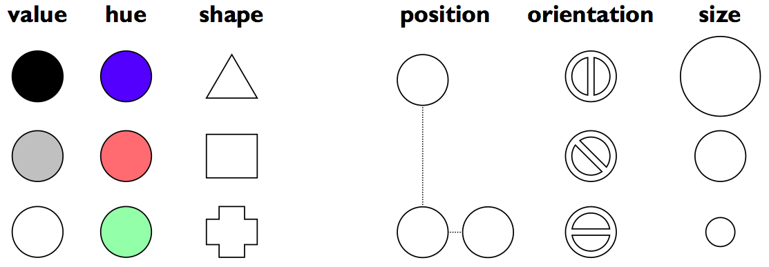
Crucial to this decision is an understanding of the different visual dimensions. Jacques Bertin developed a theory of visual variables that is particularly useful here (Bertin, Graphics and Graphics Information Processing, 1989). Visual variables identified by Bertin are shown in the figure. Bertin called these dimensions retinal variables, in fact, because they can be compared effortlessly without additional cognitive processing, as if the retina were doing all the work.
Each column in this display varies along only one of the six variables. Most of the variables need no explanation, except perhaps for hue and value. Hue is pure color; value is the brightness or luminance of color. (Figure after Mullet & Sano, p. 54).
The visual variables are used for communication, by encoding data and drawing distinctions between visual elements. But the visual variables have different characteristics. Before you choose a visual variable to express some distinction, you should make sure that the visual variable’s properties match your communication. For example, you could display a temperature using any of the dimensions: position on a scale, length of a bar, color of an indicator, or shape of an icon (a happy sun or a chilly icicle). Your choice of visual variable will strongly affect how your users will be able to perceive and use the displayed data.
Two characteristics of visual variables are the kind of scale and the length of the scale.
A nominal scale is just a list of categories. Only comparison for equality is supported by a nominal scale. Different items in a nominal scale have no ordering relationship. The shape variable is purely nominal. Hue is also purely nominal, at least as a perceptual variable. Although the wavelength of light assigns an ordering to colors, the human perceptual system takes no notice of it. Likewise, there may be some cultural ordering imposed on hue (red is “hotter” than blue), but it’s weak, doesn’t relate all the hues, and is processed at a higher cognitive level.
An ordered scale adds an ordering to the items on the scale. Position, size, and value are all ordered.
With a quantitative variable, you can perceive the amount of difference in the ordering. Position is quantitative. You can look at two points on a graph and tell that one is twice as high as the other. Size is also quantitative, but note that we are far better at perceiving quantitative differences in one dimension (i.e., length) than in two dimensions (area). Value is not quantitative; we can’t easily perceive that one shade is twice as dark as another shade.
The length of a variable is the number of distinguishable levels that can be perceived. We can recognize a nearly infinite variety of shapes, so the shape variable is very long, but purely nominal. Position is also long, and particularly fine-grained. Orientation, by contrast, is very short; only a handful of different orientations can be perceived in a display before confusion starts to set in. The other variables lie somewhere in between, with roughly 10 useful levels of distinction, although size and hue are somewhat longer than value.
There are two ways that your choice of visual variables can affect the user’s ability to attend to them.
Selectivity is the degree to which a single level of the variable can be selected from the entire visual field. Most variables are selective: e.g., you can locate green objects at a glance, or tiny objects. Shape, however, is not selective in general. It’s hard to pick out triangles amidst a sea of rectangles.
Associativity refers to how easy it is to ignore the variable, letting all of the distinctions along that dimension disappear. Variables with poor associativity interfere with the perception of other visual dimensions. In particular, size and value are dissociative, since tiny or faint objects are hard to make out.
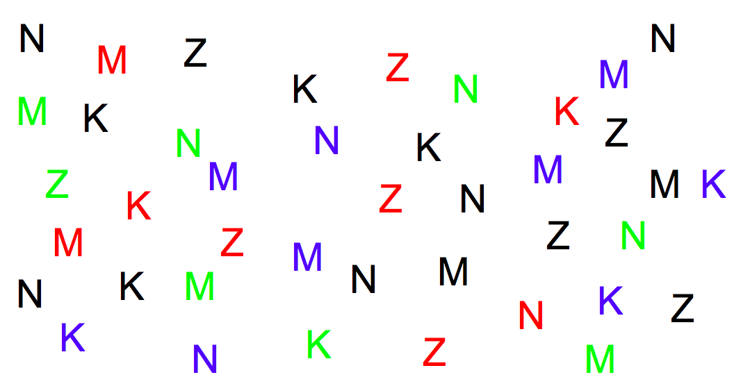
Ask yourself these questions:
- find all the letters on the left edge of the page (position)
- find all the red letters (hue)
- find all the K’s (shape)
Which of these questions felt easy to answer, and which felt hard? The easy ones were selective visual variables.
Once you’ve decided that a contrast is essential in your interface, choose the right visual variable to represent it, keeping in mind the data you’re trying to communicate and the task users need to do with the data. For example, consider a text content hierarchy: title, chapter, section, body text, footnote. The data requires an ordered visual variable; a purely nominal variable like shape (e.g., font family) would not by itself be able to communicate the hierarchy ordering. If each element must communicate multiple independent dimensions of data at once (e.g., a graph that uses size, position, and color of points to encode different data variables), then you need to think about the effects of associativity and selectivity.
Once you’ve chosen a variable, use as much of the length of the variable as you can. Determine the minimum and maximum level of the variable you can use, and exploit the whole range. In the interests of simplicity, you should minimize the number of distinct levels you use. But once you’ve settled on N levels, distribute those N levels as widely across the variable as is reasonable. For position, this means using the full width of the window; for size, it means using the smallest and the largest feasible sizes.
Choose variable levels in such a way as to make sharp, easily perceptible distinctions between them. Multiplicative scaling (e.g., size growing by a factor of 1.5 or 2 at each successive level) makes sharper distinctions than additive scaling (e.g., adding 5 pixels at each successive level). You can also use redundant coding in several visual variables, to enhance important distinctions further. The title of a document is not only larger (size), but it’s also centered (position), bold (value), and maybe a distinct color as well. Exaggerated differences can be useful, particularly when you’re drawing icons: like a cartoonist, you have to give objects exaggerated proportions to make them easily recognizable.
The squint test is a technique that simulates early visual processing, so you can see whether the contrasts you’ve tried to establish are readily apparent. Close one eye and squint the other, to disrupt your focus. Whatever distinctions you can still make out will be visible at a glance.
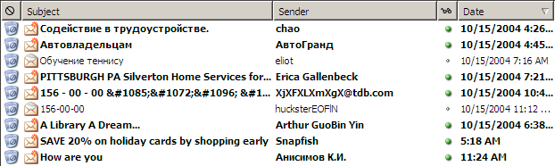
Let’s look at an email inbox to see how data associated with email messages are encoded into visual variables in the display. Here are the data fields shown in the inbox, in columns from left to right:
- Spam flag: nominal, 2 levels (spam or not)
- Subject: nominal (but can be ordered alphabetically), infinite (but maybe only ~100 are active)
- Sender: nominal (but can be ordered alphabetically), infinite (but maybe ~100 people you know + everybody else are useful simplifications)
- Unread flag: nominal, 2 levels (read or unread)
- Date: quantitative (but maybe ordered is all that matters), infinite (but maybe only ~10 levels matter: today, this week, this month, this year, older)
This information is redundantly coded into visual variables in the display, for better contrast. First, all the fields use position as a variable, since each is assigned to a different column. In addition:
- Spam: shape, hue, value, size (big colorful icon vs. little dot)
- Subject: shape
- Sender: shape
- Unread: shape, hue, value, size (big green dot vs. little gray dot) and value of entire line (boldface vs. non)
- Date: shape, size (today is shorter than earlier dates), position (list is sorted by date)
Exercise
Try designing a visualization with these encodings instead:
- Spam: size (this takes advantage of dissociativity)
- Subject: shape
- Sender: position
- Unread: value
- Date: position
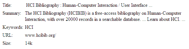
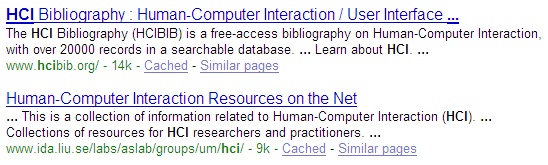
Here’s another example showing how redundant encoding can make an information display easier to scan and easier to use. Search engine results are basically just database records, but they aren’t rendered in a simplistic caption/field display like the one shown on top. Instead, they use rich visual variables (and no field labels!) to enhance the contrast among the items. Page titles convey the most information, so they use size, hue, and value (brightness), plus a little shape (the underline). The summary is in black for good readability, and the URL and size are in green to bracket the summary.
Take a lesson from this: your program’s output displays do not have to be arranged like input forms. When data is self-describing, like names and dates, let it describe itself. This is yet another example of the double duty technique for achieving greater simplicity - data is acting as its own label. Choose good visual variables to enhance the contrast of information that the user needs to see at a glance.
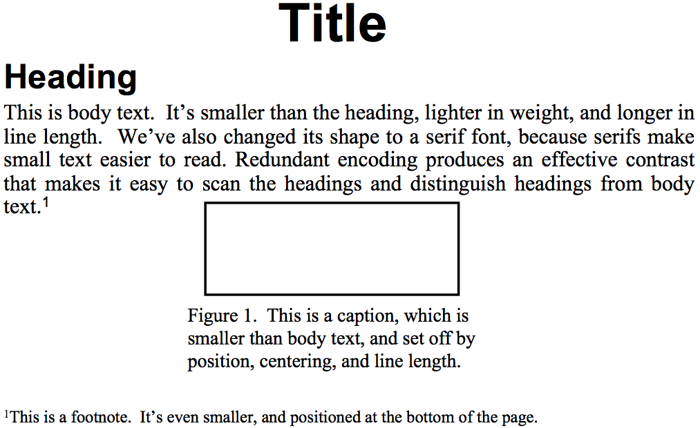
Titles, headings, body text, figure captions, and footnotes show how contrast is used to make articles easier to read. You can do this yourself when you’re writing papers and documentation. Does this mean contrast should be maximized by using lots of different fonts like Gothic and Bookman? No, for two reasons - contrast must be balanced against simplicity, and text shape variations aren’t the best way to establish contrast.
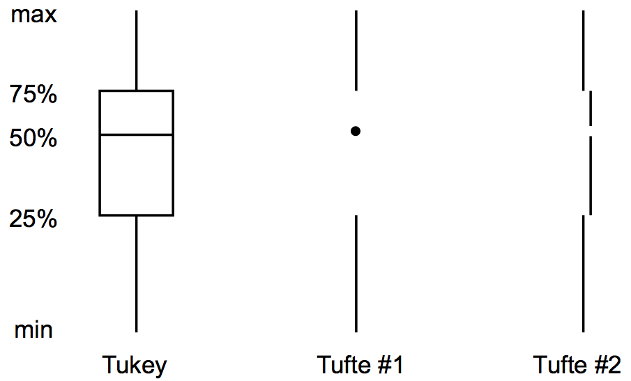
Conversely, here’s a case where simplicity is taken too far, and contrast suffers. Simplicity and contrast seem to fight with each other. The standard Tukey box plot shows 5 different statistics in a single figure. But it has unnecessary lines in it! Following the principle of simplicity to its logical extreme, Edward Tufte proposed two simplifications of the box plot which convey exactly the same information - but at a great cost in contrast. Try the squint test on the Tukey plot, and on Tufte’s second design. What do you see?
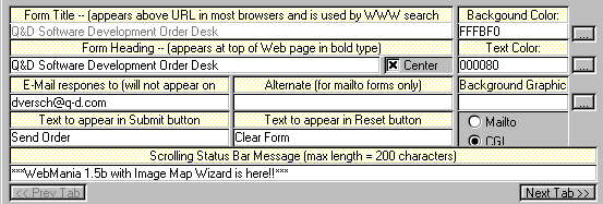
Here’s an example of too little contrast. It’s important to distinguish captions from text fields, but in this design, most of the visual variables are the same for both:
- the position is very similar: the box around each caption and text field begins at the same horizontal position. The text itself begins at different positions (left-justified vs. aligned), but it isn’t a strong distinction, and some of the captions fill their column.
- the size is the same: captions and text fields fill the same column width
- the background hue is slightly different (yellow vs. white), but not easily differentiable by the squint test
- the background value is the same (very bright)
- the foreground hue and value are the same (black, plain font)
- the orientation is the horizontal, because of course you have to read it. The result is that it’s hard to scan this form. The form is also terribly crowded, which leads us into our next topic…
reading exercises
Look at the title of the Summary box below. Which visual variables are being used to make it contrast with the other graphical elements in the box? (choose all good answers):
(missing explanation)
Repetition
The principle of Repetition refers to reusing the same or similar elements throughout your design. Repetition of certain design elements in a book, slide deck, website will bring a clear sense of unity, consistency, and cohesiveness. The same principle can be applied to smaller units. For example, a single page of a website can visually unify its different sections by reusing the same typefaces, colors and layout styles. You can repeat colors, shapes, textures, spatial relationships, line thicknesses, fonts, sizes, graphic concepts etc. Where contrast is about showing differences, repetition is about subtly using elements to make sure the design is viewed as being part of a larger whole.
Look at the video on the left which shows the award-winning brand identity of Benevolent Society, Australia’s first and oldest charity organization, designed by Designworks Sydney. Notice how design elements are repeated throughout every item, creating visual unity across a range of completely different mediums. Which design elements are repeated? Now visit the website. Which design elements unify it with the rest of the brand identity?
Be wary of too much repetition. Repeating some design elements unifies, repeating everything creates tiring, uninteresting designs. Think of classic PowerPoint templates where every slide has exactly the same design elements, and exactly the same bulleted lists with the main difference being the text. This is one reason why these are universally regarded as dull (“death by PowerPoint”).
Alignment
- Alignment helps relate information
- Columns within a page makes it easier to scan horizontally
- Place with purpose
- Grids are very useful for achieving good alignment. This will
give your design a clean, well-organized look.
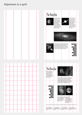
Nothing should be placed on the page arbitrarily. Every element should have some visual connection with another element on the page. Every element is connected visually via an invisible line. Where repetition is more concerned with elements across an entire work (e.g. website, application, book, slide deck), alignment is about obtaining unity among elements of a single entity (e.g. page, screen, slide, section).
Even elements that are quite far apart have a visual connection, something that is easier to achieve with the use of grids.
Proximity
- Physical closeness implies a relationship
- Group related items together to create a visual unit (remember chunking?)
- Keep space between unrelated items
- Be aware of unintentional groupings

The principle of proximity is about moving things closer or farther apart to achieve a more organized look. The principle says that related items should be grouped together so that they will be viewed as a single visual unit, rather than as several unrelated elements. Users will assume that items that are not near each other in a design are not closely related. Users will naturally tend to group similar items that are near to each other into a single unit.
People should never have to “work” at trying to figure out which heading goes with which graphic or text, or whether or not a line of text is a subtitle or a line of text unrelated to the title. Do not make users think. Robin Williams, in her best-selling book The Non-Designer’s Design Book (Peachpit Press) says that we must be conscious of where our eye goes first when we step back and look at our design. When you look at your slide, notice where your eye is drawn first, second, and so on. What path does your eye take?
We will talk more about Proximity in the upcoming lecture on Layout.