8.03 at ESG - Notes
Energy in a Stretched String
In lecture, derivations were derived, and sketches sketched, relating
the energy densities for a standing wave on a stretched string. Since
these quantities are inherently time-dependent, graphical depiction
with mere chalk can be augmented, using animations.
In the animation on this page, the formulas plotted are related to
those derived in lecture, specifically

The "leading constants'' have been adjusted for the purposes of
plotting; basically, everything has amplitude one. Recall that
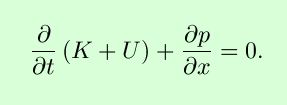
the quantities U(x,t) and
K(x,t) are the potential and kinetic
energies per unit length, respectively.
While we're making plots, we might as well plot other quantities of
interest. The transmitted power is
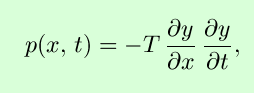 and depends on a chosen direction (unlike the
energy densities); the above expression assumes the positive
x-direction to be positive. As a check, you should be able
to show that
and depends on a chosen direction (unlike the
energy densities); the above expression assumes the positive
x-direction to be positive. As a check, you should be able
to show that
Anyway, here goes:

In the above, the different curves correspond to the different
physical quantities as follows:
- Black:
y(x,t), for one wavelength and one
period (every time the axis labels flash, the animation is
relooping).
- Orange (okay,
it came out sort of brown): U(x,t).
Note that this curve is always zero at the antinodes of
y(x,t), and oscillates with twice the
frequency as y(x,t); inverting the
curve for y(x,t) does not change the
energy denisties. A similar effect is seen for
- Magenta
(bright purple): K(x,t). Note that
this curve is always zero at the nodes of
y(x,t), where the string is never
moving, and hence has no kinetic energy at that point.
- Cyan (bright
blue): The total energy density K +
U. Note that at certain times (easily predicted
from the above equations), the total energy density is the same for
all values of x.
- Yellow:
p(x,t). This may be hard to see,
since the animation is running so quickly. If you look carefully, you
should see that when the yellow curve is positive, the blue curve is
increasing (in time) to the right, and decreasing (in time) to the
left, and when the yellow curve is negative, the reverse happens.
This demonstrates the "sloshing'' of energy in a standing wave from
kinetic to potential, with "mixed'' states in between.
It's hard to control the speed on animations generated from MAPLE
for use in web pages; the best thing to do is to make your own,
espcially so that you can "freeze'' the animation and view
frame-by-frame (there are 40 frames in the animation on this page).
Instructions for using MAPLE can be found in several places (see
the links below). For now, if you either download the worksheets or
cut-and-paste the ASCII commands, all you need to know is that you
have to enter each command, one at a time, to obtain the animation in
a separate window.
There are several possibilities for reproducing the above animation in
a form more to your liking: