EXILE
 The
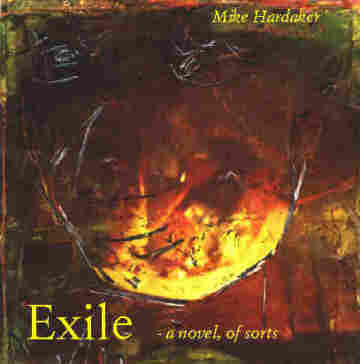
cover graphic is wild, chaotic. The first page gives away nothing about
the nature of the story ahead. That was enough to get me intrigued.
The three frames there were distracting, though, not allowing total immersion
in the content. They always reminded you were you had started, giving
you a handle on reality, on the statistics of the novel, on hints.
I got rid of them and clicked through. The quality and atmosphere
of the writing made up for the lengthy lexia in the beginning. The
sunset in the first page is reflected in the background colors, the mood
is calm and the scrolling is welcome. After a while though, I wished
some of them were shorter, as they dragged
on for screens and screens. The upside of that was that each
lexia stood as a unit, not a lost excerpt. It knew what it had to
tell you and gave you entire thoughts or events, which the links clarified,
gave background information about, or drew you deeper into the story.
One thing remained unclear though. Some lexia had the same background texture
and I wonder if they are meant to form some sort of greater unity.
The
cover graphic is wild, chaotic. The first page gives away nothing about
the nature of the story ahead. That was enough to get me intrigued.
The three frames there were distracting, though, not allowing total immersion
in the content. They always reminded you were you had started, giving
you a handle on reality, on the statistics of the novel, on hints.
I got rid of them and clicked through. The quality and atmosphere
of the writing made up for the lengthy lexia in the beginning. The
sunset in the first page is reflected in the background colors, the mood
is calm and the scrolling is welcome. After a while though, I wished
some of them were shorter, as they dragged
on for screens and screens. The upside of that was that each
lexia stood as a unit, not a lost excerpt. It knew what it had to
tell you and gave you entire thoughts or events, which the links clarified,
gave background information about, or drew you deeper into the story.
One thing remained unclear though. Some lexia had the same background texture
and I wonder if they are meant to form some sort of greater unity.
Just about every page has a really interesting picture
at the bottom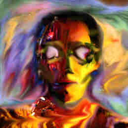 .
I later found out that these were the links that lead to the chronological
sequence the artist had in mind. The graphics were extremely interesting
and intricately designed, but sometimes the relevance was not clear, and
at other times they placed you at the scene, put you in a chair, or gave
a vibrant picture of a character's dynamic personality(right).
.
I later found out that these were the links that lead to the chronological
sequence the artist had in mind. The graphics were extremely interesting
and intricately designed, but sometimes the relevance was not clear, and
at other times they placed you at the scene, put you in a chair, or gave
a vibrant picture of a character's dynamic personality(right). 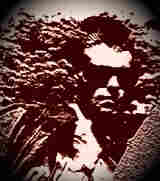 When unsure which link to follow, they kept the fluidity going. One
thing I liked a lot which did not really happen in some of the other stories
is that you can always spot links you have visited even if you see them
in another page, and so you never ended up going back to a place you had
been to. Even though this sounds intuitive, I got stuck in annoying
loops in a couple of stories I tried to read. There was extensive
use of bad poetry, though, that is the lyrics to one of the character's
songs. I was happy to see that there was no accompanying music that
would have overdone the use of different media(not to mention bringing
that poetry to a life it does not deserve).
When unsure which link to follow, they kept the fluidity going. One
thing I liked a lot which did not really happen in some of the other stories
is that you can always spot links you have visited even if you see them
in another page, and so you never ended up going back to a place you had
been to. Even though this sounds intuitive, I got stuck in annoying
loops in a couple of stories I tried to read. There was extensive
use of bad poetry, though, that is the lyrics to one of the character's
songs. I was happy to see that there was no accompanying music that
would have overdone the use of different media(not to mention bringing
that poetry to a life it does not deserve).
There were a few terminal pages which are put to very
good use. In one sentence, Hardaker writes, "the conversation
made us stop in our tracks." The story stopped in its tracks. Some like
this last page had a notebook background and script format. I was
not quite sure about the significance or necessity of such a drastic change
in presentation. "Exile" by Mark Hardaker is a cool read. The strange
thing was that out of the stories I read or tried to read it was the one
that was most structurally sound from the writer's aspect. Other
stories seemed to just give snapshots that didn't make a coherent whole,
like Shoulder to the Wheel.