Shoulder
to the Wheel
 As opposed to "Exile," "Shoulder to the Wheel" is a student work
whose art work was mostly downloaded of the web and that is substantially
shorter. The design is attractive and the first lexia invites
further inspection. There is an introduction explaining the links,
which was useful in familiarizing the reader with his abilities in the
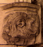
realm he is about to enter. I was disappointed with the size of the
linked graphics because they looked interesting but were too small to make
out. One of them is in the top left hand corner of this page. I made it
larger here.
As opposed to "Exile," "Shoulder to the Wheel" is a student work
whose art work was mostly downloaded of the web and that is substantially
shorter. The design is attractive and the first lexia invites
further inspection. There is an introduction explaining the links,
which was useful in familiarizing the reader with his abilities in the
realm he is about to enter. I was disappointed with the size of the
linked graphics because they looked interesting but were too small to make
out. One of them is in the top left hand corner of this page. I made it
larger here.
The story is from the points of view of two people, a
woman, DW, and a man, Gunther, that she "creates" in a game. This
offers added insight and allows the reader to know more than the characters
do. That, added to the control flow provided by the hypertext, give
a feeling of power. I was disappointed with the writing, though.
It felt as if the artist had spent a lot more effort on the design and
tree structure and not enough on style and composition. The lexia seem
choppy and lacking, as if the writer, Sara Perry, was trying so hard to
make them small that she made her sentences into skeletons of the ideas
they were trying to convey. Their size is perfect. They are
just big enough to take up just one screen and just small enough to portray
an event.
The control flow is frustrating. Many pages have
only one link, forcing you into one sequence. An index
is used which is wittily put in(you get there from a link to a bookstore),
but somehow I always ended up there. It tells you the links you have
been to and those you haven't so you just go to the ones you have not seen
yet and wind up at the list again and so on.
The backgrounds of the lexia of the two characters are
different. It is very effective in reflecting the kind of characters we
are dealing with. The woman's point of view is presented on a background
that seems to be shattered
and broken. She has become too involved in the game she has been
playing and it seems to be confusing her. The man's is on a background
of clocks
and sand timers. This seems to remind us that his existence is temporary,
surreal. I was impressed to see how those two pictures contributes
silently to the images I had formed of Gunther and DW.
This story did not seem to be cohesive. It
was more like fragments of a chapter in a book. It threw out an idea
and did not really see it through or make a point about it. Many
interesting elements were presented(spells, a book with eyes, etc.) but
their significance never elaborated on. I was hoping that there be
some cool hidden link to a continuation or a certain sequence of events
that would open up new links. I guess there are none. Even if there
were, and they are too well hidden, they would be useless because one would
get bored and leave before one had the chance to find them.
As a student project I see why it is short, but
I expected at least one complete event or idea. This story raised
an important question about the class: How much of it is web design, how
much segmentation and branching, and how much is writing skills(plot, mood,
idea, etc..)?
A more interesting and well organized student work from
last year is Egypt.
back to first page
comments on
Exile