| 11.188: Urban Planning and Social Science Laboratory |
Out: Monday, March 1, 2021, & Due: Tuesday, March. 9, 2021 (at start of next lab)
In this exercise, you will continue to examine Cambridge housing sales and census block group data (from Lab #1). First, we will examine the education level of neighborhood residents and compare housing sales prices in neighborhoods with high/low neighborhood education measures. In order to do this, we will need to learn more of QGIS's database manipulation capabilities involving query selection, tabular joins, and spatial joins. We will also use QGIS tools to compute basic statistics for selected subsets of spatial features. Second, we will buffer Mass Ave (an old and historic route through Cambridge) and examine whether the 1989 housing sales prices close to Mass Ave tend to be higher (or lower) than the sales for homes further from Massachusetts Avenue.
Much of the analytic power of GIS comes from its capacity to compute and then manipulate and visualize the geospatial relationships among selected events and locations that are recorded in otherwise unconnected datasets. In this particular lab you will turn in your answers by filling out a form as well as generating maps in PDF format. As you work on the exercise, edit your own copy of the following form (http://web.mit.edu/11.188/www/labs/lab2/lab2ex.html ) and submit the copy with your answers to the appropriate Stellar 'turn in' site.
(1) Merging, editing, and saving tables: To do this lab, we'll have to learn a few more GIS techniques for merging and saving tables. There are hundreds of census variables and any Cambridge block group map is likely to include only a small subset of them. To use other census data, we'll have to load these data into QGIS and "join" them with the attribute table of the Cambridge block group theme using a common geographic reference variable (such as the state-county-tract-block group identifier, Stcntrbg). We may also need to compute new fields that normalize or otherwise combine multiple columns of the original data. But the official class datasets are "read-only" and you need write access to attribute tables in order to create and calculate new fields. So we'll also need to learn how to save local "writeable" copies of (extracts of) our class datasets.
(2) Spatial Joins: Suppose we'd like to compare the sales prices of Cambridge homes with the socioeconomic characteristics of their neighborhoods. For example, we might want to know whether the high-priced sales tended to be in neighborhoods with highly educated adults. By drawing a pin-map of high-priced 1989 sales locations on top of a Cambridge block group map, we may be able to see a pattern. The block group map can be thematically shaded by educational attainment levels. With this map, we can 'see' whether high/low-priced sales cluster in neighborhoods with, for example, more (or less) educational attainment. But the pattern may be misleading or hard to interpret and we may want to quantify the relationship to measure the degree of association and to tag the sales data with some of the characteristics of their neighborhoods. Much of the benefit of using GIS software depends on its tools for cross-referencing and reinterpreting data based on spatial location. We'll defer until later labs the more general and advanced tools for tagging data based on spatial proximity and we'll focus in this lab on simpler spatial joins and buffer creation.
(3) Setting coordinate system: So far, the coordinate system of the shapefiles we have used has already been preset for your use. However, in many cases, you may need to specify or change the coordinate systems associated with GIS datasets that you acquire. In this exercise, you will learn how to apply a suitable coordinate system to your datasets.
Follow the usual routine to set up your work environment:
As in previous labs, we will use Cambridge data for this exercise. In
ArcMap, you should by now have added the Cambbgrp.shp
shapefile. Be sure to get the shapefile version of Cambridge block groups.
(The shapefile is recognizable by the *.shp suffix, if you have the
visibility of suffixes turned on, and by the shapefile icon, ![]() .) For clarity, rename your
Data Frame to be "Lab Exercise 2." You can do this by doubling clicking
the data frame name layers, and then edit the name on
the General tab. While on the General
tab, you should also set the "Display Units" to miles. Remember: you need
to set the Map and Display units in every new view you create in order for
ArcMap to interpret the coordinates properly and generate correct scale
bars and distance measurements. The Map units tell the software the
measurement units associated with the X,Y values actually saved in the
shapefile, whereas the Display units choose the measurement units to be
used "on-screen" when you visualize the shapefile is displayed in the
ArcMap window. Make a habit of checking the display units
immediately after adding the first layer to a new map document.
.) For clarity, rename your
Data Frame to be "Lab Exercise 2." You can do this by doubling clicking
the data frame name layers, and then edit the name on
the General tab. While on the General
tab, you should also set the "Display Units" to miles. Remember: you need
to set the Map and Display units in every new view you create in order for
ArcMap to interpret the coordinates properly and generate correct scale
bars and distance measurements. The Map units tell the software the
measurement units associated with the X,Y values actually saved in the
shapefile, whereas the Display units choose the measurement units to be
used "on-screen" when you visualize the shapefile is displayed in the
ArcMap window. Make a habit of checking the display units
immediately after adding the first layer to a new map document.
Start QGIS and open the QGIS project document (*.qgz) that you saved at the end of Lab #1, or just open QGIS without any open layers and then add the cambbgrp, cambtigr and sales89 shapefiles. All three shapefiles are saved on disk using Mass State Plane (NAD83, meters) coordinates. If you added the three shapefiles to an empty QGIS session, then the EPSG listing in the lower right of the QGIS window should show EPSG:26986 as the coordinate reference system with which your layers are displayed, and the X,Y pair for your cursor location should be shown in the 'Coordinate' box at the bottom of the QGIS windows appropriate Mass State Plane coordinates. If you opened a QGZ file from Lab#1, The EPSG code might be different - for example, it might show EPSG:3857 indicating that the map windows is displaying layers in the WGS84 Pseudo-Mercator coordinate reference system that is the native CRS for the Stamen basemap. If the Stamen layer had been the first layer added to a blank QGIS window last week, then QGIS would make that CRS the default for use in the display window. For the moment, the CRS choice for the display window will not matter, but we will return to the issue when we add the middle_county shapefile later in this exercise.
Let's find those Cambridge block groups with median household income in
excess of $35,000 per year (in 1989). Right-click the cambbgrp layer and
choose, 'Open Attribute Table.' Click on the 'select by expression'
icon, ![]() , in the toolbar of the cambbgrp
attribute table in order to open the 'Select by Expression' window.
Type "MED_HH_INC" > 35000 into the large blank window on the
left. Notice that the 'Output preview:' message below the expression
builder window changes as soon as you begin typing into the expression
window. When only the variable name "MED_HH_INC' is typed, the
'Output preview:' message says, '18056' which is the value of the
MED_HH_INC field for the first row of the table. As soon as you type
'>' after the field name, the message changes to 'Expression is
invalid' since it is now incomplete. When you then type '3' the message
changes to '1' since the expression is now valid and the value of
MED_HH_INC in the first row (18056) is indeed larger than '3' so the
expression is 1=True. Finally, after you finish type the entire
expression, the message is '0' indicating that the value of MED_HH_INC in
the first row is not greater than $35000.
, in the toolbar of the cambbgrp
attribute table in order to open the 'Select by Expression' window.
Type "MED_HH_INC" > 35000 into the large blank window on the
left. Notice that the 'Output preview:' message below the expression
builder window changes as soon as you begin typing into the expression
window. When only the variable name "MED_HH_INC' is typed, the
'Output preview:' message says, '18056' which is the value of the
MED_HH_INC field for the first row of the table. As soon as you type
'>' after the field name, the message changes to 'Expression is
invalid' since it is now incomplete. When you then type '3' the message
changes to '1' since the expression is now valid and the value of
MED_HH_INC in the first row (18056) is indeed larger than '3' so the
expression is 1=True. Finally, after you finish type the entire
expression, the message is '0' indicating that the value of MED_HH_INC in
the first row is not greater than $35000.
The middle window contains lists that can help you construct your expression. For example, click next to 'Fields and Values' to expand that list and see all attribute fields. We could have double-clicked on 'MED_HH_INC' instead of hand-typing the field name into the expression window. For long field names or complicated expressions, this list can be helpful.
Click the 'Select Features' button at the bottom-right of the 'Select by Expression' window. Nothing changes, but you may notice that 46 rows of the cambbgrp attribute table will now be 'selected' and shaded in blue. Your two windows should now look something like this:

The thematic map will also change and all those Cambridge block groups with MED_HH_INC > 35000 will be highlighted in yellow. Now click 'Vector / Analysis Tools' from the main QGIS menu. Just before you choose 'Basic Statistics for Fields', the main QGIS window should look something like this:
 The window finally looks like
 Now lets look at some descriptive statistics for the 46 block groups with high income. Make the 'Vector / Analysis Tools / Basic Statistics for Fields' choice from the QGIS menu to open the 'Basic Statistics for Fields' window. You may choose any open layer or even browse through your files for an unopen layer and then choose the field for which you would like to compute some statistics. Chosse the 'cambbgrp' file and 'MED_HH_INC' field and click the 'Run' button in the lower right of the window. the 'Log' instead of 'Parameters' tab turns on and a number of statistics are reported for the MED_HH_INC field. Notice that the block group count is 91 instead of 94 because, at the end of Lab#1, I excluded the three block groups with now households in residence. The numerical average of MED_HH_INC across all 91 block groups is $36519 and the median value is $35288. (Your numbers will be slightly different if you have not yet excluded the 3 block groups with no households using the 'Filter' tool as described in Lab#1.)
These statistics are for all of Cambridge. What about the 46 that we highlighted with our selection? Click on the 'Parameters' tab of the 'Basic Statistics for Fields' window. Notice the checkbox for 'Selected features only' just above the row for choosing your field. Check this box and then click 'Run'. Now, the 'Log' tab show the set of statistics for only those 46 block groups that meet the selection criterion. (Remember to double-check that your choice of field is still 'MED_HH_INC' and not the default choice 'AREA'. In addition to displaying the results in the 'Log' window, QGIS will open a 'Results Viewer' pane within the main QGIS window. At the bottom of this pane, a web link is provided to view the computed statistics in a browser. The browser shows the same results, but may be a more convenient format if you want to save or otherwise use the statistic output.
Without closing the 'Basic Statistics for Fields' window, go back to the
cambbgrp attribute table and click the 'Invert Selection' icon, ![]() . The
selection set will be inverted so that all block groups that had been
selected will be unselected and those that were unselected will now be
selected. Now, if you click 'Run' in the 'Basic Statistics for
Fields' window, the statistics will be computed for the inverted
selection. Note that the 'Log' tab appends the latest results to the
bottom of previous results. You will need to use the selection,
inversion, and basic statistics options to find the answers to some lab
exercise questions. Refer to the form (http://web.mit.edu/11.188/www/labs/lab2/lab2ex.html
) for the particular situations for which you are asked to determine the
count, mean, and standard deviation (std_dev) for the MED_HH_INC
field. Note also that we expect you to filter out the three block
groups with zero households before you compute any of the statistics
requested for this exercise.
. The
selection set will be inverted so that all block groups that had been
selected will be unselected and those that were unselected will now be
selected. Now, if you click 'Run' in the 'Basic Statistics for
Fields' window, the statistics will be computed for the inverted
selection. Note that the 'Log' tab appends the latest results to the
bottom of previous results. You will need to use the selection,
inversion, and basic statistics options to find the answers to some lab
exercise questions. Refer to the form (http://web.mit.edu/11.188/www/labs/lab2/lab2ex.html
) for the particular situations for which you are asked to determine the
count, mean, and standard deviation (std_dev) for the MED_HH_INC
field. Note also that we expect you to filter out the three block
groups with zero households before you compute any of the statistics
requested for this exercise.
|
(Universe: Persons 25 years and over) |
|
| Column | Description |
|---|---|
| EDUTOTAL | Total Persons 25 years and over |
| EDU1 | Less than 9th grade |
| EDU2 | 9th to 12th grade, no diploma |
| EDU3 | High school grad (includes equivalence) |
| EDU4 | Some college, no degree |
| EDU5 | Associate's degree |
| EDU6 | Bachelor's degree |
| EDU7 | Graduate or professional degree |
Suppose we wanted to generate a thematic map of the percentage of people (aged 25 and older) who have less than a high school education. The EDU variables in the Attribute table of Cambbgrp table provides the required information. They indicate the 1990 census counts of persons (aged 25 years and over) with various degrees of education as in Table 1.
From the listing, we see that the desired percentage equals
100 * ( "EDU1" + "EDU2") / "EDUTOTAL"
If we loaded Cambbgrp directly from the class data locker, then the attribute table is read-only so we would not be able to edit the table in order to add a new column that computes this percentage. To overcome this problem, we could create (and edit) a local copy of the table. [NOTE: We will go through these extra steps of creating a new table even though we are using a local, writeable copy of the original Cambbgrp shapefile that we copied to C:\temp\cambridge_shapefiles. We do this so you learn how to extract and save portions of the attribute table from a large shapefile that might be an official dataset that you should not change.]
The Cambbgrp attribute table contains several dozen
columns and we are concerned only with the geographic location of a block
group and the corresponding EDU fields. So, when we
construct our new table, which we will label as education,
we need only include the geographic identifiers and the EDU fields. You
can adjust which fields of an attribute table are displayed by using the
'Organize columns' icon, ![]() , on
the Toolbar of the cambbgrp attribute table. Deselect all the
columns and then turn on only 'STCNTRBG' (the
state-county-tract-block-group unique identifier) and the necessary
education columns, EDU1, EDU2, and EDUTOTAL. When you click 'OK' only
these four field will be shown in the cambbgrp attribute table - but the
other columns have not been removed. They are simply not displayed
in the attribute table. Notice that your thematic map of MED_HH_INC
is still showing in the map window even though the MED_HH_INC field is not
displayed.
, on
the Toolbar of the cambbgrp attribute table. Deselect all the
columns and then turn on only 'STCNTRBG' (the
state-county-tract-block-group unique identifier) and the necessary
education columns, EDU1, EDU2, and EDUTOTAL. When you click 'OK' only
these four field will be shown in the cambbgrp attribute table - but the
other columns have not been removed. They are simply not displayed
in the attribute table. Notice that your thematic map of MED_HH_INC
is still showing in the map window even though the MED_HH_INC field is not
displayed.
To create a new table with only these four columns, we need a different tool. Choose 'Layer / Create Layer / New Virtual Layer' from the main QGIS menu as shown here: (Notice also in this image the 'Results Viewer' on the right side with various statistics and plots that I have made previously and the link to the latest results at the bottom of the pane.)

Your choice opens a new 'Create a Virtual Layer' window with a large blank area in which to construct a Query that will build your virtual layer. Enter this SELECT statement into the window:
Select STCNTRBG, EDUTOTAL, EDU1, EDU2, 100.0 * ( [EDU1] + [EDU2]) / [EDUTOTAL] as p_lowed
from 'cambbgrp';
in order to add the four columns we need to the virtual layer plus a fifth column that computes the percentage of adults in each block group whose educational attainment level is at least high school. Notice that we included 'as p_lowed' at the end of the top line of the query to assign the name 'p_lowed' to the result of the percentage computation. We also multipled the fraction by 100.0 including the digit after the decimal point. That is to insure that QGIS treats the new field as a floating point number instead of an integer. Click the 'Test' button at the bottom of the window and, if the query is okay, a small window will pop up saying 'No error' if all is okay, or an error message if the query won't work. A valid query window will look something like this:

although the test result window might pop out outside the 'Create a Virtual Layer' window, and could even be hidden behind some other windwo on your screen! Click 'OK' after entering a valid query and then click the 'Add' button along the bottom to create the virtual table. Clicking the 'Add' button will not make the 'Create a Virtual Layer' window go away, but you will notice a new entry in the 'Layers' panel in the main QGIS window. Click 'Close' to exit the 'Create a Virtual Layer' windows and return to the main QGIS window. Finally, right-click on the 'virtual layer' and open its attribute table - just like you do for any other layer. It looks the same as original cambbgrp attribute table but the virtual layer has only the four columns and none of the others that are hidden. (Turn them back on with the 'Organize Columns' icon if you want to check.)
Notice that neither the virtual layer and nor the newly added 'pct_low_ed' layer are mappable. Unfortunately, we aren't ready to do that yet since a virtual layer must be saved as a 'real' layer before it can be joined to another layer. We can save our virtual layer as a 'real' layer by right-clicking on the layer and choosing 'Export / Save Features as'. A new 'Save Vector Layer as...' window pops up. We need to fill in the 'File name' and 'Layer name' and we can use the defaults for other settings except for the 'Format' which must be set to 'ESRI Shapefile' so that we have no trouble joining the table to our cambbgrp shapefile layer. (Take a look at the other default settings. 'SQLite is a simple table format suitable for SQL queries like the one we used to pull columns and rows from the cambbgrp attribute table. However, it will not join properly to our cambbgrp shapefile, so we will save our virtual layer in the ESRI shapefile format instead. Once we specify 'ESRI Shapefile' as the format, the CRS setting changes to EPSG:26986' the CRS on-disk for the cambbgrp shapefile used to create our virtual layer.) If you click the elipsis (...) next to the 'File name' row, a file system browser window opens up and you can navigate to wherever you want to store the virtual layer. I choose the path plus filename, 'C:\temp\11.188s21\lab1-prep\scratch\pct_low_ed' and the 'layer name' could not longer be set once I chose the file name and specified the 'ESRI Shapefile' format. Click 'OK' to add this new layer to the Layer pane and we are now ready to join it to the original cambbgrp layer.
Double-click (or right-click) on the cambbgrp layer to get the layer
properties window and click on the 'Joins' tab in the left-side column. To
specify the new 'pct_low_ed' layer as the one we want to join to cambbgrp,
we need to click the 'Add new join' icon,  , to open the 'Add Vector
Join' window. Set the 'Join layer' to be our new 'pct_low_ed' layer,
and the 'Join field' to be 'STCNTRBG'. The 'Target field' is the
field in 'cambbgrp' that must match the 'Join field' in 'pct_low_ed' is
also 'STCNTRBG'. The join field and target field need to have the
same meaning - the unique identifier for the
state-county-tract-block-group of a row in the table - but their column
names do not need to be the same.
, to open the 'Add Vector
Join' window. Set the 'Join layer' to be our new 'pct_low_ed' layer,
and the 'Join field' to be 'STCNTRBG'. The 'Target field' is the
field in 'cambbgrp' that must match the 'Join field' in 'pct_low_ed' is
also 'STCNTRBG'. The join field and target field need to have the
same meaning - the unique identifier for the
state-county-tract-block-group of a row in the table - but their column
names do not need to be the same.
After setting the choices, click 'OK' and the join will be listed in the window. Click the arrow next to the name to see more details. The window should then look something like this:

Now take a look at the cambbgrp attribute table and notice that the four columns of 'pct_low_ed' have been appended to the rows of cambbgrp. Finally, we are now able to develop a thematic map of the percentage of adults in each block group whose educational attainment level is at least high school. Double click on the cambbgrp layer and use the symbology tab to construct your thematic map in a manner similar to what you did in Lab#1.
Experiment with different classification methods, category numbers, and color ramp settings to shade your thematic map according to the percentage of adults with low educational attainment in each block group.. Also experiment with the color or transparency of the block group borders to improve the readability of your map. To save time, we won't ask you to print out this map. Just pick a readable graduated color scheme and take a little time to examine the thematic map: Do the patterns you see match your impression of the socio-economic patterns in Cambridge? In what way does this map differ from the MED_HH_INC map that we drew in Lab#1? If you duplicate your cambbgrp layer you can symbolize the two layers with each of your variables and click the layer checkbox on/off to quickly switch between maps.
Since we are using a copy of the cambbgrp shapefile rather than the original and we have 'write' access, we could have avoided creating a new virtual layer by simply adding a new field to the cambbgrp attribute table. QGIS has a tool for this. Rather than change cambbgrp directly, let's save a fresh copy of this shapefile, give it a new name, and edit the attribute table of that shapefile. Right-click on the cambbgrp layer and choose 'Export / Save Features as' to open the 'save Vector Layer as..' window. If a selection is currently active for your cambbgrp layer, then you will have the option to save all features or only those that are currently selected. Set the path and filename to something like 'cambbgrp2' and save the shapefile. I chose to save my copy in: C:\temp\11.188s21\lab2-prep\scratch\cambbgrp2.shp. When you click 'OK' note that the checkbox next to 'OK" will add the saved file to your map. Open the cambbgrp2 attribute table and check the counts reported next to the title at the top of the window. Are there 91 features or 94? If the layer you exported had been filtered to omit block groups with no households, then three block groups would have been filtered out and only the remaining 91 would be included in cambbgrp2. Exporting a layer is an easy way to extract unfiltered and/or selected features in addition to allowing you to transform the layer into a different coordinate reference system (CRS).
Now, let's add a new field to the cambbgrp2 attribute table that
will calculate the percentage of block group adults with at most a high
school education. Click the 'Pen Field Calculator' icon,  , near
the right side of the Toolbar to open the 'Field Calculator' window.
Make sure the 'Create a new field' checkbox is checked and give your new
field a name. I use 'p_lowed' just as we called the new field when
we created a new virtual layer. Choose 'Decimal number (real)' for
the 'Output field type' so that our percentages will allow
fractions. I also reduced the Precision to only one decimal place
since our numbers will range from 0 to 100%.. To compute the
percentage of adults with low education, enter the formula: 100 *
( "EDU1" + "EDU2") / "EDUTOTAL" just as we did earlier for the
virtual layer. We don't need to write 100.0 this time since we have
specified that the data type for our new field is a decimal number. When
you are satisfied with your expression (and the Output preview below the
expression box does not report an error), then click 'OK' and your new
field will be computed and added as an additional column to the attribute
table. Note that you may use this same 'Field Calculator' tool to
re-calculate the values in any existing column in the attribute
table. Now that we have added p_lowed directly to the attribute
table of cambbgrp2, we can create a thematic map of p_lowed without the
need for any virtual table. Try it! For our case, the 'add
field' approach would have been easier since all the data we needed for
the p_lowed calculation were already in other column of the attribute
table. In many cases, however, the calculations we want require data
from other tables (such as census data with block group identifiers but no
geometry). So, the need to join two or more tables is quite
common. There is nothing to hand in for the section (part II.E of
the exercise). We just want you to be familiar with the 'field
calculator' tool for adding new fields and recalculating values in
existing fields.
, near
the right side of the Toolbar to open the 'Field Calculator' window.
Make sure the 'Create a new field' checkbox is checked and give your new
field a name. I use 'p_lowed' just as we called the new field when
we created a new virtual layer. Choose 'Decimal number (real)' for
the 'Output field type' so that our percentages will allow
fractions. I also reduced the Precision to only one decimal place
since our numbers will range from 0 to 100%.. To compute the
percentage of adults with low education, enter the formula: 100 *
( "EDU1" + "EDU2") / "EDUTOTAL" just as we did earlier for the
virtual layer. We don't need to write 100.0 this time since we have
specified that the data type for our new field is a decimal number. When
you are satisfied with your expression (and the Output preview below the
expression box does not report an error), then click 'OK' and your new
field will be computed and added as an additional column to the attribute
table. Note that you may use this same 'Field Calculator' tool to
re-calculate the values in any existing column in the attribute
table. Now that we have added p_lowed directly to the attribute
table of cambbgrp2, we can create a thematic map of p_lowed without the
need for any virtual table. Try it! For our case, the 'add
field' approach would have been easier since all the data we needed for
the p_lowed calculation were already in other column of the attribute
table. In many cases, however, the calculations we want require data
from other tables (such as census data with block group identifiers but no
geometry). So, the need to join two or more tables is quite
common. There is nothing to hand in for the section (part II.E of
the exercise). We just want you to be familiar with the 'field
calculator' tool for adding new fields and recalculating values in
existing fields.
One final comment, before finishing this section on manipulating attribute tables. The cambbgrp layer that we joined to our exported virtual layer could now be exported to a new shapefile (e.g., cambbgrp3) and the joined field would be appended to the new attribute table just as if we had added them as new fields. If the table were larger with, say, tens of thousands of rows, doing mapping and other operations on it would be slowed down by the joins. Exported the joined tables into new feature layers is one way to speed up performance - but adds to the proliferation of files on disk.
Thus far all our query examples have focused on calculations and selection criteria that are done directly on attribute tables. We would also like to be able to perform queries that depend upon the spatial relationships of the spatial features that are related to the rows in the table.
We are already familiar with the simplest graphical selection tools. Suppose we wanted to use the map to examine a few Cambridge block groups near MIT. This is easily done using the graphical selection tools and 'Basic Statistics for Fields' tool that we used earlier in this lab. In the map area, select the two block groups along the southern-most edge of Cambridge that contain most of the MIT campus. Make sure the cambbgrp layer is highlighted in the 'Layers' panel so that features in that layer are selected. Determine the mean population for those two block groups. It should be 2535.5.
Next we'll exercise the "spatial join" capabilities of QGIS to see whether lower-priced housing tends to be in neighborhoods with relatively low income and low levels of education. We've already mapped the low education percentages, p_lowed, for Cambridge block groups, and the sales89 layer contains the location of all (1-4 family) residential homes in Cambridge that sold during 1989. These sales data come from a Banker and Tradesman Real Estate Transfer Database, for 1987-1989 (data that Anne Kinsella Thompson acquired for use in her MCP thesis). We can address our question about housing value, income, and education, if we can observe and summarize the extent to which the low-priced housing falls within those block groups with high p_lowed values (or low med_hh_inc values, if we map the median income instead).
Add the sales89 shapefil as a layer in your QGIS window (if you have not already added this shapefile). Open the attribute and 'Select features by expression' to select only those sales with a realprice less than $150,000. You should find that 29 of the 222 sales meet this criteria. Next, we would like to select areas of the city (block groups) where these sales occurred. Selecting by location instead of attribute table values will allow us to do this. Choose 'Vector / Research Tools / Select by Locatin' to open the 'Select by Location' window. Think about the correct settings for what you want to do. Your choices should look something like this:

Note that we have selected all the low-priced sales and wish to choose those block groups that contain any of these low-priced sales. Click the Apply button. Every block group that contains one or more of the low-priced sales will be highlighted. You have just done a basic "point-in-polygon" query to find the set of polygon features (block groups) which contain a set of point features (the low-priced sales). [Note: The 29 low-priced sales were located in 21 of the 90+ Cambridge block groups.]
Analyzing the results:
The lower priced sales do appear to occur in block groups with somewhat lower income. Next, do the same queries for the p_lowed values that you computed earlier. What is the (unweighted) mean and standard deviation of p_lowed for the 21 block groups that contained all the low-priced homes (realprice < $150,000)? What about the other 70 block groups? Write the values on your lab assignment.
These point-in-polygon queries are useful for quick exploration of the data but the summary statistics are only that -- a summary of the patterns that result. As we might suspect, the general trend suggests that low-priced housing tends to be in lower-income, lower-education neighborhoods. But there is quite a bit of variability and the tools we've used so far don't let us move the Attributes of Cambbgr data from the census table over to the appropriate sales89 rows. Doing that would permit us to examine the patterns more closely. In later labs, we'll look at other tools (in the QGIS Toolbox) that let us tag the sales89 table with the census data for the block group that contains the sale.
The "spatial join" in the previous section involved asking which set of spatial features (sales) were completely contained within another set (block groups). Another simple "spatial join" operation is to determine which spatial features are close to other spatial features. Buffering tools are one way to do this.
Suppose we want to check whether the lower-priced housing tends to be closer to the major roads. Let's use the buffering tools to create a buffer around Mass Ave and see whether the sales in the buffer are relatively high or low priced.
If not already added, add the cambtigr.shp shapefile to your QGIS project. This shapefile is the Cambridge dataset that we used in an earlier lab. Use the 'Select by expression' capability utilized earlier in this lab to select only those road segments with FNAME = 'Massachusetts'. (There is one street segment on the Mass Ave bridge that has FNAME = 'Masssachusetts Ave'! Don't bother including that link since neighboring Mass Ave links will still be enough to generate the buffer we need.) Beware of another issue when making this selection: Some Mass Ave street segments are not selected. That's because the FNAME for those segments are listed as 'State Hwy 2A' rather than 'Massachusetts'. This multiple-name issue could be a problem. In this case, the 55 selected Mass Ave street segments are sufficient to create a buffer that will enclose the others so we won't need to do extra work to identify those Mass Ave segments that list the route number instead of the street name. QGIS has some more elaborate database table schemas to handle such naming and route numbering issues but we won't get into that level of complexity in this exercise.Let's extract these Mass Ave road segments into a new shapefile before we create our buffer. By doing this, we can save the smaller Mass Ave file on a local drive for better performance. Make sure that the Mass Ave road segments are still highlighted and then right-click the camtigr layer and choose 'Export / -Save selected features as'. Keep the default options to export only the selected features and to use the coordinate system of the layer's source data (i.e., the way it is saved on disk). Set the location for the saved shapefile to be in C:\temp\11.188s21\lab2-prep\scratch (or some other local directory that is writeable) and name the shapefile to be massave.shp. Now you can click 'OK' to save a new shapefile on a local drive with only the Massachusetts avenue road segments. Also click 'OK' to add this new shapefile to your main QGIS window. Finally, open the layer property window of the layer. Under the general tab, change the layer name to Mass Ave.
We are now almost ready to use the 'Buffer' tool to create a buffer around our 55 Mass Ave road segments. Choose 'Vector / Geoprocessing Tools / Buffer' from the main QGIS menu to open the Buffer window. Choose MassAve for the input feature and enter a path and shapefile name in the 'Buffered' area to save and name the output feature that will save your buffer as a polygon shapefile in the writeable sub-directory of your choosing. Be sure that you choose a shapefile (shp) file type for your output. (I named my output file: C:/temp/11.188s21/lab2-prep/scratch/massave_buf.shp). In the 'Distance' portion of the buffering window, set the linear unit to be 750 and be sure the units are set to meters. Accept the defaults for the 'side type' and 'end type' (regarding how the shape of the buffer is computed) and check the 'Dissolve result' checkbox so that overlapping buffers around each individual street segment are merged. When you've adjusted all these settings, click "Finish" and wait for QGIS to do the computations. You should end up with a curved sausage-shaped area drawn above you cambbgrp layer. The result should look something like this:

Since this newly created buffer is a shapefile, we can use it just like any other theme. In particular, we can do an exercise similar to the "point-in-polygon" example we did earlier in this exercise in order to determine which 1989 housing sales are located within the new buffer. Highlight the sales89 theme (with all the sales not just the low-priced ones) and use the select-by-location tool to select all the sales89 cases that intersect the Buffer of Mass Ave layer. (We used "contain" before but we should choose "intersect" this time. Do you understand why?) How many of the 222 sales are located within the 750 meter buffer? What are the mean and standard deviation of sale prices for the sales within the buffer? Write the values on your lab assignment.
The sales prices in and out of the buffer aren't all that different (compared with their standard deviation). Also, some parts of the buffer falls outside Cambridge and we don't know about home sales prices in those areas. Before reaching any conclusions, we would want to do further analysis. But, this quick tour of spatial selection is enough for today. In subsequent labs, we'll examine lots more of the spatial analysis capabilities of QGIS.
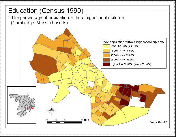
In this last part of today's Lab, you will practice preparing layout views of your map and making them more readable. Add an another shapefile to your project - a shapefile of the Massachusetts municipalities in Middlesex County (which includes Cambridge). This shapefile does *not* contain coordinate reference system information but is, in fact, saved on disk using Mass State Plane (NAD83, meters) Mainland coordinates, just like the other Cambridge shapefiles we have been using. Create a map layout page similar to the one shown below (with a thematic map of your pct_low_ed variable) but with a more readable choice of color ramp, border outline and the like. Also, overlay your Mass Ave buffer with the transparency set to allow seeing the thematic map underneath. Be sure to include the other features (scale bar, north arrow, legend, data sources, classification method, etc. that we have mentioned). Also, see if you can figure out (using QGIS documentation, the 'Layout Manager' and Google searches) how to show on the same map layout the small 'locator' map of Middlesex County with the municipality of Cambridge highlighted. Don't spend too much time adjusting your map and learning various 'layout' features, but do get used to using the QGIS documentation and online searches to help you answer 'how to' questions.
 |
Include in your lab exercise a PDF of your version of your improved layout with better readability and the added Mass Ave buffer.
Today's lab assignment has 6 questions and the one map from Part IV. Please upload your answers to the appropriate Stellar site (as you did for Lab #2). The lab is due Tuesday, March 9, 2021 before class. NOTE: Before logging out from the workstation, be sure that you have copied to your private network locker or a thumb drive any new or changed QGIS documents, shapefiles, coverages, etc. that you have created on a local disk (e.g., C:\temp\... ). If you use Windows Explorer to copy the files to be sure that all the required files that make up a shapefile or have been copied appropriately.
Created by Thomas H. Grayson and Joe
Ferreira.
Modified Sept. 16 2003-17 by Jeeseong Chung,
Jinhua Zhao, Xiongjiu Liao, Mi Diao, Yang Chen, Yi Zhu, Eric
Schultheis, and Hongmou Zhang.
Last modified 1 March 2021 by [jf].
Back to the 11.188
Home Page.
Back to the CRON
Home Page.