Bottom Board

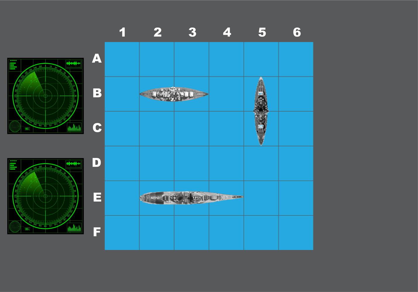
For the bottom board, instead of designing a 3D board we decided to go with a painting or a sticker to go on the floor. Since users will need space to walk around and throw balls, and the dimensions of the rooms are a little small, we decided this would work best. We also didn’t want users to step on and break 3D ships. Finally, we figured this would be more cost effective.
I wanted to make the design have the same structure as that of the board game while looking a bit more realistic. I used gray lines for the grid instead of black to give the users the illusion of being at sea. I also used realistic ships and radars. The grid is meant to have the same dimensions as the grid on the wall that the users have to shoot the balls over. The ball release mechanism will rest on top of the empty gray space to the right of the grid. Although the grid above is not meant to be the same size as the ball detection grid behind the wall (we wanted a bigger surface area for this part for better chances of beating the game), it is meant to give the users an idea of the spacing and structure of the game for better aiming.
