Analysis of the E14 Passenger Elevators
The MIT Media Lab complex is one of the newest and most modern buildings on campus. Completed in 2009, the building is both functionally advanced and architecturally distinguished, making it an ideal home for technological innovation and design at MIT. It features a dual awe-inspiring glass elevator positioned right at the center of the main atrium. Here I analyze this elevator, the ride that passengers get to enjoy, and suggest improvements that can be made to deliver a better user experience.
Exterior
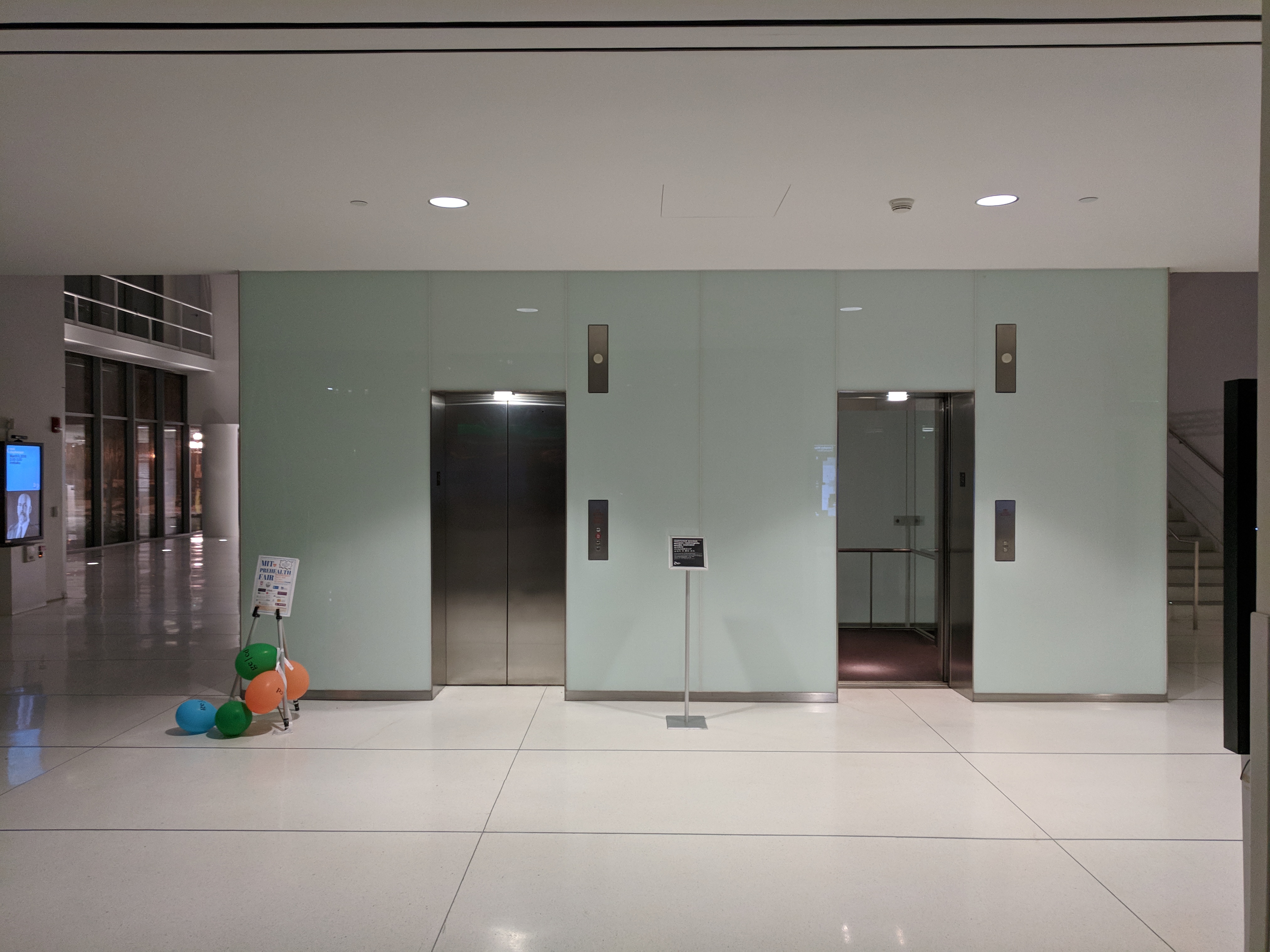
Unlike nearly ever other elevator at MIT, the passenger elevators in E14 are not hidden away and embedded into some wall. Rather they are prominently displayed, right at the center of the airy atrium. Thus, the elevators in this building deliver not only transporation needs and interactive user experience, but also they serve as a key architectural and aesthetic element that is part of the building's DNA. As such, it is not surprising that they are designed to a degree far superior compared to elevators that are meant to be hidden behind walls. From the outside, one can see all components of the elevator, including the wires, cables, safety mechanisms, and all other mechanical parts that are normally completely hidden from view. The entire elevator shaft is exposed - except on the first floor where there is a glass barrier added for obvious safety reasons.
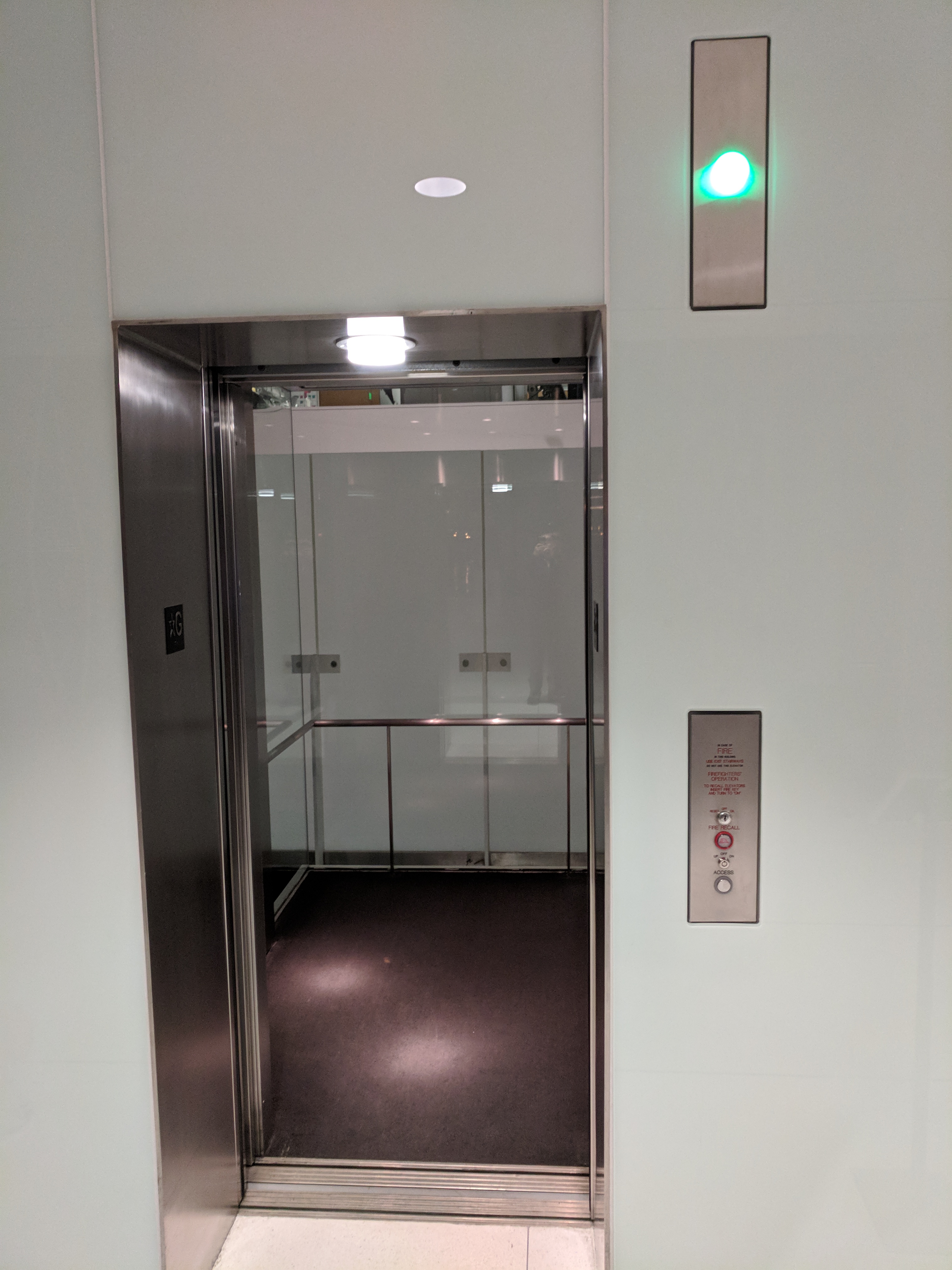
From the front side the elevator looks similar to other dual-elevators. There are two metal doors with smooth metallic finish, surrounded by semit-ranslucent glass. Above the center of each door there is a light for illumination purposes that is always on. At the top right corner of each door there is an indicator light that is off by default. To the right of each door, there is a control panel with one call button. The height of the button is approximately 1 meter high form the ground, making it accessible for a wide range of users. The choice of colors, styles, and the otherwise superficial elements like the illumination lights - make the facade of the elevator feel very welcoming and inviting. Moreover, unless both elevators are in use, one elevator is always waiting at the ground floor and its door is kept open by default.
Shortcomings: There is no information about the current location of the two elevators. The algorithm always returns an elevator at the ground floor and keeps its door open by default, but information about the location of the elevator with the closed door is unknown.
Improvements: Provide information about the current location of each elevator, including whether the elevator is moving or not, and in which direction.
Call Buttons and Elevator Arrival
There is almost never a need to press a button on the ground floor, because the underlying algorithm always keeps an elevator on that floor and the door to that elevator is kept open by default. If the doors to both elevators are closed, that means they are both being used at the same time. Whether you press the button to call the elevator or not has no effect because an elevator would come to the first floor anyways after it is no longer used. The only time when the pressing the button would have an effect is if someone from the different floor is also requesting an elevator at exactly the same time. Then by pressing the call button, you can receive priority over that other person.
Shortcomings: There is no indication anywhere that the default behavior of the elevator is to keep its doors open. So whenever unfamiliar users see that an elevator door is open, they rush toward it because they assume that it would close very soon - based on their previous experience with all other elevators they have encountered in their lives. Furthermore, because people are not used to seeking an elevator door open for an extend time, they often assume that the elevator with the open door is actually not in service, so they simply press the call button and wait while assuming that the other of the two elevators will arrive. When the button is pressed, a red light around it turns on momentarily to acknowledge the pressing, and then the light above the elevator with the open door turns on and this is accompanied by a ding sound.
Improvements: Indicate to users that what they are seeing is not an anomaly, but the norm for that elevator. This could be done via lit arrows indicating to users that they should enter the elevator whose door is already open. Another way to deliver this message is via regular text placed next to the call button.
Control Panel
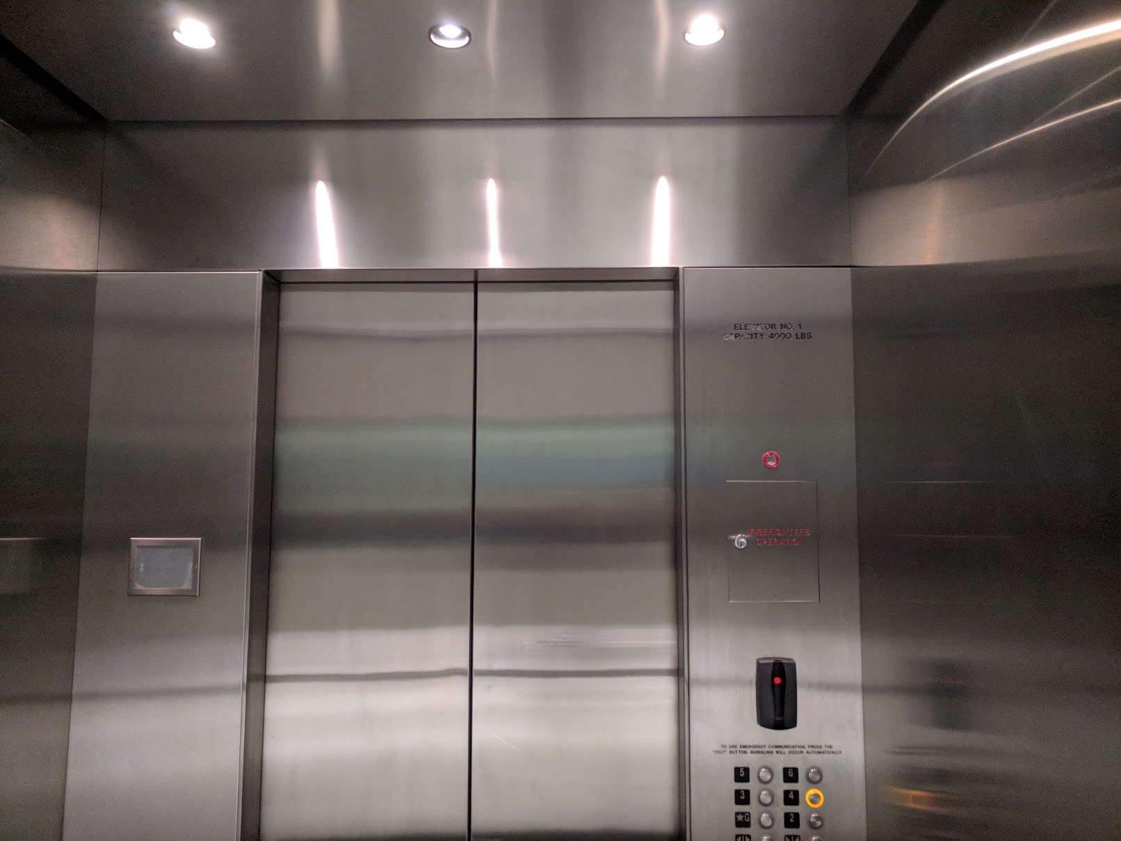
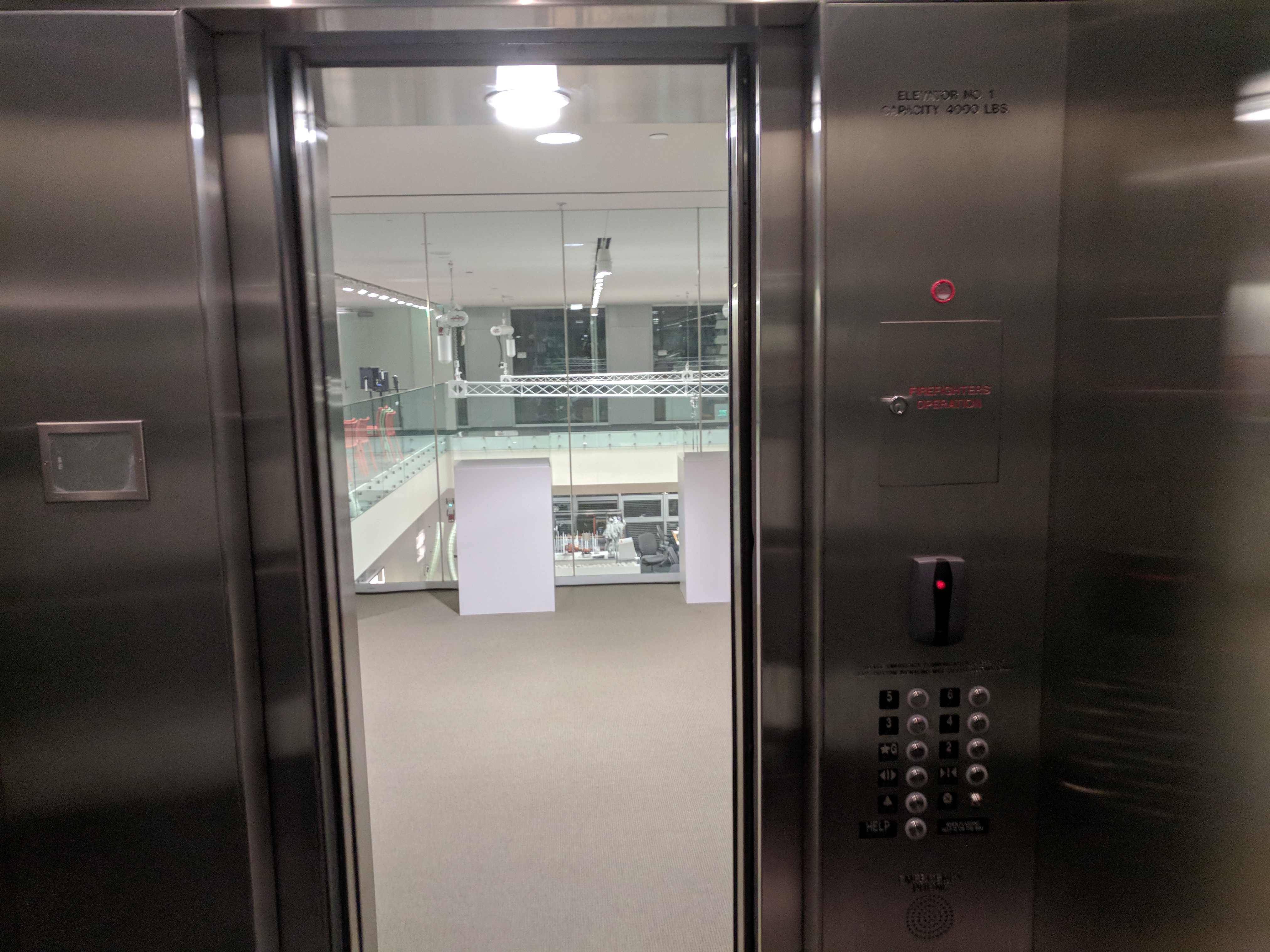
When the passenger enters the elevator, the door still remains open. It closes only after they choose a floor to go to. The passenger presses the button for the floor they wish to go to. An annulus around the button lights up green, acknowledging that the button has been pressed - without any perceptible delay. The buttons require a very light push. Moreover, they are protruding from the panel, thus they can easily be pressed even if a user's hands are occupied with other items. The control panel is positioned very low which makes it easily accessible by a wide range of users, but slightly inconvenient for tall users.
Shortcomings: People habitually expect that once they enter an elevator, the door would immediately close behind them - based on their normal experience with elevators. Once this does not happen, they feel confused and sometimes assume that the elevator is out of order. The buttons are arranged in two columns and there is no separation between floor buttons and emergency buttons.
Improvements: Have a sensor that detects whether a person has entered the elevator and if they are inside it, have a voice that prompts them to choose the floor to go to. The emergency buttons should be slightly separated from the floor buttons - so that even without looking at the button labels one can identify which group of buttons is for the floors.
Elevator Ride
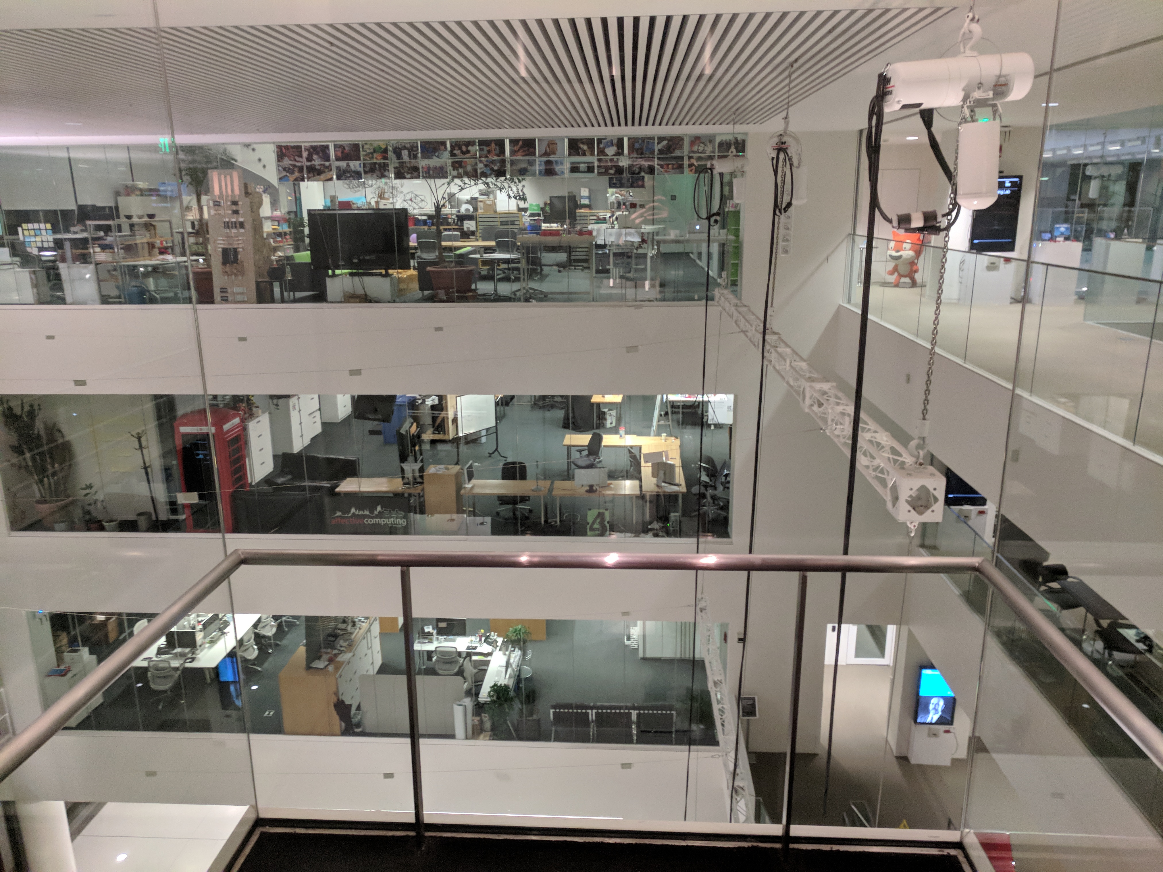
The door closes accompanied by a long audio tune. A moment later, the elevator starts moving upward. There is no indication anywhere on the control panel or elsewhere that shows what floor the elevator is at. However, this is a feature rather than a but, because if they were to be paying attention to some digital display, they would miss the beautiful view right behind them. Thus, users almost always ride the elevator with their back toward the door, while enjoying the view through the clear glass windows. Because the elevator offers 270 degree viewing experience, users always know not only on which floor they are but also can estimate exactly how long it would take them to reach the floor they have chosen to go to assuming no unforeseen stops occur. Because the view is dynamically changing from the user's perspective during the ride, the passenger does not feel boredom as they would in a conventional isolated elevator. They also don't feel claustrophobic because they can see everything around them, and more importantly everyone else around the building can see them - which affords a sense of security in case an elevator suddenly stops and traps the passenger. Similarly, the glass walls also provide a sense of security in case of a blackout due to power outage.
Shortcomings: The elevator ride is so enjoyable that it feels very short, especially for first time visitors to the Media Lab.
Improvements: Have the ability to control the duration of the ride and make it more prolonged.
Elevator Exit
Depending on the number of stops on different floors and the number of people entering and exiting, the ride from the first to the fourth floor could take anywhere form 20 seconds to over 1 minutes. Once the elevator arrives on the 4th floor, a sound effect is produced, and the door opens. The door remains open for approximately 10 seconds, after which it closes if no one has passed through it. There is a sensor that detects if someone is passing through the door. When the sensor in engaged, the door remains open, and it stays open for about 5 seconds after the sensor has been disengaged.
Shortcomings: Sometimes, one may exit at the wrong floor if they are not paying attention to the view.
Improvements: A voice stating the floor number may solve this problem.
Additional Observations and Recommendations
-
One every other floor of the building, one must press the button to request an elevator. No information is provided to that user about how long it would take for an elevator to arrive of where is an elevator located. Having a display on the facade of each floor showing elevator location and direction of motion would be helpful.
-
The prominence of these elevators and the pleasant user experience they deliver makes them the default choice for users to take. Thus, they encourage less usage of stairs. The elevators can have a persuasive design element added to them that subliminally reminds users to take stairs next time.
-
Although the elevator door is open by default on the first floor, for the case of every other floor it is closed by default. Have the elevator doors be open on any floor where the elevator happens to be located.
-
For the case of floors other than the ground floor, the wait times for an elevator to arrive can be significantly reduced if the call buttons are not located right next to the elevator, but rather as far from it as possible. Then, as users are approaching the elevator, they can press the call button. By the time they actually reach the elevator, an elevator would already be on its way resulting in shorter waiting time in front of the elevator's door.
-
Collect data about the traffic flow patterns and then train a neural net on that data to predict where the most appropriate location of the elevator should be during each time of the day to minimize wait times.
-
Suppose you are going to from floor 1 to floor 4, and you are the only person in the elevator. Upon entering the elevator, however you notice that the person before you has pressed buttons "2" and "3". Now your journey to the 4th floor just became far more frustrating because you are forced to stop on floors 2 and 3 for no good reason. There needs to be an option to disable buttons that have been pressed but are serving no useful purpose. This could be implemented by simply updating the firmware, so that when an active button is pressed a second time it deactivates, and the elevator does not stop on that floor.

