Analysis of the E15 Passenger Elevators
Building E15 at MIT was built when the Media Lab was first founded, approximately 32 years ago. We can therefore assume that the elevators in that building are also at that age. And based on the looks and feel of the elevator - both from inside and out - this guess feels reasonable. While the elevator is definitely not a modern-day elevator, it also is not an ancient one either. We begin this analysis by looking a the elevator's exterior and context, and then examine in detail every aspect of the typical elevator ride journey.
Exterior
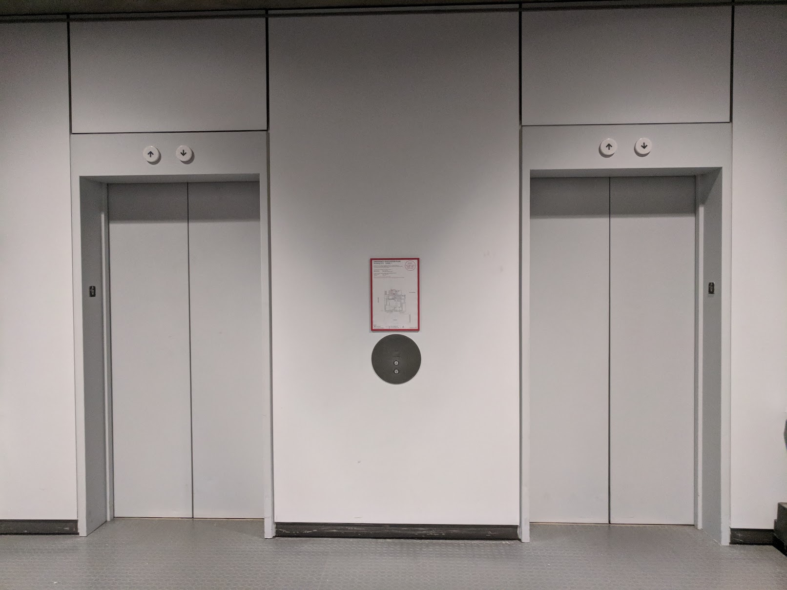
The image shows the exterior view from the first floor. It is a dual-elevator that is embedded into the wall of the building, as is typically the case for most elevators. As a passenger approaches the elevator, they are presented with 2 closed doors and a control panel between them with two buttons. Above each door is an upward pointing and a downward pointing arrow, and both of them are off.
Shortcomings: No information is provided about the current location of either elevator. The doors are nearly identical in color with the surrounding wall which makes the façade appear uninviting and plain.
Improvements: Provide information about the current location of each elevator, including whether the elevator is moving or not, and in which direction. Make the color of the elevator doors more appealing and inviting.
Call Buttons
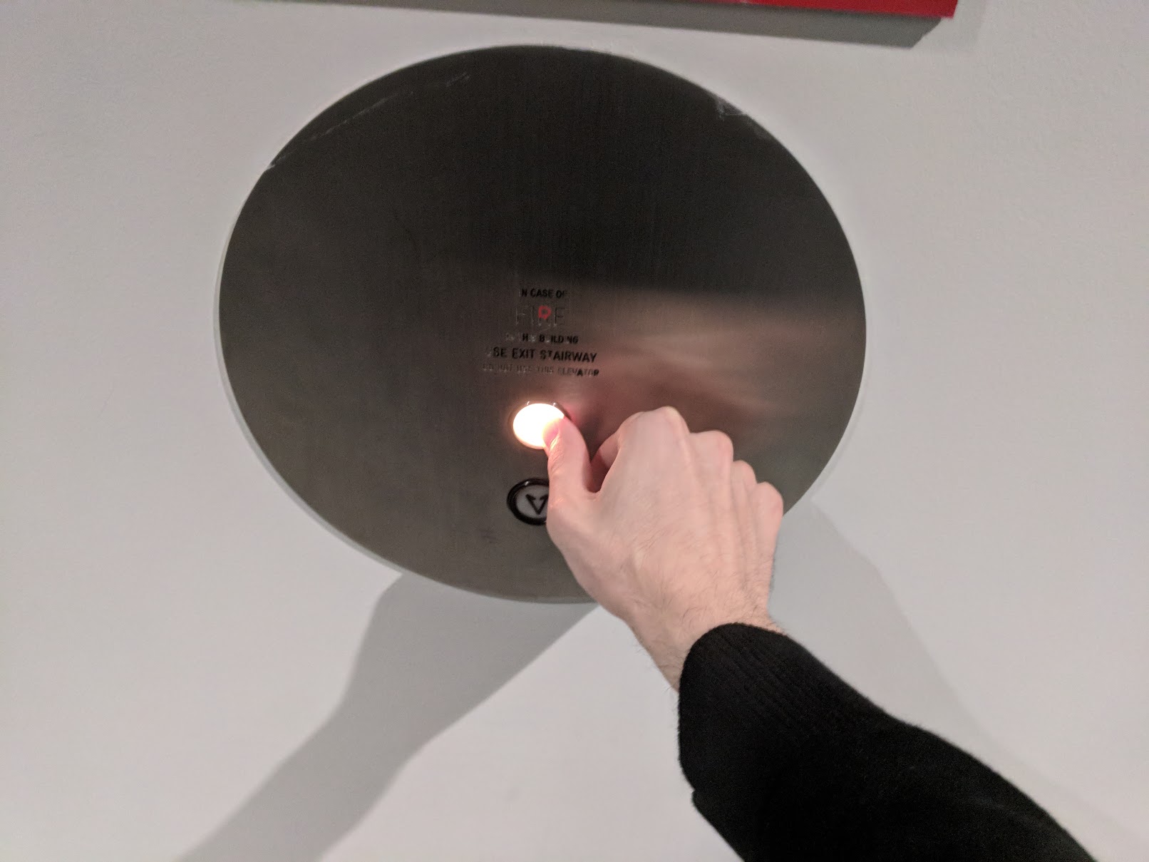
The control panel between the elevators consists of 2 buttons. The “up” button would be pressed if the passenger wishes to go to a higher floor, and the “down” button if they wish to go to a lower floor. After the button is pressed, it stays lit until an elevator arrives. This light serves as an indicator to the user that the call has been acknowledged and an elevator is on its way. The vertical position of the buttons is well designed, allowing for highly diverse range of users to access them - from children to elderly and disabled.
Shortcomings: Information about the meanings of the buttons is not provided. For instance, when I was younger, I thought that the down button needed to be pressed if you expected the elevator to be coming from a floor below the current floor. Moreover, there was no way to validate or disprove this hypothesis by observation because even if I pressed the "down" button when I wanted to go up, an elevator would still arrive. Every once in a while I see people doing exactly the same wrong that I used to do when younger, without them knowing that they are pressing the wrong button. Until an elevator arrives, the user has no idea which of the two elevators is coming, and how long it will take for the elevator to arrive.
Improvements: Have clear labels next to the two buttons indicating which button should be pressed when: “Press to Go Up” and “Press to Go Down”. Provide clear feedback so that passengers don’t formulate false hypotheses about the behaviors of those buttons. If a person presses the "down" button, but then after they enter the elevator press a floor number above the current floor – have an audio or visual feedback indicating to the passenger that their down-call is inconsistent with their wish to go up. Provide information about which elevator should the user expect to arrive, and when will that elevator arrive.
Waiting for Elevator Arrival
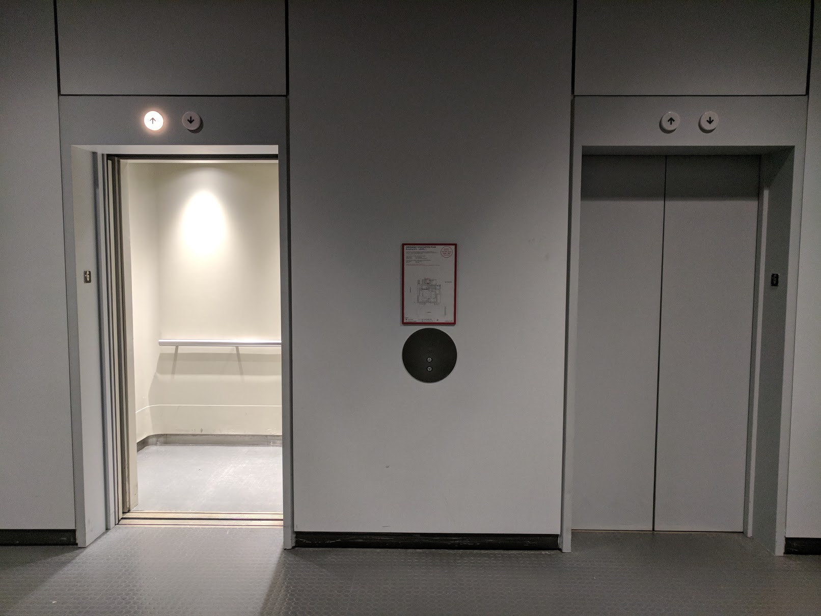
After pressing the button, the user now waits for the elevator to arrive. Which of the two elevators would arrive is determined by a closed-source algorithm, so either the left or the right elevator could arrive. Eventually, and elevator arrives and the door opens for the passenger to enter. At the time of arrival, the upward arrow above the door lights up and a dinging sound is heard. If the user does not enter the elevator within approximately 10 seconds, the door will close.
Shortcomings: The user has no idea which of the two elevators is coming, until one of the elevators actually arrives. Moreover, there is no indication about how far an elevator is or how long it would take before it arrives. Sometimes, the wait time could be as long a 30 seconds, in which case users become frustrated because they don't know whether an elevator is even on its way or not.
Improvements: Provide information about the current location of each elevator and which elevator is coming, so that the user is not kept in complete mystery.
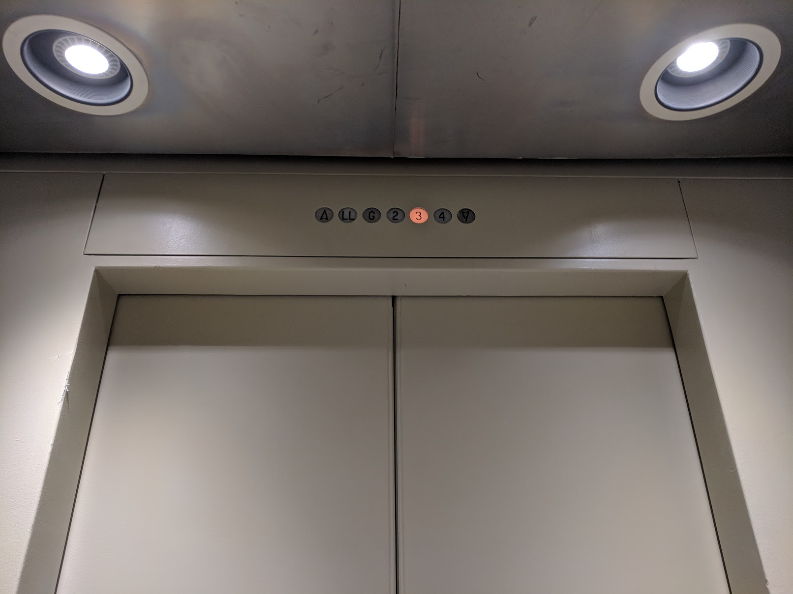
Control Panel
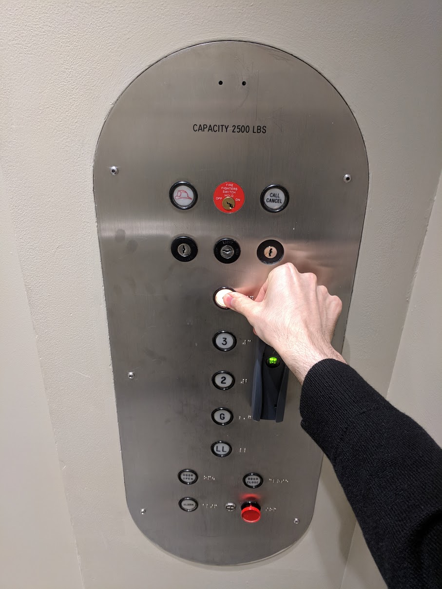
Once the passenger is inside, the door closes behind them after a few seconds. On the right-hand side, there is a control panel. The passenger presses the button for the floor they wish to go to. The button lights up and stays lit to convey via visual feedback that the press has been acknowledged. The floor buttons are vertically arranged, matching the arrangement of floors in the building. The buttons are circular and large, and they are positioned fairly low - allowing for a wide range of users to easily access them.
Shortcomings: The buttons need to be pressed very hard before. Each button is located inside the panel, requiring for a user to insert their finger into the hole. A button cannot be pressed with some other object that is larger than the button diameter. It takes about 300ms for the LED behind the button to lit up after a button is pressed. One sees users pressing and holding the button pressed until the LED turns on. It is no necessary for it to be held because the light will appear even if released immediately after it has been pressed, but because the feedback is delayed people have no way of knowing whether their press has been registered right away.
Improvements: Make the buttons protrude slightly from the pane, so that they can be pressed with knuckles or with another object that a user may be holding in their hand and when their hands are not free. Make the buttons require a lighter pressing. A few of the buttons have been cracked because of people pressing them really really hard. Make the feedback delay shorter, and also provide another form of feedback, such as auditory or haptic to acknowledge that the button press event has been registered.
Elevator Ride
The elevator starts moving upward. A row of lights above the door indicates which floor the elevator is currently at. There is also a chiming auditory signal when a new floor is reached. Nothing else is happening during the duration of the ride.
Shortcomings: The elevator ride is an abysmally boring experience. Whenever riding the elevator with people, they always take out their phone and fiddle with it. The elevator itself offers nothing for one to engage their mind with - nothing. The elevator can make one feel as if they are in a sensory deprivation chamber. The user has no control over what is happening in their surroundings. The user can't even turn off or dim the light in the elevator; they are completely at the mercy of the elevator during the ride. Moreover, they don't know anything about what is happening outside of the elevator, don't have any direct sense of floor position, and they completely must surrender to the elevator.
Improvements: Make the elevator ride journey more pleasant by introducing dynamic elements to the ride or by providing anything that the user can engage with. Some examples include adding a mirror inside the elevator, adding a clock that also provides weather information, or adding a display showing stock prices are some very inexpensive-to-implement examples. Adding the ability for users to control the light intensity in the elevator would also help alleviate the claustrophobic feeling, by giving users at least some control over what is happening in their environment. Another approach to this problem is to add some interactive element into the elevator - it could be as simple as adding two guitar strings that users can play with and produce some audio with during the ride. Or it could be as complicated as adding a fully-featured gestural interface. The gist of this paragraph is that there needs to be something that would allow users to occupy their minds with during the ride
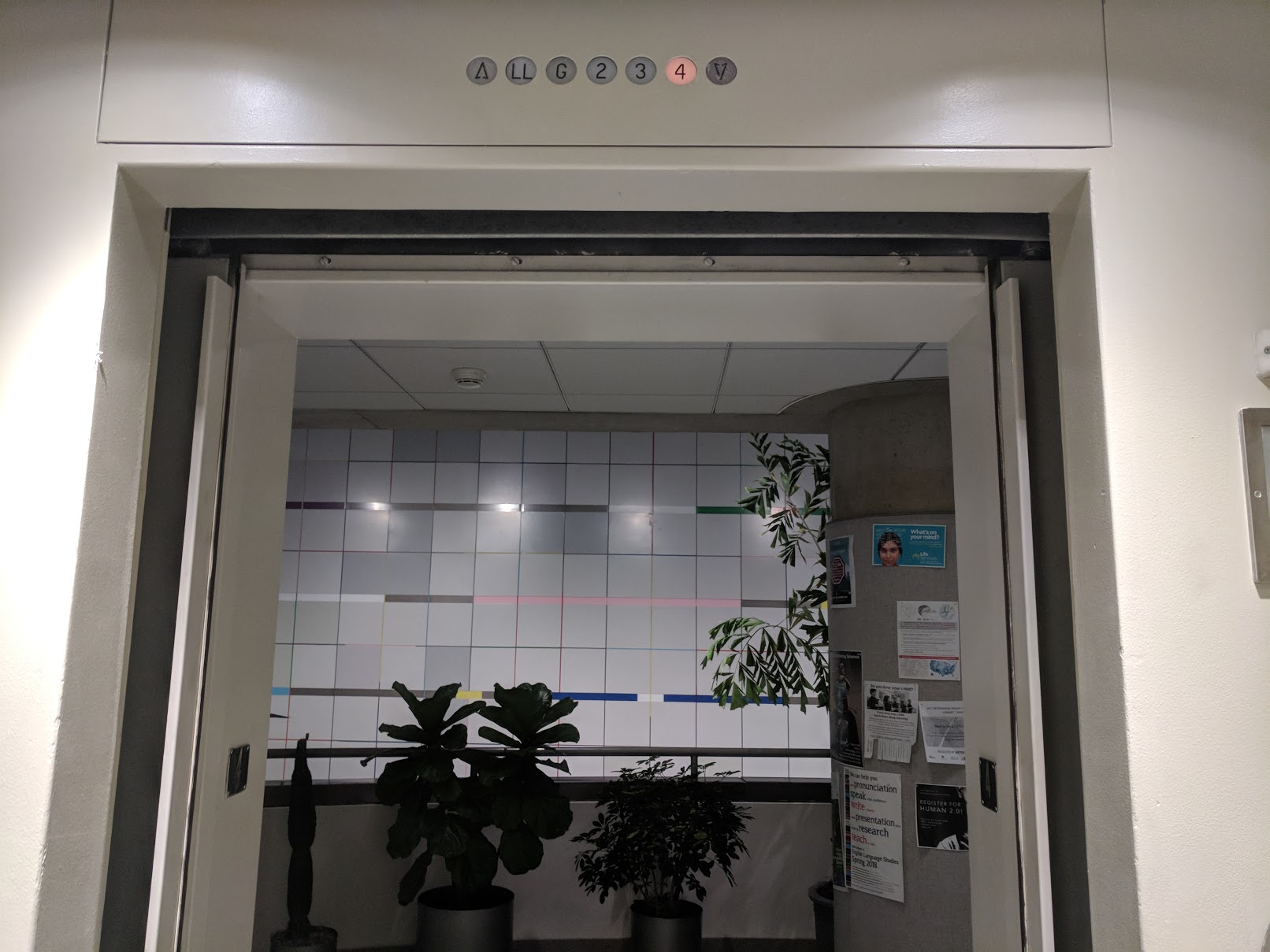
Elevator Exit
Depending on the number of stops on different floors and the number of people entering and exiting, the ride from the first to the fourth floor could take anywhere form 40 seconds to over 3 minutes in the worst case. Once the elevator arrives on the 4th floor, the number "4" above the door becomes lit, a chiming sound is produced, and the door opens. The door remains open for approximately 10 seconds, after which it closes if no one has passed through it. There is a sensor that detects if someone is passing through the door. When the sensor in engaged, the door remains open, and it stays open for about 5 seconds after the sensor has been disengaged.
Shortcomings: If one does not look up at the number above the door they would not know which floor they are at when the door opens, because all floors look the same. Often times people exit at the wrong floor only to realize that after they step out of the elevator.
Improvements: Provide an additional indicator, such as audio-based, that explicitly tells which floor the elevator is at.
Additional Observations and Recommendations
-
The wait times for an elevator to arrive can be significantly reduced if the call buttons are not located right next to the elevator, but rather as far from it as possible. Then, as users are approaching the elevator, they can press the call button. By the time they actually reach the elevator, an elevator would already be on its way resulting in shorter waiting time in front of the elevator's door.
-
Currently, even if an elevator is already at the same floor where I am, I still need to press the call button just for the door to open. Why not have the door be open by default at the floor where the elevator currently is located.
-
Collect data about the traffic flow patterns and then train a neural net on that data to predict where the most appropriate location of the elevator should be during each time of the day to minimize wait times.
-
Suppose you are going to from floor 1 to floor 4, and you are the only person in the elevator. Upon entering the elevator, however you notice that the person before you has pressed buttons "2" and "3". Now your journey to the 4th floor just became far more frustrating because you are forced to stop on floors 2 and 3 for no good reason. There needs to be an option to disable buttons that have been pressed but are serving no useful purpose. This could be implemented by simply updating the firmware, so that when an active button is pressed a second time it deactivates, and the elevator does not stop on that floor.
-
On the fourth floor of the building, the light behind the elevator call button has burned. As a consequence of which, after pressing the button users receive no feedback acknowledging that their press has been registered and that the elevator is coming. Thus, users keep pressing the button multiple times, just to make sure that they have pressed it. This applies even to users who are taking that elevator every day and who know that the light has been burned out for months. Even these users keep pressing the button at least 2 times. Feedback to acknowledge button press is essential. The more modalities for feedback the more apparent it would be to the user that the action that they have taken matters. Then even if one of the modalities stop working the other would still provide sufficient information to not cause frustration. Other forms of feedback besides light could include auditory feedback upon button press, and haptic feedback such as button vibration.