 About
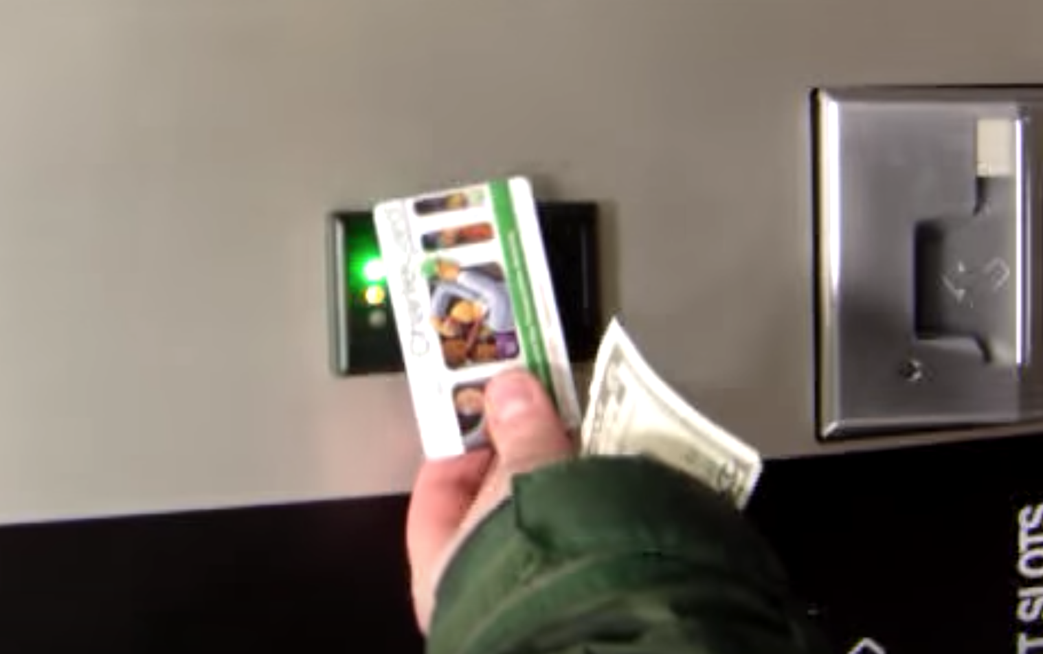
Payment
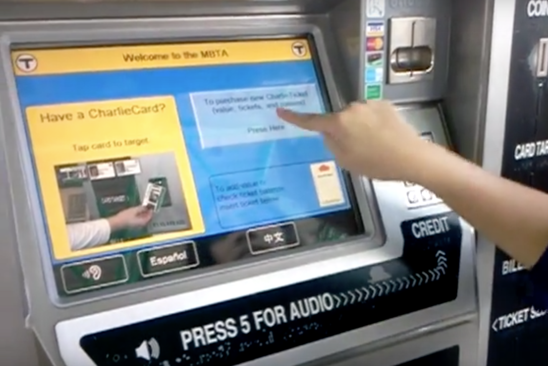
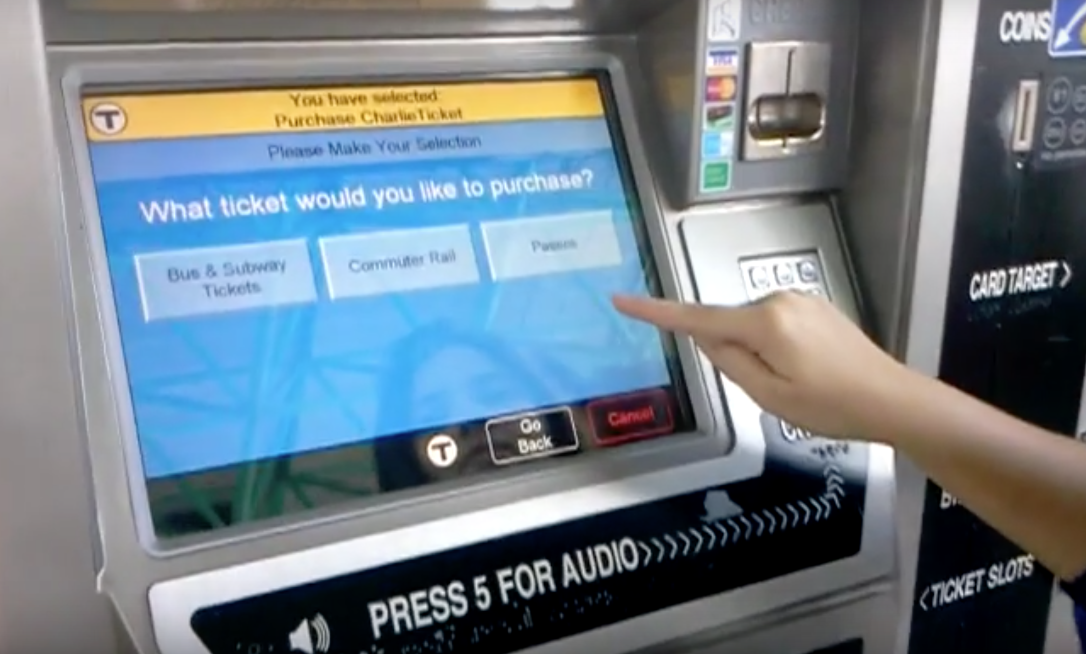
Screen Navigation
References
About
Payment
Screen Navigation
References
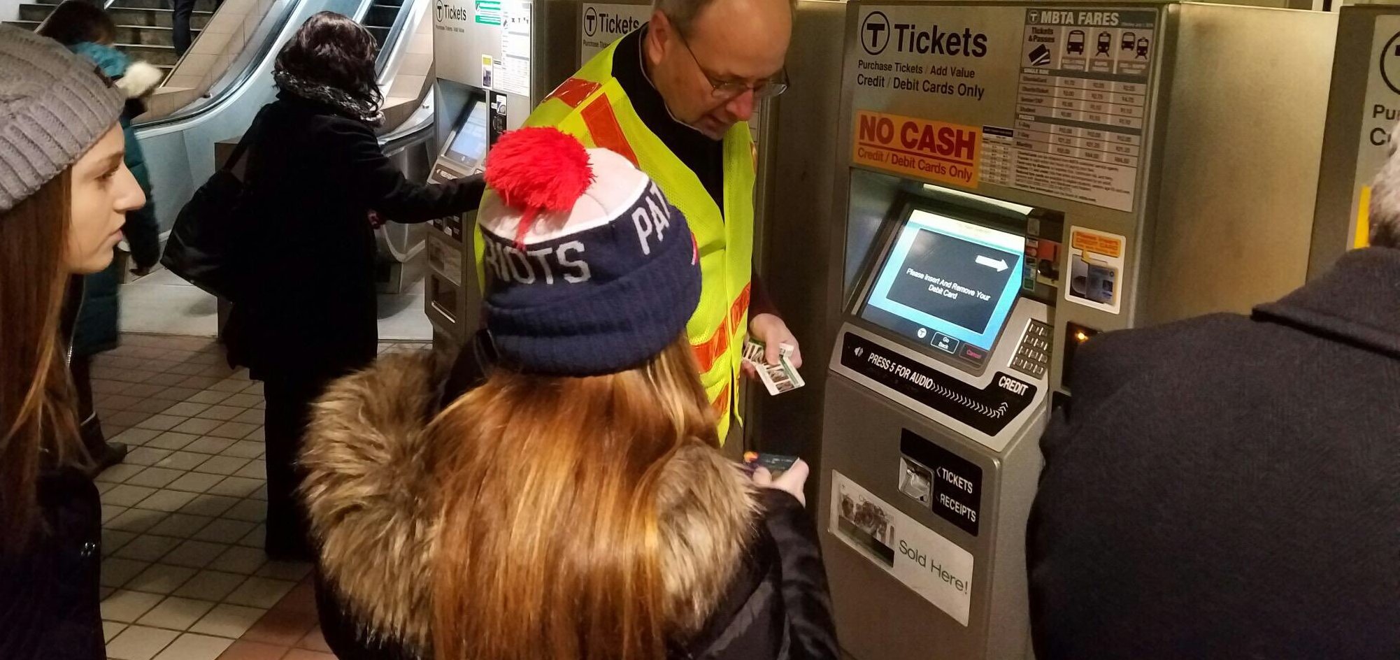
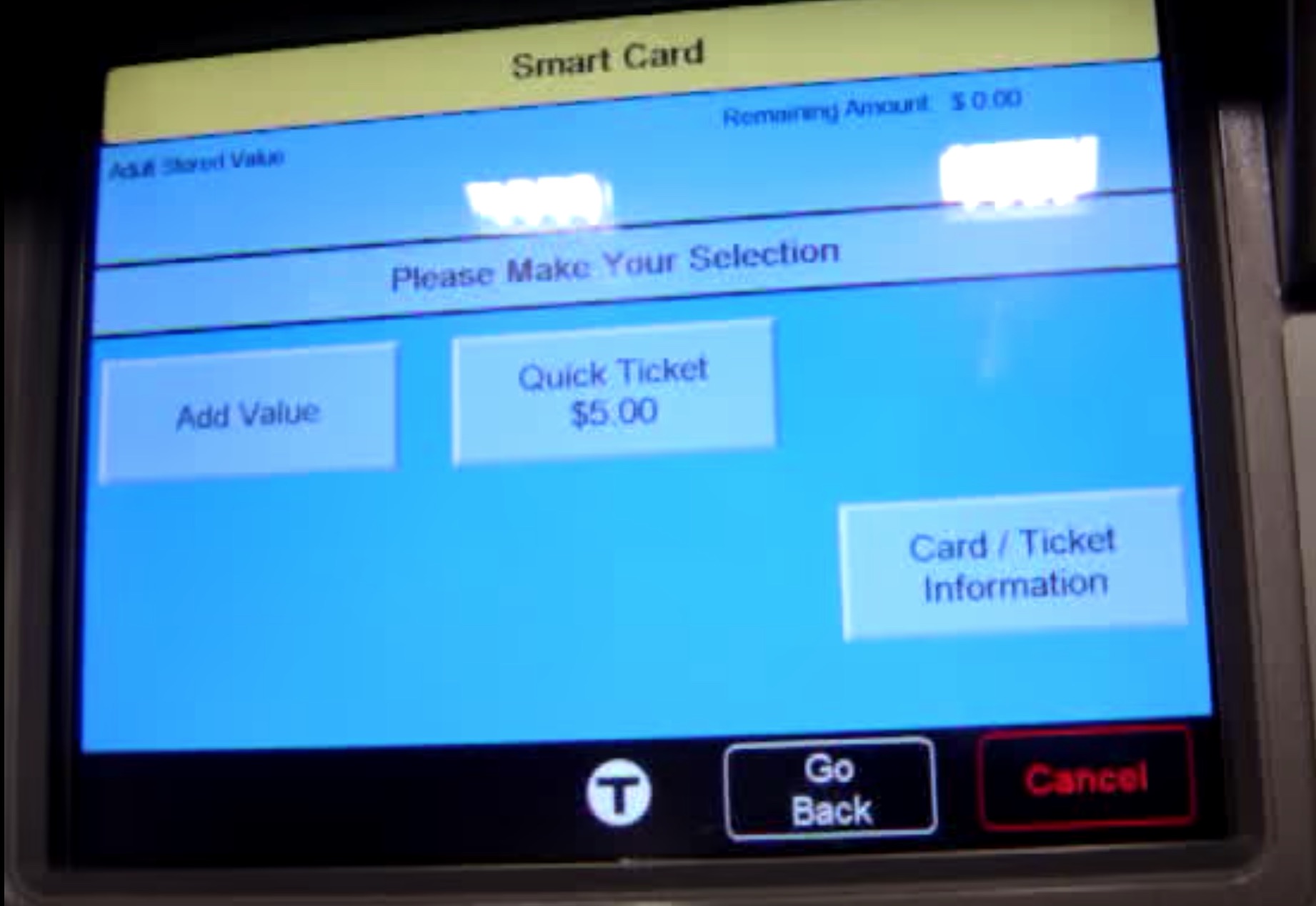
Passengers who use the MBTA fare vending machine have to not only navigate a physical interface but also a digital touchscreen. While the interface is relatively simple with arrows that point to the different physical areas on the face of the machine, it also relies heavily on words on buttons. While this may be good enough for most users, anyone who does not read English or one of the other two languages offered (Spanish and Chinese) will find the screen navigation impossible.
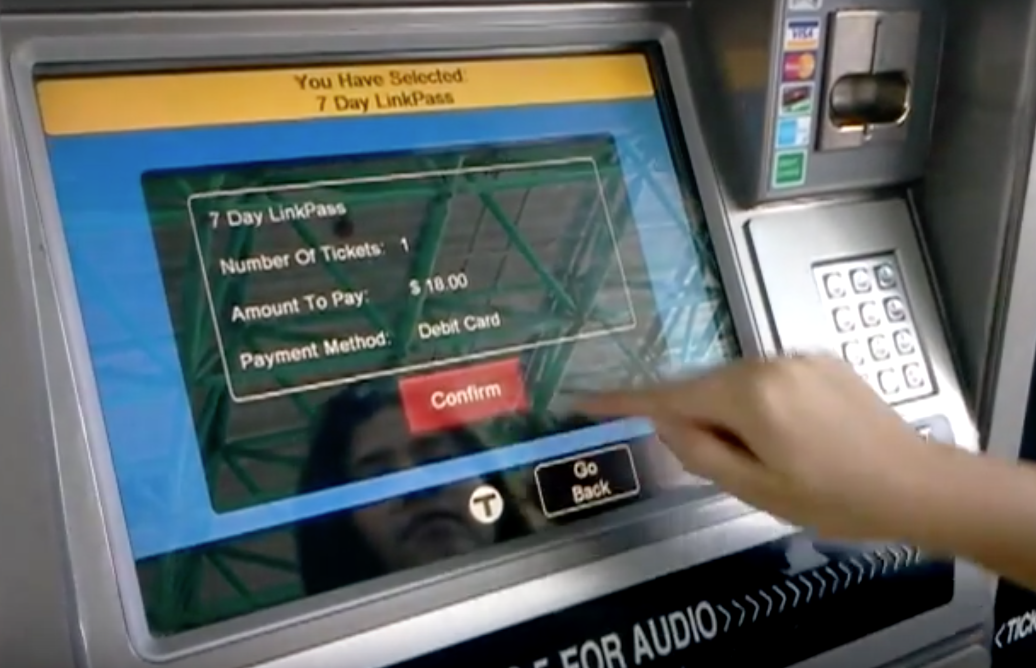
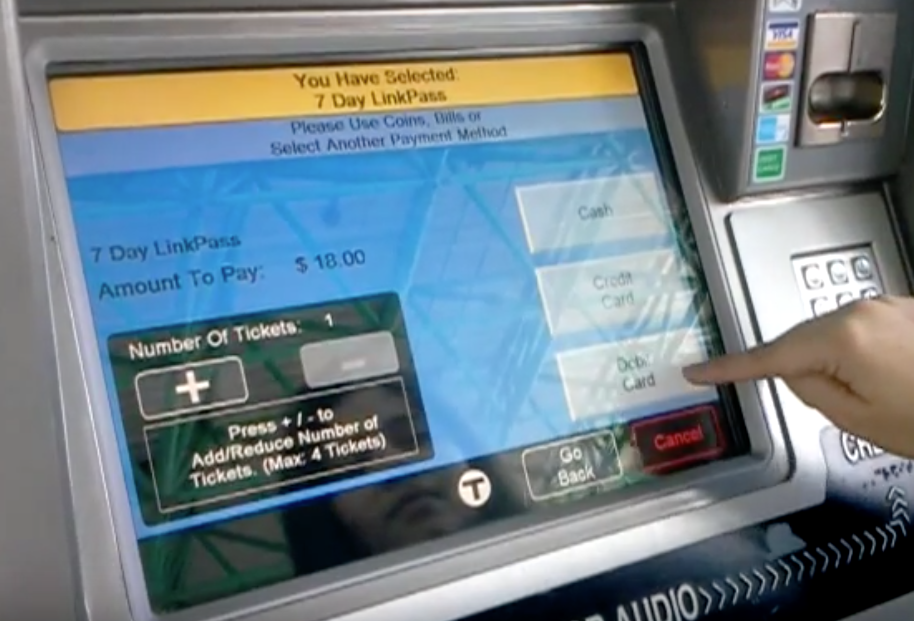
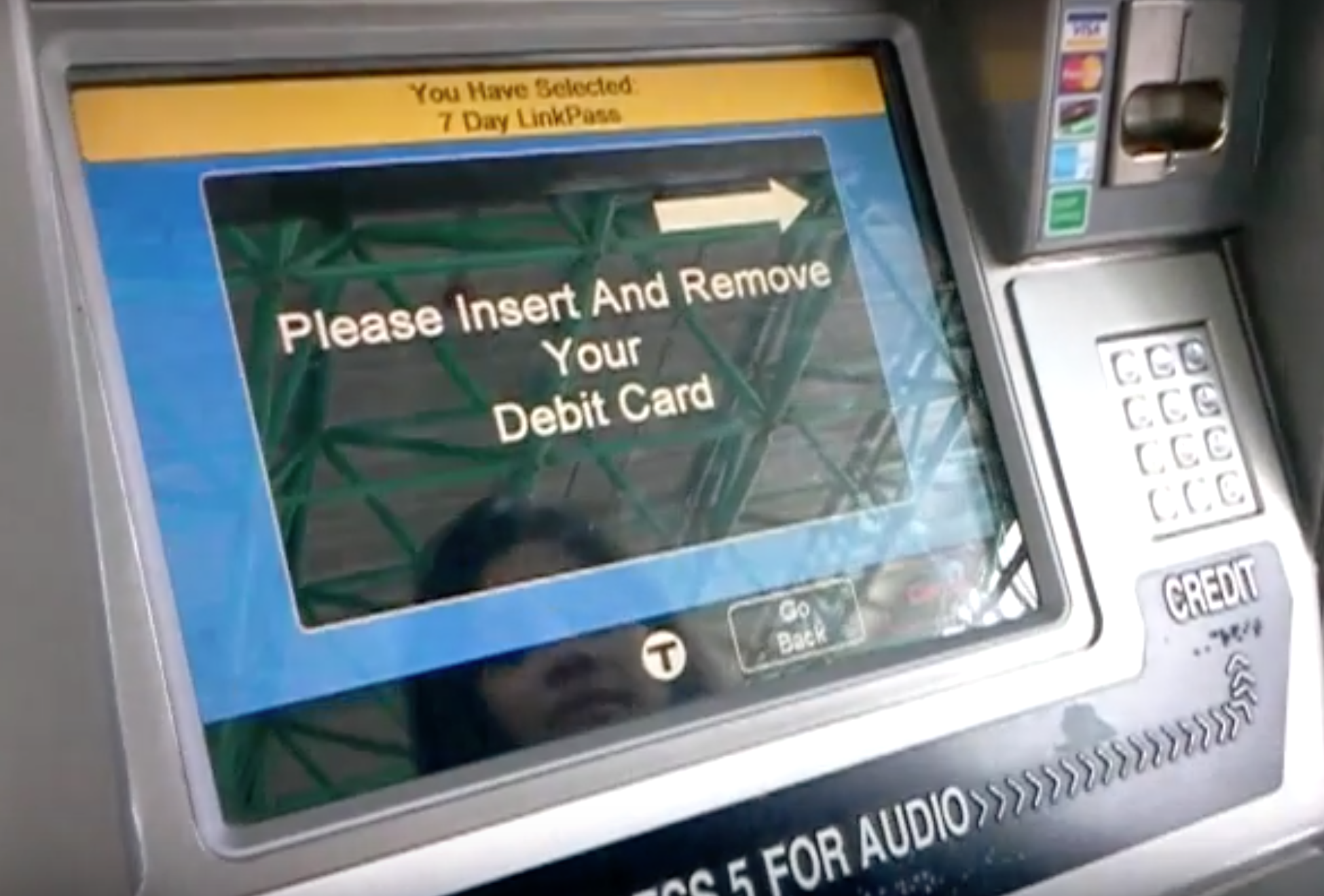
In addition, there are so many variations of fares that can be purchased, that it takes up to seven separate screens to get to actually receiving a paid ticket. Handily, each screen has a "Go Back" button in case of user error. However, the majority of users who might only want to top up their card may end up spending more time than necessary tapping through all the buttons and screens.
The current navigation flow is long and non-intuitive.
I propose discovering the most commonly used function for the vending machine and creating "shortcuts" on the first page. While the fare vending machine must be able serve the needs of the user who wants an uncommon fare, a large majority of users must need only a small set of outcomes. By surfacing these options higher in the process flow, the machine can be much more efficient and easier to use.
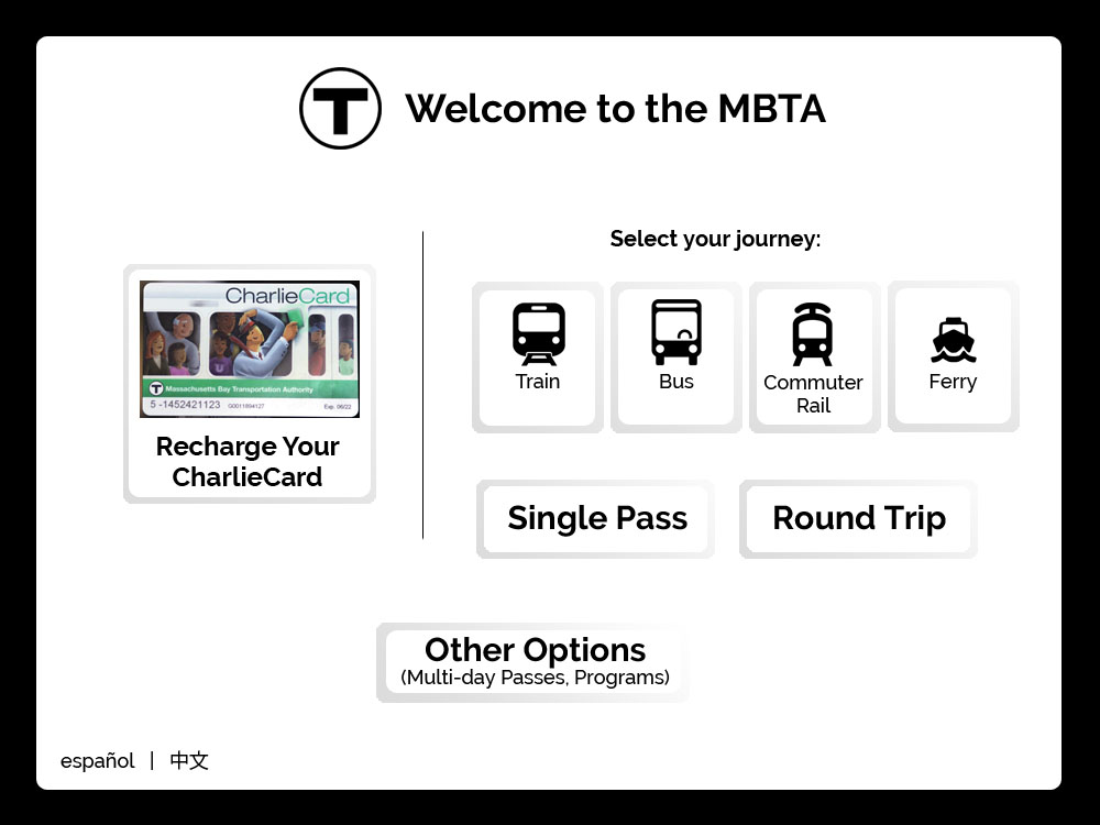
In addition, the user interface could be improved by adding icons or more images to illustrate exactly what the user is buying. Especially for those who are visually impaired or have difficulty reading English, images communicate different options much more effectively than a button with text on it.