 About
Payment
Screen Navigation
References
About
Payment
Screen Navigation
References
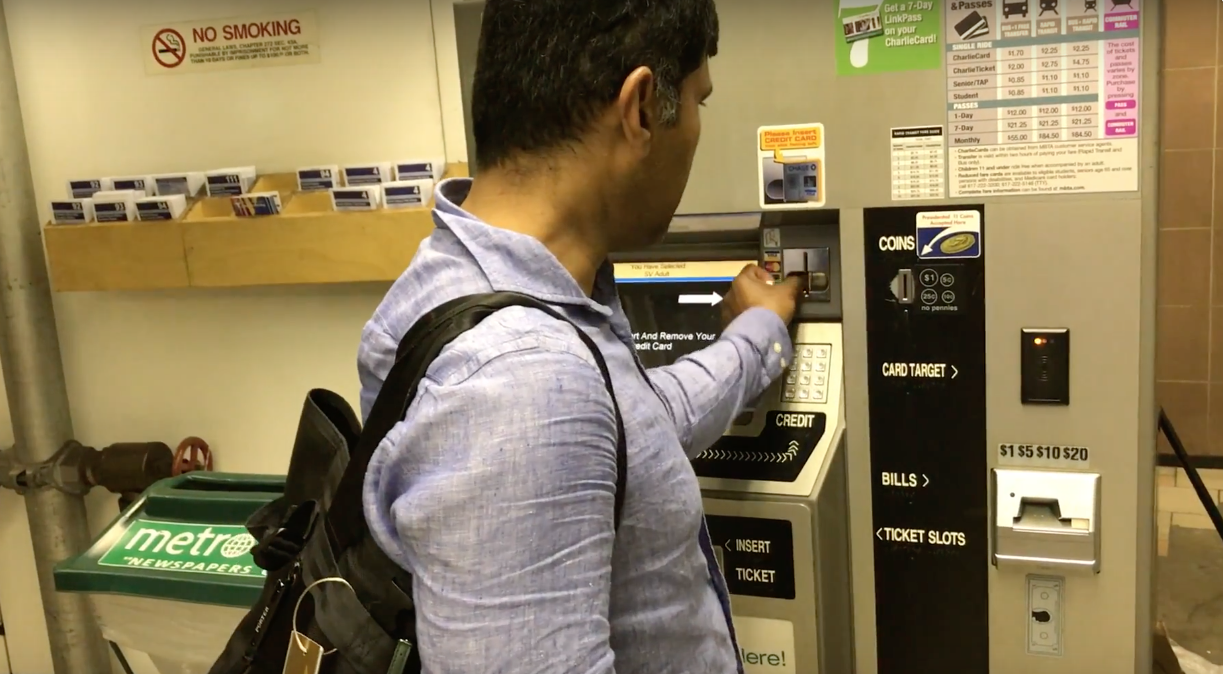
Currently, it takes users up to seven separate screens to get to payment. Once the user is ready to pay, he or she can select "Cash", "Credit Card", or "Debit Card". When selecting "Credit Card" or "Debit Card", a helpful thick white arrow on the black screen points to the credit card slot.
However, I noticed that some users would start attempting to insert their CharlieTicket or CharlieCard into the credit card slot. Or, if they did not wait long enough for the arrow to show up, they would attempt to insert their credit card into the slot for the ticket. Foreign users might easily confuse the card reader as a tap payment system.
Even more difficult to figure out was the cash payment method. I observed users attempting to insert bills into the ticket and receipt slots. If the user was not careful in following instructions on the screen, he or she might have difficulty identifying the correct slot for payment.
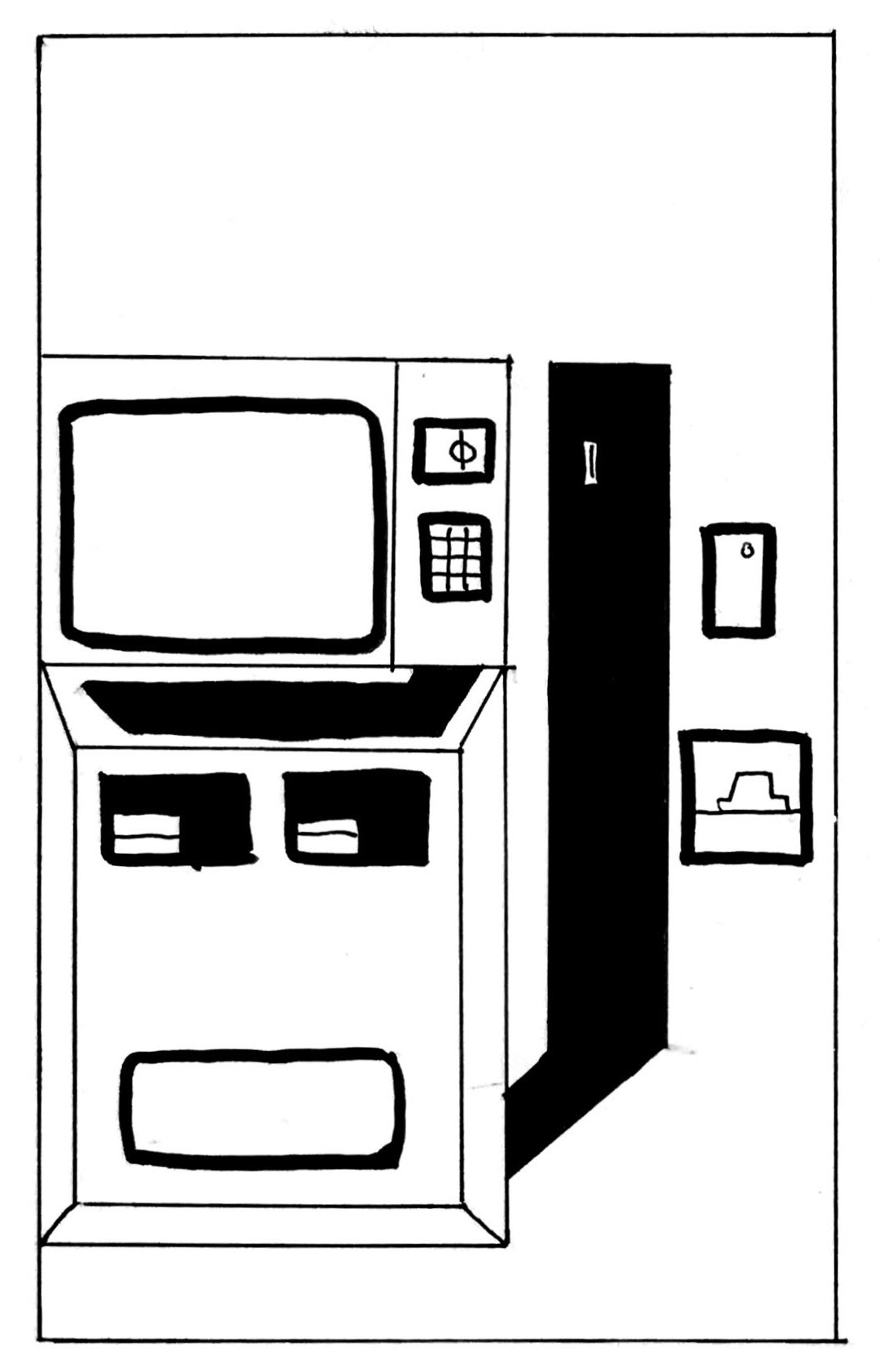
In the current fare machine interface, all physical interaction points are placed in unexpected places. The credit card reader and keypad are next to the screen, but the bill insertion slot is in the lower right side. The coin slot is up high in the black bar running down. The receipt exit slot is next to the ticket insert slot. When I removed all text from the front of the machine, it is nearly impossible to understand which part is for what purpose.
The interface also fails to utilize symbols or visual cues. The only text is in English and some Braille, and the black bars and rectangles on the face of the machine seem to have no logic to them.
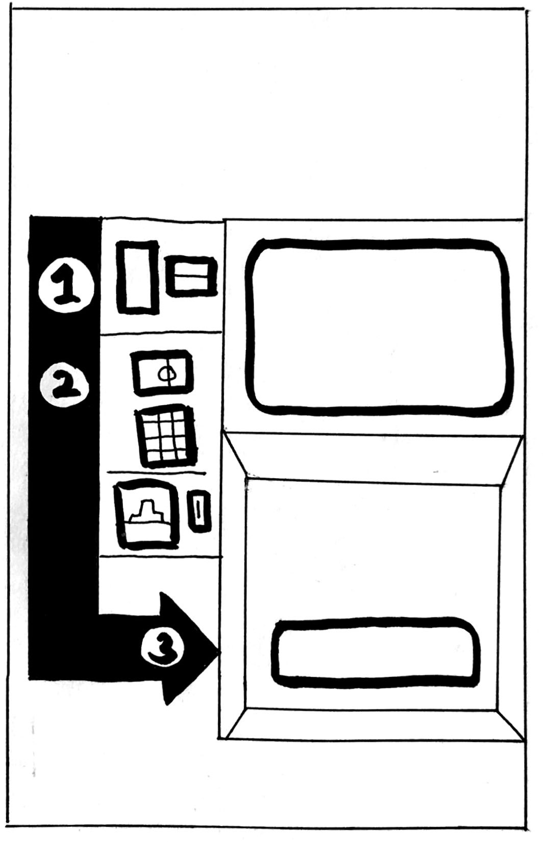
In my proposed solution to this payment interface problem, I identified two main changes: the groupings of interaction points and the visual cues for process flow. Even without text, the user should be able to understand what parts of the machine each next step involves.
I grouped the interaction points into three steps:
I then shifted each of these sections into a logical flow. Most people in the U.S. read from top to bottom, left to right, so I organized the steps in that order. Also, instead of haphazard black bars, one thick black arrow leads down from checking your existing card to payment to pick up. Each section is labeled with a number which can then correspond to symbols or indicators on the touchscreen.
By organizing each interaction point into coherent groupings and then ordering them in a logical way, users can expend less mental effort to understand each step in the process of getting and paying for a fare, and thus getting to their final destination more quickly and efficiently.