Atlas Time Entry Human-Use Analysis
by Elizabeth

Surveying Other Users
I sent out a voluntary survey to a list of undergrads and got over 25 responses. Their responses and experiences were similar to mine, and I have analyzed their feedback below.
Who uses it and how?
The majority of students who responded (61.9%) use Atlas to log their hours as an undergraduate researcher, though other common positions include grader (23.8%) and lab assistant (28.6%). On average, students who responded had used Atlas to log two different types of jobs over their time so far at MIT. Some of these students might log hours for two or three jobs each week, while other students might have held one type of hourly job freshman year and a different type of job sophomore year.
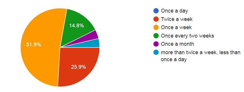
I also asked students how often they use Atlas Time Entry. A majority of students (51.9%) said they use Atlas once a week. The next most significant group said they use Altas twice a week (25.9%). This makes sense as most student hourly jobs occur each week and hours on Altas are approved once a week.
What is the experience like?
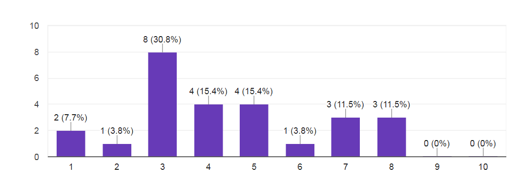
I then asked students "How would you rate Atlas Time Entry?", and gave them a linear scale between 1 = "It is the most annoying website I have to interact with" and 10 = "It is my ideal user experience in a website." The mean rating was 4.42, while the mode rating was 3.
Asking students "What is the experience like?" received responses that mostly reflected their rating of the system as they ranged from being satisfied with the software to finding it frustrating and stressful.
On the more positive end users described it as: "It's mostly pretty straightforward" "It's relatively smooth and predictable."
On the negative end users described it as: "It is frustrating and time-consuming and inefficient" "frustrating; often crashes; sometimes locks me out. very stressful to have so much money on the line on such a broken system"
What does or does not work?
Like many website - based user experiences this site falls into a category of if you know how to use it, it works fine. But if you don't know which buttons to click to do what you want you might end up locking yourself out or having to re-enter hours. This learning curve is well described in one student's response:
"It was very confusing the first time I was faced with putting in my hours, which were many weeks' worth, because I kept failing to save them and struggled with navigating the weeks. There was no explanation available. After the first time, it was pretty easy to use, since I knew how it worked now, despite its terrrible interface."
The most positive response I received to this question was: "I'm glad that the automated system does tell me when I'm paid, and that I'm allowed to retroactively add in hours (or roll over hours in order to not go overtime)." However other users noted the opposite, saying they couldn't retroactively add in hours if one of their jobs had been approved for the week already.
From my survey, there were a few issues that were reported multiple times:
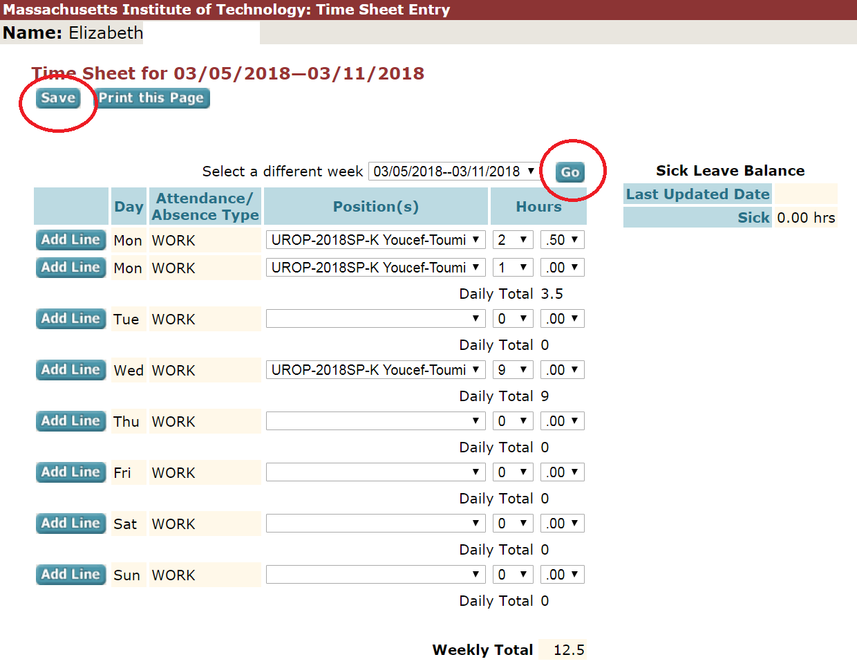
1. Pressing "Go" does not save the hours which were just inputted. Often users will input hours for one week, and then want to input hours for another week to. To do this they must enter their hours, click "save" and then select the new week and press "go". If they simply press "go" the hours they just typed in will not be saved.
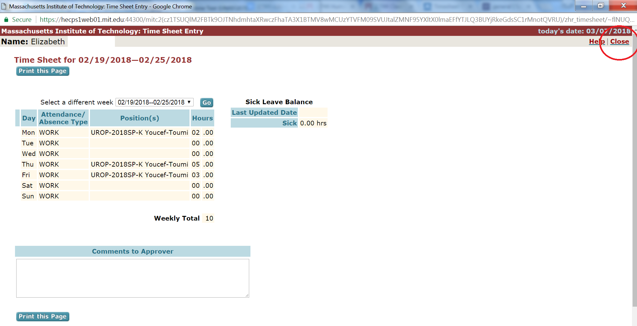
2. If you close the window to enter hours by using the X in the upper right hand corner rather than the "close" button you will be unable to enter hours for the next hour. Instead users who try to open the page again after they incorrectly used the "X" are confronted with a page stating that their personnel number is locked, with no further explanation.
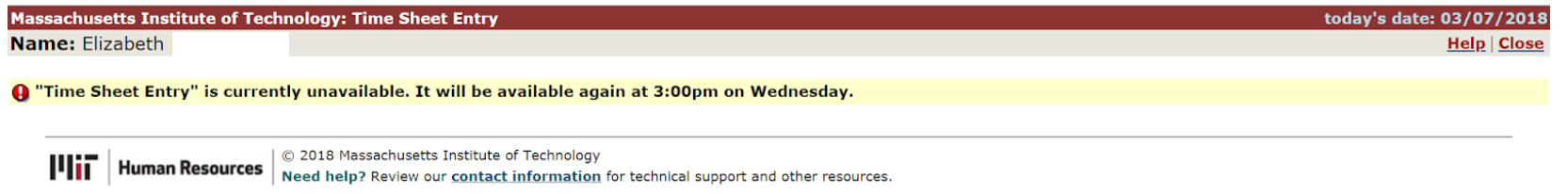
3. Users are locked out from entering hours into their time sheet for chunks of time on Monday, Tuesday, or Wednesday whenever one of their jobs is approving their hours. Since this lock out time is dependent on when a job is approving hours it varies week to week which can often be frustrating. However the system does at least tell the user when they will be able to access their account again, which is helpful.
Do people want something different?
From the overall poll asking students to rate the user experience it appears students believe that this user interface is below average and hence they would like the problems mentioned above fixed. When asked in the poll "Do you want something different? (And if so, what?)" students came up with a wide range of improvements.
The most common of this desired improvements (other than fixing the issues mentioned above) was the addition of a calendar view as students note they "have to check which weeks are which in my calendar each time before entering my hours" and "it's often not clear which week you're editing."