Atlas Time Entry Human-Use Analysis
by Elizabeth


Improvement Analysis
Summary of Suggested Improvements and Fixes
From my analysis it appears there are a couple critical aspects in need of improvement:
1. A better method for navigating between weeks, preferably in calendar form.
2. A better method of summarizing hours entered and the review state each week of each job is in.
Along with a few fixes which should be prioritized:
1. Only locking the user out from hours that are actively being reviewed - the user should still be able to edit other jobs, or future weeks for the job that is being reviewed.
2. Allowing users to separately enter comments for each job.
3. Not auto-locking a user out if they press the X to close the window rather than the close button.
4. Auto-saving the users hours if they switch over to another week or close out of the window while editing.
Visual of Suggested New Design
Details of Suggested Improvements and Fixes
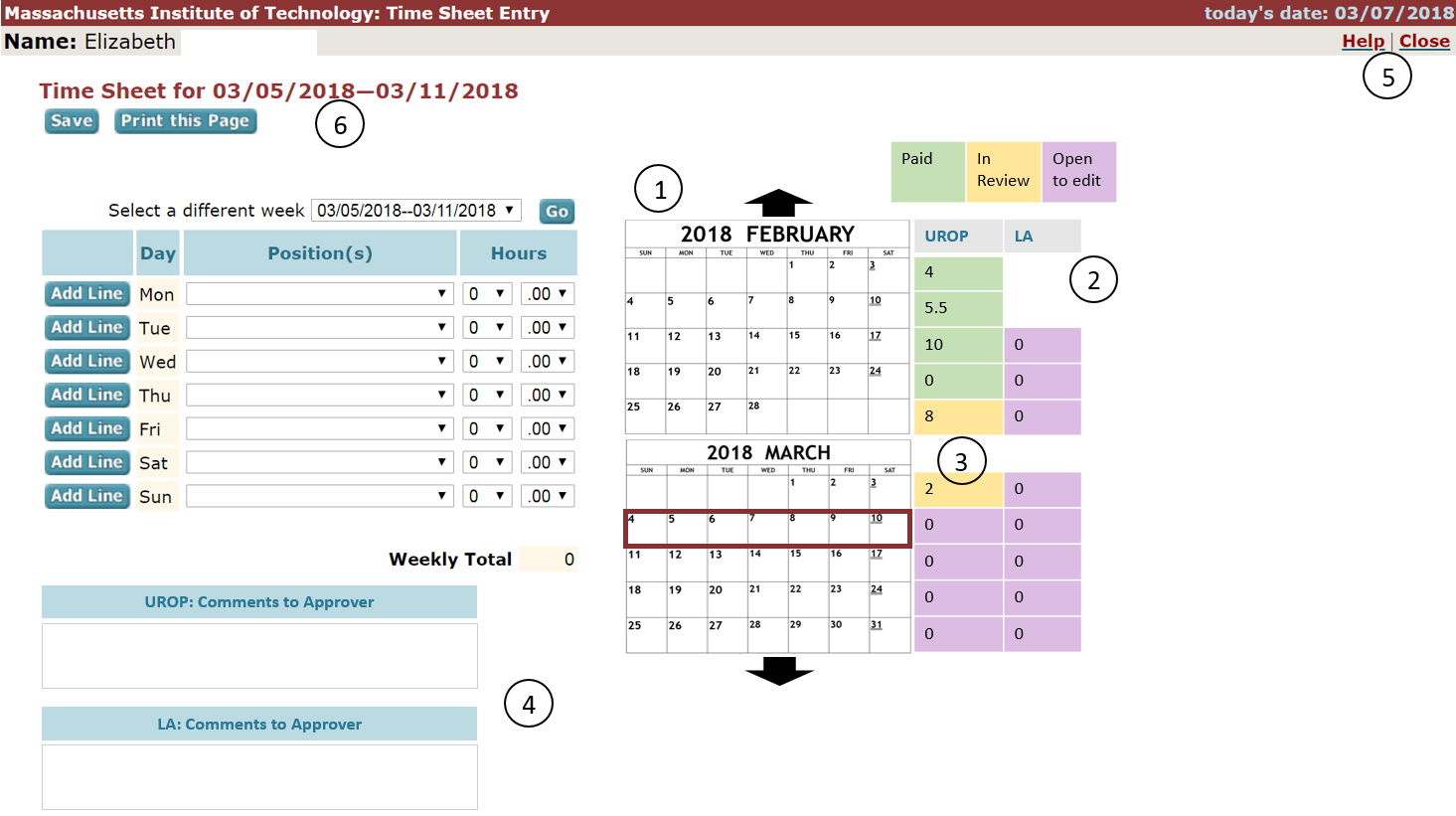
1. The first critical aspect which could benefit from improvement is moving between weeks. Currently the user has to select the new week from a dropdown menu and then click "go." Some users may like this method, but many would like a clearer visual to help. By supplementing the current drop down selection with a calendar on the right hand side the user can clearly see the dark red box outlining the week they are currently viewing. They can then choose to either click on the week they would like to view by clicking on that portion of the calendar, or they can use the traditional drop down menu.
2. The second critical aspect which could benefit from improvement is displaying summarized information. Users have expressed an interest in being able to see hours for multiple weeks at once and being able to see which weeks have been reviewed and approved versus which are still open to edit. I think this could be most simply completed by adding additional columns to the right of the calendar, one for each job. The columns would list how many hours each job was worked that week and would be color coded according to a key at the top. Green boxes have been reviewed and paid, yellow boxes are uneditable and currently being reviewed, and purple boxes are still open to edit. Colors were chosen to not look similar to individuals who are red/ green color blind and to not confuse with the other colors of the page which have blue backgrounds.
3. A fix implemented in this redesign is only locking the user out of the job that is being reviewed on the week(s) it is currently being reviewed on. This in review status is indicated by the yellow background. In this example the user will still be able to edit their LA job in the week containing March first- third, and will still be able to edit both of their jobs in the current week (March 4th-10th).
4. Another fix implemented in this design is providing the user with one box for comments for the approver for each job. This will allow users with many jobs to better communicate with each of their approvers.
5. Another fix implemented is to have the "X" in the window do the same thing as the "close" link. Specifically, they both save and close but do not lock the user out in the future.
6. A final fix is that hours are autosaved whenever the user moves to edit a new week or closes the window.