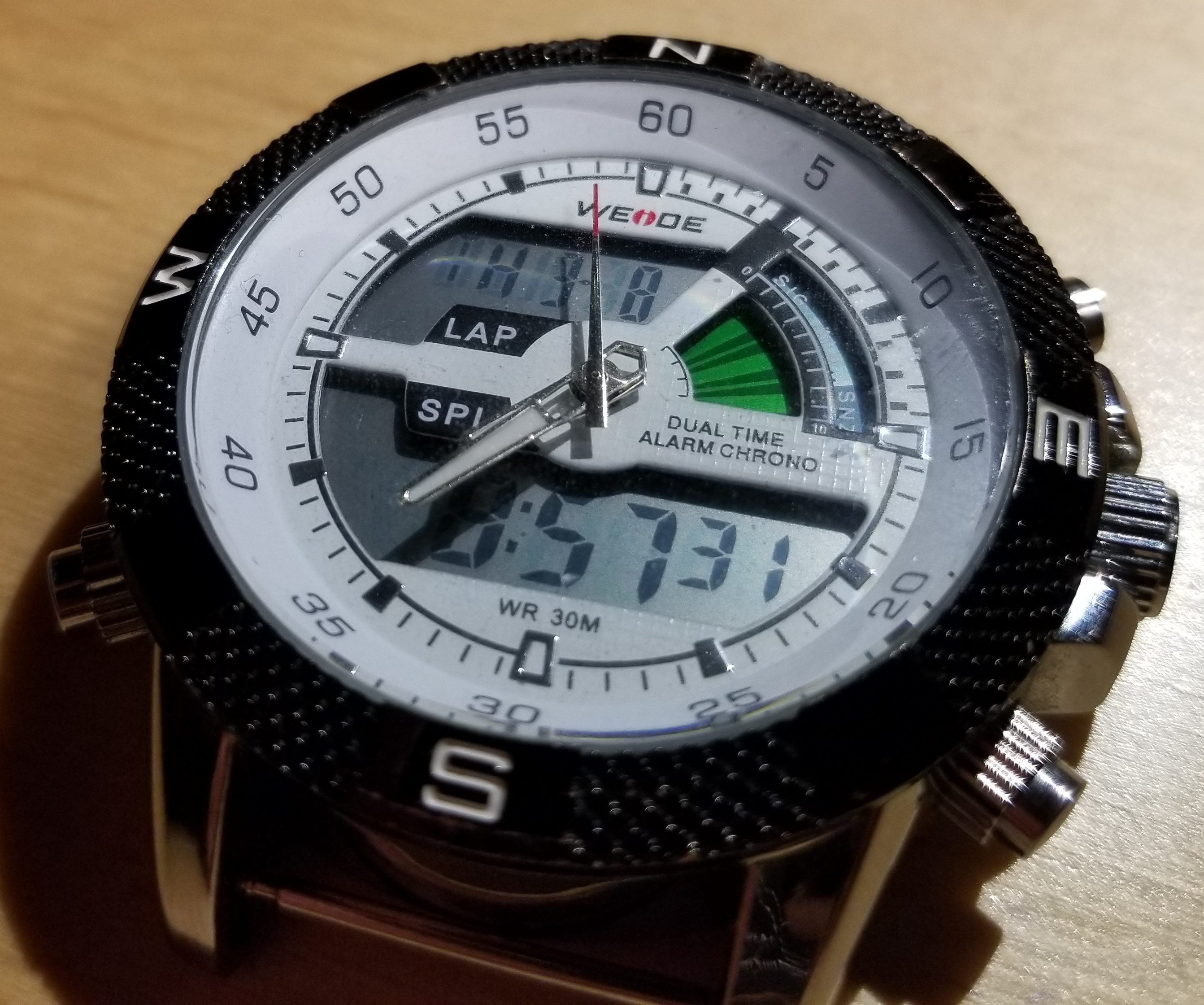
| Overview |
| Interface |
| User Experience |
| Improvements |
Second, it was found to be generally more intuitive if the set button had a role in setting the time. Holding the set button on the time face seems to be the method that makes the most sense, as it is clear when the face changes from static time to having the seconds blink. Also, for the white watch, when the time setting mode activates, a beep can be heard, adding a layer of sensory signaling to the process.
As for what features a digital watch should have, the answer is less clear. Aside from just time, users said they specifically wanted a stopwatch function. Aside from that, other features may require different button actions to control the application, so for simplicity, it may be best to have just the two modes. Many of the other features, such as alarm, timer or even calculator have eveolved to be accessed through a smartphone instead of classic digital watches. While smartwatches are becoming popular, their primary intention is to interface with a smartphone and will subsequently have a different set of users and user needs to create a good user experience.
