I focused on two main issues: confusing buttons and blocking data with tablets. These were concerns many users as well as myself found to be the most annoying.
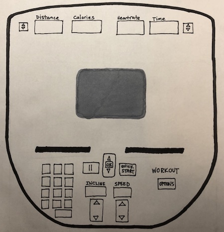
Confusing buttons:
The buttons for different workout options were removed. Ideally, you would press the 'Options' button underneath workout and view the options on the screen. From there, you could just toggle between options with the up/down buttons and the 'OK' button in the middle. In addition, the volume and channel buttons originally at the top were removed as most users don't use those buttons. In addition, the knobs to adjust the speed and incline are now buttons to give more control over how much you want to increase either option.
Blocking data with tablets:
The displays at the top are now located even higher above. This is to allow you to have a tablet in front of you without blocking important feedback, such as distance travelled, calories burned, or heartrate.