BLACK + DECKER Toaster Oven Redesign
There are many aspects of the BLACK + DECKER toaster oven that can be maintained (the size for example), but there are also many improvements that can be made. The two most critical aspects that need to be addressed first are the user interface and the overheating issue. The user interface is what effects whether or not someone is actually able to use the toaster oven and greatly effeects their overall experience. The overheating issue is a great safety concern and safety is something that should be a given when thinking about appliances.
User Interface

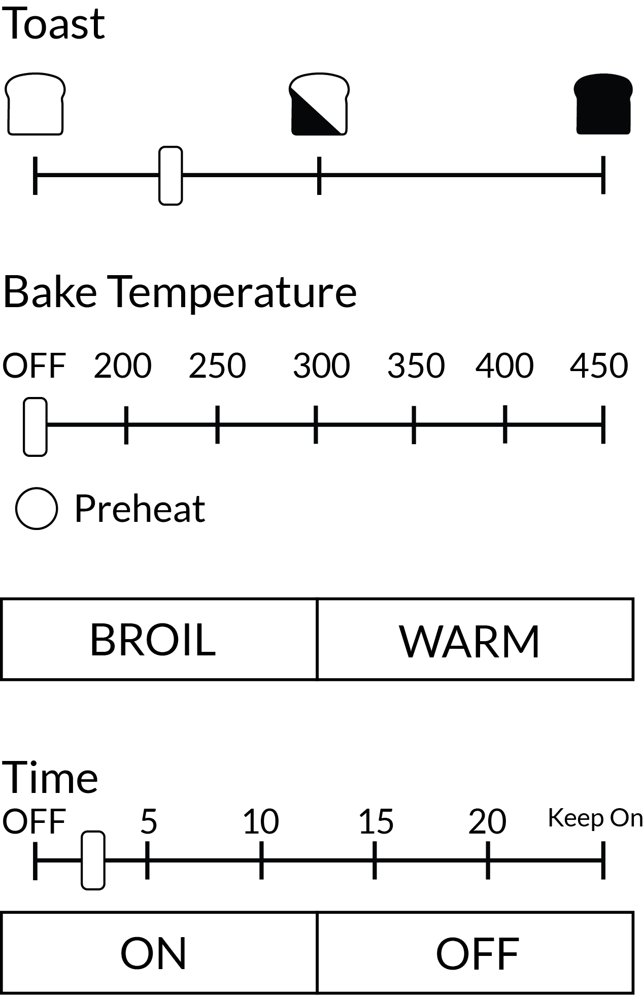
The goal for this new user interface was to create a more intuitive experience by eliminating redundancies, adding constraints and signifiers, and making more discrete settings. In this user flow, users first decides what they are trying to do (toast, bake, broil or warm), and choose the setting they want under the appropriate category. They then set the timer and press on. The idea is that once you choose a setting in one category, the other 3 automatically go off so that you know exactly which setting you are on. This new layout eliminates the redundancies that the first 2 dials had before.
The dials are now sliders because it was very difficult to tell exactly what the setting was on a circular dial. People seemed to like the toast icons, so I kept those. In addition, the ON button would be lit when the toaster is on, and nothing would be lit when the toaster is off so it is very clear whether or not your toaster is still on. The keep warm function is also a totally separate button from the OFF button so that it no longer as easy to have the toaster oven on keep warm accidentally, making it safer. For the baking feature, there is an added light, indicating if the oven is done preheating or not. In addition, the timer should be changed so that it is only dings and ticks when the toaster is plugged in so that people realize that the toaster is not actually on.
The dials are now sliders because it was very difficult to tell exactly what the setting was on a circular dial. People seemed to like the toast icons, so I kept those. In addition, the ON button would be lit when the toaster is on, and nothing would be lit when the toaster is off so it is very clear whether or not your toaster is still on. The keep warm function is also a totally separate button from the OFF button so that it no longer as easy to have the toaster oven on keep warm accidentally, making it safer. For the baking feature, there is an added light, indicating if the oven is done preheating or not. In addition, the timer should be changed so that it is only dings and ticks when the toaster is plugged in so that people realize that the toaster is not actually on.
Overheating
In terms of overheating and catching fire, the problem of the oven being kept on unintentionally should be addressed with the new UI design. However, another problem that came up through personal use, interviews, and reviews of the product is that the outside of the toaster oven gets extremely hot. This causes many people to burn themselves or things around the toaster oven to melt, especially because people tend to want to put things on top of the toaster oven. Since it is probably quite costly and diffiult to redesign the heating element, the solution for this is to either have some sort of insulating coating on the outside, or at least a large visible sign that reminds you to not touch/put things on top of the toaster. In this way, people will be more aware of what is going on, safer, and not be upset at BLACK + DECKER for not warning them of potential dangers.
These redesigns would definitely be more expensive, but they are ones that will improve the overall user experience and BLACK + DECKER's brand image as well.