In a recent paper, colleagues and I used nighttime light signatures recorded by a Department of Defense weather satellite to evaluate the hypothesis that the surge of US troops into Baghdad beginning in early 2007 had improved conditions of life in the city. If that hypothesis were true, we would see an increased intensity of light for the city between December 2006 and December 2007. Prior studies have demonstrated that nightlight intensities can proxy for population densities and economic activity fairly accurately. Therefore, the improved quality of life that the surge was supposed to bring to Baghdads inhabitants should have manifested in a greater supply of electricity and, accordingly, more intense light signatures at night. These signatures would, presumably, match up with evidence of declining violence.
It should be noted that the surge was never designed to reduce US military casualties. Indeed, casualties were expected to mount as the US military switched to a more engaged, socially-embedded counterinsurgency strategy. The surge aimed to provide a military basis for improving the material conditions of life in Baghdad, thereby advancing political reconciliation between the citys major political factions, particularly the Sunni minority and Shiite majority. In fact, the data that we collected suggests that rather than increasing over time, the citys light intensity decreased significantly during the surge. Moreover, when intensities were calculated for different neighborhoods in Baghdad, a systematic pattern emerged while many predominantly Shiite areas in the eastern part of the city maintained or increased their nightlight intensities, many mixed and predominantly Sunni neighborhoods in the western and southwestern sides of the city experienced major declines in theirs.
The Study
Our project began in a course on remote sensing of satellite data at UCLA. The instructor, Thomas Gillespie, and two students, Jorge Gonzalez and Brian Min, wanted to undertake a study that would bring remotely-sensed data to bear on a significant contemporary issue, and produced all of the initial analysis of the satellite data.
We gathered nightlight data for those few nights when weather conditions permitted collection of infrared signatures. We analyzed satellite passes over Baghdad (and other Iraqi cities, most of which showed steady or improving nightlight intensities over time) from November 16, 2003 (9:00pm); March 20, 2006 (9:00pm); March 21, 2007 (9:00pm); and December 16, 2007 (11:00pm). An obvious limitation of our study is the anomalous last time-of-day. We accounted for this fact when interpreting our results, assuming that there would likely be fewer lights on at that hour. Nevertheless, light intensities in the eastern areas held up relative to previous dates, while the western ones declined further.
My colleagues consulted with me to understand this initially puzzling finding. We first conjectured that by 2006, the Baghdad electric grid was in such bad shape that little confidence could be placed in the nightlight findings. After finding several journalistic accounts suggesting that the electricity supply to the city had not changed very much over our period of inquiry, however, and numerous suggestions that those neighborhoods showing reduced light intensity were those that had always had the best electricity supply (partly because, under Saddam, they were favored and more affluent, and thus more able to supply their own generators than, say, the eastern Shiite slum of Sadr City), we concluded that the images might be telling a real story about the surge.
In particular, we concluded that the surge had not improved the material condition of life in Baghdad as a whole, and more particularly, that the quality of life had deteriorated in previously mixed and Sunni neighborhoods.
Our Conclusions
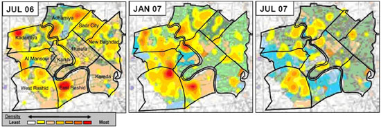
To test our finding, we grafted our maps onto maps of sectarian population distributions and violence patterns in Baghdad that General James Jones produced in a report to Congress in September 2007. His maps covered exactly the same time period that ours did. We discovered that the problematic neighborhoods that we had identified are precisely the ones that General Jones singled out. His maps suggest that these neighborhoods were sites of extreme violence in the period immediately before the surge (Summer 2006). Our satellite images strongly suggest that thereafter, these neighborhoods were depopulated, at least through December 2007. For this reason, their nightlight intensities showed no sign of recovery. The surge, therefore, came after the greatest paroxysm of violence had ended and did not, at least for the period in question, lead to improved material conditions of life in Baghdad as a whole, and certainly not in its western and southwestern neighborhoods.
The Jones Report was the coup de grace. It proved invaluable in explaining what our satellite images could only describe: ethno-sectarian violence peaked before the surge was under discussion and had started to decline before the surge had started. It provided an almost complete match between ground data on the geographical course of violent deaths in Baghdad between December 2006 and December 2007 and our satellite nightlight images. The heart of our paper, therefore, lies in the congruence between these data patterns, not in the satellite images themselves.
Science is the fraught process of building, testing, and then either rejecting or tentatively accepting theoretical hypotheses. From above the earth, we have reasonably objective evidence that backs up ground-based data that the military surge into Baghdad came into effect after swaths of the city had been subjected to vicious sectarian violence and, at least through December 2007, had not experienced any visible progress in their material conditions. What politicians make of these realities, of course, is entirely up to them. They ignored the Jones Report; why should our paper command more attention?
 |
Density plots of incidents where deaths occurred in July 2006, January 2007, and July 2007 (Jones Report 2007)


