Graphing |
|
| |
|
 |
|
| |
||||
|
||||
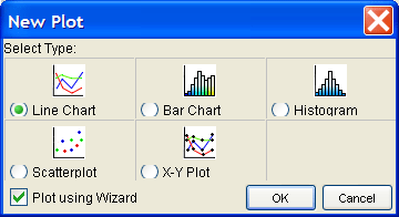
| As of StarLogo version 2.0 graphing has been made easier by way of a new graphing wizard. Users no longer need to manually initiate their graphs by typing commands. Though, if you open a project with the traditional StarLogo commands you will have a mini-graphing window added to your project that displays these plots in addition to the regular plot window. Implementing the new graphing wizard is both quick and easy. First, click on the graphing icon on the StarLogo toolbar, and then click anywhere in the workspace. This will bring up the Graph Chooser dialogue box, from which you can select the type of graph that you wish to initialize. You can choose from a line chart, bar chart, histogram, scatterplot, and x-y plot. You will also select whether the graph is controlled by a wizard, or by using traditional StarLogo commands. FIGURE 1: Graphing Icon |
||||
|
||||
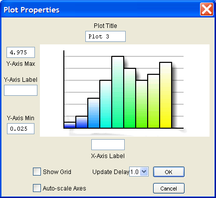
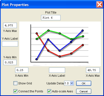
| The Line Chart is a simple graph that follows a set of data over time and is used for analyzing trends in a specific variable. For example, you could graph the average energy of all the turtles on the screen over time. In the Plot Properties window which was just opened, there are several options available. You can input the title of your new graph at the top of the dialogue box. You can input labels for your x-axis and y-axis in their respective positions. You can also set a specific range on the x-axis and/or y-axis which you specifically want to display. Note however, that most users will not set these inputs and will allow the computer to automatically scale the window for you. This is especially useful for graphs which have a varying x and y range. You can show the gridlines in your graph or you can choose to turn them off by checking or unchecking the box in the bottom left corner. For the Line Chart you can choose to connect the points that are graphed by checking the box in the bottom left corner as well. Select OK when you are done.
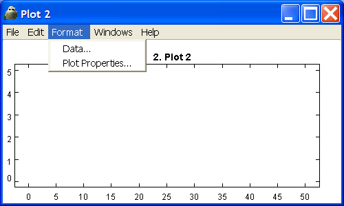
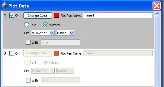
FIGURE 4: Plot Properties Window (Line Chart)Next, go to the Data item in the Plot Format Menu we discussed earlier. In the Plot Data Window you can turn on up to ten plot pens. Each plot pen will plot an item on your graph. Next to the number of the plot pen is a box to check if you want to turn that plot pen on. You can give a name to your plot pen, usually something representing what that plot pen will be graphing. Under this, is a selection area for either Wizard or Text. The Wizard allows you to use the simpler, faster method of telling the program what you want to graph. Power users may want to choose Text to resort to the original way of inputting graphing functions by command if there is a level of sophistication to their graphs that may be unreachable by the Wizard. The How-To will continue with the Wizard. Next you can choose what you want to plot. The first two boxes allow you to choose the value that you want plotted, while the third box allows you to input what items you want to graph for. For example, you could plot the "average of" "energy" for all "turtles." The last section of the plot pen area allows you to set a limitation on what items to plot. For example, if you already chose to plot the "average of" "energy" for all "turtles," perhaps you only want to plot the red turtles. So, check the box next to the word "with" and type "color = red" in the input box. Now you're all done with your first Line Chart!
FIGURE 5: Plot Data Window (Line Chart, Bar Chart, Histogram) |
||||
|
||||
|
Next, go to the Data item in the Plot Format Menu of the blank graph. Similar to the Line Chart above, you can turn on plot pens, choose colors for your plot pens, and select the data values you wish to plot with your plot pens. (See Line Chart and See Figure 5) |
||||
|
||||
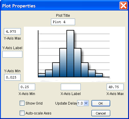
| The Histogram is used to display how a certain variable is distributed. For example, you could analyze the distribution of energy in the turtles. Questions you could answer with the Histogram: "How many turtles have between one and five energy?" or "Do more turtles have a lot of energy or do more turtles have less energy?" In the Plot Properties Window, for the Histogram, you can set the plot title, set the x and y-axis labels, set the x and y ranges, and choose to show the plot grid. Select OK when you are satisfied with your choices.
FIGURE 7: Plot Properties Window (Histogram)Next, go to the Data item in the Plot Format Menu of the blank graph. Like in the Line Chart, and Bar Chart, you can turn on plot pens, choose colors for your plot pens, and select the data values you wish to plot with your plot pens. (See Line Chart and See Figure 5)
|
||||
|
||||
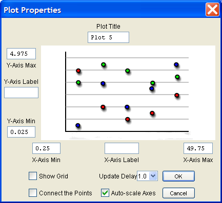
| The Scatter Plot is used to plot the real-time coordinate of two variables for each turtle/breed/etc. For example, you could plot energy versus speed, and every turtle would plot its point on the graph for its current energy versus speed coordinate. If you were to plot the y-coordinate of the turtle versus it's x-coordinate, you should get a replica of the patch canvas. In the Plot Properties Window you can once again set the title, set the x and y-axis labels, set the x and y ranges, choose to show the grid and choose to connect the points.
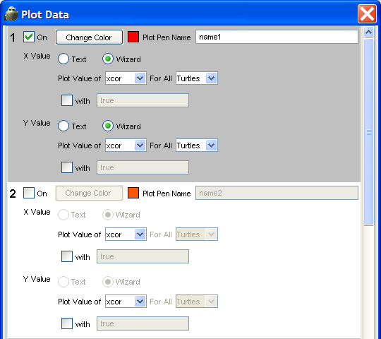
FIGURE 7: Plot Properties Window (Scatter Plot)Next, go to the Data item in the Plot Format Menu. The Plot Data Window is slightly different for the Scatter Plot and X-Y Plot than for the Line Chart, Bar Chart, and Histogram. In this Plot Data Window you can still turn on plot pens, set plot pen colors, and name plot pens. However, this time, you have to specify which variable to graph for both the x-value and the y-value of each turtle on the graph.
FIGURE 8: Plot Data Window (Scatter Plot, X-Y Plot) |
||||
Getting Started |
Download |Community
| Tutorial
Commands | Projects
| FAQ | Info
