The first step of the project was to understand the underlying physics behind LED based artwork. Fundamentally, the eyes are a very odd sensing system. The ears do a frequency based analysis of incoming pressure waves, and report all of the dominant frequencies to the brain for interpretation --- if we hear two frequencies of different pitches, they sound distinct. This isn't quite as true when you talk about harmonics of sounds, as they will start to affect the timbre instead of sounding as a distinct pitch, but the basic idea is that we can pick out independent sounds with different pitches fairly easily.
The eyes, on the other hand, do spatial and frequency-based sensing; however, they throw away much of the information about the specific frequencies detected. For instance, if you look at any particular spot, you will see a single color -- not a spectral map of the complete visible spectrum coming from that point. This is great for the purposes of vision; it would be rather difficult, I think, to walk around while receiving that much information. However, this means that the eye behaves very strangely in the presence of multiple colors from the same location.
The classical example of this effect is the additive color wheel. You mix red light and green light, you get what appears to be yellow light. But how is this possible? If yellow is a frequency of light, how does mixing red (620nm) and green (530nm) produce yellow (590nm) light? There is certainly no physical process that does this sort of mixing in general.
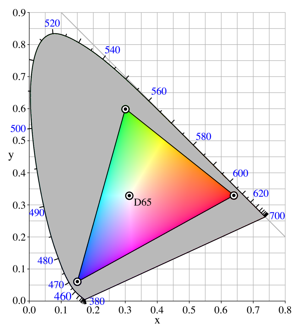
In fact, the idea that red and green combine to form yellow is a trick of the mind only. You may think you're seeing yellow light, but the fact is that you are seeing independent red and green light, and your brain is converting that information into the appearance of yellow! Very strange. This trick is summed up in the Chromaticity Diagram (pulled from wikipedia). On this diagram, pure frequencies are displayed along the outer border from 460 to 700nm. As you mix two colors together, you draw a line between their positions on the border, and the ratio of the two tells you the position in the diagram that your apparent color lies. For example, if you combine 520nm green light with 620nm red light in a 50-50 ratio, you will have what appears to be yellow light. Likewise, if you have 620nm red light and 490nm cyan light in a 50-50 ratio, you will have what appears to be approximately white light.
This explains how an RGB cluster of LEDs can produce so many apparent colors of light -- they aren't actually producing those other frequencies of light; instead they are tricking the eyes into thinking that they are producing those other frequencies of light. To quote wikipedia:
The choice of primary colors is related to the physiology of the human eye good primaries are stimuli that maximize the difference between the responses of the cone cells of the human retina to light of different wavelengths, and that thereby make a large color triangle.
The normal three kinds of light-sensitive photoreceptor cells in the human eye (cone cells) respond most to yellow (long wavelength or L), green (medium or M), and violet (short or S) light (peak wavelengths near 570 nm, 540 nm and 440 nm, respectively). The difference in the signals received from the three kinds allows the brain to differentiate a wide gamut of different colors, while being most sensitive (overall) to yellowish-green light and to differences between hues in the green-to-orange region.
One good point in this is that it says that the responses are peaked at yellow, cyan/green, and violet -- not red, yellow, and blue (the traditional triad of primary absorptive colors). The red, yellow, blue primary color set is obsolete -- the absorption of the cones and rods in the eye are actually shown in the absorption curves:

And to continue quoting Wikipedia:
Since the likelihood of response of a given cone varies not only with the wavelength of the light that hits it but also with its intensity, the brain would not be able to discriminate different colors if it had input from only one type of cone. Thus, interactions between at least two types of cone is necessary to produce the ability to perceive color. With at least two types of cones, the brain can compare the signals from each type and determine both the intensity and color of the light.
For example, moderate stimulation of a medium-wavelength cone cell could mean that it is being stimulated by very bright red (long-wavelength) light, or by not very intense yellowish-green light. But very bright red light would produce a stronger response from L cones than from M cones, while not very intense yellowish light would produce a stronger response from M cones than from other cones (counterintuitively, a "strong response" here refers to a large hyperpolarization, since rods and cones communicate that they are being stimulated by not firing). Thus trichromatic color vision is accomplished by using combinations of cell responses...
Many historical "color theorists" have assumed that three "pure" primary colors can mix all possible colors, and that any failure of specific paints or inks to match this ideal performance is due to the impurity or imperfection of the colorants. In reality, only imaginary "primary colors" used in colorimetry can "mix" or quantify all visible (perceptually possible) colors; but to do this the colors are defined as lying outside the range of visible colors: they cannot be seen. Any three real "primary" colors of light, paint or ink can mix only a limited range of colors, called a gamut, which is always smaller (contains fewer colors) than the full range of colors humans can perceive.
The next critical concept to understand is that between a "monochromate" color with only one frequency, and a "polychromate" color made up of a collection of frequencies. At the root, the fundamental underlying physical process of absorption is still occuring, and this is where the apparent colors in the subtractive system come from. A magenta pigment absorbs green light, and a cyan pigment absorbs red light. When you mix them together, the mixture absorbs both green and red light, reflecting blue.
However, what we want to do is more complex -- the selection of specific colors *without* exciting other nearby colors in the pigment. For example, we want to be able to put down a splotch of yellow paint that will appear yellow, and only yellow (or black). In this example, you start with yellow, a primary absorptive color that absorbs strongly in the blue. The removal of the blue from white light causes the green and red receptors in the eye to be excited, resulting in an apparent yellow color.
Where this breaks, is if you consider what that yellow paint looks like under green light. The paint only absorbs in the blue, so under green light it will appear green. Under red light, likewise, it will appear red. This means that as we vary the RGB color emitted by a LED light fixture with this idealized primary pigment, we are simply fading the color from red to yellow to green, with no ability to force it to only reflect real yellow light. If instead, we had a pigment that actually absorbed everywhere except for at yellow, we would remove that shifting color effect entirely, allowing for "addressability" of individual colors matching specific LED light outputs. This sort of manipulation of the way that the colors look under different illumination spectra is called photometamerism.
So, while it is true that in a standard absorption schema, you can use magneta, yellow, and cyan pigments to mix and form any color, this is not a complete picture when you're interested in this sort of photometamerism. Colors will simply not show up properly unless the incoming spectra happens to match the color you're trying to emit because the pigment may emit polychromatic light.
This imprecision in the color reflection where paints will change colors instead of directly fading in and out is, frankly, an aesthetically ugly effect that makes it very difficult to produce something that looks good.
What if you want only the yellow parts of a piece of art to appear brightly lit, distinct from red, green, cyan, and orange parts? The only way to achieve this is to identify a pigment which uniquely reflects in the 590nm region, and absorbs everywhere else. Then, you can include a 590nm LED that emits true yellow light to select that pigment for viewing specifically. The number of colors you can uniquely "address" is limited only by the broadness of your reflection peaks.
So, you can take a pigment that absorbs everywhere that is not yellow, and a pigment that absorbs everywhere that is not green, you can put them next to each other and get very discrete fading from the green region being illuminated, into the yellow region being illuminated by using one LED for yellow and one LED for green. This sort of effect looks extremely good -- the discrete effect makes the painting feel much more alive and active, the spatial difference between the colors introducing a strong aspect of movement. I personally think it is by far the most effective type of technique to use with LED illuminated artwork.
Of course, in the real world there are no ideal pigments. All real pigments are a complicated pattern of absorption, and may absorb in unexpected ways. For instance, you may purchase a blue paint, and find that for some reason, it reflects yellow as well when only the yellow LED is on. This sort of nonideality is a large part of why in LED art to date, colors like orange, green, and purple are so drastically under-represented compared to colors like red and blue.
