|
||||||||||||
|
Carrying It Out
|
||||||||||||
|
|
||||||||||||
|
Included are excerpts on preparing handbooks, posters, and leaflets; an article on general thoughts on communication, and checklist for making public awareness posters. |
||||||||||||
Further resources:
|
||||||||||||
|
|
||||||||||||
| Communicating Building for Safety Guidelines for methods of communicating technical information to local builders and householders |
||||||||||||
|
||||||||||||
 “A drawing suitable for a Quechua-reading person who understands cartoon conventions and hard to read so-called designer script, but does not understand Spanish. Thus it is designed for a person who does not as yet exist.”
|
||||||||||||
|
The only form of building improvement program which has the potential to result in widespread improvements is one which changes the building decisions made by the poor in their own construction projects, designed and paid for by themselves. The task is to encourage practical improvements in indigenous building practices, the primary tool is communication, and the main assumption is that outsiders have useful information to communicate. Communication in planning
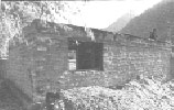
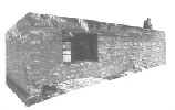
“Photograph of a well-built house of stone and cement. A few people commented that this house was well built. On occasions the window caused confusion, as did the building materials in the foreground. The strong shades and the cluttered foreground and background make this photograph unsuitable for educational materials. Reproduction usually makes the problems worse because the shades and contrast will appear even stronger.” Cutout version of the photograph. The removal of the background emphasizes the strange angle of this photograph and made it look like a coffin to one respondent. A couple of people did not recognize this as a house. One described it as a plan of a house compound. The window and the piles of material in the foreground caused confusion. In this drawing the content of the photograph was reproduced more or less exactly with little selection of what was or was not significant. The stones were not drawn clearly but in a matter indicating a general texture. Some commented that the house was poorly built, most probably because of the appearance of the stonework. While in the photograph the stonework is no more than a texture of light and shade, it still gives the impression of a well-built house. In a drawing, a line is expected to be there for a purpose. Stonework represented by broken or incomplete lines was read as poor stonework. Similarly, both the heap of sand and the crying children, because they are carefully drawn in, took on an even greater significance than in the photographs. Respondents commented: ‘if someone has gone to all the trouble of drawing it then it must mean something.’ Educational materials
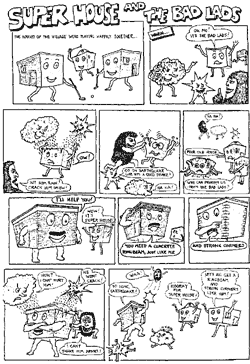
When an Urdu version of this cartoon was tested for its usefulness in conveying messages about safety in Pakistan, it proved spectacularly unsuccessful.” Illustrating building for safety Printed images for building education need to be designed on the basis of an understanding of how people from the target audience interpret pictures. Although the problems of visual interpretation will vary from place to place, there are some important problems which commonly reoccur. Picture style:
Symbols and conventions:
Cartoons:
Connections and sequences:
Cultural associations:
Use of text and language:
Preproduction testing:
|
||||||||||||
|
|
||||||||||||
| Some Thoughts on Communication | ||||||||||||
John Bowers |
||||||||||||
|
Notwithstanding Professor Marshall McLuhan who wrote “the medium is the message”, for all practical purposes we need to draw a clear distinction between the two. The worst crime a communicator can commit is effective communication of inappropriate or misleading messages. It is certainly worse that no communication at all, since it confuses the receivers and destroys the credibility of the communicator. So, even in an emergency situation it may be worth a few day's delay to do some rapid action research to make sure that what you propose to say will be valid, appropriate and acceptable to your intended audiences. This action research should involve a representative sample of local population in discussion groups or individual interviews, based on a prepared list of questions. It is essentially systematic listening and should aim to find out the characteristics and needs of your intended audience. Are they a homogeneous group or a variety of subgroups - richer or poorer, more rural or more urban, illiterate or educated? What are their traditional housing designs and construction skills? Is their environment homogeneous or will one area use bamboo and another mud bricks? Having distinguished the target groups the next step should be to define your aims, if possible in behavioral terms – what do you want each group to know and do? It should then be possible to plan clear, simple messages appropriate to specific groups. This ‘message research and planning’ may well be done by a small group or communication unit. As agreement is reached on what should be said to whom, intended messages may well be written in short sentences on a blackboard or large sheet of paper, with rough sketches where visual representation is more appropriate. The planning group can then look at each statement and picture critically to assess its relevance to the target group. Effective Communication Once it has decided what should be said to whom, the next question is by whom? Who is to write the notes, handbook, draw the pictures, design the posters, take the photographs? These communicators are not necessarily the same as the people who planned and determined message. It is generally not advisable to allow a ‘specialist’ to communicate with unsophisticated audiences since he generally relapses into his professional jargon. A distinction is often drawn between direct or face-to-face communication, and indirect media communication. In general the face-to-face channel, using the spoken word and live demonstration, has powerful advantages. It is the normal channel of intercourse with possibilities of immediate empathy and feedback. Thus it may be more effective and economical to train local demonstrators than to put time and money into media. Where physical action is the aim, listening, seeing and doing are likely the most effective learning methods. Yet the face-to-face channel has two serious defects: its limited reach (to small groups and individuals), and the high information loss and distortion involved. (Singh and Haque, 1970 Indian Agricultural Research Institute, New Delhi, India; report from 43% to 70% loss and distortion in the oral transmission of simple messages from district-level through block-level to village-level workers.) Both of these can be overcome to some extent by media. Extending media such as radio and written materials, can reach larger audiences while written language and pictures can record and retain information and retrieval. So the ideal is an integration of both channels, using various media to complement and reinforce each other - a multimedia approach. In all cases, before the media are finalized they should be tested. Problems of Visual Communication There is a tendency to assume that written materials are more or less useless in largely illiterate communities, and that pictures are more effective. There are three fallacies in this seemingly logical argument. First, there are very few communities in the world which do not contain a smattering of literate members who are ready to interpret the written word. Secondly the understanding of drawings, photographs, etc. is largely a learnt skill and research in many countries has revealed that illiterate and semiliterate adults have serious problems in interpreting two-dimensional representations of three-dimensional realities. Thirdly there is a difficulty of representing reality in drawings, or indeed in photographs. Some rules of thumb for graphics:
Language and style Communication is complicated by the fact that there are more than 3,000 languages in the world, many of which have variant dialects. Even assuming a common language there is still the question of style and levels of complexity both in speech and writing. Experience suggests that illiterate adults do not use or understand the abstract terms and technical jargon which have been acquired by the ‘educated’ man - words such as ‘health’, ‘conservation’, ‘responsibility’ or their equivalents in literary forms of their own language may have no meaning for them, although they may have profound experience of the realities to which they refer and may be able to convey their understanding of these realities in concrete terms or by similes or fables. The ‘educated’ man must therefore adjust his style of speech and writing without patronizing or talking down to the illiterate or semiliterate. Reading ability and readability People obviously have different levels of reading ability which can be crudely graded from illiterate through semiliterate to functionally or high literate. In order to communicate its meaning, the readability of a written text must match the reading ability of the prospective readers. Skill in writing for semiliterate readers can be improved by training and perhaps helped by a number of crude ‘rules’:
Design, typography and printing The reproduction and printing is a crucial stage in media communication. Style and quality assume importance. The method of type composition, the printing process and the paper quality, as well as the design and color of the cover, may well determine whether a book or pamphlet is read or ignored or whether a poster catches attention. Attention in the receiver is essential to effective communication. |
||||||||||||
|
|
||||||||||||
| Checklist for Making Public Awareness Posters | ||||||||||||
|
Checklist
|
||||||||||||
|
|
||||||||||||
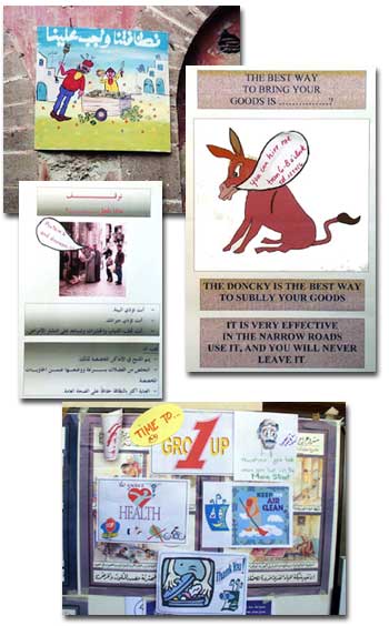
| Collage of public awareness posters. | ||||||||||||
 |
||||||||||||
|
|
||||||||||||
|
||||||||||||


