Pie graphs pictorially represent percentages of the whole by showing these percentages as "slices" of a complete circle (the complete circle represents 100 percent of whatever item or quantity you are discussing). Be sure that the percentages of the whole represented by the slices total 100 percent.
The number of percentage slices drawn on a pie graph may vary. Too many segments may make your graph unreadable; too few segments may make it useless for discussion. A carefully sized and composed pie graph will permit you to include more than the usually recommended five items, affording you greater scope in making comparisons, as shown in Figure 11.
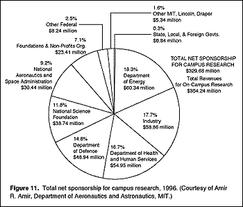
Label all sections clearly with the percentage and the name of the item being depicted.
Pie graphs give a striking and quick representation of simplified data. They are most often used before nonexpert audiences because the relationships of data are not highly detailed.