Human Use Analysis: Microwaves
Problems
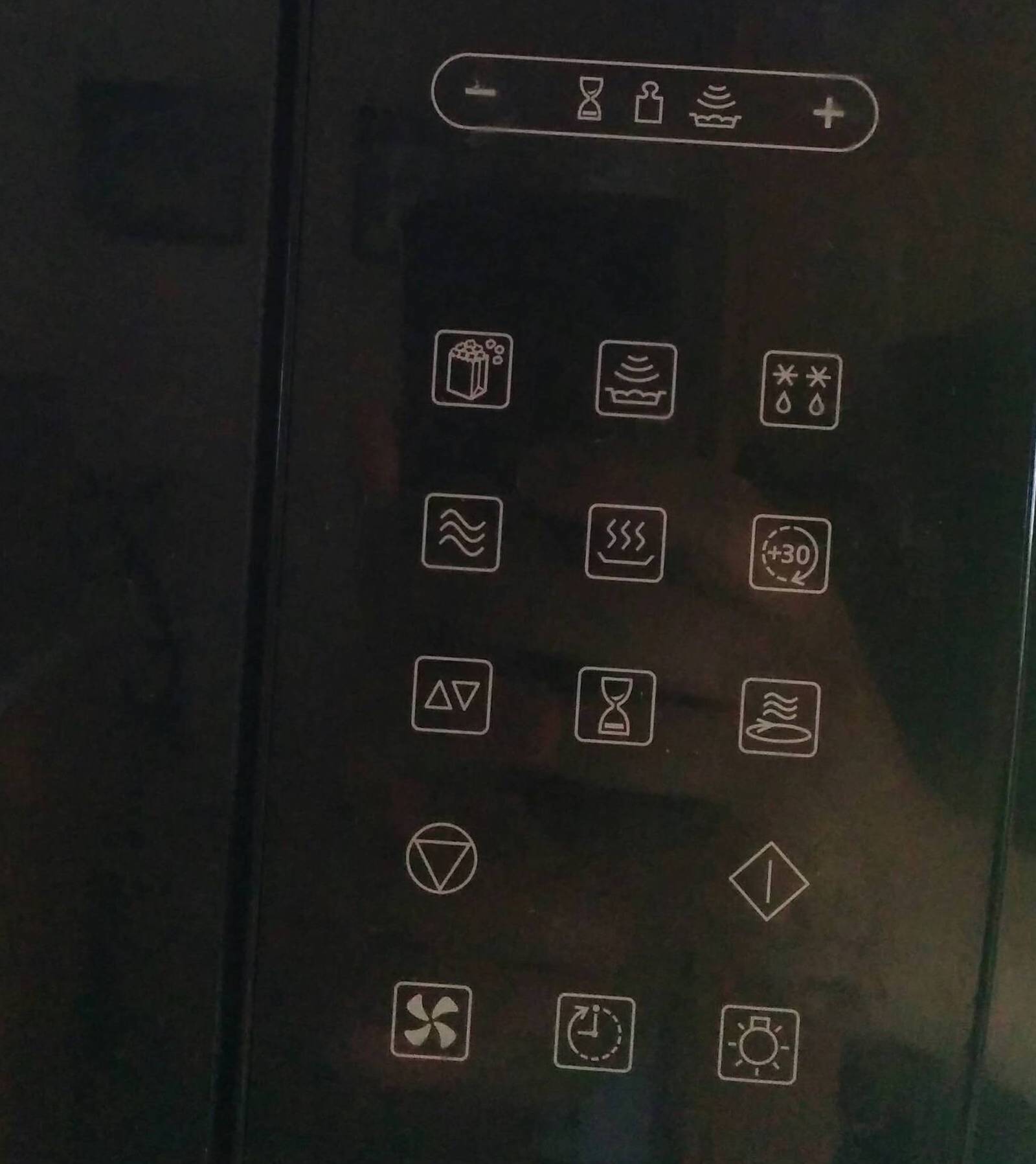
The primary issue with the current design: too many buttons.
User Interviews
Chris: "I use the 30 second button, and I use the timer a lot."
Kathy: "I don't use many pre-programmed buttons except defrost occasionally. I mostly use the 30 second button, number pad, and timer."
Molly: "I use the dial pad most often, and start and stop. I use power a lot because I reheat frozen things, and it's best to use 50% power. I don't use the specific food buttons with the exception of popcorn if I'm making popcorn. On our microwave at home, we've put velcro on a few of the buttons because my sister is legally blind, and otherwise they all feel the same."
Historical Context
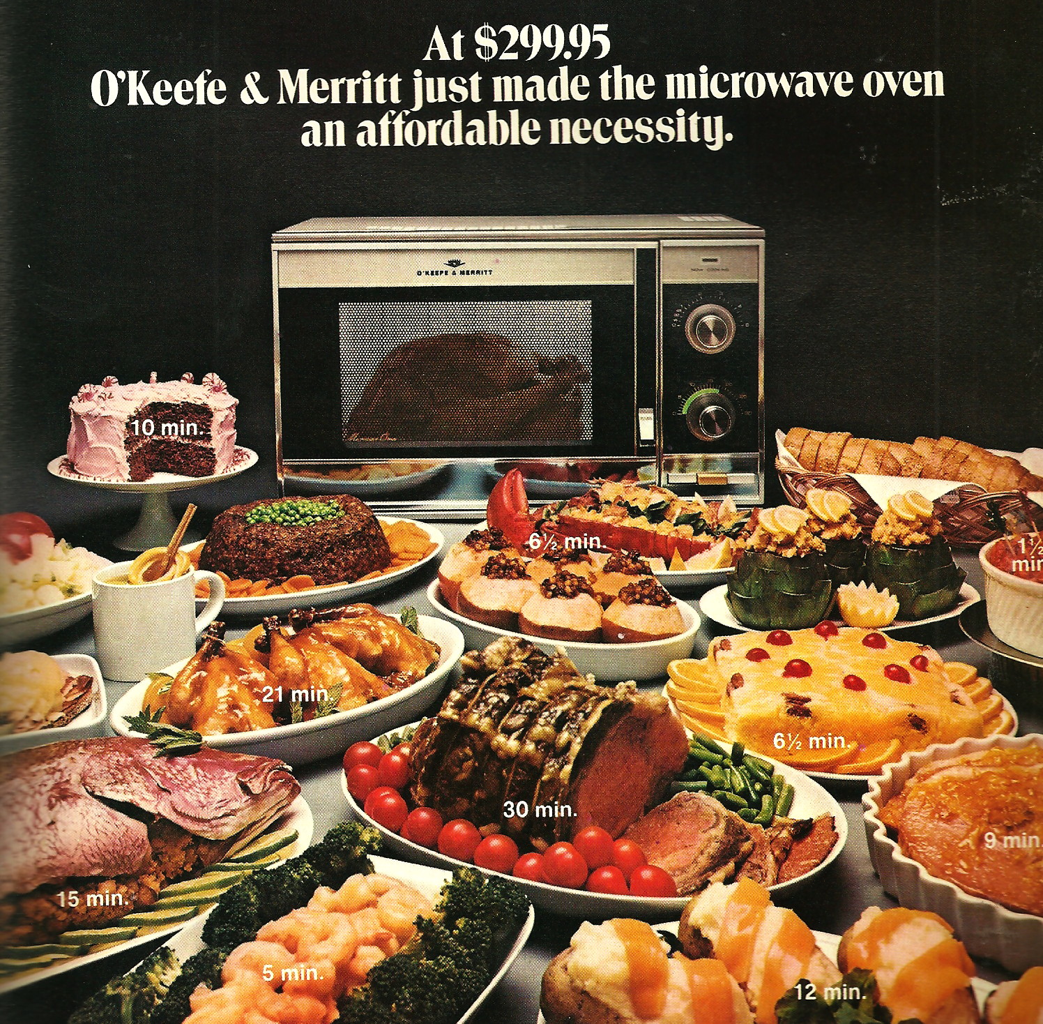
The idea of using radio waves to heat food has been around for nearly 100 years: at the 1933 World's Fair, Westinghouse showed off a 10-kilowatt shortwave radio transistor that could cook food between two metal plates. The idea gained traction, though, following WWII, as companies involved in developing radio techonology and equipement looked for a commercial market. In 1946, Raytheon engineer Percy Spencer filed a patent on the use of microwaves to cook food. The first commercially available microwave ovens were large, expensive, and intended for use in restaurants or on airplanes. By 1967, though, more affordable models on the order of $500 began to show up on the market aimed at home use. Pictured below is a model from 1970.

It is far more difficult, though, to track the design of the microwave's user interface, beyond an acknowledgement that the number of buttons and settings available has grown enormously in the last fifty years. On online forums, pictures of cryptic or overly complicated displays abound, and there are scores of posts on design blogs bemoaning the dearth of simple, intuitive microwaves in the market.

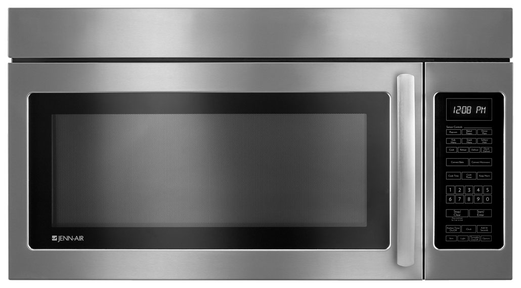
In one blog post, the author shows a photo of the Jenn-Air microwave he has at home, which sports "thrity-four flat, zero-feedback buttons." Of those, he basically just uses the 30 second and stop/cancel buttons, making 94% of the buttons wasted space. He further mentions a frustration with the non-tactile design, as he needs to be looking at the microwave while he programs a setting. Like many of the other frustrated users online, he favored a simpler design with a tactile knob, a call back to earlier microwave designs.
