Human Use Analysis: Microwaves
Redesign
The priorities: fewer buttons, tactile feedback.

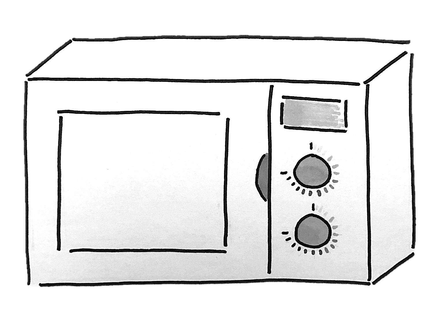
In the microwave redesign, I focused on feedback from user interviews and online research. The overwhelming consensus was that there are currently far too many settings and programs on exisitng microwave interfaces, and most users had never used more than a few buttons. A secondary concern was tactile feedback, for a range of users with different needs.
There is a screen at the top with a clock, which several users mentioned as a desired feature. There are two dials: the upper dial controls the time for heating (or changing the clock time), and the lower controls heat. As you turn the dial, there is tactile feedback to indicate every notch passed, both for ease of use and for the visually impaired.